Cattle Brand
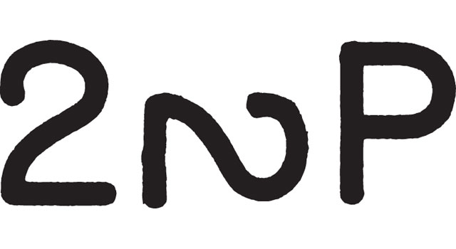
The mark above is a cattle brand, and a particularly fantastic one at that. I first saw it in Per Mollerup’s marvellous book, Marks of Excellence.
Cattle brands have been around since the days when the Egyptian pharaohs were doing their thing, but they really came of age in the late 19th century in the United States, where in 1880 there were almost 40 million head of cattle.
With that many cows wandering around, you need to make sure people know which ones are yours – particularly with rustlers about eager to make off with your livelihood. That was done with brands burnt into the cattle’s hides with hot irons – as Ramon F Adams says in the introduction to Manfred R Wolfenstine’s comprehensive history of cattle branding, The Manual of Brands and Marks, ‘A brand’s something that won’t come off in the wash’. Here’s a plate from that book, showing drawings of one of Wolfenstine’s irons.
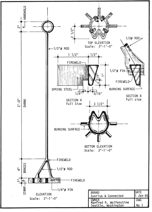
All cattle brands are registered with the county or state in a brand book, which records the name, design and placement of each mark. They can be made up of letters, numbers or symbols, and all manner of combinations of each of those. They are read from top to bottom, and from left to right. Branding irons were traditionally made of steel (if made by hand), or copper or stainless steel (if manufactured commercially), and heated over a wood fire. Individual letters and numbers were generally between three and five inches high, and 1 1/2 inches wide.
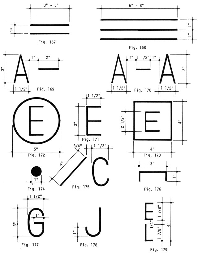
Various alphabets were designed specifically for branding, including standard, flying, running, hooked, bradded, forked, barbed, dragging, walking, swinging and rocking:
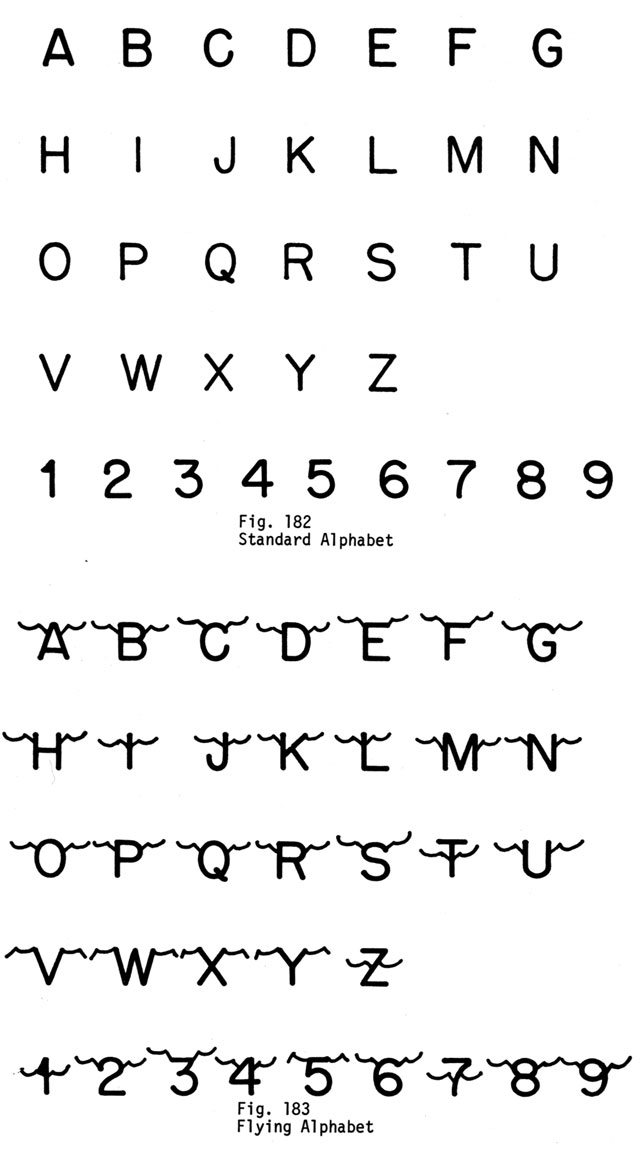
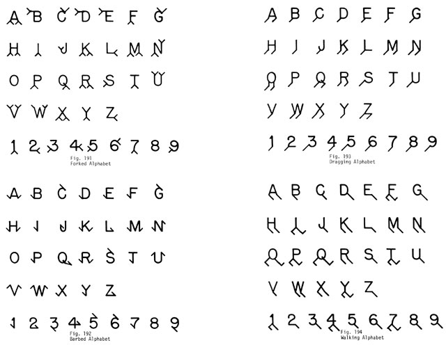
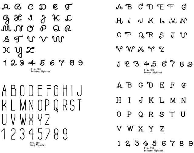
An alphabet that featured letters and figures on their sides, ‘too tired to stand up’, was described as ‘lazy’.
Now that you know that, you should be able to decipher the brand:

The brand is 2 Lazy 2 P, or ‘Too lazy to pee’. I love it for its staggering narrative economy. The idea of someone being too lazy to even take a pee is damn fine in itself (though for them to use that to identify themselves and their cattle is a little bonkers), but to compress the idea into two numbers and a letter is just brilliant; and brilliantly unforgettable.
[This is an extended version of Alistair’s Pictoform piece in the latest issue (G191) of Grafik magazine.]