British Design 1948–2012

We nipped along this morning to the big new show at the V&A, British Design 1948-2012, a retrospective of the creative industries in Britain since the end of the Second World War. Timed to make the most of the Olympic hordes who'll be hitting the capital this summer (the show ends the same day as the Olympic closing ceremony), it's a clear attempt to grab back some of the glory from the sporting crowd. Which is no bad thing.
This is the first big exhibition of post-war design that the V&A has staged, and it covers fashion, furniture, fine art, graphic design, photography, ceramics, architecture and industrial products. It's good to have all of that creative output lumped together, even if it does mean that you can only have a few key pieces from each discipline. Pleasingly there's rather more graphic design than we'd anticipated, particularly from the period just after the war, with work from Abram Games, Edward Bawden, Reginald Mount, and David Gentleman.
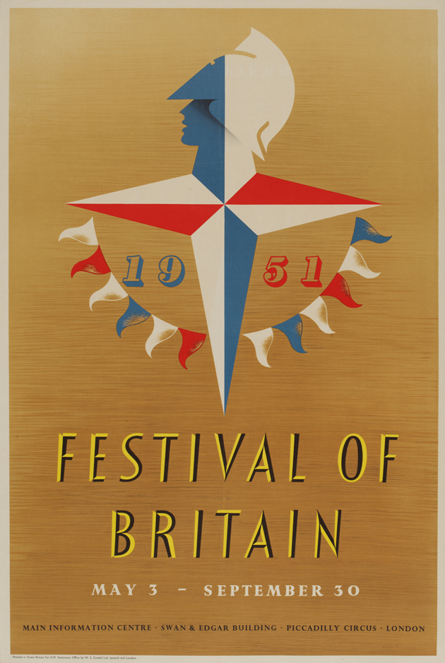
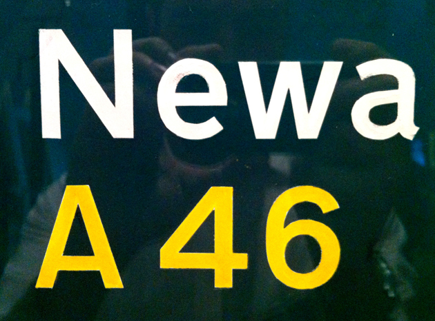
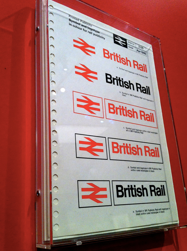
The show is grouped into three main areas, Tradition & Modernity; Subversion; and Innovation and Creativity, which run more or less chronologically from 1948 to the present day. The three groupings don't necessarily help, creating rather forced divisions between periods and styles. But there's lots of great stuff on display, including four hand-painted maquettes for British road signs by Jock Kinneir and Margaret Calvert; and a page from Design Research Unit's British Rail Design Manual.
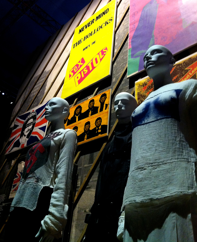
The second section, Subversion, deals mainly with the rise of the art school and a more youth oriented period of design - so you get Jamie Reid's Sex Pistols posters, Vivienne Westwood's punk clothing designs, some Beatles album covers, and of course Peter Saville, Barney Bubbles and Neville Brody. Which is all well and good, but unfortunately this part of the exhibition is designed with a rather clichéd underground vibe - lots of black walls and industrial fittings, which really cheapens the work on display, making it feel like we're walking through some sort of gaudy themed tourist attraction.

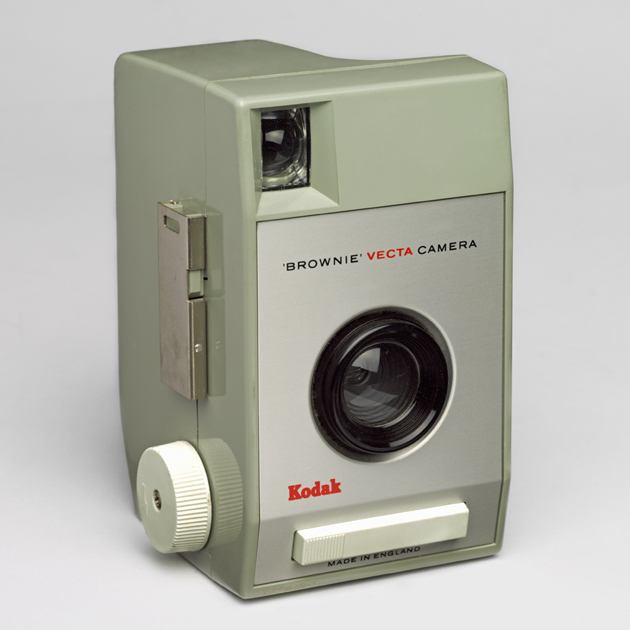
The third section focuses more on manufacturing industries, technology and architecture. Somehow the curators have managed to use Apple's iMac as a pioneering example of British technology design (Jonathan Ive, the iMac's designer is from these shores, sure, but come on…). Elsewhere there's a model of Concorde, an E-Type Jag, a Topper sailing boat, and Kenneth Grange's Brownie Vecta camera.
Meanwhile, graphic design in this section is represented by Wolff Olins' hideous London 2012 logo (it just doesn't get any better does it?); their Orange logo from 1994, and Alan Fletcher's lovely V&A logo from 1989 (rather happily referencing Ian Dennis's National Theatre logo, which is shown earlier in the exhibition).
Our favourite exhibit though was these Globoots from 1969:
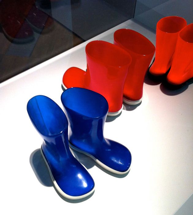
They were unique at the time of their production, being double dip-moulded in two different plastics, so that the translucent uppers and opaque soles were made in one piece, without seams. And crikey, don't they look like a certain coloured computer designed in the USA by a British bloke called Jonny?
Our only real gripe is that it features way too much art. The show is British Design 1948-2012, not British Art & Design 1948-2012, but we're treated to work from Henry Moore, Eduardo Paolozzi, Allen Jones, David Hockney and Damien Hirst. Obviously there's crossover between the disciplines, and many of those artists worked in design as well as art, but the pieces shown are their artworks rather than their design pieces. So for example, we get Hockney's We Two Boys Together Clinging painting rather than any of his fantastic stage designs. This seems like a real shame, given how much great design has had to be left out to make room for the art.
Overall though, it's a great show, and anyone interested in design should get along quick smart.
The show opens on Saturday 31 March, and runs until 12 August.
Picture credit for top image: Children crossing sign, by Margaret Calvert and Jock Kinneir for the Ministry of Transport, 1964 © Margaret Calvert