Recreating The Wipers Times
On Saturday 12 February 1916, the first edition of a newspaper, The Wipers Times, was published.
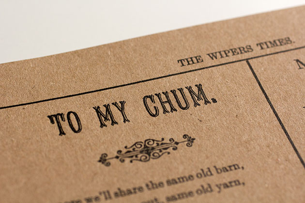
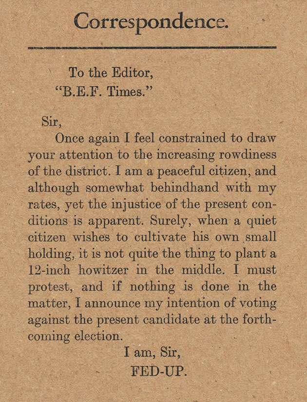
Twelve pages long, it featured a mix of editorial, articles, advertisements, poetry, letters to the editor, a competition, and even an agony column. Nothing too unusual there.
But it was utterly remarkable because it was written, printed, distributed and read by soldiers serving in the trenches of the Western Front of the First World War. And it was deeply satirical, joyously lampooning the top brass, the enemy and the war itself in equal measure.
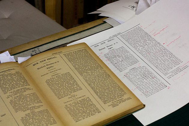
At a recent Wynkyn de Worde Society event, cartoonist and author Nick Newman related the story of this fantastic publication. Newman really knows his stuff, having co-written (with Ian Hislop) a BBC drama about the newspaper, The Wipers Times, in 2013 (watch the trailer here, and you can still catch the whole film on Netflix).
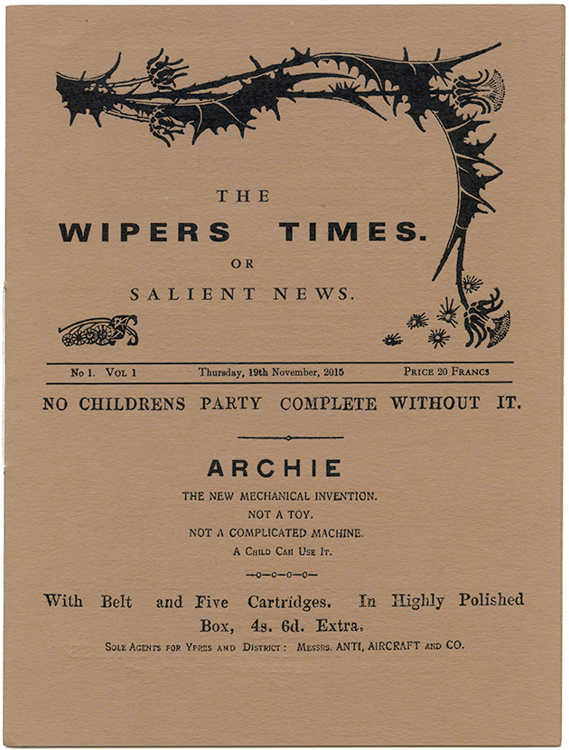
I’ve been honorary designer for the society this year, so to mark the talk, I decided to create a new edition of the newspaper (shown top), featuring a collection of the best bits from across its twenty-three editions.
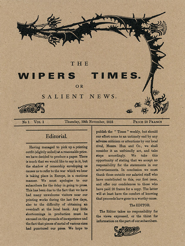
The Wipers Times came about after two soldiers, Captain Fred Roberts and Lieutenant Jack Pearson, came across an abandoned and slightly damaged printing press in the heavily-shelled city of Ypres. You can imagine the glint in their eyes as they decided that they might just be able to get the press working, and possibly even lay their hands on enough type, paper and ink to produce a newspaper.
Both men served in the 12th Battalion of the Sherwood Foresters, which formed part of the British Expeditionary Force (B.E.F.). So they set themselves up as the printers and publishers ‘Sherwood, Forester & Co. Ltd., B.E.F.’.
Of course, they needed a title for their paper. The British soldiers’ common mispronunciation of Ypres served as the perfect name - The Wipers Times was born.
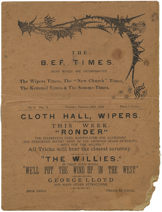
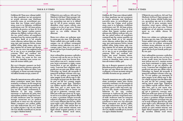
As the battalion, and the press, were moved around during the war, the newspaper took on a series of new names - after being The Wipers Times it became The “New Church” Times, then The Kemmel Times, The Somme-Times, The B.E.F. Times, and finally, at the end of the war, The Better Times. Just above you can see the front cover of The B.E.F. Times from February 1918 - published two long years after the first edition.
Here are a couple more spreads from the same edition:
(You can see the full set of scans of this edition over at our Wipers Times Flickr album.)
It’s incredible to think that the newspaper was produced throughout the war, often under fire. Roberts and Pearson fought in both battles of the Somme, and were both decorated for gallantry.
Designed to entertain the troops, the newspaper took a deeply satirical approach to news. Here’s a piece by ‘Belary Helloc’, gleefully satirising the writer Hilaire Belloc, whose writing in pro-war magazine Land and Water would often feature inflated estimates of enemy casualties:
“In this article I wish to show plainly that under existing conditions, everything points to a speedy disintegration of the enemy. We will take first of all the effect of war on the male population of Germany. Firstly, let us take as our figures 12,000,000 as the total fighting population of Germany. Of these 8,000,000 are killed or being killed hence we have 4,000,000 remaining. Of these 1,000,000 are non-combatants, being in the Navy. Of the 3,000,000 remaining, we can write off 2,500,000 as temperamentally unsuitable for fighting owing to obesity and other ailments engendered by a gross mode of living. This leaves us 500,000 as the full strength. Of these 497,250 are known to be suffering from incurable diseases, this leaves us 2,750. Of these 2,150 are on the Eastern Front, and of the remaining 600, 584 are Generals and Staff. Thus we find that there are 16 men on the Western Front. This number I maintain is not enough to give them even a fair chance of resisting four more big pushes, and hence the collapse of the Western Campaign. I will tell you next week about the others, and how to settle them.”
For the new edition of the newspaper, with advice from Nick Newman, I pulled together a selection of different articles, adverts, columns and poetry that represented the overall feel of the publication.
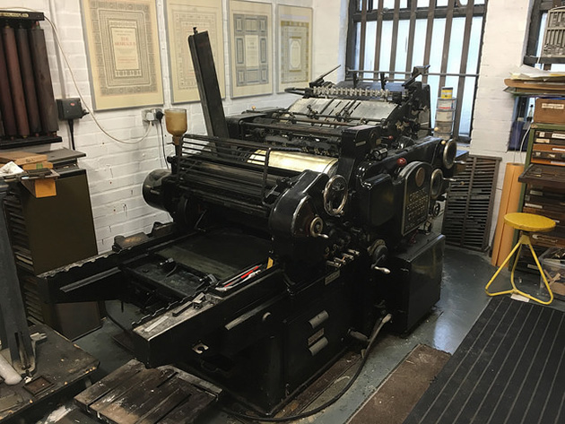
From a printing point of view, I wanted to create something that was as true as possible to the original. Fantastically, Matt McKenzie, a member of the Wynkyn de Worde Society who runs his own letterpress studio, Paekakariki Press, offered to typeset and print the new edition on his Heidelberg KS Cylinder press.
(I should point out that the newspaper was probably originally printed on a Liberty or Arab press. There's a lovely article in Printing History News that relates Tim Honnor’s provision of an Arab press for The Wipers Times film.)
We decided to do as much as we could within the time available with movable type, and to use plates made from scans of the originals for the rest.
I sent Matt a template grid of the newspaper to work to, with a page size of 10″ high x 7.5″ wide (though I actually set the measurements in mm, because, well, imperial measurements are confusing right?).
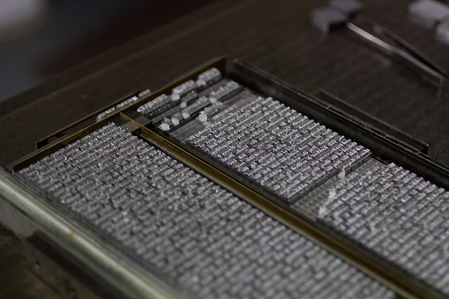
Matt has a Monotype Composition Caster which he used to create a lot of the movable type for the newspaper.
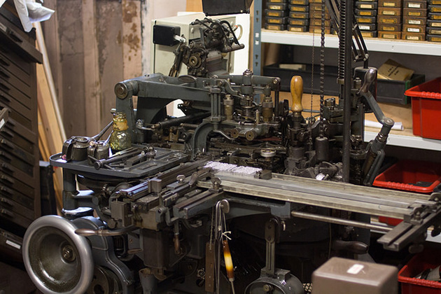
Historically, using the Monotype System, you would type out text on a Monotype Keyboard, which looked a bit like a massive typewriter. The keyboard would produce a roll of perforated paper tape, which could then be fed into a separate machine, the Monotype Caster, which would cast (at considerable speed) brand new individual metal letters, set line by line. Matt’s caster though is connected to a computer interface, which means he can type the text onto his laptop, and it’s produced moments later by the caster. It’s about as close to magic as you can get. Here’s a short clip I shot of the caster at work – view it full screen and you can see each individual letter being created:
Brilliant!
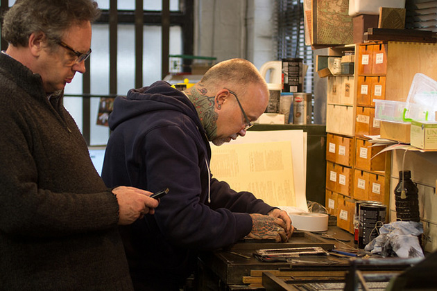
Once the type was cast, Matt (with just a little assistance from Mike from the printers Benwells, and myself) then put together the spreads, combining the new type with the scanned plates. Here are Mike and Matt at work:
Gradually, the pages came together, ready for proofing.
The newspaper was then printed onto a recycled stock, before being bound and sewn by Benwells.
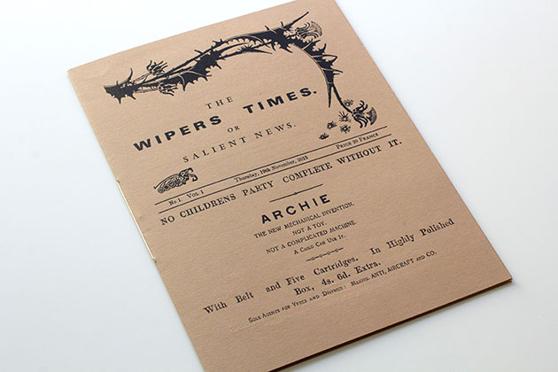
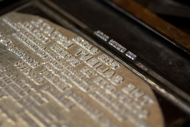
The Wipers Times had a peculiar format, in that it effectively had two front covers. There was an outer 4 page section, that worked as a protective cover, and was a heavier weight than the text pages. You can see that above, with the cover created from a mix of freshly cast type and plates created from scans. (The advertisement for an ‘Archie’ is for an anti-aircraft gun – no children’s party complete without it!)
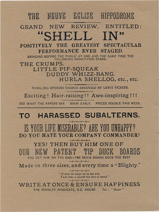
The page above was printed entirely from plates.
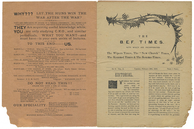
This page shows the internal front cover, which repeats the title, date, edition number and price. The text here was freshly cast for printing.
For the bits of type that couldn’t be created on the caster, and for which I didn’t have clear enough original scans, I sourced some digital fonts, and recreated the text using those. So, above, you can see Frisco Antique Display, and below, Dharma Slab Condensed, both of which approximate the typefaces originally used.
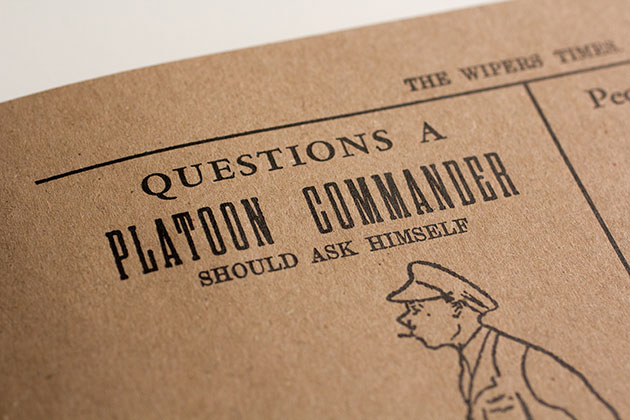
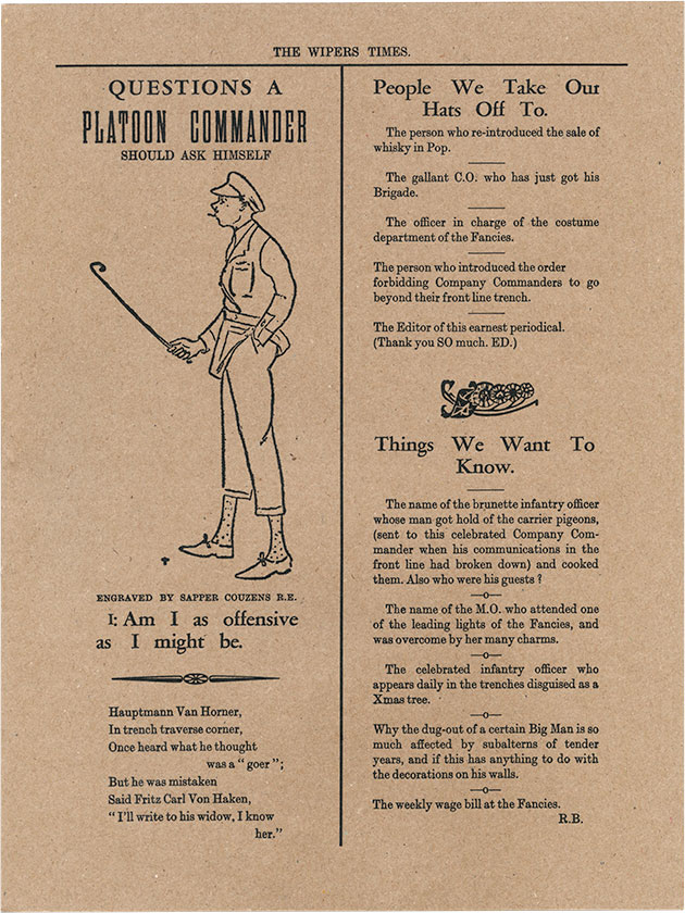
The question ‘Am I offensive as I might be?’ (above) was one asked by staff officers of the troops on the front line, questioning whether they were sufficiently eager to attack the enemy. It was turned around by the writers of the newspaper to suggest that the officers themselves might well be considered offensive.
The Wipers Times is an incredible example of creativity and humour, created in truly perilous circumstances.