The Crystal Goblet
Buying old typography books is a deeply guilty pleasure, particularly when your shelves are already at capacity. But heck, I just can’t help myself. And just occasionally you find something a little bit special.
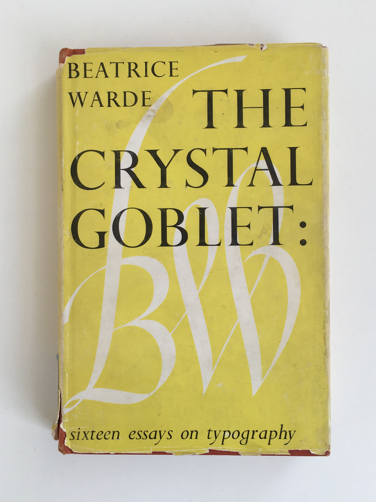
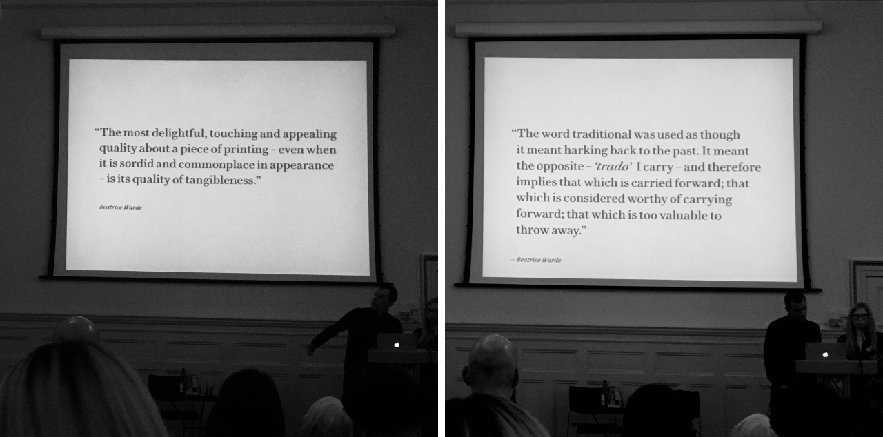
The latest rather special thing I’ve picked up is The Crystal Goblet: Sixteen Essays on Typography, by Beatrice Warde. I hunted this down (translation: looked on abebooks.co.uk) after attending the Beatrice Warde Memorial Lecture at the St Bride Foundation last week. The lecture was by the letterpress studio The Counter Press, and was a real corker. During the talk, David and Elizabeth from the press showed a series of slides featuring quotations from Beatrice Warde’s writings.
That left me hungry for more, hence my excursion to AbeBooks.
Beatrice Warde (1900–1969) was a writer, lecturer, historian and expert on typography, as well as marketing manager for Monotype. The Crystal Goblet is a collection of 16 of her essays. Initially she wrote under the pseudonym ‘Paul Beaujon’ – in this excerpt from a 1959 interview with Warde she explains why:
“Well, I wanted a pen name. I wasn’t quite sure at that time (which is a long time ago) that women would be taken quite as respectfully. I thought that if I was going to have a pen name, I might as well have a man, and I took a Frenchman’s at that, to make it a little more mysterious.”
(You can listen to the full interview over on Typeradio, and read a transcript over on Eye.)
The key essay in the book, and the one which gives it its title, is ‘The Crystal Goblet or Printing should be invisible’, in which she argues for a quiet and unobtrusive form of typography, revealing rather than obscuring meaning. (You can read that essay here, and a contemporary response here.)
Here’s a short excerpt:
“The type which, through any arbitrary warping of design or excess of ‘colour’, gets in the way of the mental picture to be conveyed, is bad type. Our subconsciousness is always afraid of blunders (which illogical setting, tight spacing and too-wide unleaded lines can trick us into), of boredom, and of officiousness. The running headline that keeps shouting at us, the line that looks like one long word, the capitals jammed together without hair spaces — these mean subconscious squinting and loss of mental focus.”
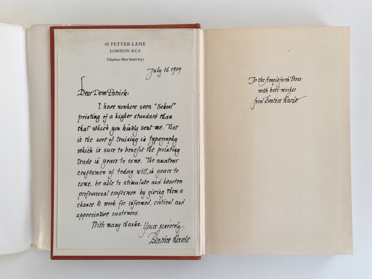
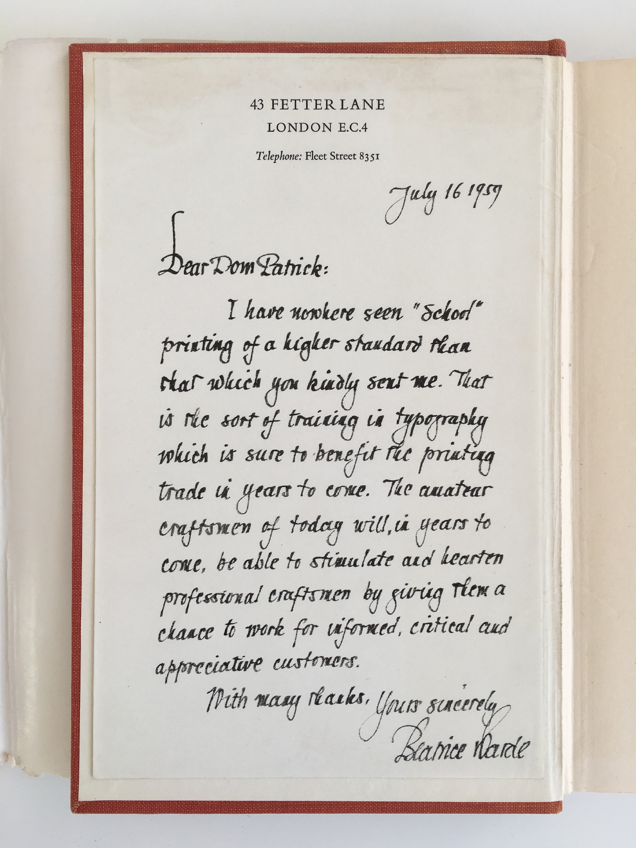
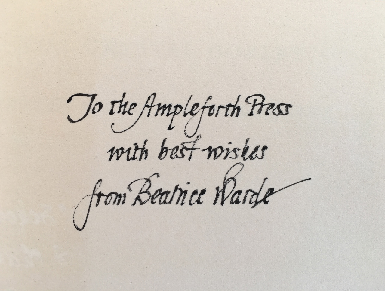
The book arrived this morning and I was surprised and more than a little bit delighted to find that it had originally come from Warde’s very own shelves (and if they were the shelves at her Fetter Lane address, then they were only a short walk from my studio here in Clerkenwell). Inside the front cover is an elegantly hand-written letter from her, dated July 16 1959; and on the first page a dedication from her to the Ampleforth Press.
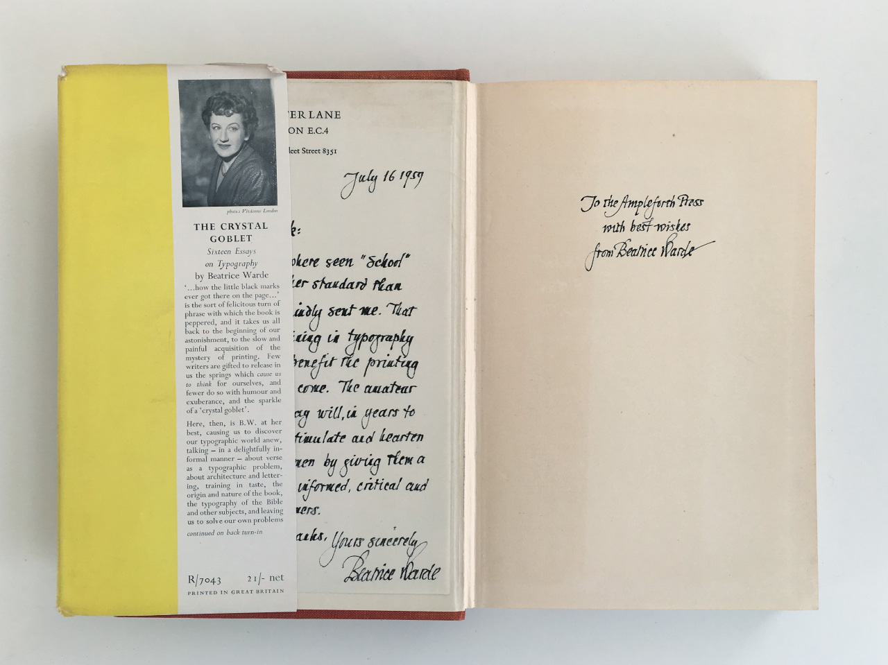
The letter is addressed to Dom Patrick, with ‘Dom’ being an honorific used for some Benedictine and Carthusian monks, so we’d guess that the Ampleforth Press was part of Ampleforth College, which is run by Benedictine monks. Presumably Dom Patrick had sent B.W. a copy of one of their publications, and she had sent them back a copy of her own book to say thank-you.
Fantastic stuff. I’m thoroughly looking forward to reading it.