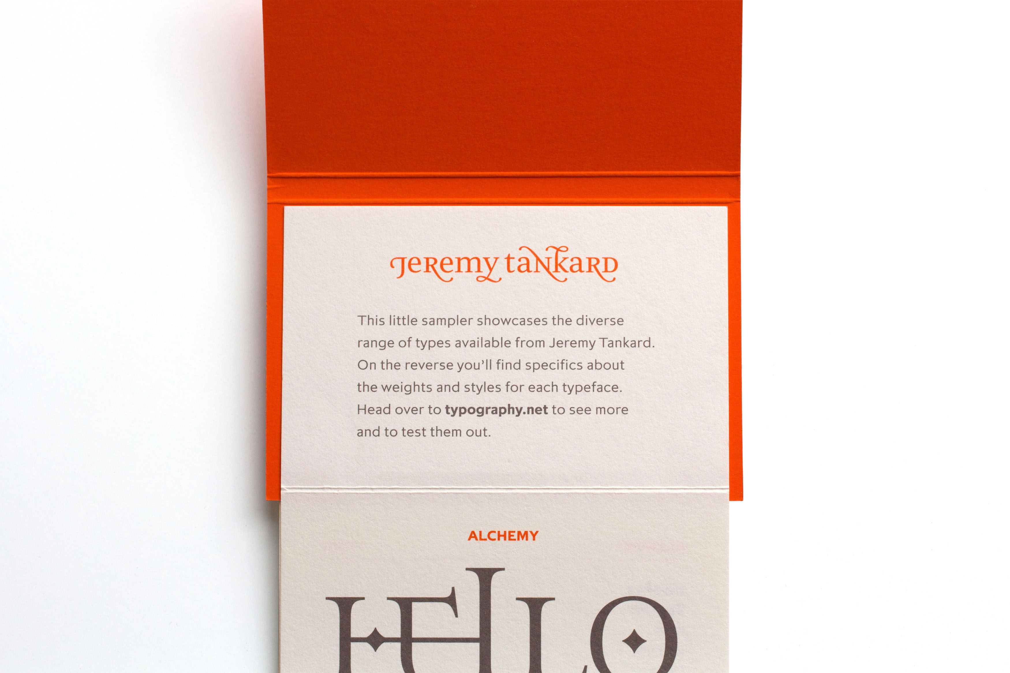
Jeremy Tankard Typography
Jeremy Tankard Typography, a type design studio in Cambridge, has been producing award-winning typefaces since 1998. Having worked on the sample book for Jeremy’s brilliant De Worde typeface, he came to me after complete redesign of his website, and asked me to create some promotional materials for the site’s launch.
I designed an insert for Creative Review magazine, as well as a series of adverts to go in other magazines.
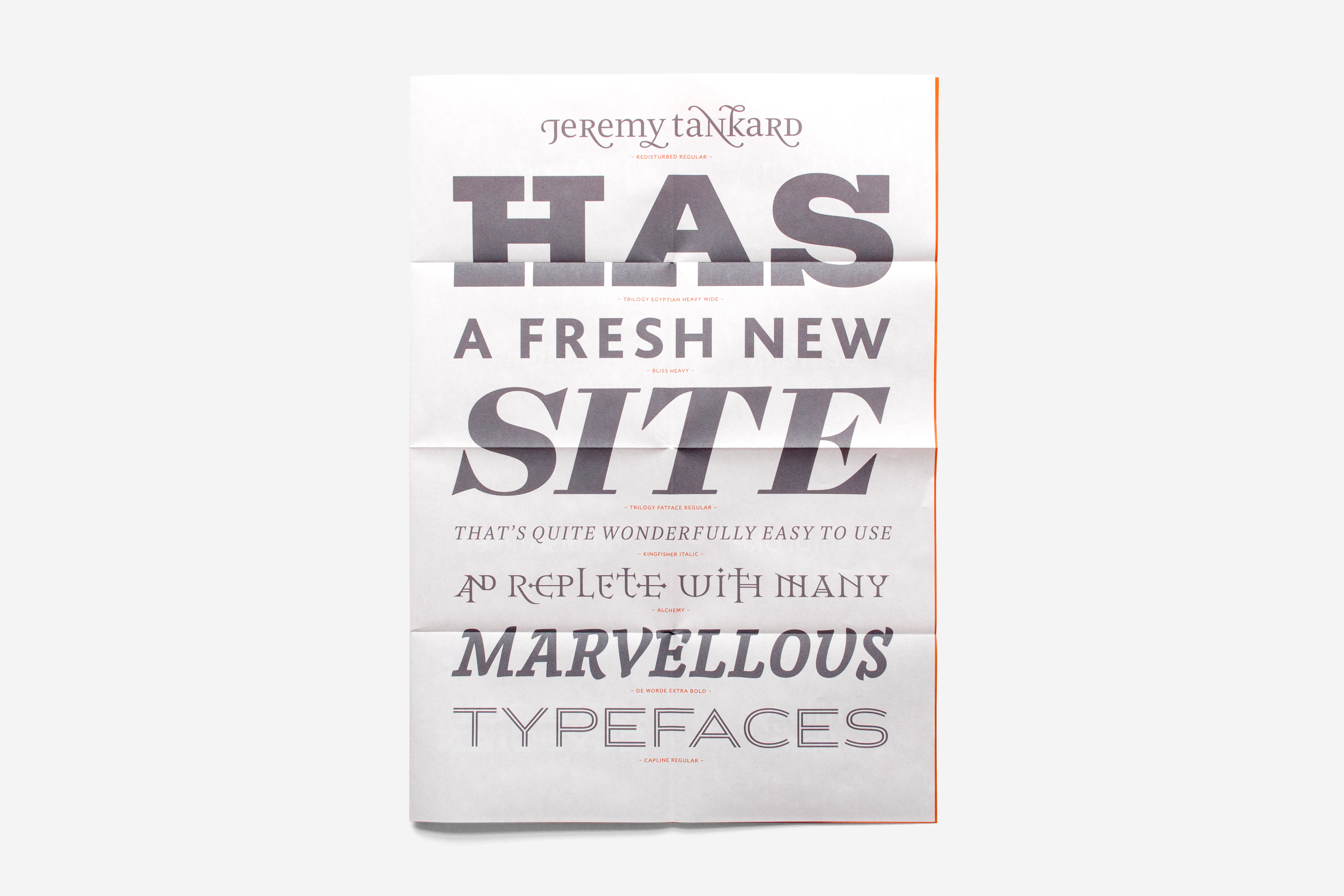
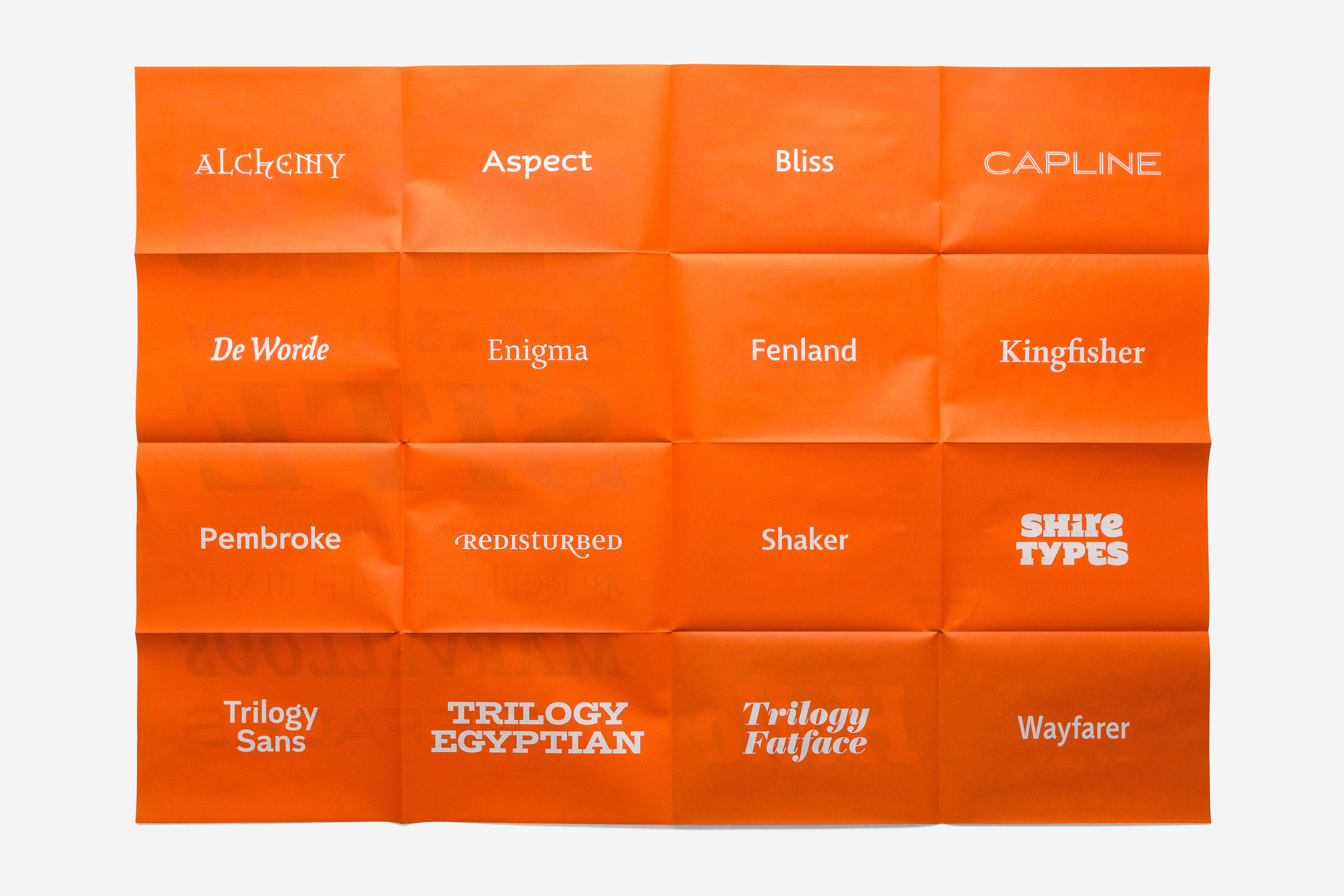
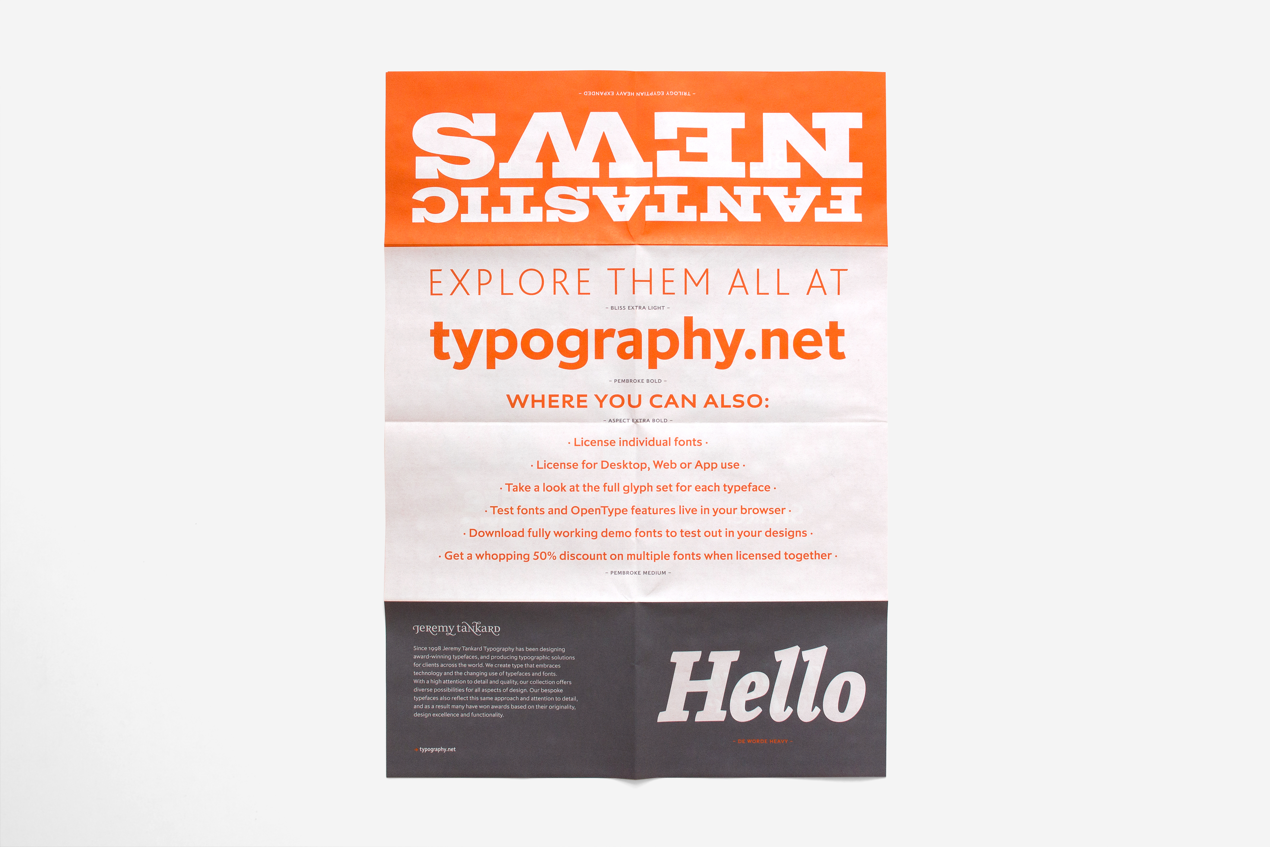
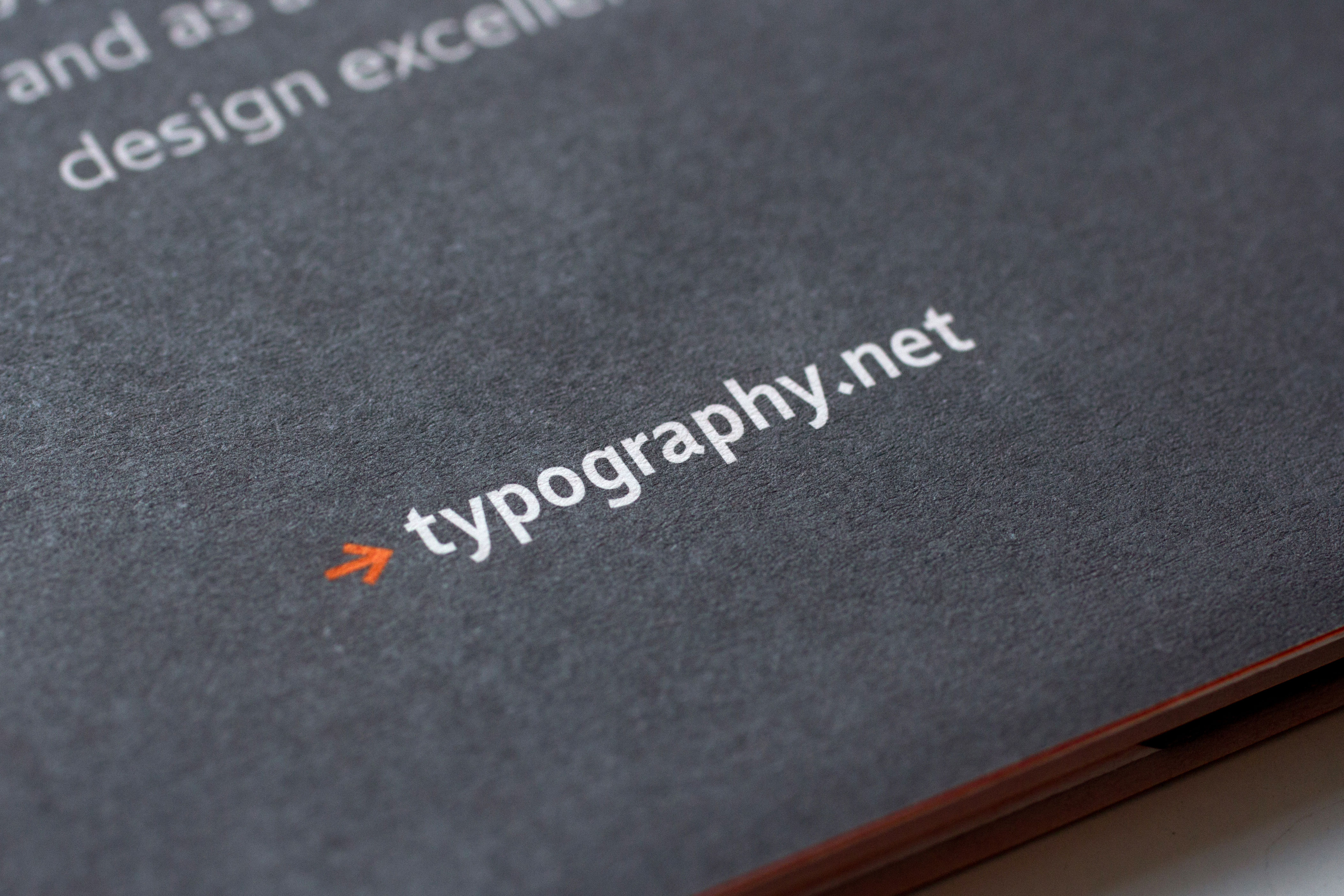
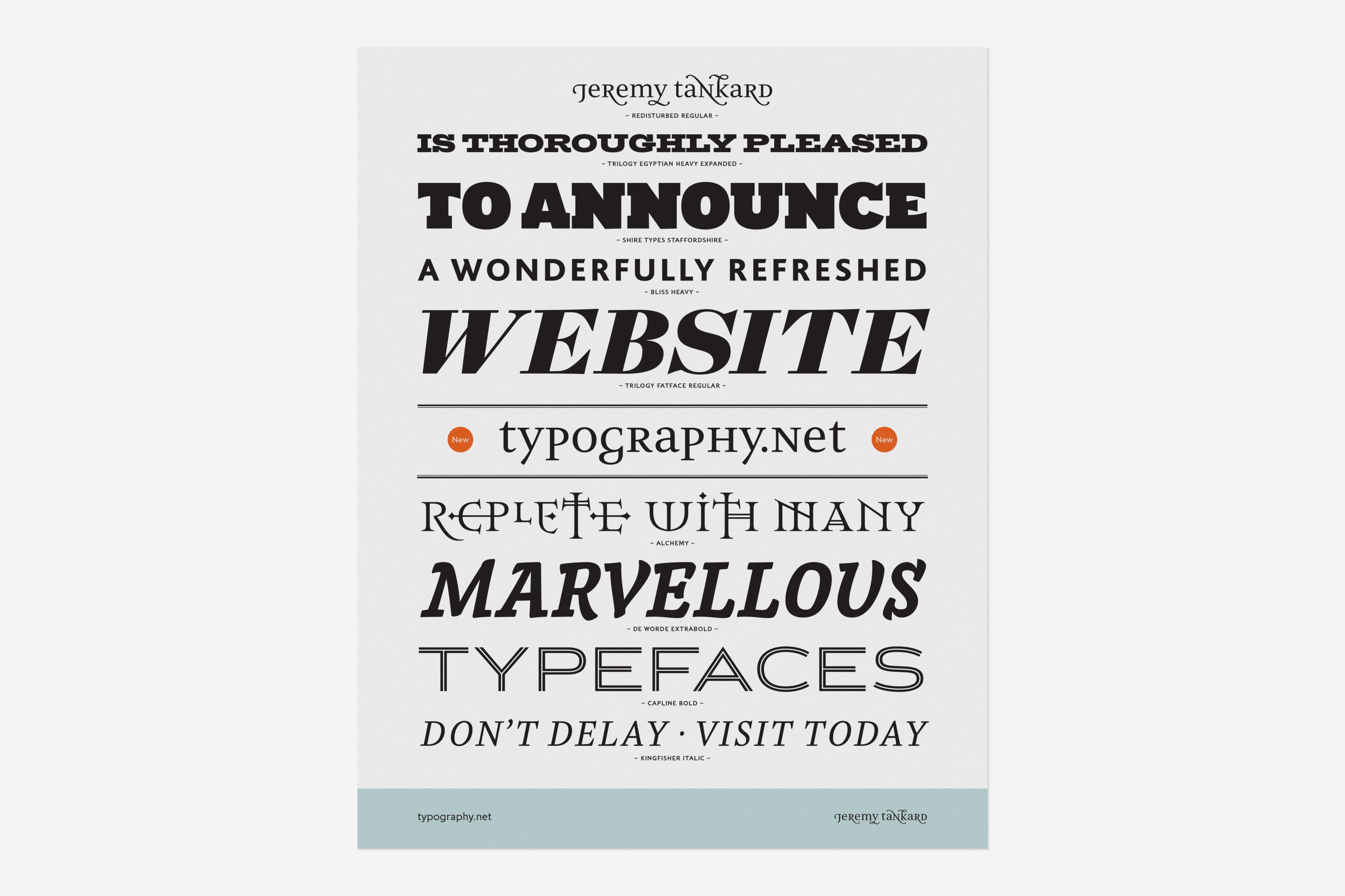
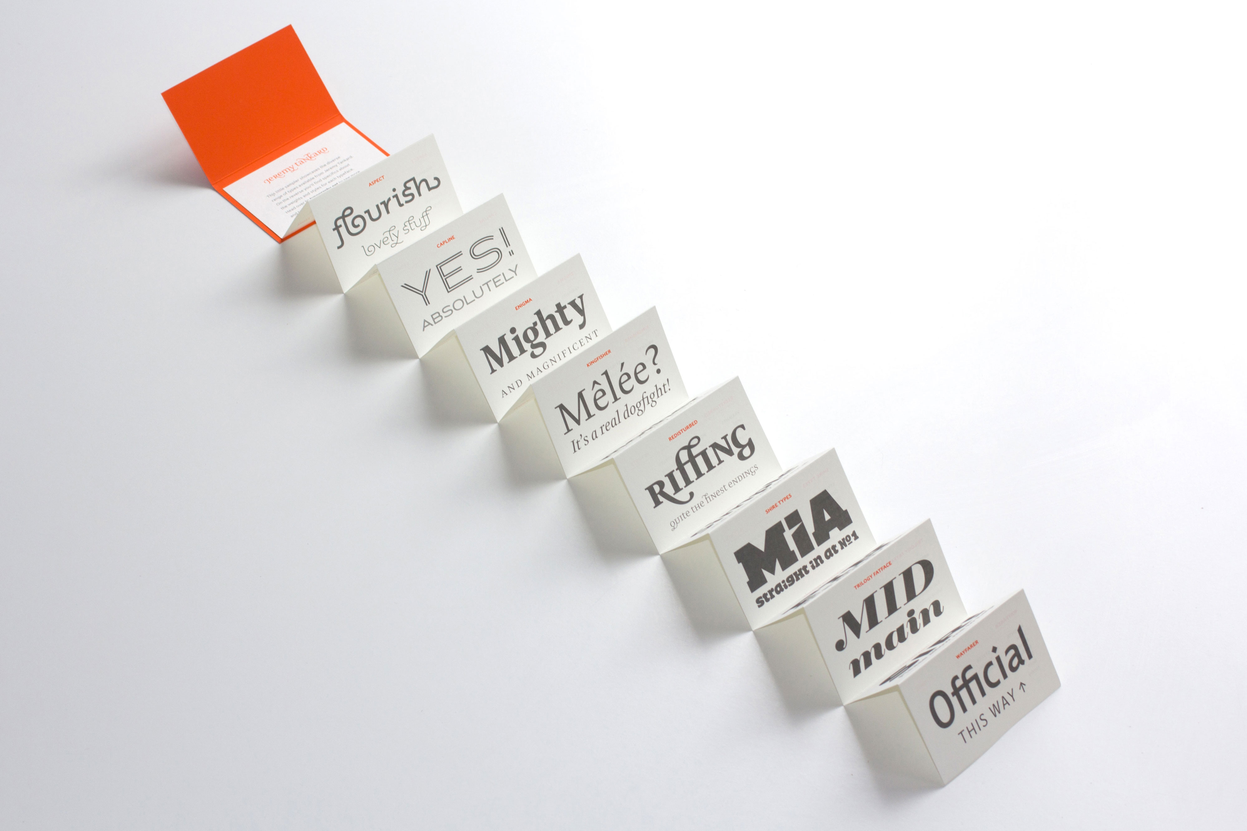
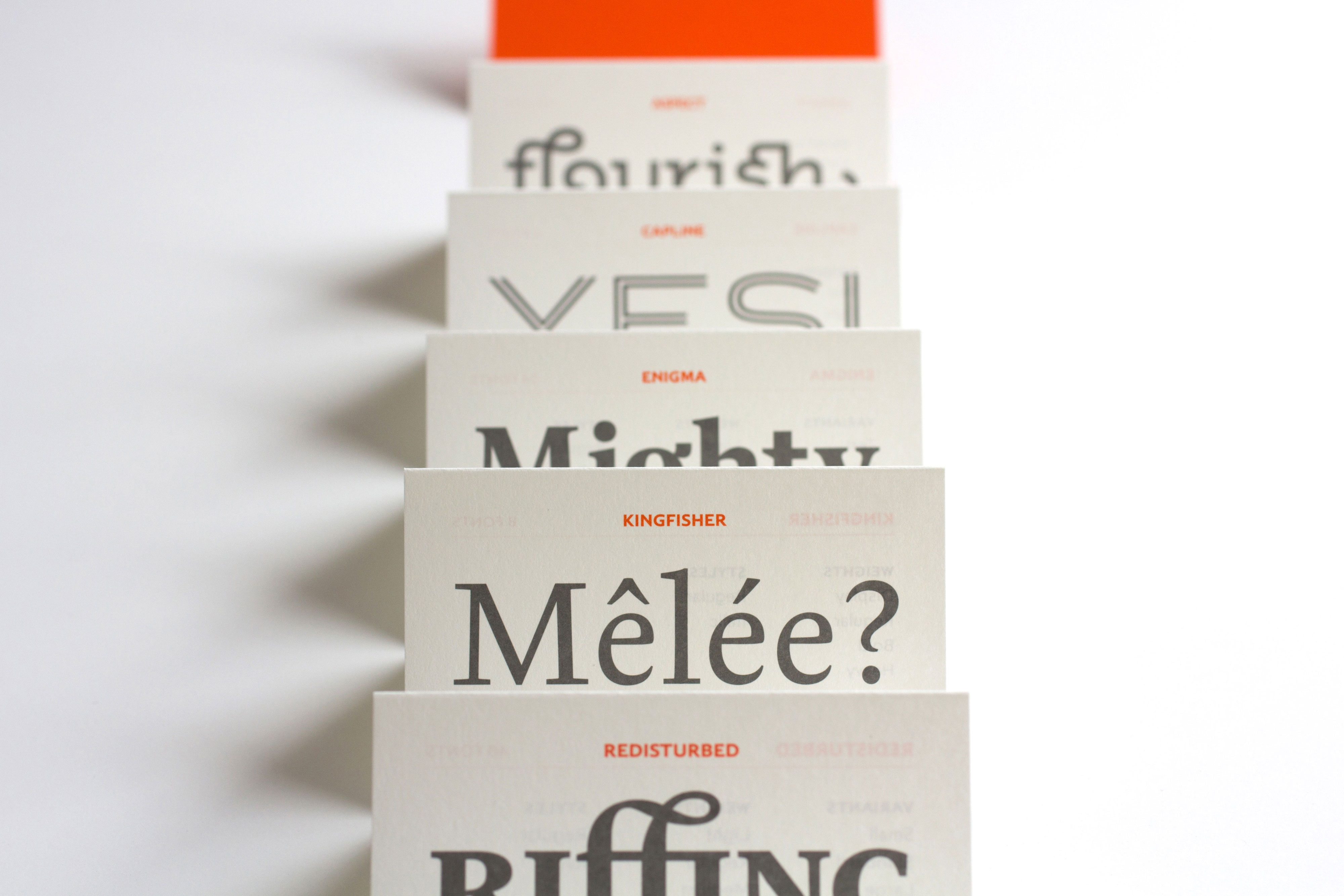
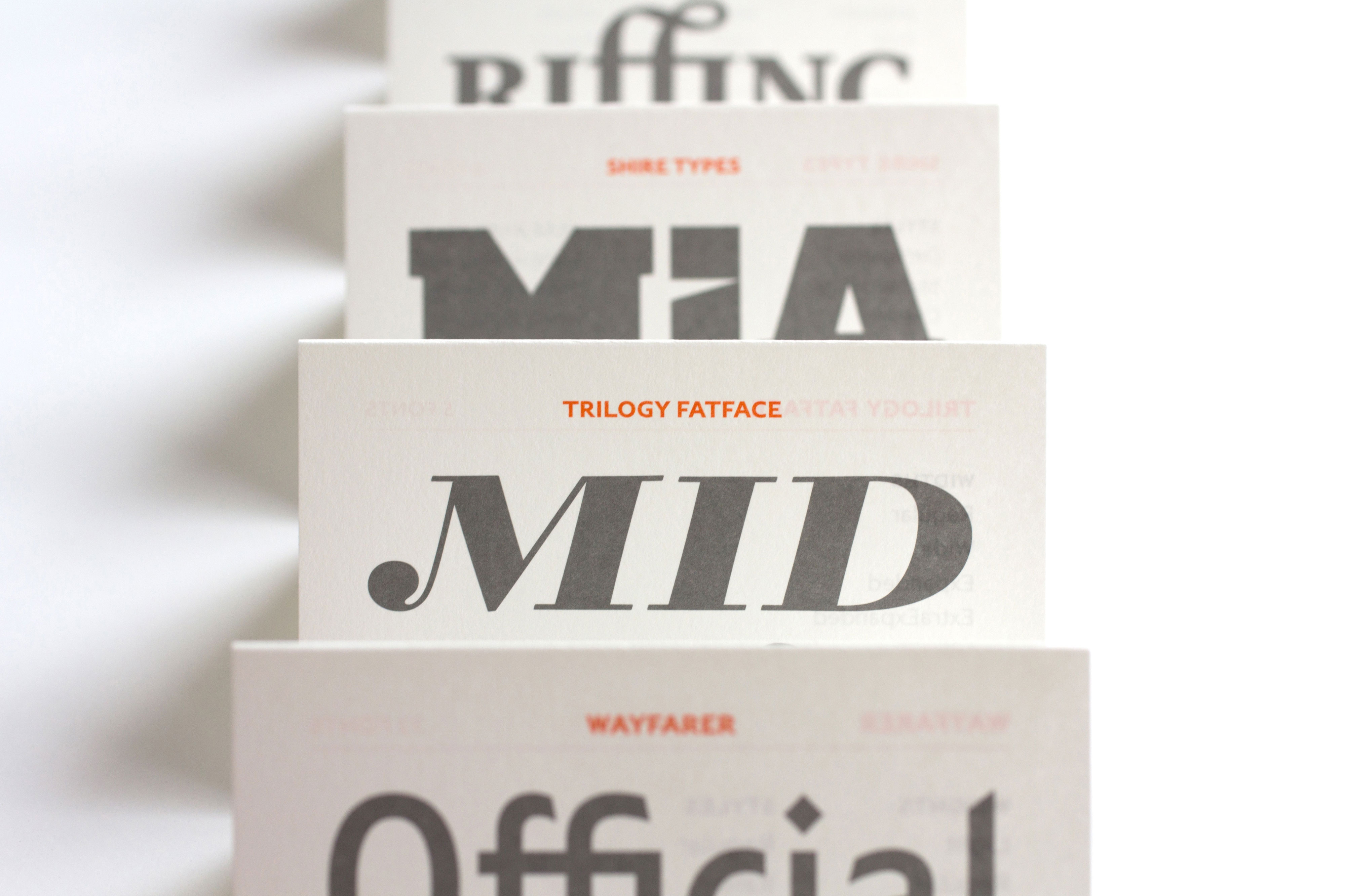
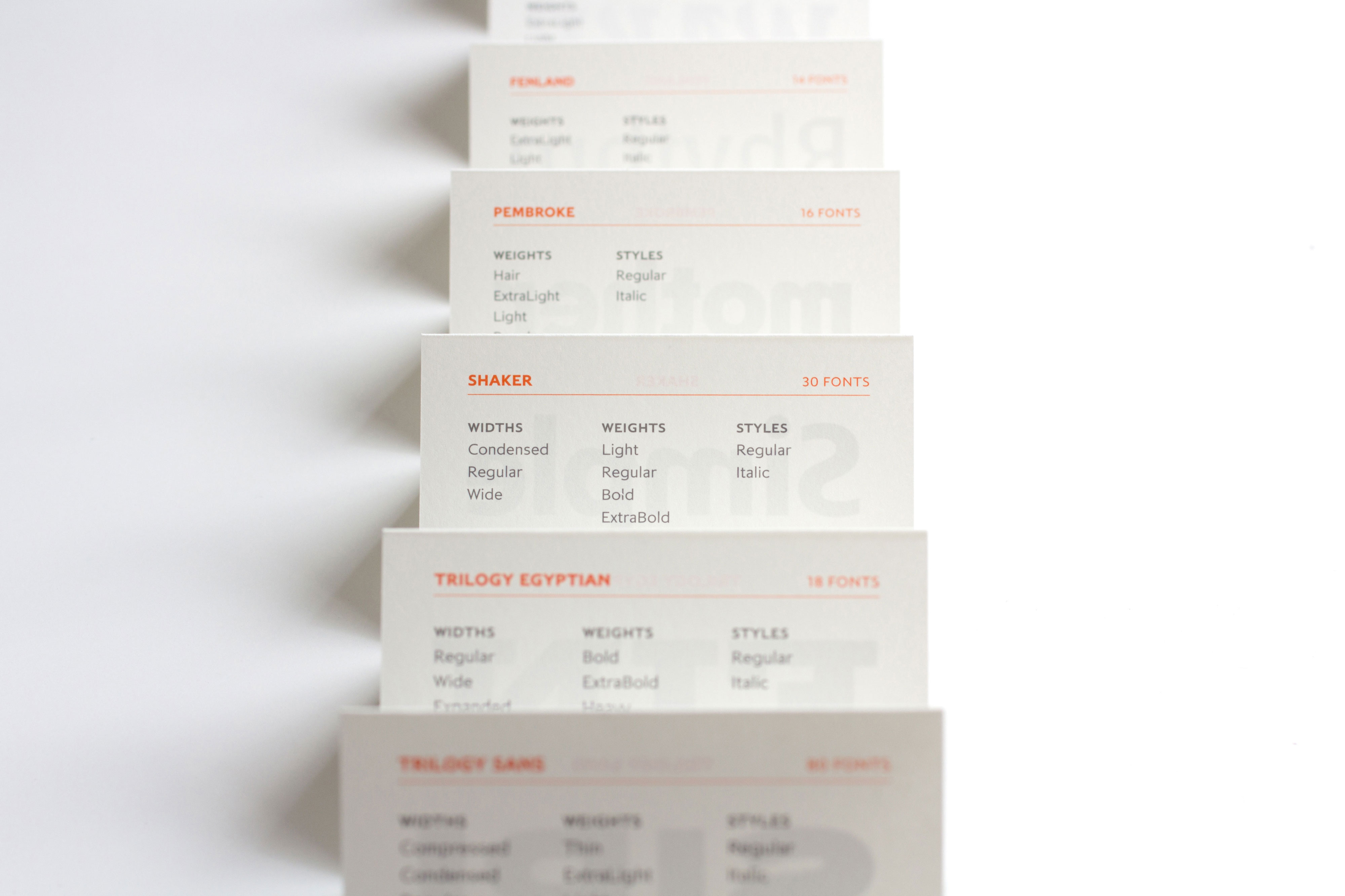
For the Creative Review insert, I realised that the foundry’s 16 core typefaces would fit rather neatly onto an A2 poster, which could then fold down to an A6 size leaflet. I worked with Fenner Paper and Push Print to work out exactly the best paper to use (the wonderful 60gsm Offenbach Bible paper), and exactly the right folding style to avoid unsightly creasing. I also wrote the copy for the piece – open and engaging, while relevant to the particular styles of the studio’s typefaces.
The following pictures show how it unfolds from a small leaflet into a large poster.