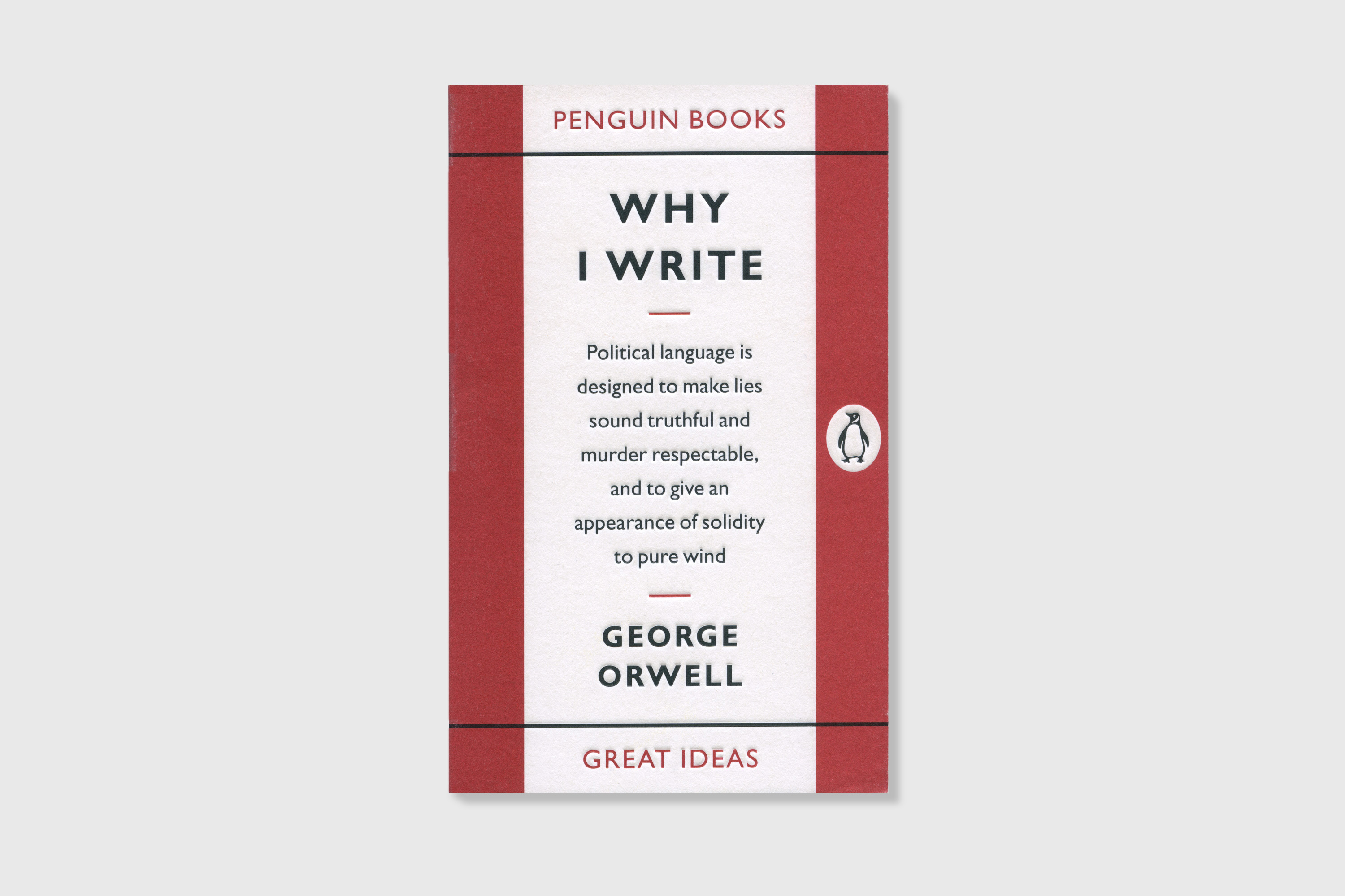
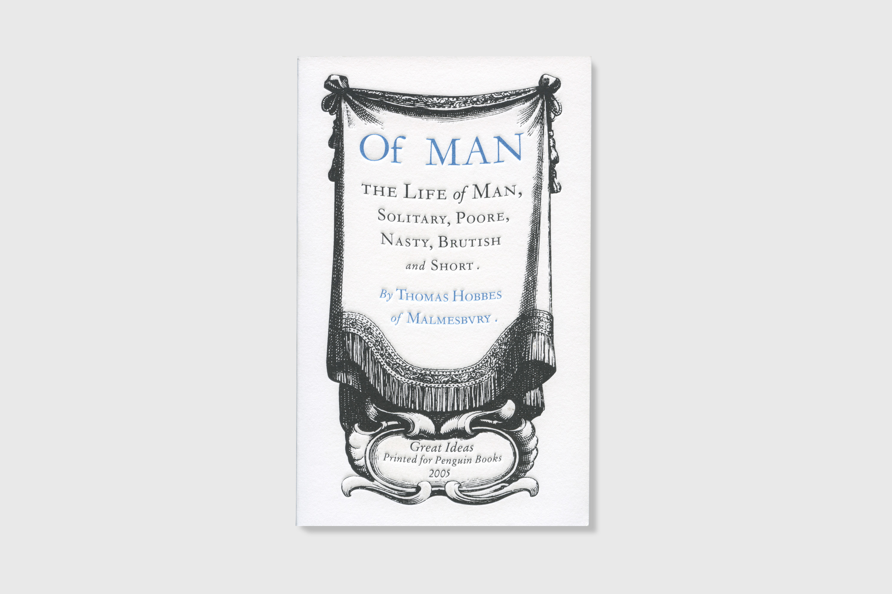
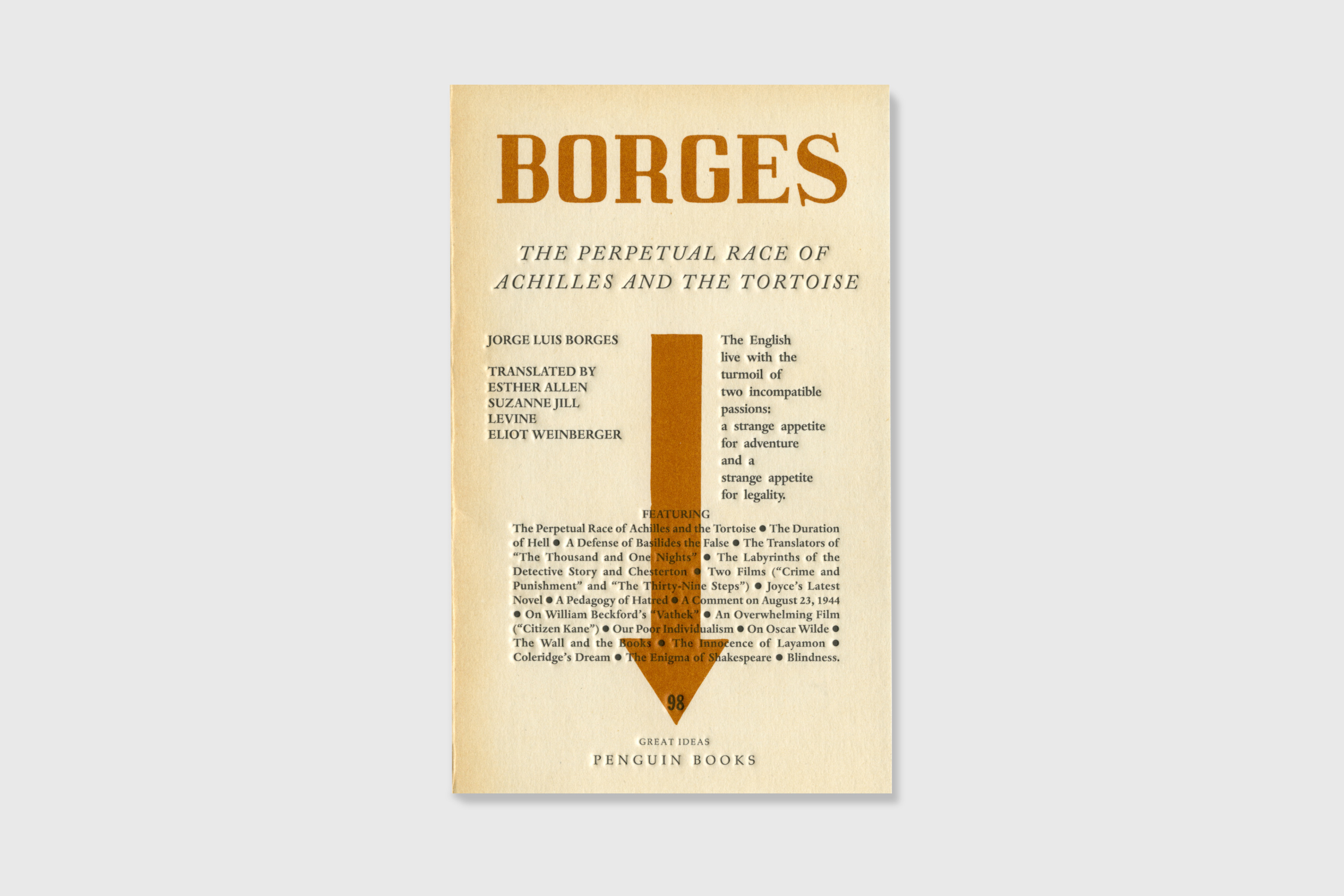
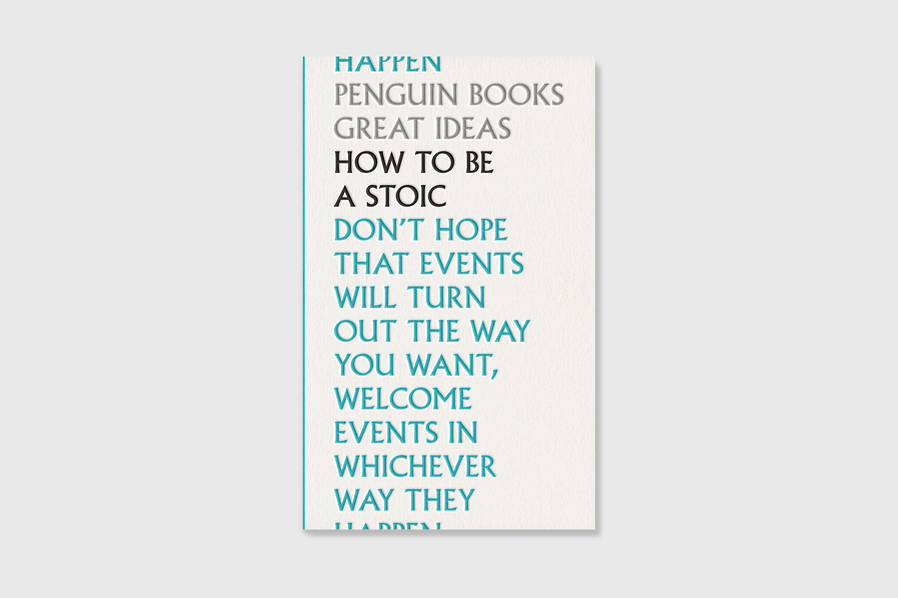
work blog about search


Penguin Great Ideas

Project Type:
Books

Client:
Penguin Books

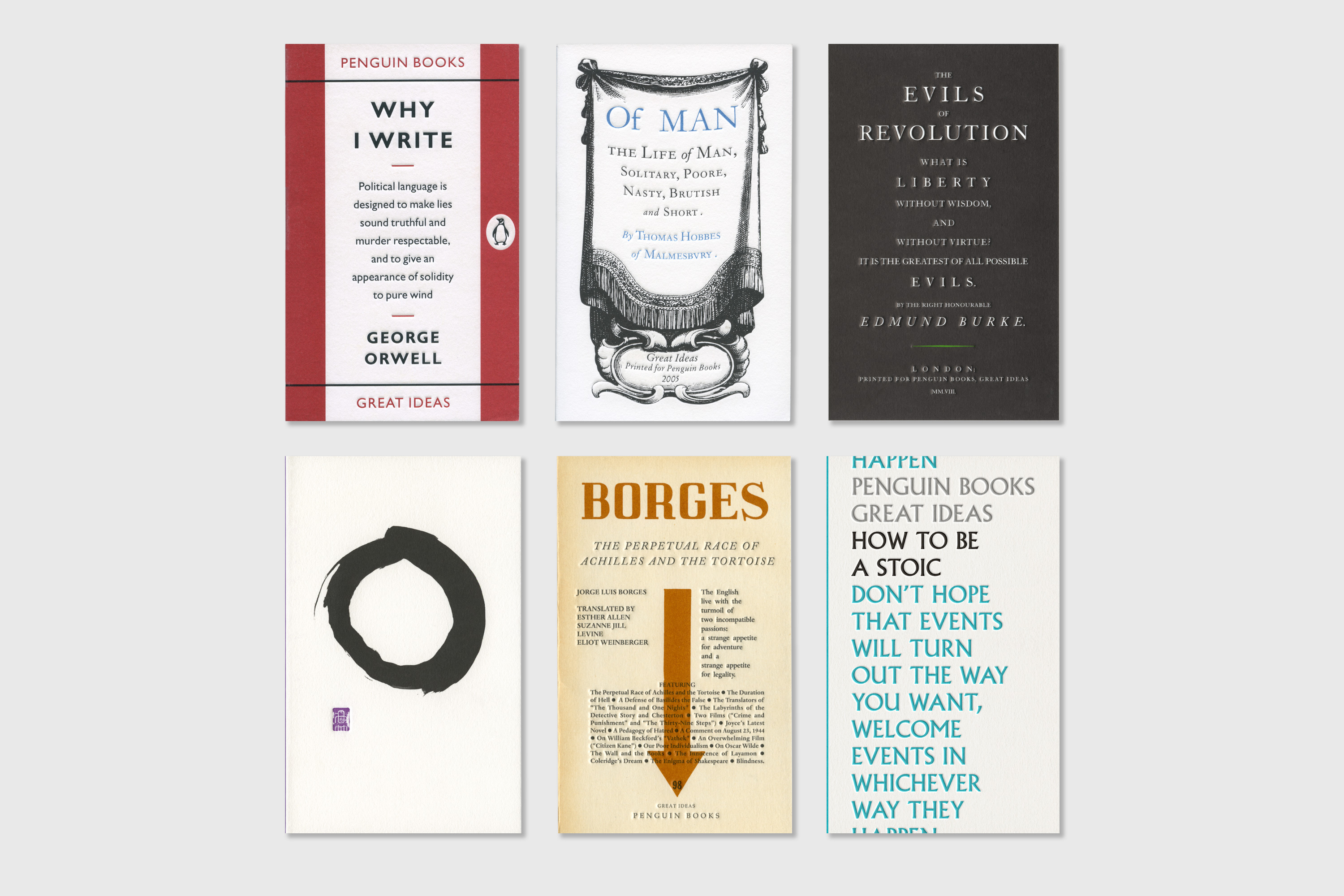
The Penguin Great Ideas Series is a set of a hundred and twenty key social, political and philosophical texts presented using typographic styles prevailing at the time of each title’s original publication. The first set were published in 2004, and the latest set over fifteen years later, in 2020. To date they have sold over four million copies.

Book designer David Pearson, working at Penguin at the time of the first series of twenty books, led the project and designed the majority of the covers. But he also invited Phil Baines, Catherine Dixon and me to work on a few of the covers (as well as Joe McLaren and Felix Koeberlin on the most recent set).

Owing to the subjective nature of philosophy, David thought it a mistake to dress the covers in literal imagery that would mislead the reader, so type-led covers were chosen in order to challenge the reader to project meaning onto them, and to match more closely the essence of the subjects. The first series won a D&AD Pencil (for Most Astounding Book Covers), and the design team were nominated for the Designer of the Year Award at the Design Museum.

WMT_Great-Ideas-Why-i-write
 

For the first series, published in 2004, I designed the cover for Why I Write by George Orwell, simply applying the early Penguin format created by Hans Schmoller, which was contemporary with Orwell’s writing.

WMT_Great-Ideas-Of-man
 

For the second series, I designed this cover for Thomas Hobbes’ Of Man. “The founding father of modern political philosophy, Thomas Hobbes, living in an era of horrific violence, saw human life as meaningless and cruel; here, he argues the only way to escape this brutality is for all to accept a ‘social contract’ that acknowledges the greater authority of a Sovereign leader.”

This series was nominated for a D&AD award for ‘Typography, Outstanding Achievement in Book Design’.

WMT_Great-Ideas-The-evils-of-revolution
 

For my cover for the third series, in 2008, I was given The Evils of Revolution by Edmund Burke. The brief for this volume was to expand on the stylings from the previous two, to play around a little more. But I decided this was tantamount to revolution, the very thing Burke was warning against. So instead I created a sombre, forbidding cover that stayed true to the original design concept of the series.

WMT_Great-Ideas-Writings-of-the-zen-masters
Zen Masters penuin icon
 

For the fourth series, in 2009, I was asked to design a cover for The Writings of the Zen Masters, a collection of short texts that illustrate the philosophy of Zen Buddhism. It was the first book I’d done where I managed to remove both the title and the author name from the front cover! The design features an enso, or circle, painted with a Japanese bamboo brush and sumi ink, which comes in a solid stick which you grind with water on an ink stone. The enso relates to Zen notions of enlightenment, strength, and elegance; the painter should ideally create the circle in a single fluid movement, the shape then revealing the spirit of the artist. The focus of Zen Buddhism is the achievement of enlightenment through meditation, rather than a scholarly focus on long texts, so it felt right to strip the cover back to the most elegant and simple of forms, particularly one so closely associated with Zen. I also created a stylised hanko, or seal, crafted to represent a simplified version of the Penguin logo.

The New Statesmen reviewed the series: “…the overall standard is very high… [the] anthology of Zen fables… gets a simple ‘O’ painted with a brush, but underneath is the zinger, a tiny violet pictogram of a penguin.”

WMT_Great-Ideas-The-perpetual-race-of-achilles
 

For the fifth series, in 2010, I was asked to design a cover for a collection of essays by Argentine writer Jorge Luis Borges, under the title The Perpetual Race of Achilles and the Tortoise. The essays discuss, amongst other things, the existence of hell and the philosophy of contradictions. I did a bit of research into Borges’ writings, and learned that he’d been one of the founding contributors to the Argentine literary journal Sur, which was published regularly from 1931 until around 1966. The magazine had a very distinctive (and typographically bonkers) masthead, and fortunately the name ‘Sur’ isn’t a million miles from the name ‘Borges’, so basing my design on it felt like a rather tasty solution.

WMT_Great-Ideas-How-to-be-a-stoic
 

For the sixth series, published in September 2020, I was given a collection of texts by Epictetus, Seneca and Marcus Aurelius, entitled How to be a Stoic, which seemed mighty timely given the year’s tumultuous events. I set the text in Albertus, which felt suitably monumental, and then simply displaced its positioning. Cropping isn’t an exact science on books like this, so I’m yet to see if the crop has worked as intended – either way, I suspect stoicism is the only sensible response.