Dumb quotes
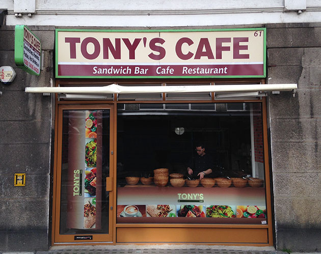
This is Tony’s Cafe. It’s a lovely little place on Leather Lane in Clerkenwell. They do a really fine create-your-own salad for just £4. I go there often for lunch.
But. Their sign. It’s a problem.
Look at it. Just after the Y. Just before the S. What is that? It thinks it’s an apostrophe. It certainly wants to be an apostrophe. Heck, it downright needs to be an apostrophe.
But it’s not.
And you know what’s to blame for that?
Typewriters. Damn typewriters.
Take a look at this. It’s a full set of the characters available on an Olivetti Lettera 22 typewriter:
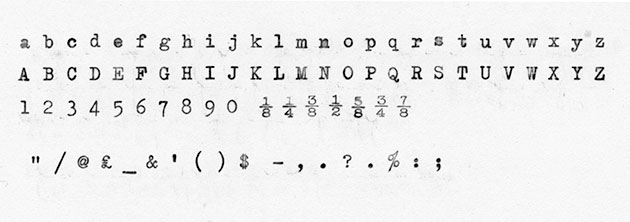
Rather beautiful right?
Let’s take a look at the punctuation characters along the bottom row.
Right up front there, that character made of two little vertical lines, like a pair of rabbit’s front teeth? That’s what you’d generally have used to mark out a bit of quoted text. It’s a versatile little thing: you could use it both at the beginning and the end of a chunk of quoted text. You could also use it to indicate various units of measurement – a number of inches, or a number of seconds, or even a number of arcseconds if you were a navigator. It even doubles (if you’ll excuse the pun) as the ditto symbol.
Further along the line, just after the ampersand, sits its singular sibling. You could use that to mark out quoted text, but more frequently you’d use it as an apostrophe. It also did fine work when it came to measurements, denoting numbers of feet, numbers of minutes, and of course, numbers of arcminutes.
So back up to Tony’s Cafe, we can see that little fella doing his job just fine as an apostrophe, right?
Nope. Uh uh. No sir. Not at all.
You see, although those two characters I just mentioned, which we can call typewriter quotes, were fantastically versatile, they were in truth a mashing together of different characters. It made perfect sense to do that back then, because typewriters only had a set number of keys available.
Here’s the layout of the Olivetti Lettera 22.
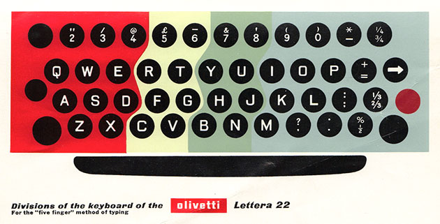
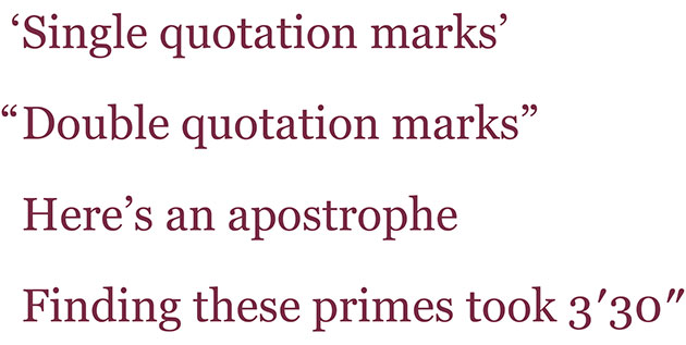
The characters that got messed with were the single and double Quotation Marks, which come in left and right varieties; the Apostrophe (which is the same as the single right quotation mark), and the Prime, which is the angled mark used for various units of measurement. Those look like this, when set in the Georgia typeface:
So, with typewriters, those characters got mashed together. The left and right varieties of the quotation marks were merged, losing their ears and becoming upright verticals, which meant they could also double for primes. They must have felt good about that versatility, but you can’t help but wonder if they looked at the still-curved comma and semicolon with a sense of loss and longing…
Either way, it was a sensible solution in the days of the typewriter, typing in a single typeface at a single size, when stylistic finesse and grammatical accuracy could be ditched in favour of utility.
But, you know, we don’t generally use typewriters now.
We use computers. Which are just a little bit more sophisticated.
So we shouldn’t really need those vertical typewriter quotes anymore.
But, and it’s a fairly sizeable but, when computer keyboards were put together, they were largely based on typewriters. Here’s the current Mac keyboard, with the key with the quotation marks / apostrophe highlighted.
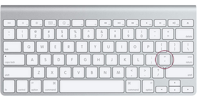
Theoretically, that key should only bring up left and right quotation marks, either single or double.Those should be the default setting right?
But they’re not. The default characters are the straight vertical typewriter quotes. Characters designed specifically for a drastically reduced set of keys on a machine from the last millennium.
So if we go back to Tony’s cafe, and its sign, this is what you get if you type it out, in AG Book (which is a passable approximation for the actual typeface used on the sign):

And of course, that damn typewriter quote is there, happy as Larry.
Or Tony.
Whose salads, as I’ve mentioned, are really quite good.
Now, of course, there are ways around this intolerable situation. Depending on your software set up, you can tell your machine to ignore the typewriter quotes – sometimes (and entirely justifiably) called ‘dumb quotes’ – and replace them with what are called either ‘smart quotation marks’, ‘smart quotes’ or ‘typographer’s quotes’. Those are all software settings – you might also hear the characters referred to as ‘curly quotes’ or ‘inverted commas’ – really, how many terms to these things need? Smart quotations, smart quotes, typographer’s quotes, book quotes, curly quotes, inverted commas – identity crisis much?
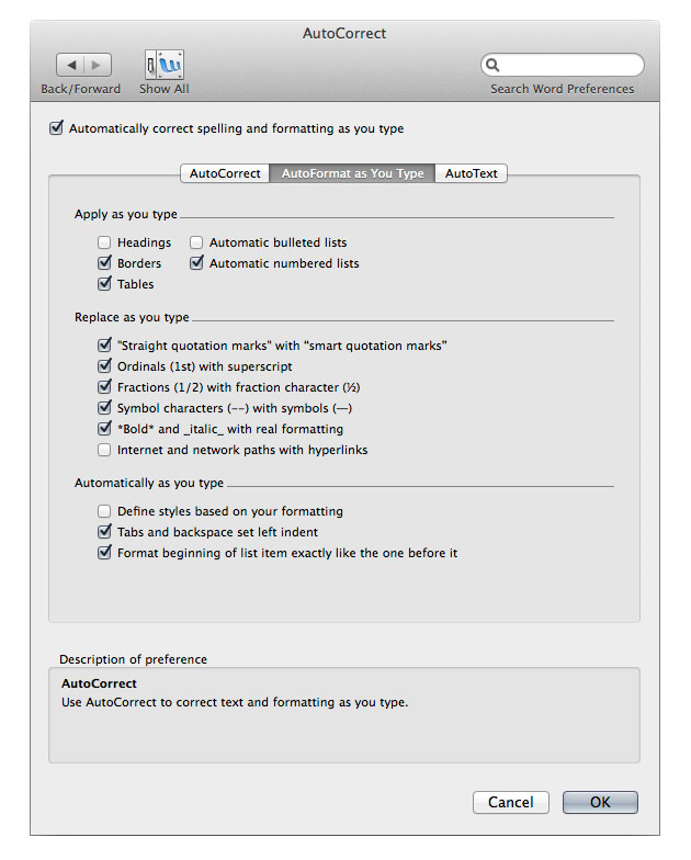
In Microsoft Word, where they’re called ‘smart quotation marks’, you’ll find the setting in the AutoCorrect tab of the Word Preferences. This is how it looks in the version we’re running:
Using InDesign, as we are with our revision of Tony’s sign, you switch on ‘Typographer’s Quotes’ in the Type section of the Preferences panel.
With that done, this is how Tony’s looks when you type it out, now with a proper apostrophe:

How much better is that? Not only is it the correct grammatical character, its weight and form just fit so much better with the word.
So, we can use the correct characters if we tell our software that we want to. But we shouldn’t really have to do that right? These are hardly obscure characters, only used once in a blue moon. Why on earth do those typewriter quotes even still exist? They were ingenious, but they’re a relic from another age. Stick ’em in a museum.
And actually, you know what, the problems don’t really end there anyway.
Because even if you have your smart quotes turned on, you’re not guaranteed to be getting things right.
Have a look at these three examples, set in Georgia again.
The first one uses the default typewriter quotes:
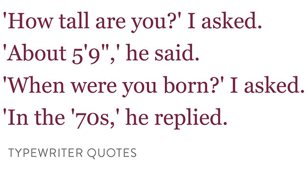
Unpleasant. Deeply unpleasant. And more than a little confusing.
The second one uses typographer’s quotes:
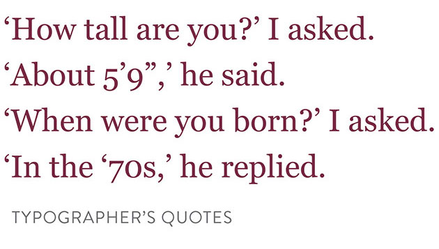
Better. But wait – punctuation klaxon! That height measurement? That’s totally wrong. For that you need to use primes, as we have done in the third version. The eagle-eyed amongst you will also notice that the apostrophe before 70s is wrong. Despite being called smart, sometimes these quotes can still be a little dumb. When they appear with a space before them, they automatically assume they’re at the beginning of quoted text. But here, we’re using the mark as an apostrophe (marking the absence of 19 from 1970s), so the mark needs to face in the other direction. So in this instance, despite having smart quotes on, we have to use a key command to insert the right character.
So, with all that in place, it should look like this:
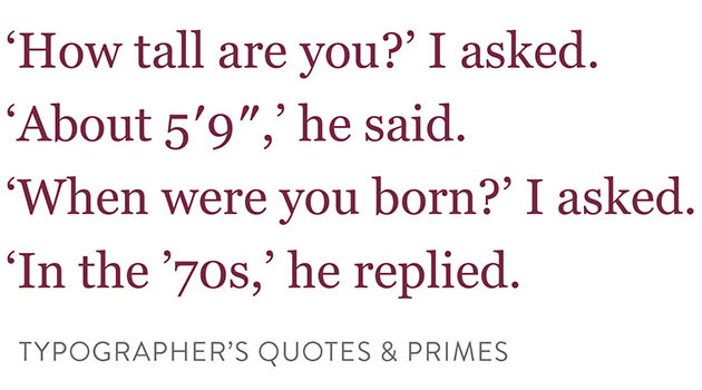
Peace at last! Typographically and grammatically wonderful.
Headache much?
And it doesn’t even end there. Many contemporary fonts don’t even feature primes in their character set. They’ve just sort of been forgotten about. Instead, those inferior usurpers, the typewriter quotes, have taken their place. You can sort of fudge them, by italicising the dumb quotes, but that’s hardly an ideal solution.
And this isn’t just a problem for purveyors of fine salads.
You’ll notice the problem most online, where typewriter quotes are slung about with a hideous abandon. That’s not a giant problem in body text (though it still irks), but it’s grimly obvious in headings. Here’s a recent post from the very popular tech site Engadget:

Those typewriter quotes must be laughing it up. Relics they may be, but there they are, in the heading of a post about Google Glass – they could hardly be hanging out anywhere more modern!
This seems to be something to do with the software used for most blog posting, which is less than eager to insert smart quotes.
So, you’re smart people. And you probably know even smarter people. How do we fix this? Surely we can get rid of those dumb typewriter quotes?
Because dumb isn’t clever.
––––––––––
Oh, and if you’re looking to read a little further on any of this, I’d like to highly recommend Matthew Butterick’s wonderful online book, Butterick’s Practical Typography, which is a treasure trove of learning. His article about this very topic is brilliant, and far more concise than this one.