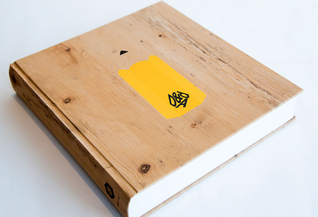
The 2015 D&AD Annual cover
I’m lucky enough to share studio space with two rather talented designers: David Pearson and Paul Finn. We work together from time to time, and our most recent collaboration launched last night: a series of covers for the 2015 D&AD Annual.
D&AD is a ‘global creative design and advertising association’, and the D&AD Annual collects together the best work entered for its yearly awards scheme. Dave was commissioned by GBH’s Mark Bonner, this year’s D&AD President, to create the cover for the Annual.
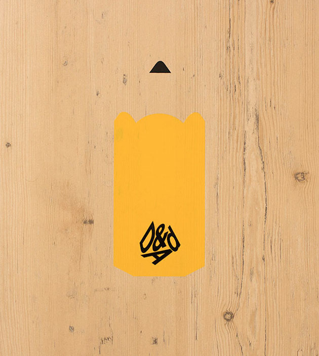
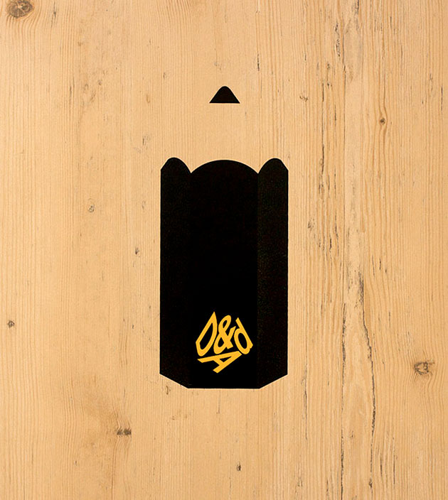
Dave, Paul and I had been discussing the brief in the studio, chewing over possible solutions. This happens a fair bit, even though we each run our own practices - it’s one of the many benefits of sharing space together. We’d been talking about the fact that when you boil D&AD down to its essence, it’s all about the awards that they give out each year. They come in the form of oversized pencils, and two new ones have been introduced this year: the Wood Pencil and the Graphite Pencil.
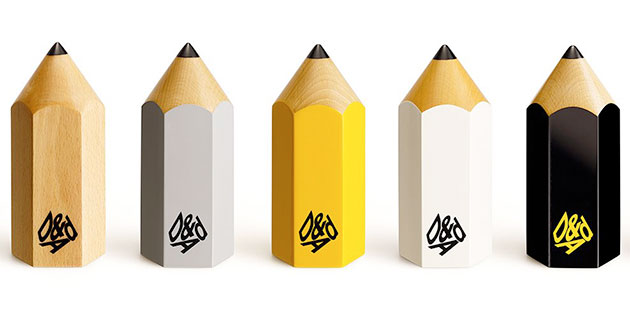
The Wood, Graphite and Yellow Pencils roughly equate to bronze, silver and gold awards. The White Pencil is for Yellow Pencil-worthy work that also affects ‘real and positive change in the world through creative thinking’. And the Black Pencil is for work that is ‘ground-breaking in its field’ – only a handful of them are awarded each year, if any.
With the introduction of the full family of five Pencils it felt like the right time to put them front and centre on the cover.
Dave had been playing with a delicious GF Smith wood-effect stock, Woodside Garden Pine, that I’d used for one of my postcards for Benwells, and was looking at ways to incorporate it on the cover. I suggested that it would look great used across the whole cover, and had fished out a D&AD Pencil that I had in one of the drawers next to my desk. Dave took it and stood it on a sheet of the Woodside, and then Paul laid it flat, and we had one of those lovely moments where you all just go ‘Ah! That’s it!’.
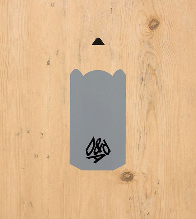
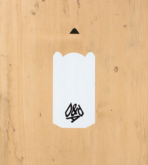
Very generously, Dave suggested we work together and make it a collaborative design. We decided on a series of five covers, each one featuring one of the awards at actual size, shown front and back. Clean and simple.
As the project progressed, we tried out a lot of different options, adding in copy, logos and spine text in various shapes and sizes. All along though, we were basically trying to hang on to the simplicity of that initial moment.
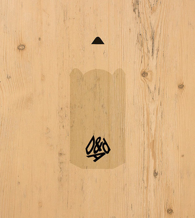
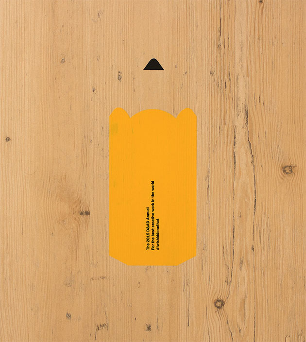
This is how the back cover of the Yellow Pencil version looks:
Of course, the idea still had to be turned into actual printed covers. The Woodside stock has a coating on it that can make some inks or foils react in unexpected ways – at one point the covers were all working except the black one, on which you could scratch the ink off with your fingernail. Fortunately for us, D&AD have a fantastic production manager, Martin Lee, who was exceptional at working out the best way to realise the idea. He provided multiple print tests and proofs until they were exactly right.
We’re dead chuffed with the results.
You can buy the D&AD Annual here, and read an interview with Dave about its creation over on It's Nice That.