Bruno Monguzzi
I was lucky enough to be invited along to Central Saint Martins last week to meet Swiss / Italian graphic designer Bruno Monguzzi, and to watch a film, The Spider and the Fly, about his many decades of work. It was an utter delight to be introduced to both the work and the man.
The film features Monguzzi examining various pieces from his career in exacting detail, revealing the design and production decisions that led to their creation. The title comes from the following anecdote, related in the film, but also featured in Caroline Roberts’ book Graphic Design Visionaries: Monguzzi “…credits Antonio Boggeri for curbing his Modernist-inspired perfectionism. ‘Swiss graphic design’, Boggeri once warned him, ‘is often as perfect as any spider’s web. But often of a useless perfection. The web is useful when broken by the entangled fly.’”
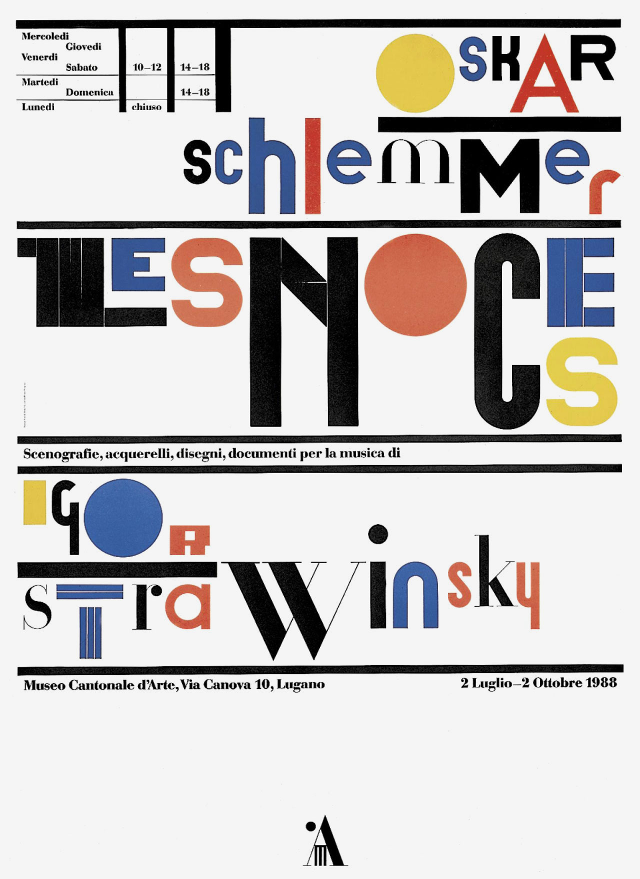
Here’s Monguzzi’s poster for an Oskar Schlemmer show at the Museo Cantonale d’Arte, featuring types by Schlemmer’s Bauhaus companion Herbert Bayer:
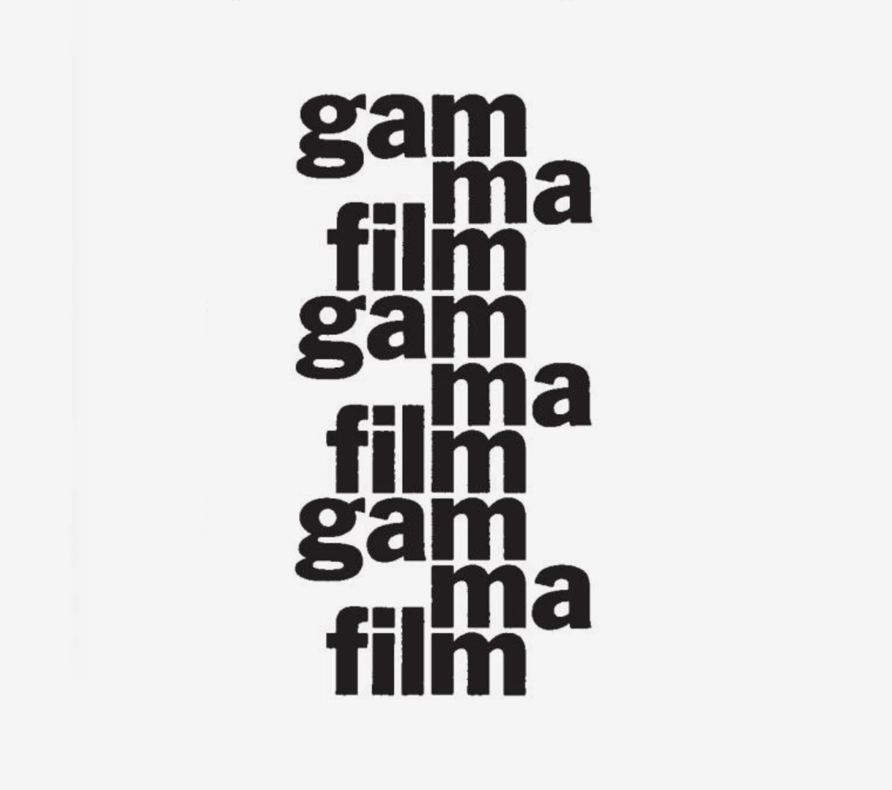
And his 1969 logotype for film company Gamma Film, with its repeated ‘m’ mimicking a strip of celluloid:
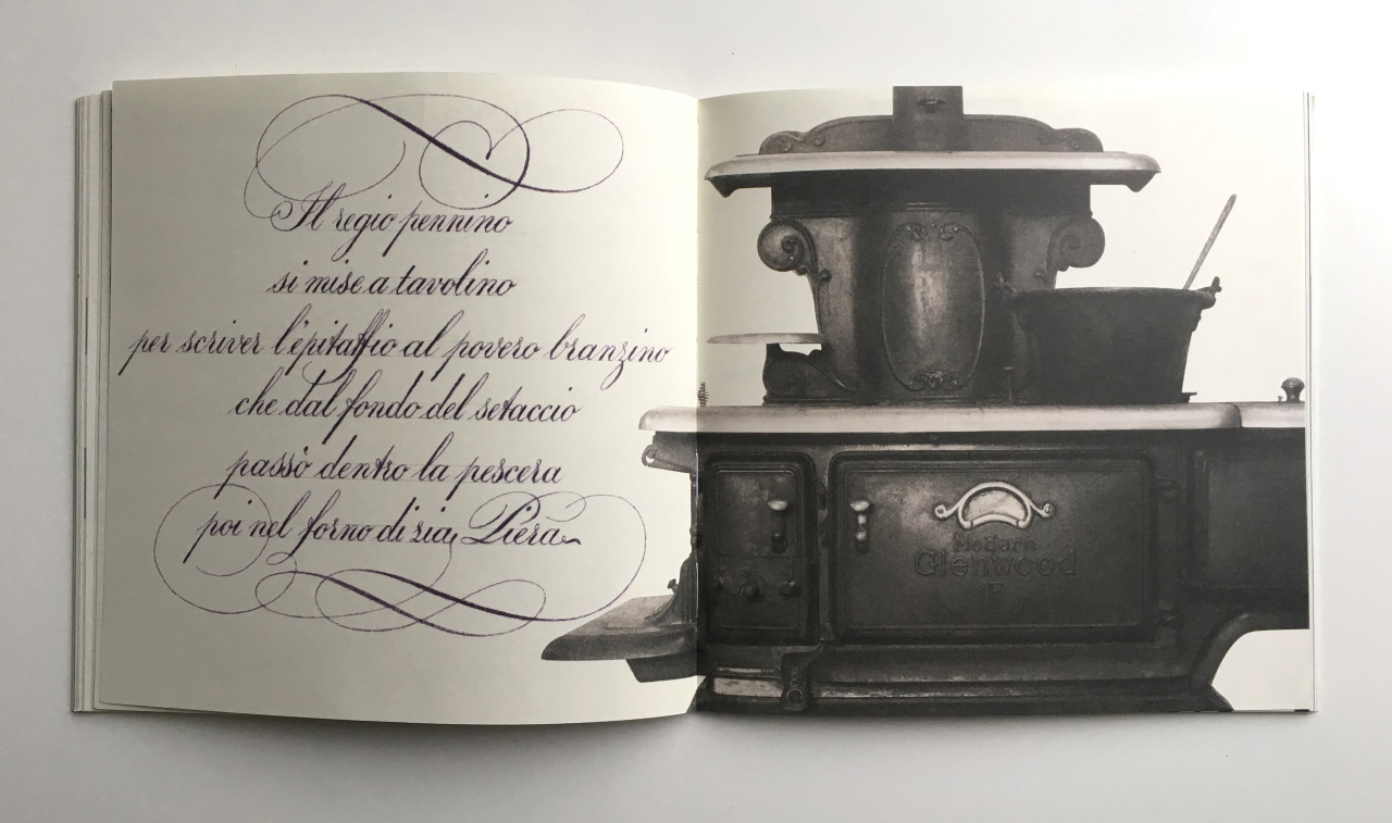
The end of the film features Monguzzi reading from his incredible children’s book, Leonardo.
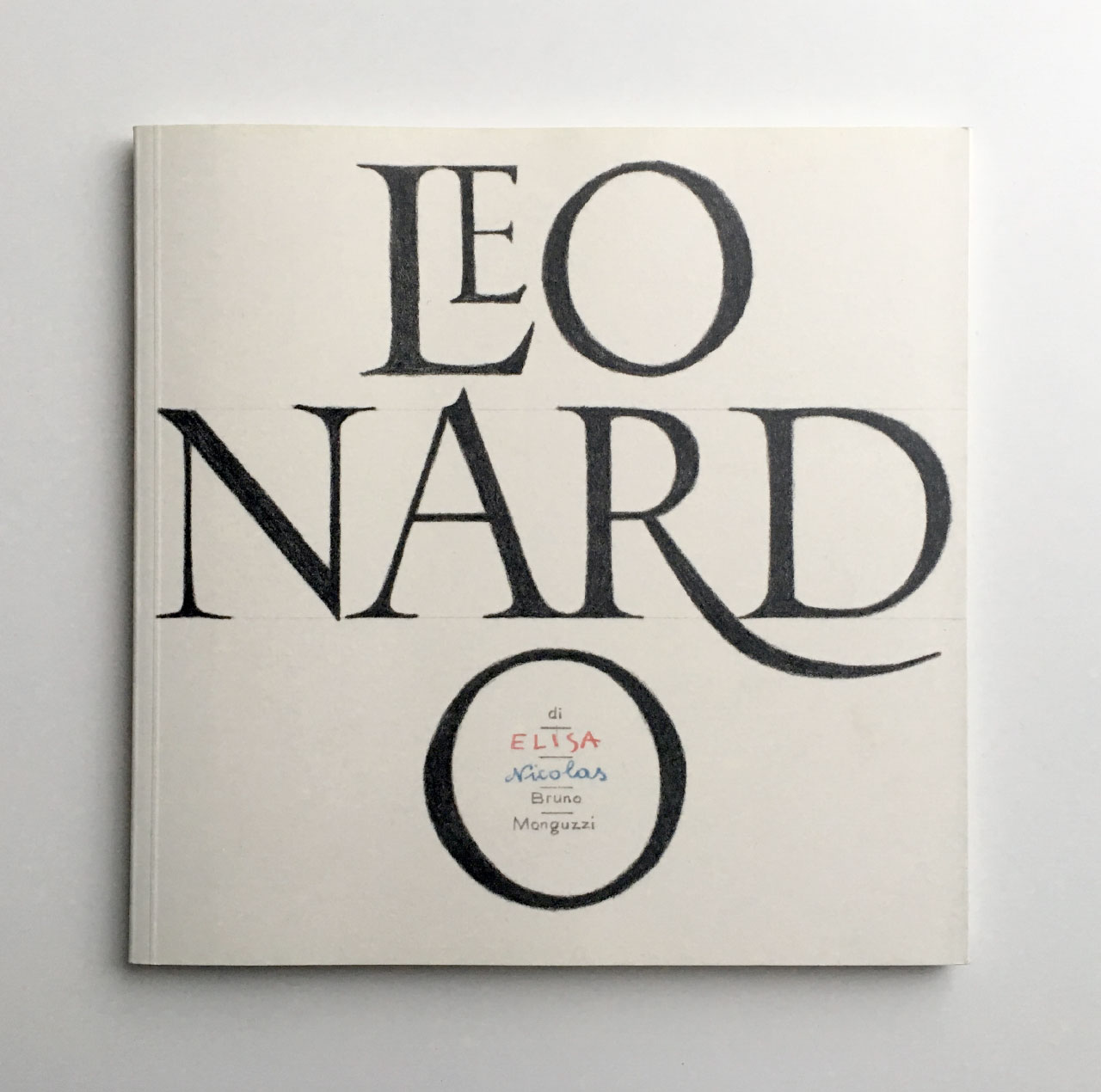
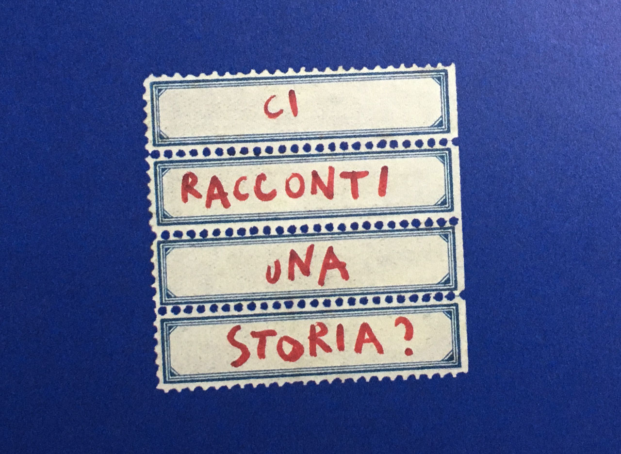
It’s a glorious and rambling story that revels in language and image. Based on a conversation between Monguzzi and his children Elisa and Nicolas back in 1978, the book is a fantastic assemblage of stunning hand-drawn lettering, illustrations, photographs and ephemera. The book starts with a question from Nicolas (whose words are set in a blue script) and Elisa (set in red):
‘Bruno?’
‘Can you tell us a story?’
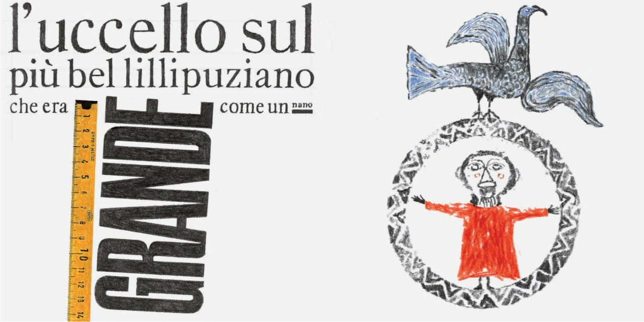
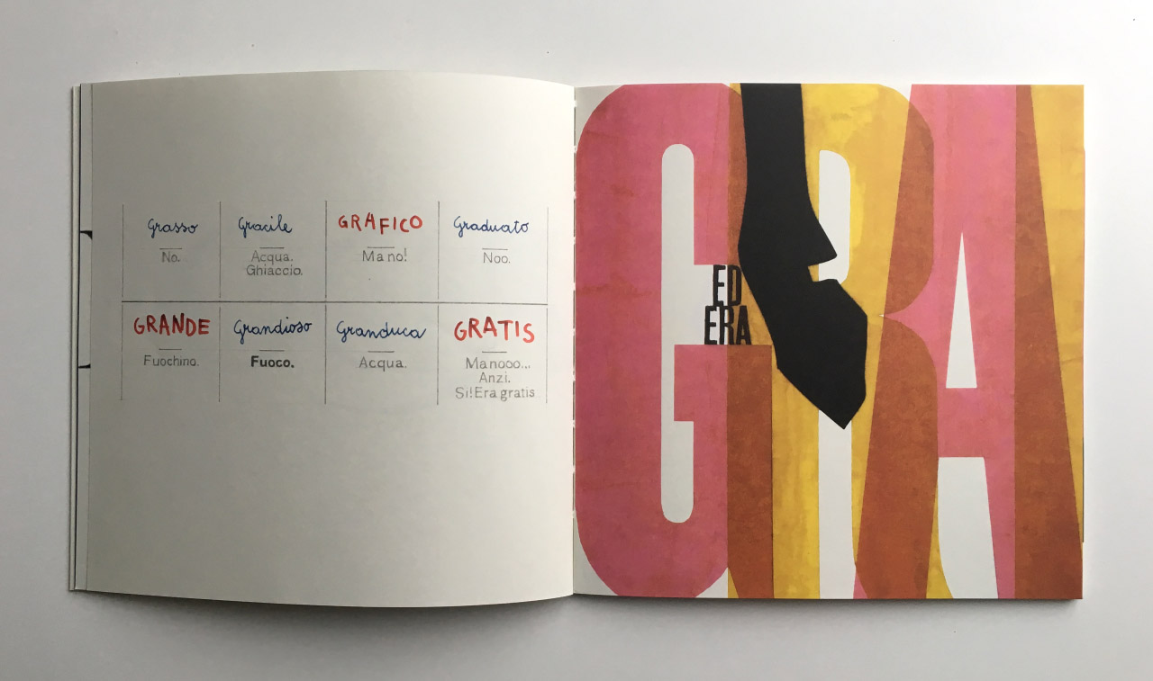
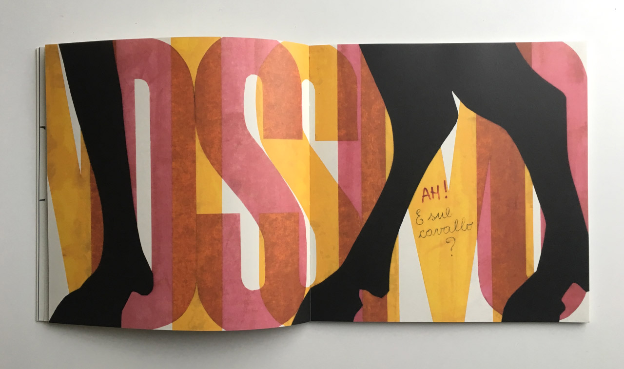
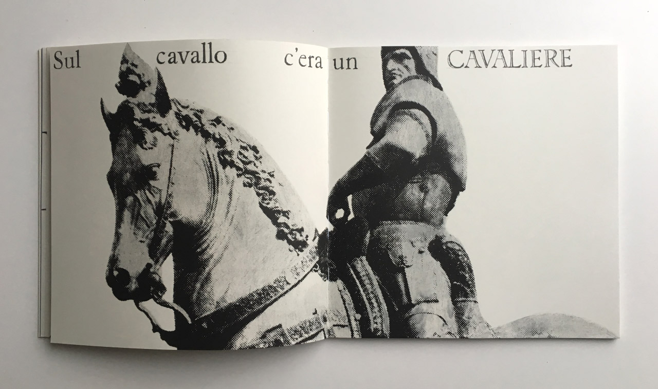
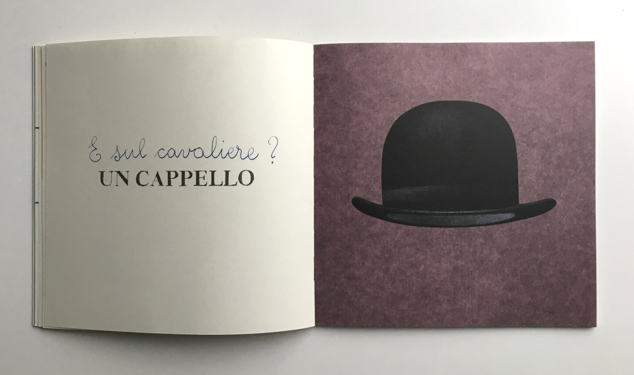
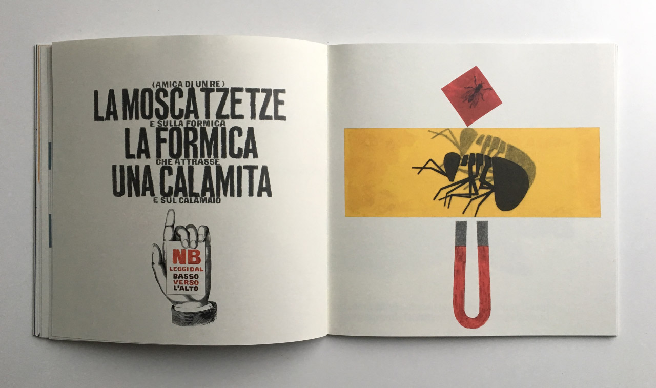
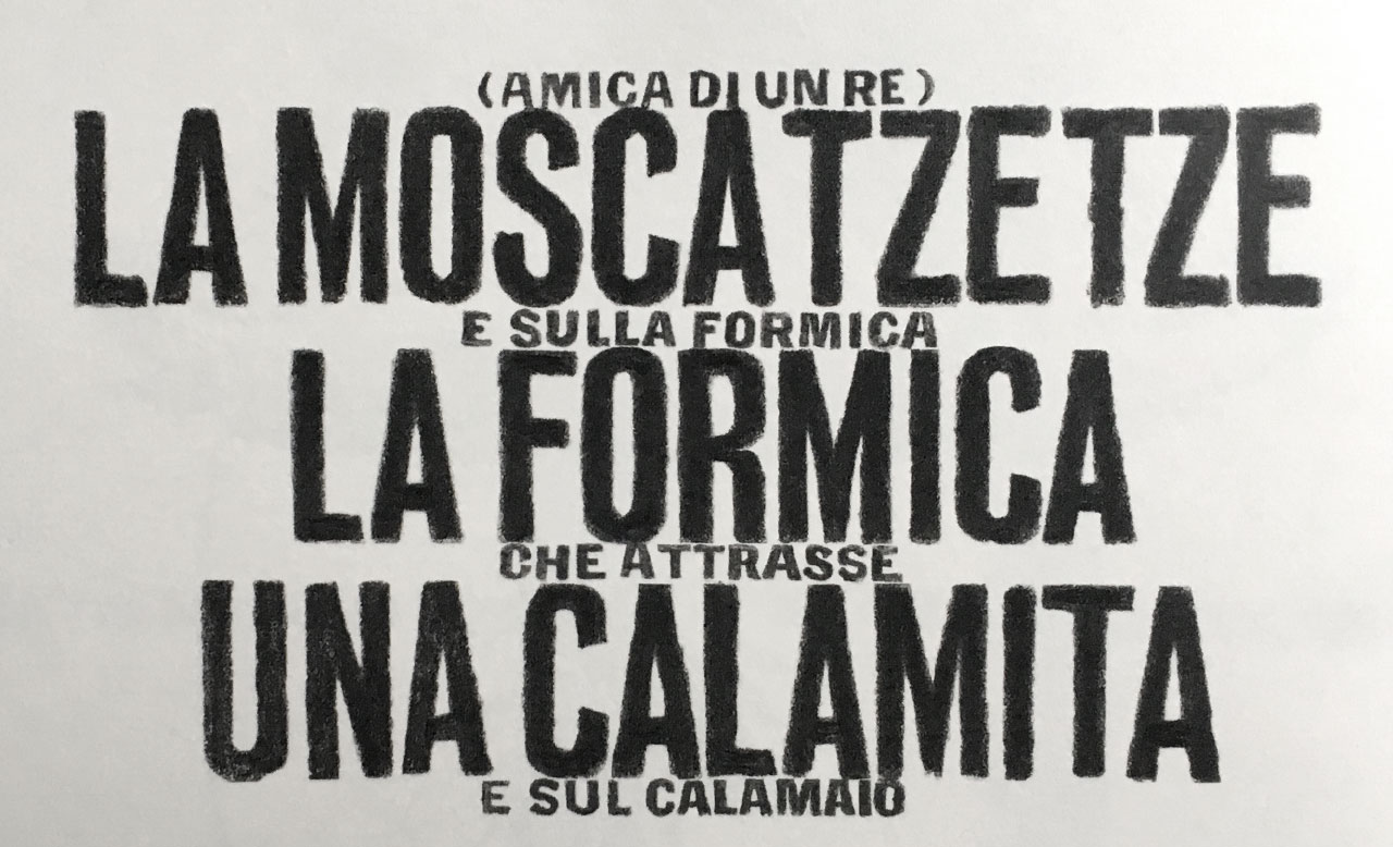
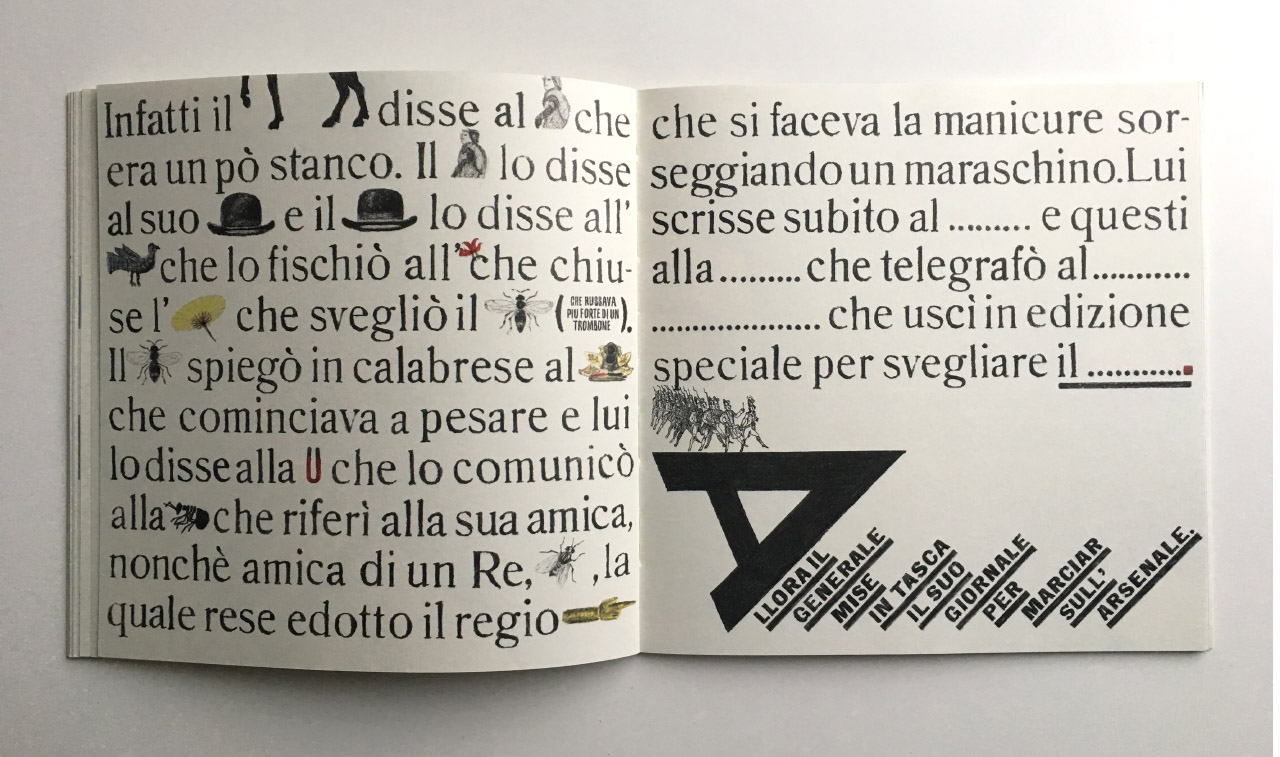
Bruno goes on to tell a tall tale of a gigantic horse called Leonardo. On the horse is a knight, and on the knight is a hat, and on the hat is a bird, on top of which is a smaller bird, on top of which… well, it goes on. It’s only available in Italian, but even if you don’t speak the language, you can discern the absolute joy in the sounds of the words.
In the spread below, you can see Nicolas and Elisa’s interruptions, as they guess at how Bruno was about to describe the horse, and his responses, in the Italian form of ‘Cold / Warmer / Hot’.
Here’s how the book is described on the cover flap:
“The idea for a work of this kind came to Bruno Monguzzi after reading an article by Metzger, published in the book Education of Vision. After observing the ways children respond to different visual stimuli, Metzger inferred that children’s creative potentials are encouraged to grow when they receive complex stimulation, as they do when they see works expressed in a full-developed adult manner, while they remain indifferent to more child-like figurative or narrative models. According to this view, it is therefore not merely a good idea to introduce children early to great historical works of art but an essential step in their expressive development. This observation prompted Monguzzi’s decision to turn his back on ‘children’s’ illustrations that deploy a traditional iconographic repertoire that is lacking in imagination. The graphic universe used in Leonardo is therefore very extensive; a complex repertoire of images woven together in an interplay of referencces and citations (Klee, Magritte, etc). The book’s virtuosity is much more than an exercise in style or a display of learning that is really directed at an adult audience. It is a difficult juggling act to incorporate the book’s many illustrations in a rigorously typographic format. Every page offers something unique: the relationships within the story are not established by recurrent illustrative stereotypes but are embellished by each line in the dialogue, by each episode of the story and by new and relevant aspects. The images are therefore in no way secondary to the narrative voice but become an essential background of imagination and interpretation.”
Boom! Fantastic stuff.
You can read about Monguzzi’s work yourself, in the book 50 Years of Paper (which you can preview here). As an added bonus, buying the book also gets you a link to download the film. You can also check out this interview with Monguzzi from the first issue of Eye Magazine.