British Hardware Federation
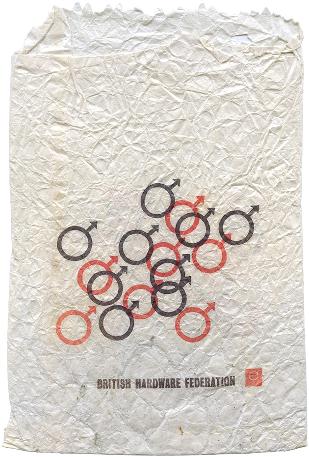
I stumbled across this little paper bag the other day, and crikey it’s peculiar.
It features branding for the British Hardware Federation, the national trade association for independent hardware and DIY retailers in the UK. I’m not quite sure when this particular bag dates from, but I’d guess it’s the early 1970s. (I’ve been in touch with the BHF to ask them if they know anything about the branding, but they’ve not got back to me with any answers yet.)
So that symbol. That’s the male gender symbol right?*
So, hum, was the British Hardware Federation really suggesting, as James Brown would have it, that DIY is a ‘man’s man’s man’s world’? Because that seems kinda outrageous, even in the 70s.
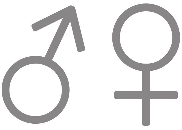
The symbol itself, the circle with an arrow pointing outwards at an angle, and its equivalent female symbol, the circle with a cross below it, have an interesting history.
Their use as markers of gender dates back to the work of Swedish Botanist Carl Linnaeus, in his dissertation Plantae Hybridae (1751), where he used them for male and female parents of hybrid plants.
But Linnaeus didn’t invent the symbols, he just appropriated them from the scientific study of alchemy, where the male symbol was originally used to refer to the metal iron, and the female symbol to the metal copper. In fact he’d previously used them as such in his 1735 piece, System Naturae.
The symbols’ use in alchemy derived from a shorthand for the names of the planets, each of which was associated with a metal. Iron (a hard red metal used to make weapons) was associated with Mars (big red planet, god of war); and copper (a soft metal that turns green) was associated with Venus (goddess of love). Read all about that over on this Today I Found Out article.
Which is all well and good, but doesn’t perhaps explain why the male gender symbol was used to brand a DIY trade body. It’s possible it was something to do with iron, but it feels like most people would have connected the symbol with maleness way before they thought about a hard red metal.
Of course, there’s a much more contemporary instance of the symbol being used as a key part of a much larger brand identity…
![]()
Volvo refer to their mark as ‘the iron mark’, so they’re definitely anchoring (sorry) the symbol with that meaning. As opposed to subtly suggesting that cars are just for men.
*If anyone knows any more about the British Hardware Federation identity, get in touch. It’s always possible that the symbol refers to something very DIY specific. I’d love to know.