Olivetti – Beyond form and function
I nipped over to the ICA at the end of last week to catch their exhibition, Olivetti – Beyond Form and Function, showcasing the spatial and graphic design of typewriter manufacturer Olivetti during the post-war era.
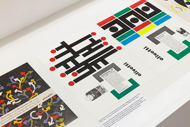
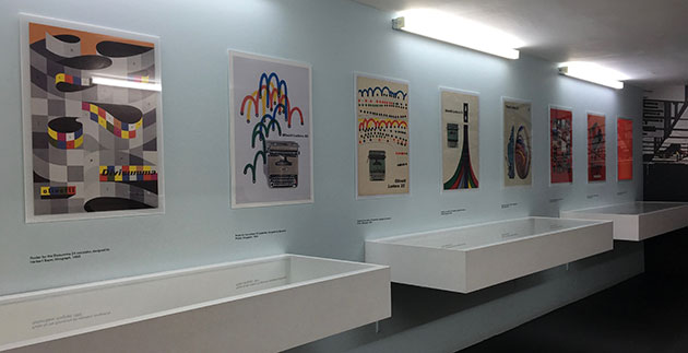
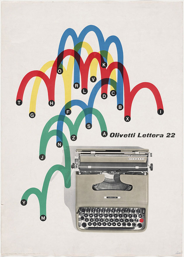
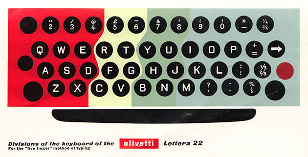
The show featured a mix of advertising posters, magazine adverts, and ephemera from Olivetti, courtesy of the Associazione Archivio Storico Olivetti. Many were designed by Giovanni Pintori, who worked in-house with Olivetti for over 30 years, eventually becoming the company’s Art Director.
It was interesting to see how photographs of the typewriters were kept quite small, if shown at all, letting simple abstracted graphics to do most of the work instead.
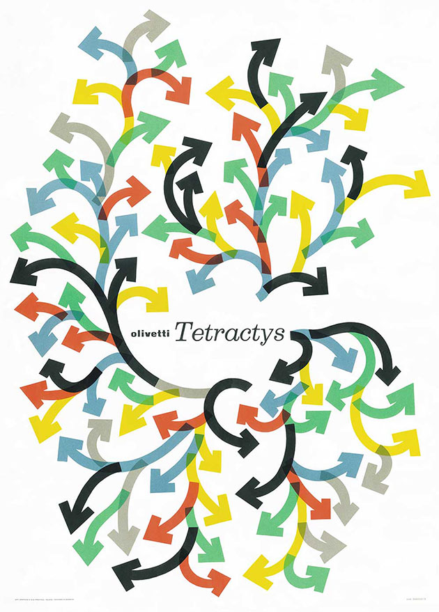
(You might recognise the image above from some adverts for The Guardian by Weiden + Kennedy back in 2007. This post from Simon I’Anson about the similarity between those ads sent me off to this fantastic Flickr album of graphic design work done for Olivetti.)
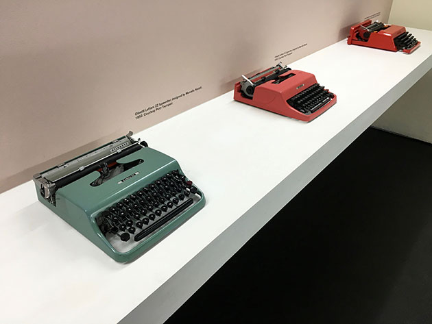
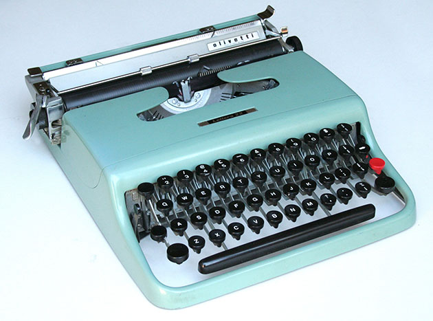
The show also featured some actual typewriters, including the beautiful lightweight and portable Lettera 22. I have one in the studio, and love it:
Here’s what the text from that looks like once it’s typed out:
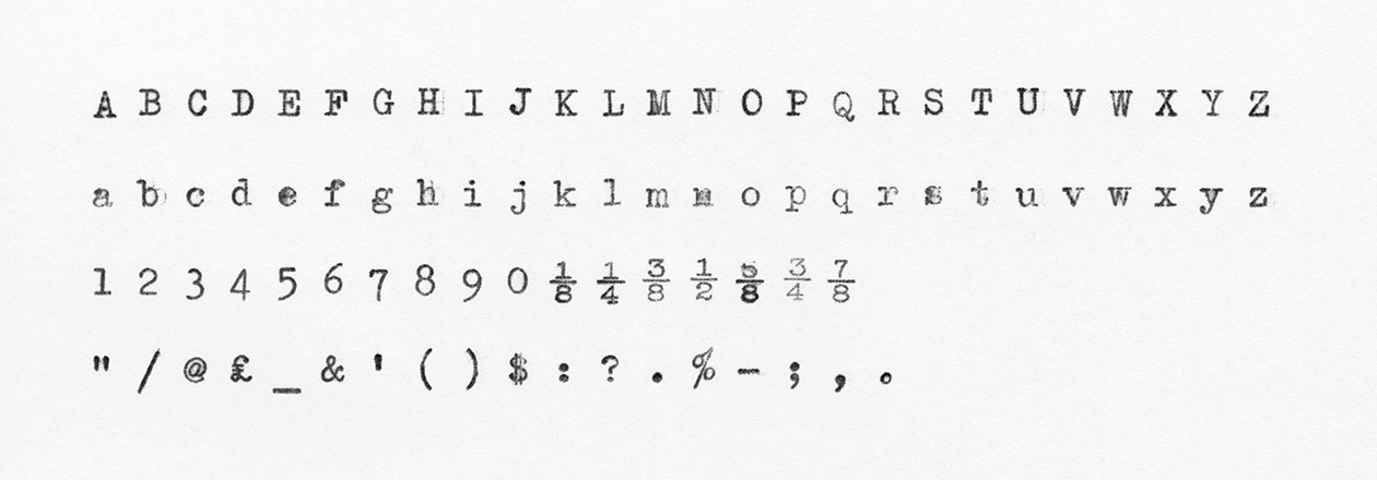
I was wondering who designed letters themselves. Courier, the standard typewriter typeface, wasn’t designed until 1955, and the Lettera 22 dates from 1949. I’m guessing that quite a few similar typefaces were around at the time – but was wondering where the first one came from (do get in touch if you know). As you can see from the sample above, the characters are monospaced, so they each take up the same amount of space, allowing the creation of tabular information to be done really simply. (Read more about typewriter typefaces over on this Typographica page.)
The first commercially successful typewriter was the Sholes and Glidden Type-Writer, also known as the Remington No.1, which went on sale in 1874. It introduced the first QWERTY keyboard, which lingers on today, despite attempts to update it.
However the Remington was slightly limited because you couldn’t see what you were typing while you typed, and it only had uppercase letters.
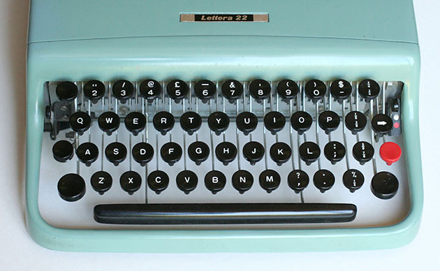
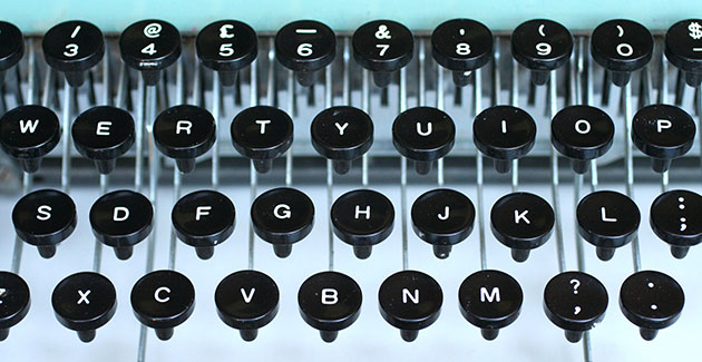
Even on the lowercase and uppercase typewriters, some characters were still absent. If you look at the keyboard on our Lettera 22 above, you’ll see there’s no numeral 1, no exclamation mark, a dollar symbol but no cent symbol, and no maths symbols (addition, multiplication, division, equals).
Using a typewriter necessitated some clever tricks – here are just a few:
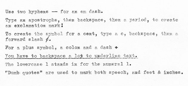
The dumb quotes I mention there are a massive bugbear of mine. They still linger on modern computer keyboards, when they were only created as a space saving device on typewriters. They should have disappeared years ago. (Read more about that on this old post about dumb quotes.)
If you’re looking for more Olivetti Lettera goodness, check out this Flickr album from Ed Cornish, showcasing the machine’s instruction manual.
Lovely stuff.