work blog about search


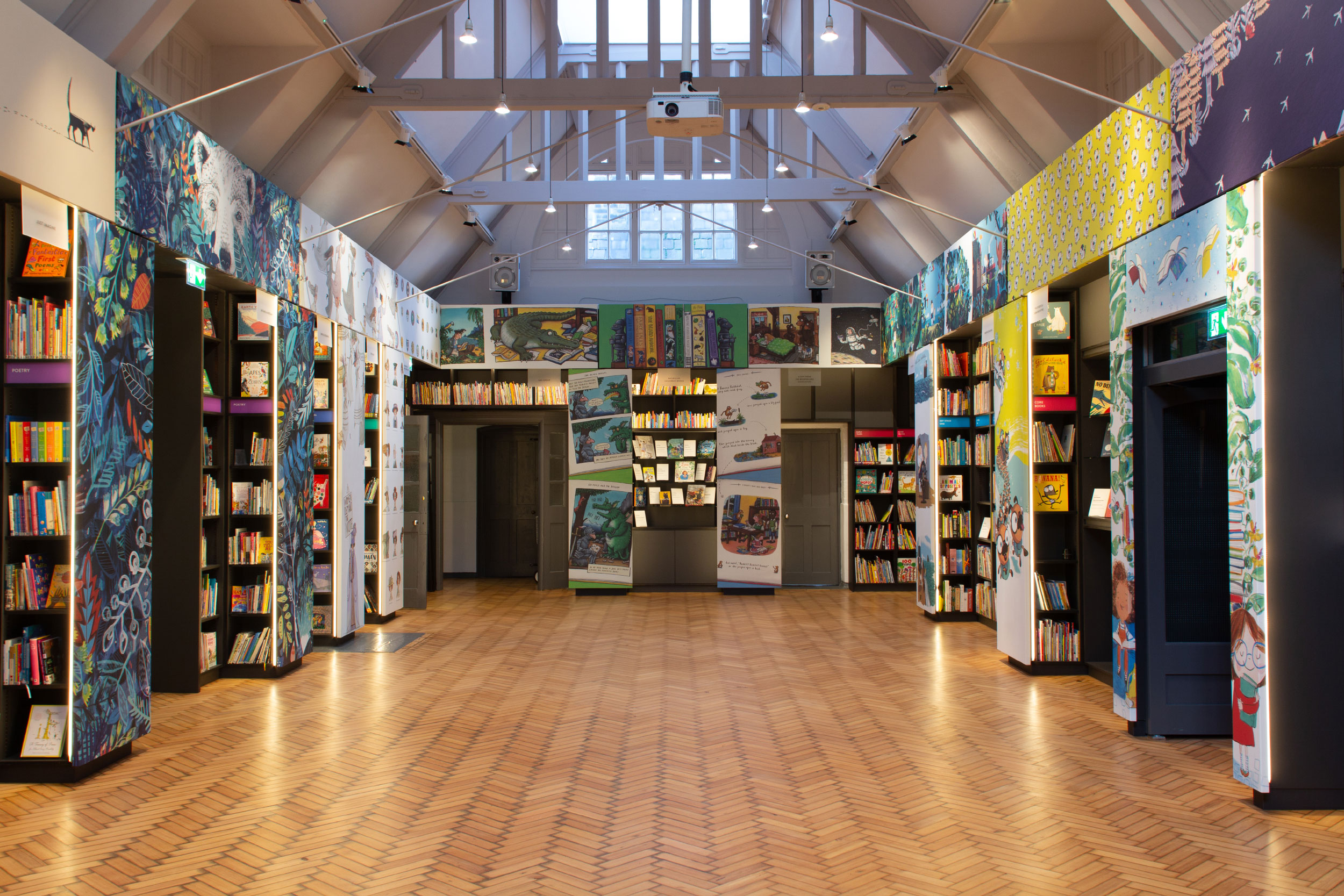
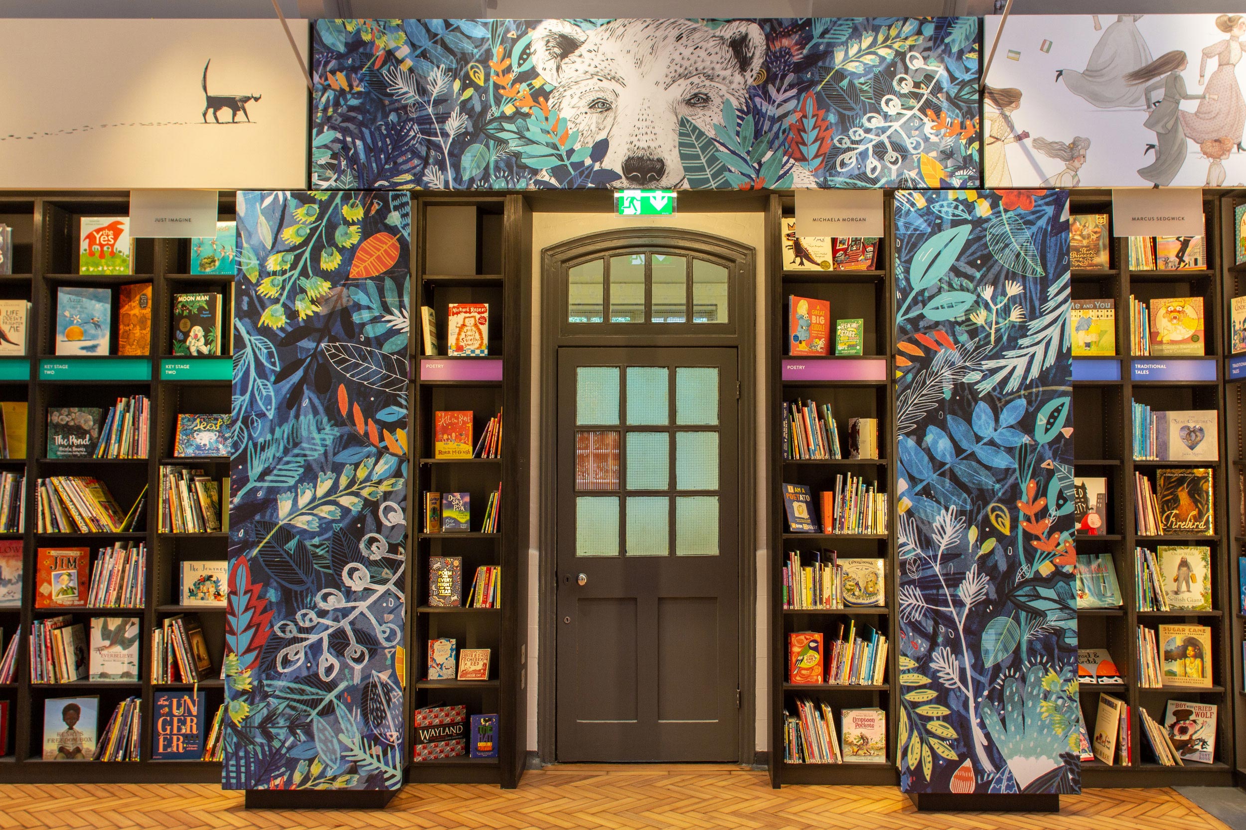
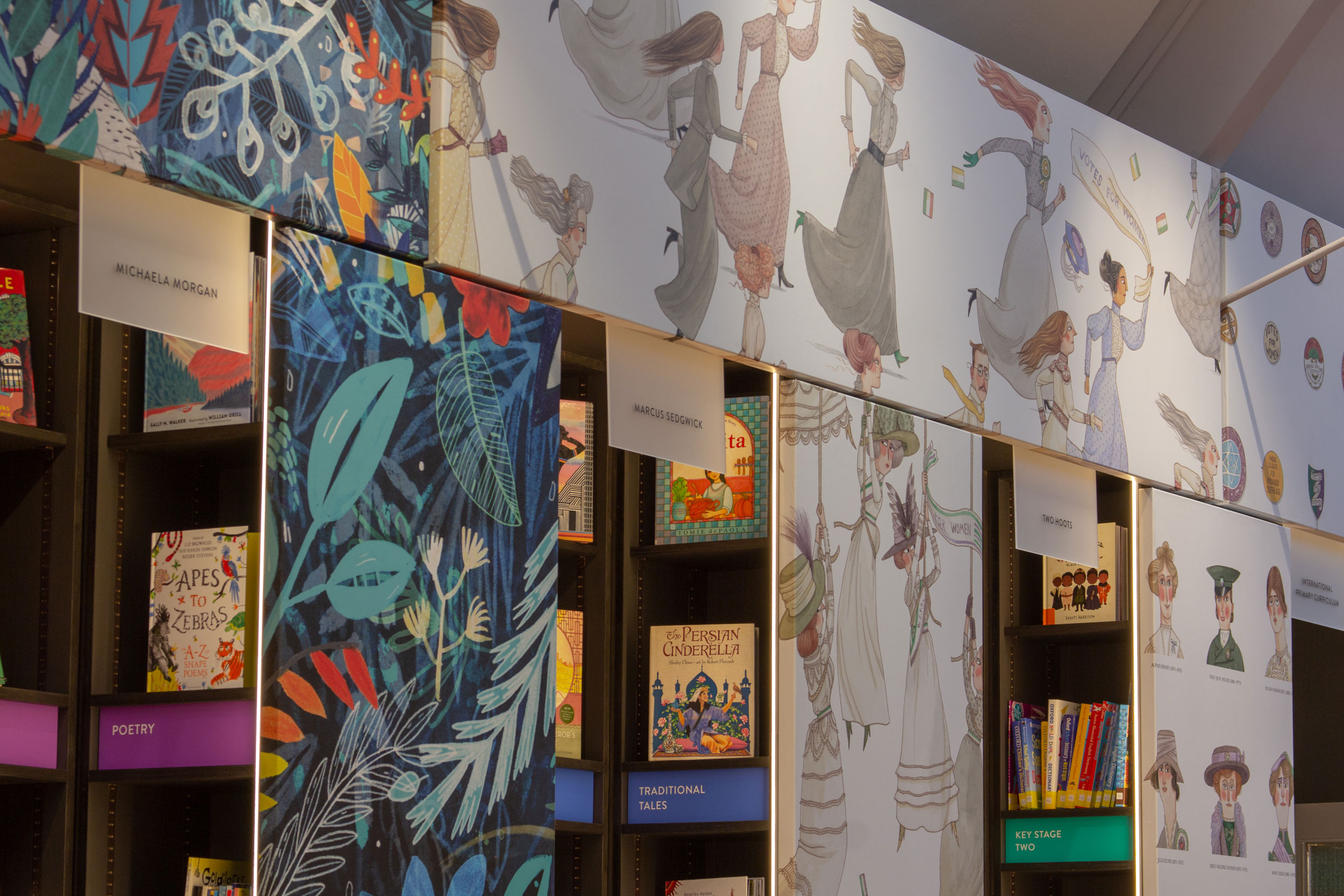
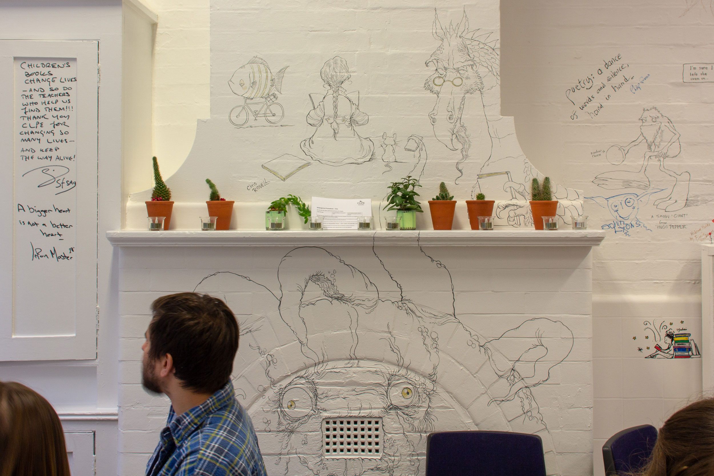
CLPE Literacy Library

Project Type:
Environmental

Client:
CLPE

The Centre for Literacy in Primary Education (CLPE) is a charity working to improve literacy in primary schools. Their work raises the achievement of children by helping schools to teach literacy creatively and effectively, putting quality children’s literature at the heart of all learning. Which is, you know, great!

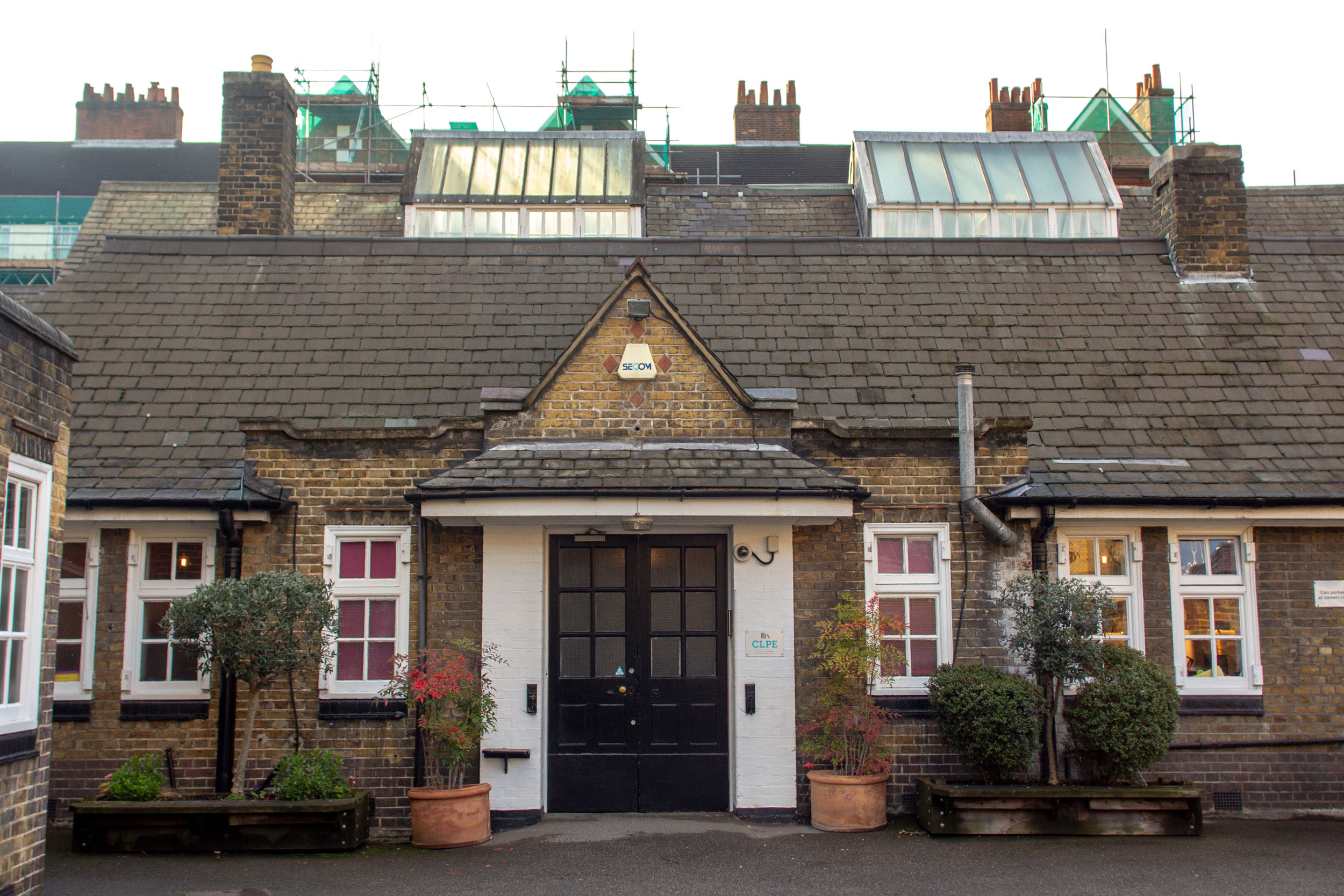
CLPE is based in Southwark, in an old arts and crafts building which was originally a school for children with impaired mobility.

IMG_9133
 

CLPE recently completely renovated the interior of the building, with a fantastic design by architect Eric Guibert. At the heart of the design is the Literacy Library – a permanent home for the charity’s 23,000 children’s books. The library also doubles as an event space used by teachers, literacy charities and literature organisations. Eric’s scheme features a magnificent frieze with imagery from famous children’s books, which sits in front of alcoves of shelving all around the room. Here’s a look at the new space – though without the furniture.


IMG_9135
IMG_9139
IMG_9141
 

To complement this, Eric asked me to design all the signs for the new library, including room names, shelving section dividers and sponsor signs. They all needed to be robust, smart and cost effective; and to be functional, while not fighting against the visuals on the frieze.

We decided on a mix of sign materials depending on use. The room names, which are the most permanent of the signs, were laser etched into the surface of the shelving.

IMG_9189
IMG_9193
 

To fund the new library, supporters were invited to sponsor shelves, bookcases or alcoves. Each of these different levels of sponsor needed a different level of signage. For the alcoves, we designed frosted perspex hanging signs, attached to the back of the frieze.

IMG_9169
IMG_9166
 

For the bookcase and shelf sponsors, we designed acrylic strips in a grey that matched the bookcase colour. Again, these were laser etched, and applied to the front of the shelves. Production for these was done by the good folks at Cutlasercut.

IMG_9155
IMG_9157
 

The section dividers for the shelves needed to be moveable and quick and cheap to produce if more were needed, depending on the changing numbers of books in the library. These were produced on a foamex board by MJCP, with colours taken from CLPE’s brand guidelines.

IMG_9190
IMG_9150
 

To top it all off, the centre’s cafe – the Riddell Cafe – features hand-drawn illustrations by the incomparable Chris Riddell:

IMG_9200
 

I’m dead pleased to have helped out on such a joyous and worthwhile project.