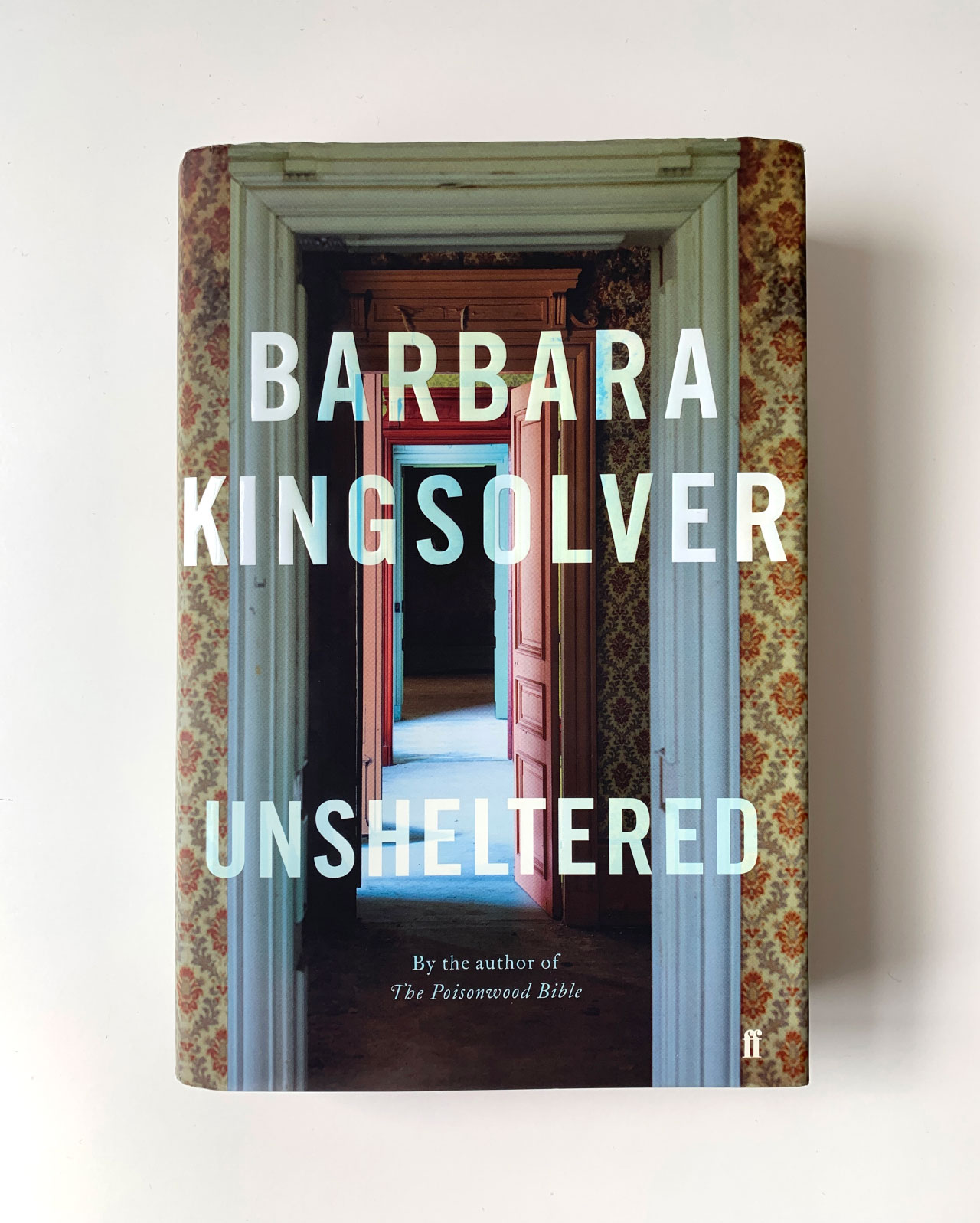
Unsheltered book cover by Ami Smithson
While browsing the shelves and tables in Foyles on Charing Cross Road a few weeks ago, a book caught me eye. Well, the book jacket and book design did. They demanded attention, and within moments convinced me to buy the book. I was glad I did – it turns out as well as being a great piece of book design, it’s also a fantastic book.
Published in the UK by Faber & Faber, Unsheltered is the latest novel from author Barbara Kingsolver, and it’s a cracker. The Guardian calls it ‘a powerful lament for the American dream’. It centres on the lives of two families living in a crumbling house in Vineland in New Jersey, but at different times – 1871 and 2016. The back cover blurb simply states: ‘Without shelter, we stand in daylight. Without shelter, we feel ourselves likely to die.’ I’d heard of one of Kingsolver’s previous books, The Poisonwood Bible, but wasn’t familiar with her work generally, and hadn’t heard anything about this book. But I didn’t hesitate to buy it. And that’s principally down to the design.
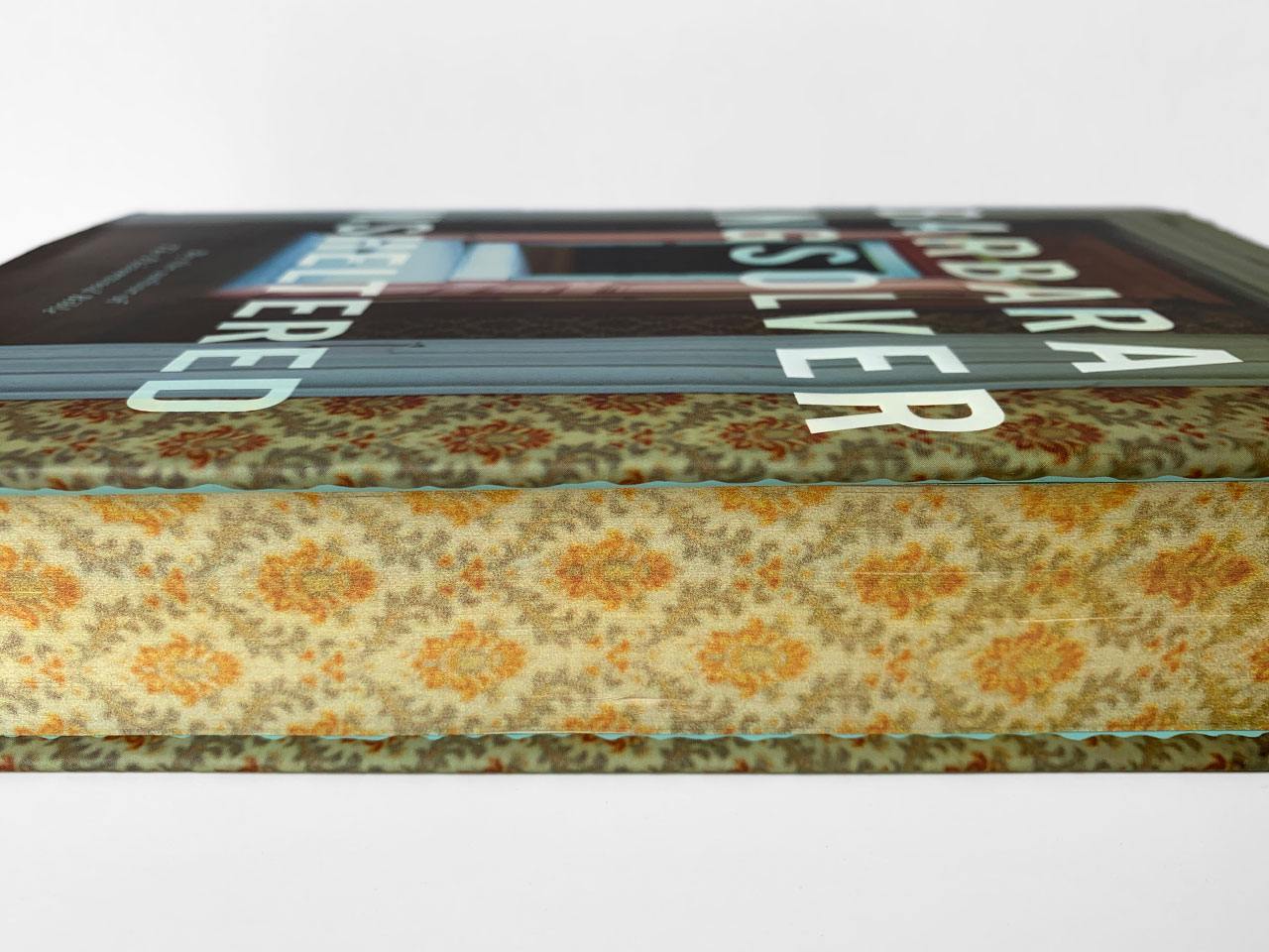
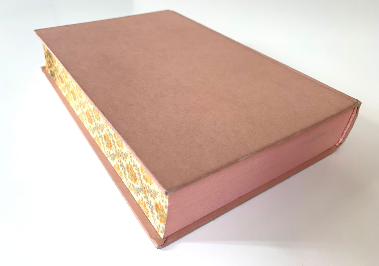
The book [printed by CPI] is particularly unusual for having an image printed along its fore-edge. It’s a continuation of part of the photograph from the dust jacket, which integrates the jacket brilliantly into the book.
Colour along the edge of a book isn’t anything new of course. Historically some books were covered with a top edge gilt finish – a layer of gold leaf, or similar, to protect them from dust and moisture over the years they might spend sitting on shelves. Even putting images onto the edges of books is nothing new – fore-edge painting has been around for ages. However this is the first time I’ve seen fore-edge printing of an image done on a such a mainstream contemporary book. It really enhances the feeling of the book and the text within as a cohesive ‘thing’.
I was intrigued by the way the cover had grabbed and maintained my interest, so I got in touch with the designer, Ami Smithson, to ask her a few questions about it.
What was the brief?
This was flagged from the beginning to be a Big Book for Faber. Which is both helpful and anxiety-inducing! Kingsolver is a heavyweight and hadn’t published a book for five years, so this book needed to be noticed. And, importantly, to be different from the botanical themes of previous novels. The editor highlighted that alteration in direction, and also that a focus on person, time and place were wanted. The key booksellers were outlined, and high production values flagged. The book needed to be a complete, covetable object.
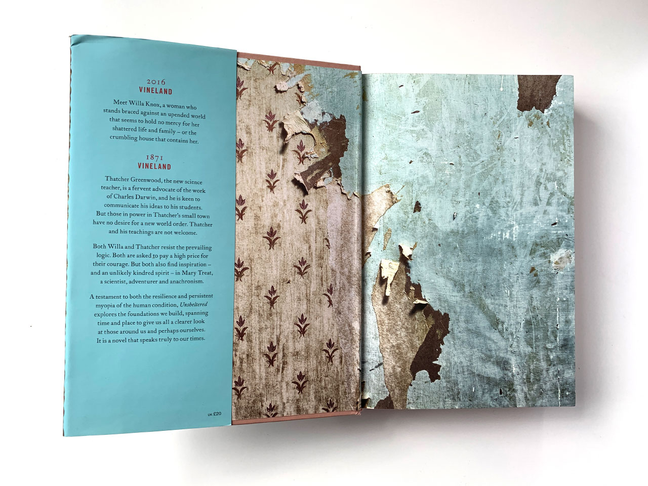
The actual brief was incredibly specific on paper – but having read and re-read it, I spoke to Donna [Donna Payne, the Faber & Faber art director] and we did what designers usually do – separated the specifics from the intention, and then things looked clearer. In essence, the two time periods were important, and the passage of time, and the pull of the house itself being the thing that linked the characters. There was also the significance of a baby crib in the mix. I found the house very significant, and its effect on the inhabitants over time, so wanted to use this.
Was the US edition designed simultaneously? Did you know what it looked like when you started your design?
Yes, they had the same publication date, but I didn’t know what route they were taking, so this didn’t alter my thinking.
[The US edition, shown below, was designed by Milan Bozic, senior art director at HarperCollins US.]
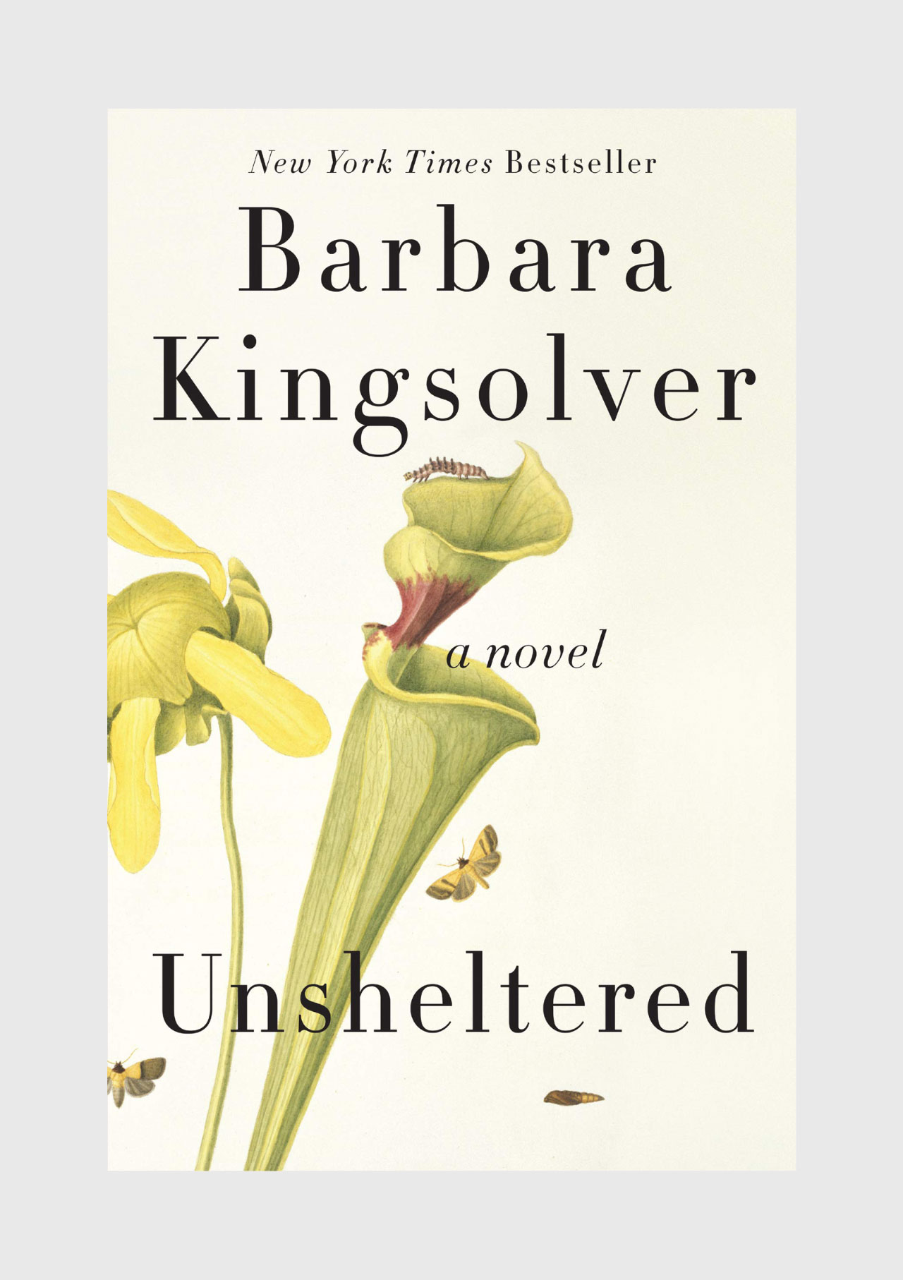
Generally, why do you think the US and UK markets have different designs anyway?
Massive question and probably needs another blog post. My understanding is loosely, the US has a clearer distinction between more commercial books and literary ones, and the UK possibly less so. The edges are fuzzier, so I’ve found our commercial designs can look more varied, and our literary designs more poppy. So possibly more people read more widely here. This is by no means the full answer – editor and author and importantly international sales would know more about their markets. I’d also say that now every hardback has to work very hard, be very desirable in some form, to incentivise ownership and spend.
Was your published design the first design route, or one of many?
I submitted around nine variations of a cover approach, and within those – happily – the final cover design lurked. It was possibly less vibrant, but a solid basis of the final jacket was there. At this point Donna did a great thing and talked both to the editor and the sales team, and they were all in agreement on one cover design. I have to flag here that this is a fairly dreamy outcome, and not that usual (for me anyway!)
What was the evolution from initial idea to finished concept?
This one was reasonably smooth – there was plenty more work but what was great is that I felt we were all pulling in the same direction. We secured the image, and worked on getting the most from both type and image that we could. That balance where there’s a tipping point between overworking an image and type, and it looking right. So retouching, thinking about the book as a whole – front, back, finishes, flaps, author image, endpapers, board and edge colours – those were all in the mix.
Did you get to chat to the author about the design at any point?
I didn’t – I am hoping that’s because she liked it! I know that she was really appreciative once she’d seen it. Faber were great about sending on feedback, which is always so positive. The editor sent the visual to her after I had refined the colour more, so I knew fairly quickly that we had her approval.
The fore-edge printing is spectacular, and really adds to the experience of reading the book. How did it come about?
I have to confess that though I suggested a dusty pink, Faber took the edges to another level by taking the wallpaper to the long edge. My pink suggestion was used top and base. I’m not in house at Faber, so wasn’t involved in those production intricacies, but would think they tested first.
[I chatted to Jason at CPI about the process, which is something they developed for short run editions, for book fairs and other promotions. Publishers really liked the feel of it though, and began asking for it on longer print runs, right up to editions of hundreds of thousands. The fore-edge is digitally printed, and then with this book, the top and tail edges were sprayed with colour as well.]
Do you find that you have to fight for extra finishes on books – or does the editor / art director suggest them from the outset?
My tactic is to talk to the production controller (and editor) as soon as possible, so they can think about this and cost things as soon as they can. Then if the margins look terrible to go to Plan B, or scale down. This jacket was always flagged as special, and Faber stuck brilliantly to that principle. I thank you Faber. I also thank production controllers everywhere.
It looks to me like you’ve done a fair bit of retouching to the photograph used on the cover – how did that come about?
Yes, the retouch was on two levels of thinking. I drive myself bonkers by being a very symmetrical designer, so wanted the wallpaper even on each side. Then there are legibility issues for type running over areas of high contrast, then it’s just making the image as luscious as you can. While not, hopefully, trashing it; and respecting its original feel. I also wanted this image to look not entirely period, so making some colours more vivid was part of this.
The cover text looks like it’s embossed and hit with a spot UV – is that right?
Yes, and the cover has a soft-touch laminate, which usually gives some colours an enhanced glow.
You’ve left some of the letters solid, and the others are translucent. What’s the thinking behind that?
I wanted graphic type but also atmospheric type – initially I presented two versions, one solid white and the other where the type deepened almost as the light in the doorway did, so they were more of a piece. Though solid white is graphic and legible, there’s a sitting-on-top slightly hard edge to that, and that’s not how the book feels. There was much exchange between me and Donna at this point until we had something where the type became much more in harmony with the almost ghostly feel of the image, and they sync together. I like the blues that have come though so am really happy we got to that point.
I generally remove dust-jackets while reading hardbacks, and return them once I’m done. Is that something you do too?
Pretty much always. How respectful of you – thank you. I have a tragic story: I removed the jacket of my copy of The Old Ways to take the book on holiday and then somehow, along the way, lost the book (forgive me). Now there’s a sad empty dust jacket staring at me thinly from my bookshelves.