work blog about search


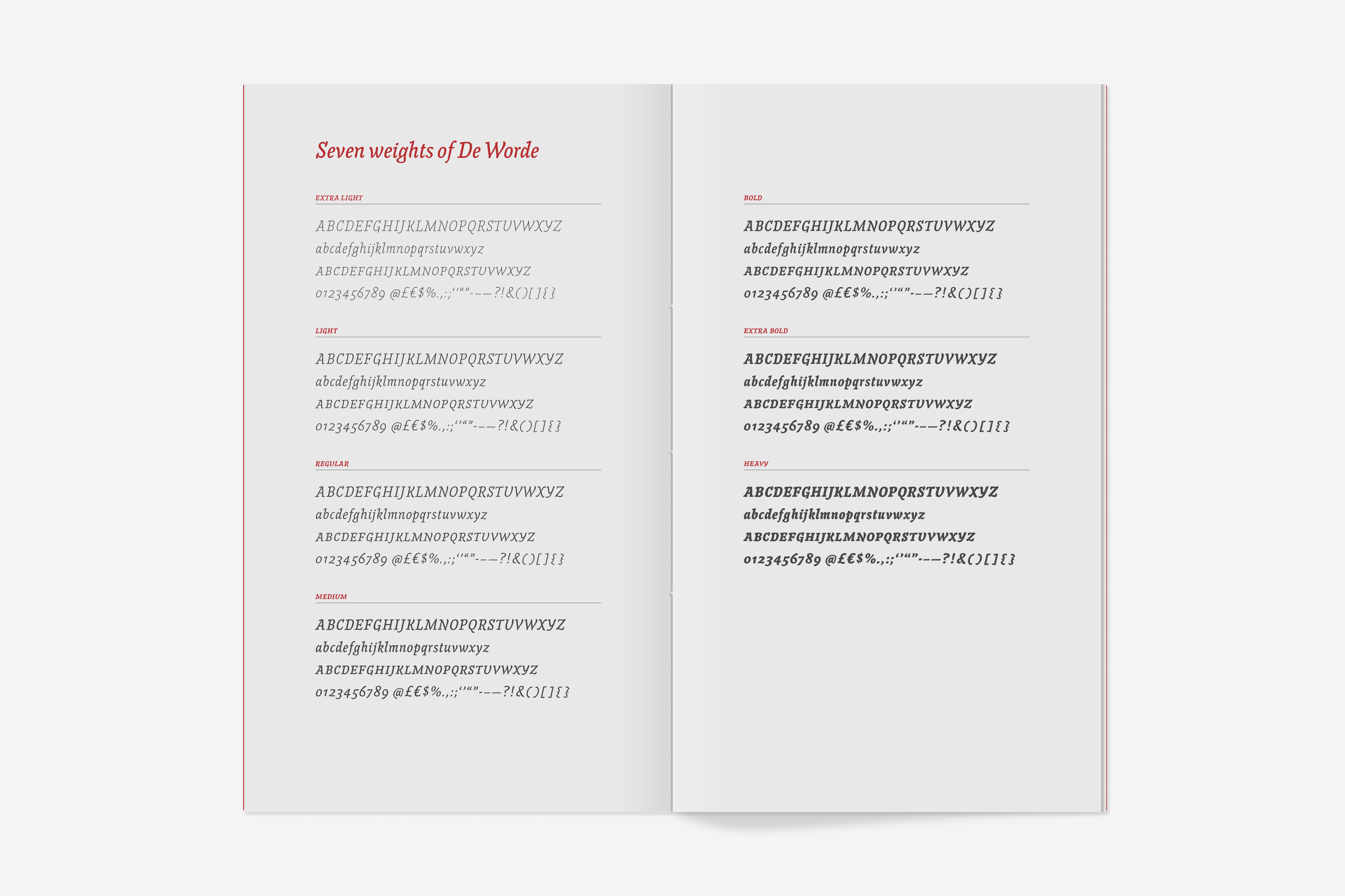
De Worde type specimen

Project Type:
Print

Client:
Jeremy Tankard Typography

When you first start working with a new typeface, it’s hard not to feel like a child with a much longed-for new toy. When you first download it, you’re full of awe and excitement. You give the typeface a speedy once-over. Get a feel for the overall vibe. It’s a quick and heady hit of joy. But the real pleasure comes from when you properly dig down into the typeface to discover its true nature, its capabilities and aptitudes. And as you start working with it more and more, you uncover its real strengths. Its essence.

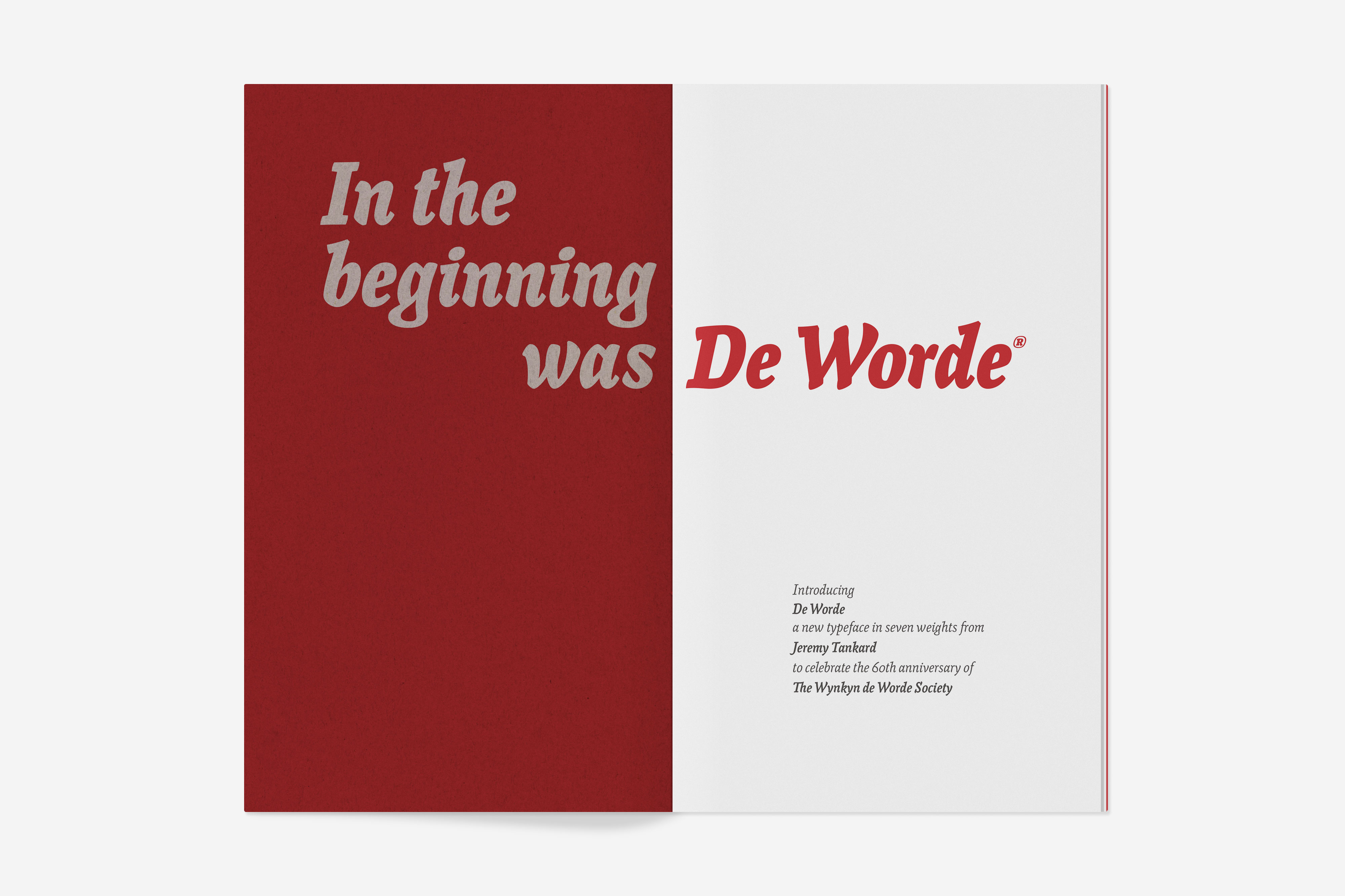
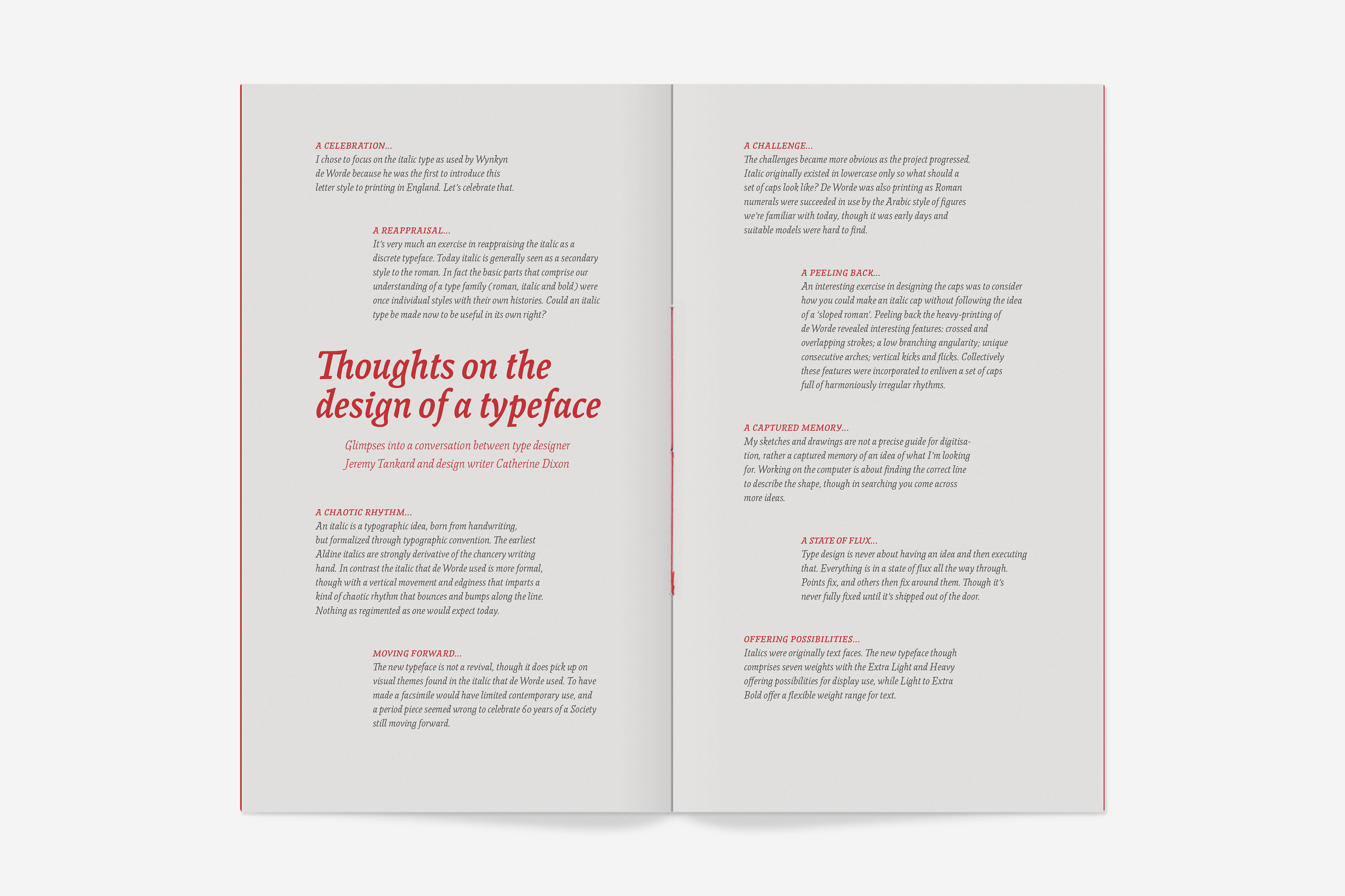
So when the rather wonderful type designer Jeremy Tankard approached me to design a type sampler for his new typeface De Worde, I was properly excited.

De-Worde-12
 

De Worde was commissioned by the Wynkyn de Worde Society to mark its 60th birthday. The Society was set up in 1957 by a group of publishers, typographers and designers ‘dedicated to promoting excellence in all aspects of print and the graphic arts’. The Society meets several times a year to drink, chat, eat, and to hear talks from leading designers, printers, publishers and associated folk.

De-Worde-2
 

In 1500 Wynkyn de Worde, often known as the ‘Father of Fleet Street’, was the first printer to set up his shop on Fleet Street, which for centuries was perhaps the world’s most famous centre of printing.

De-Worde-3
 

In 1528, de Worde was the first printer in Britain to use an italic type, and Jeremy used this as his starting point for his new typeface:

“When looking for inspiration for the De Worde typeface, it seemed logical to start with the italic he used and introduced to English printing. Examination shows a type full of chaotic rhythm – it bounces along the line quite freely and is not as regimented as we would expect today. This, combined with several interesting details seen in the lettershapes, formed the basis of what would become the De Worde typeface.”

(Read the full story of De Worde’s design in Jeremy’s excellent newsletter, Footnote 26.)

De Worde comes in seven weights, from a refined ExtraLight to a characterful (if you’ll pardon the typographic pun) Heavy.

De-Worde-13
 

Playing around with the typeface was an absolute joy, particularly discovering its extended character set which includes small capitals, superiors, number sets and fractions. There’s a real depth of study and understanding in the design of the letters, but that doesn’t weigh it down – it has a joyous vivacity to it.

De-Worde-4
De-Worde-5
 

My job was simply to reveal as much of the typeface’s brilliance as possible – to give just a hint at what it might be capable of.

For the format of the sampler, I worked to the dimensions of James Moran’s wonderful history of de Worde, Wynkyn de Worde – Father of Fleet Street, so that they could sit comfortably next to each other on a shelf.

I then wrote copy that related to print and publishing, or simply showed off the very best features of the typeface. And inspired by an old joke about newspapers, I decided it should be black, white and red all over. Well… Pantones 426 and 1797 to be accurate (but that’s a little less catchy).

De-Worde-6
De-Worde-7
De-Worde-9
De-Worde-14
 

The sample booklet was printed and bound by the good folks at Typecast Colour, on Shiro Echo White from Fenner Paper. The cover, on Remake Smoke (also from Fenner) was foil-blocked by the wonderful team at Benwells. The spines were three-hole sewn, just to emphasise the sense of craft involved in the typeface’s creation.

De-Worde-10
De-Worde-11
 

“[Alistair] is a very talented designer and we knew that the strong typographic approach of his work, coupled with his excellent copywriting skills, would be the perfect vehicle to showcase the typeface in all its glory.”
Becky Chilcott · Chair of the Wynkyn de Worde Society