work blog about search


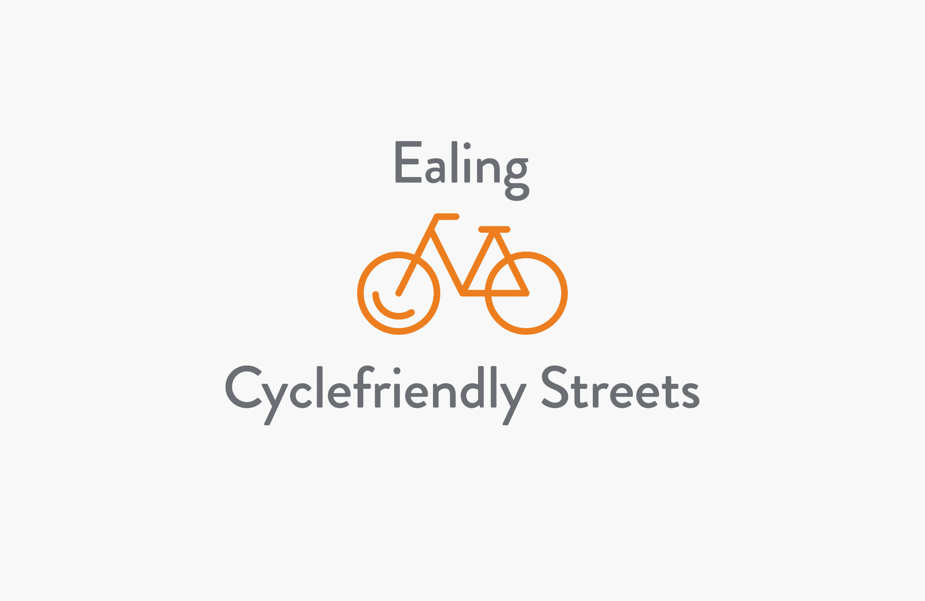
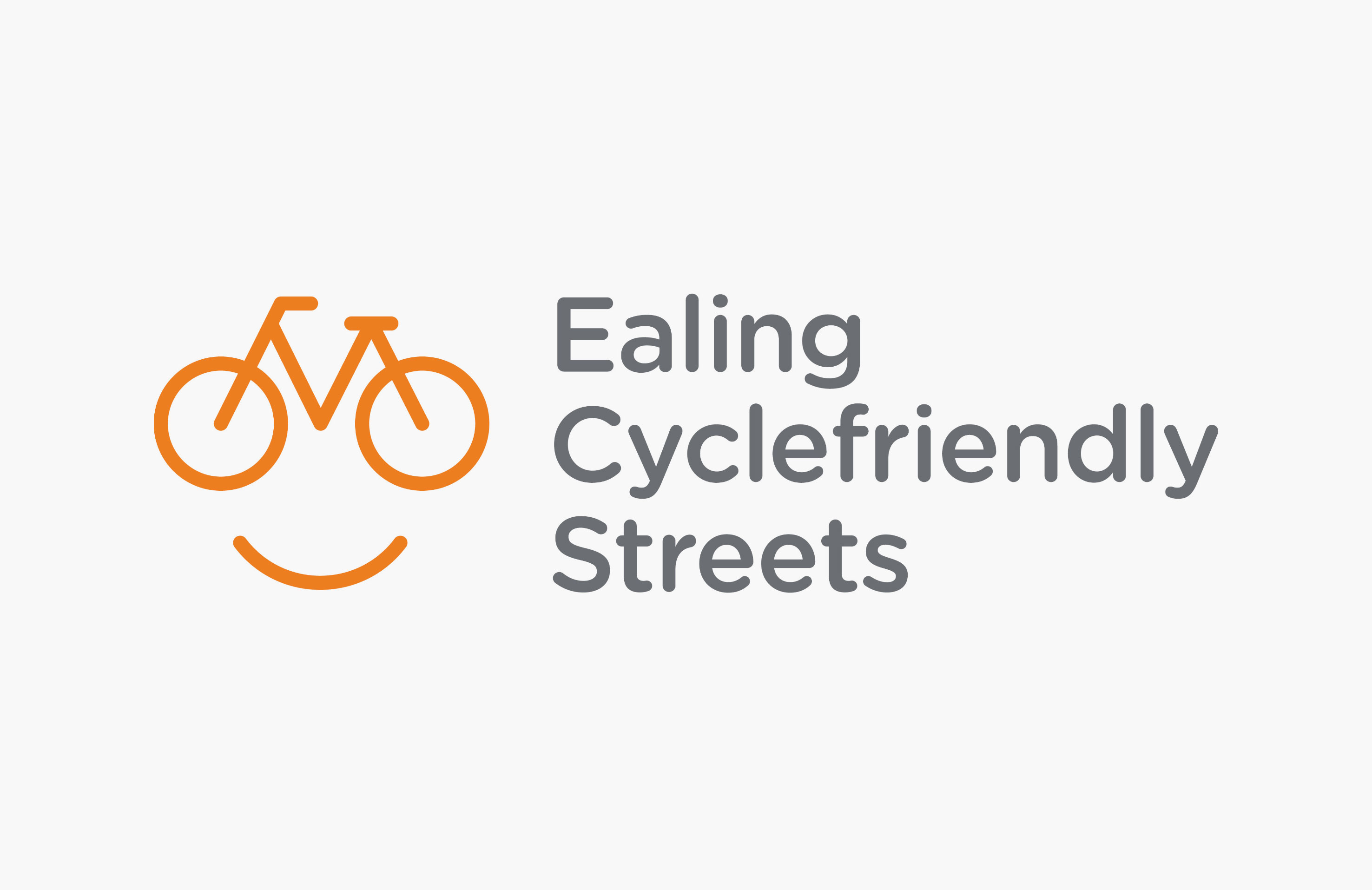
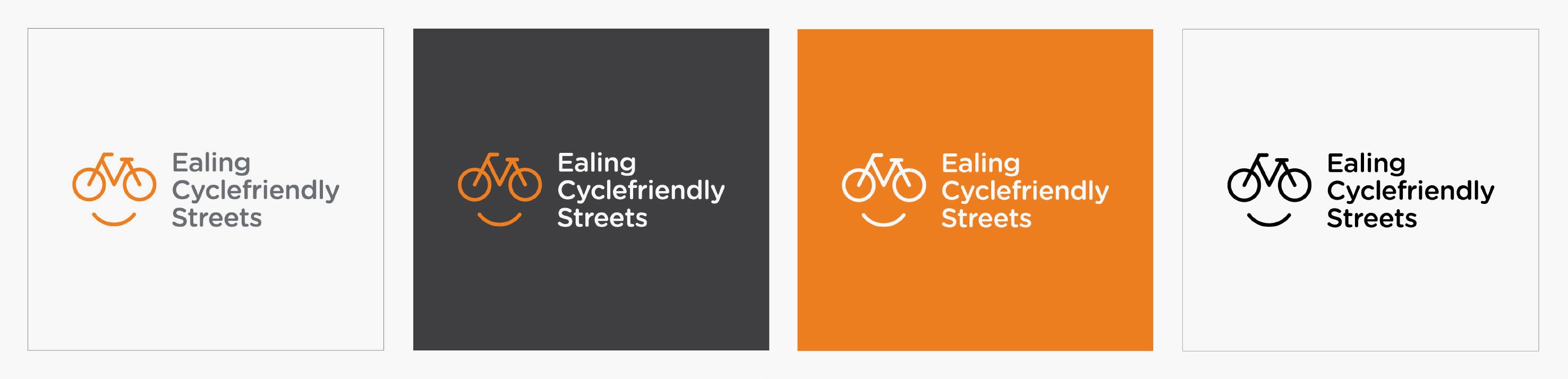
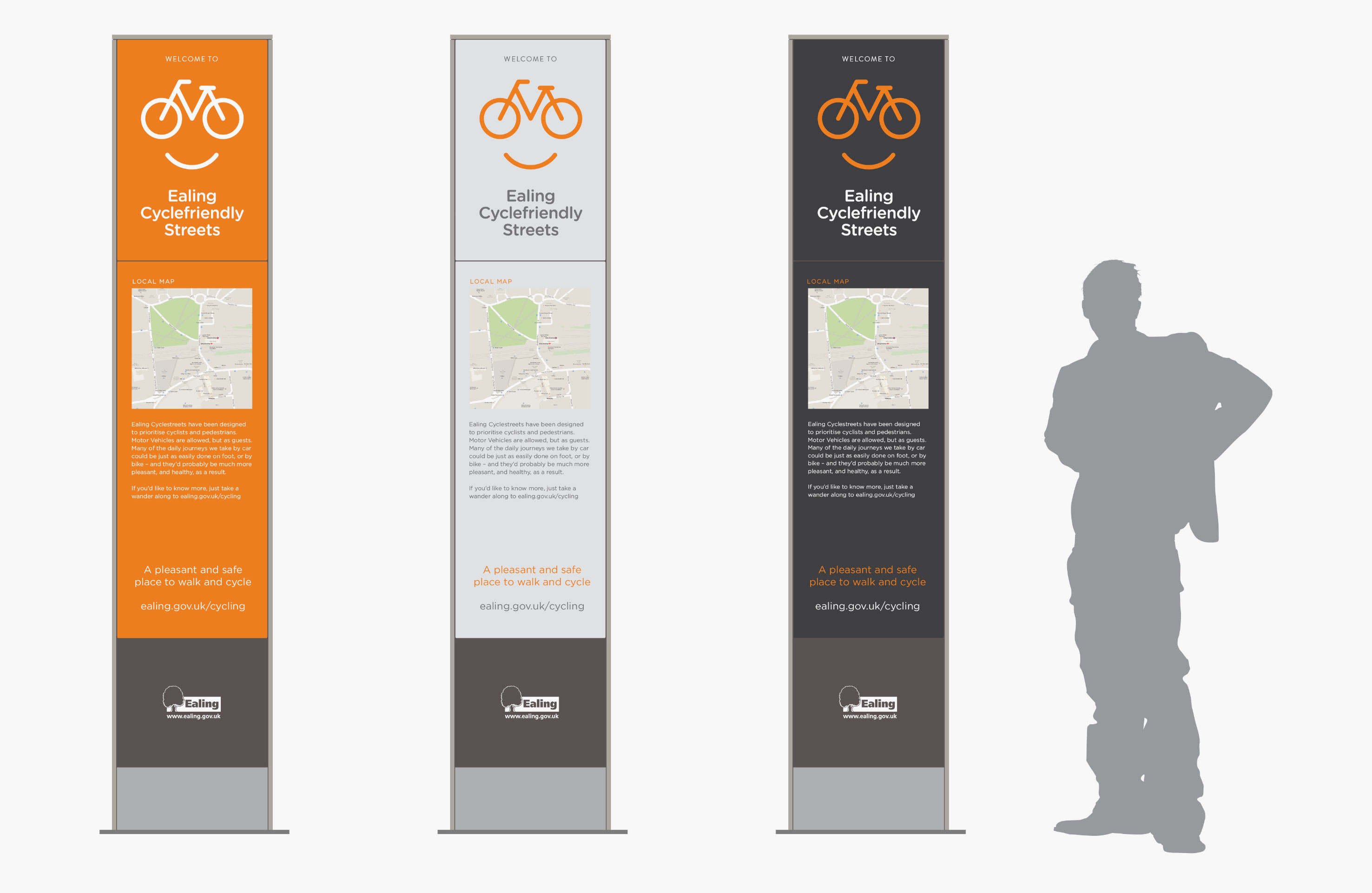
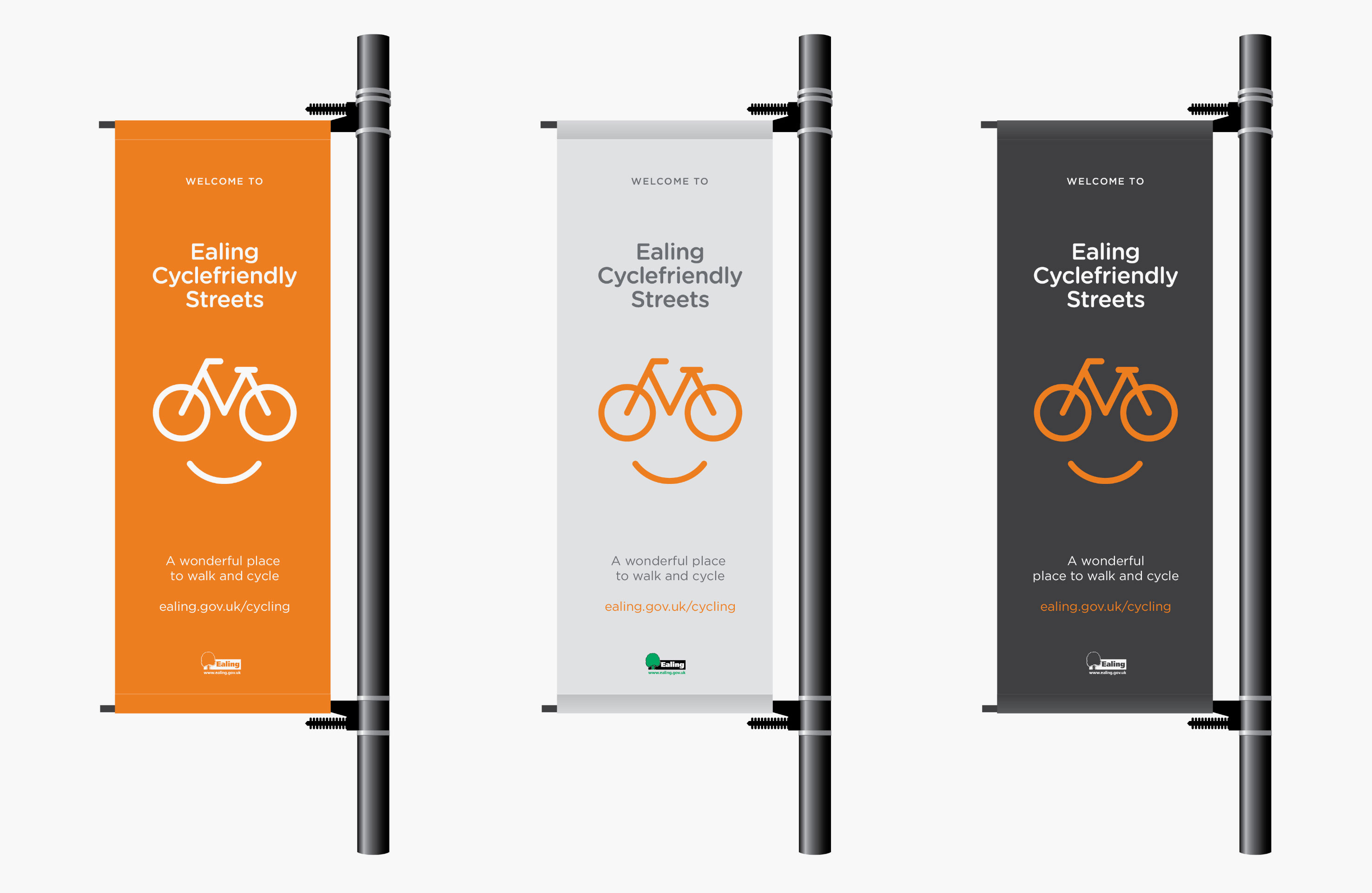
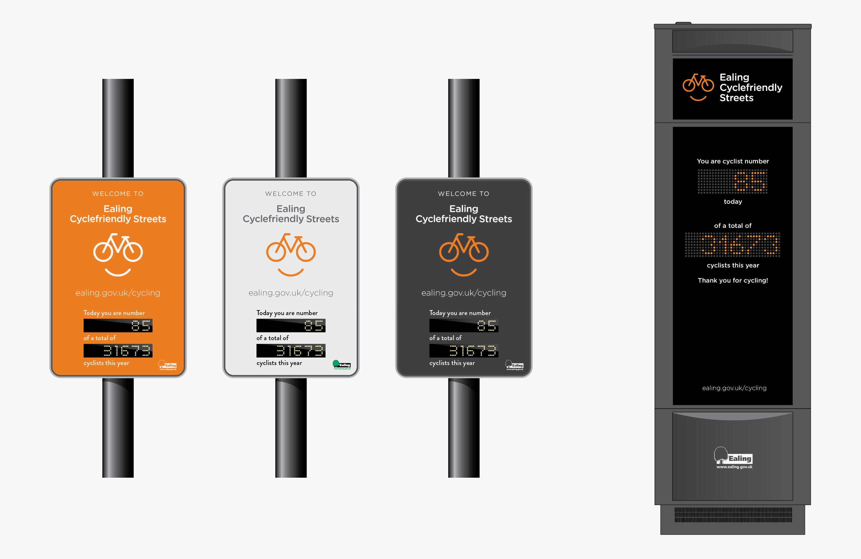
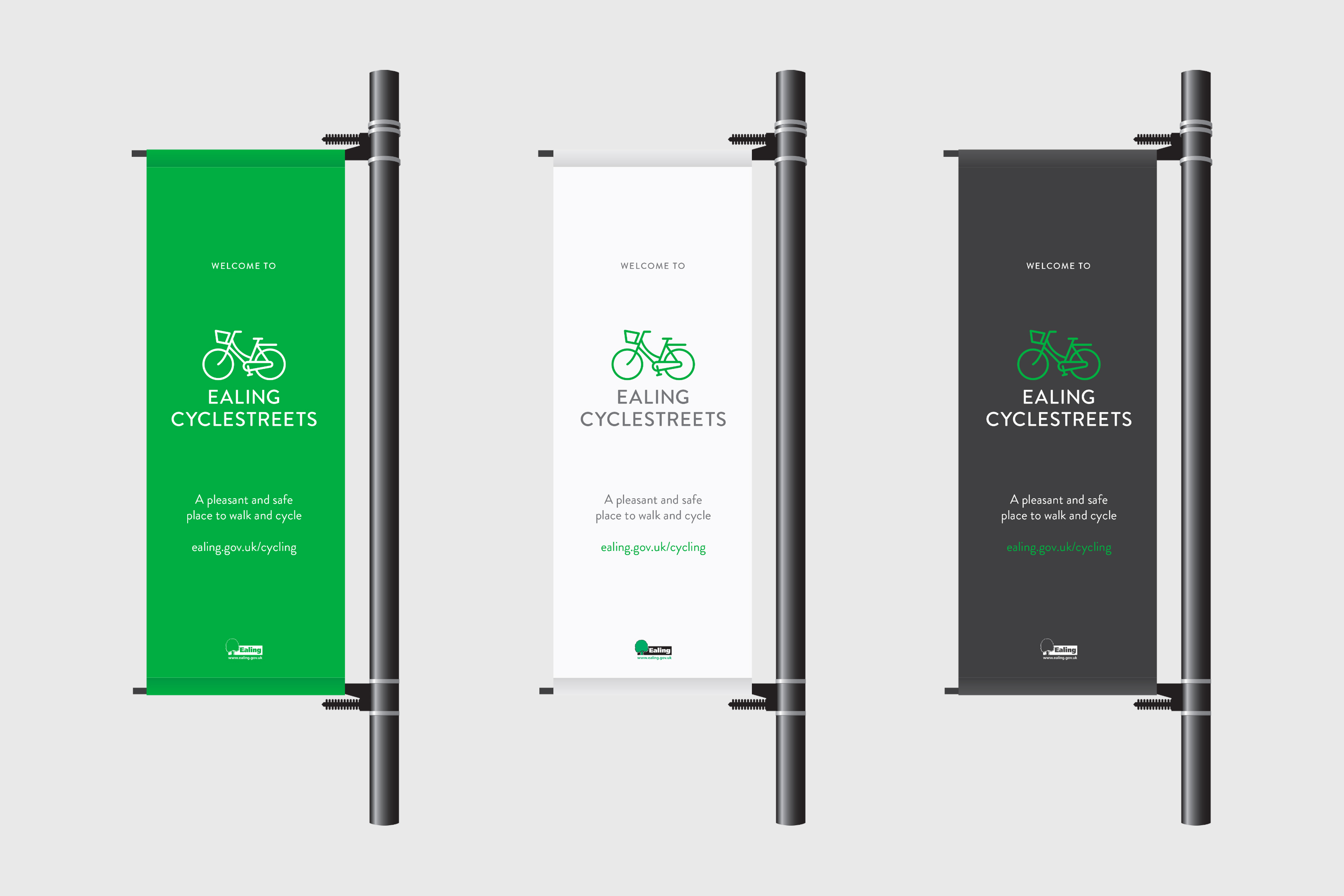
Ealing cycle routes proposal

Project Type:
Branding | Environmental

Client:
Ealing Council

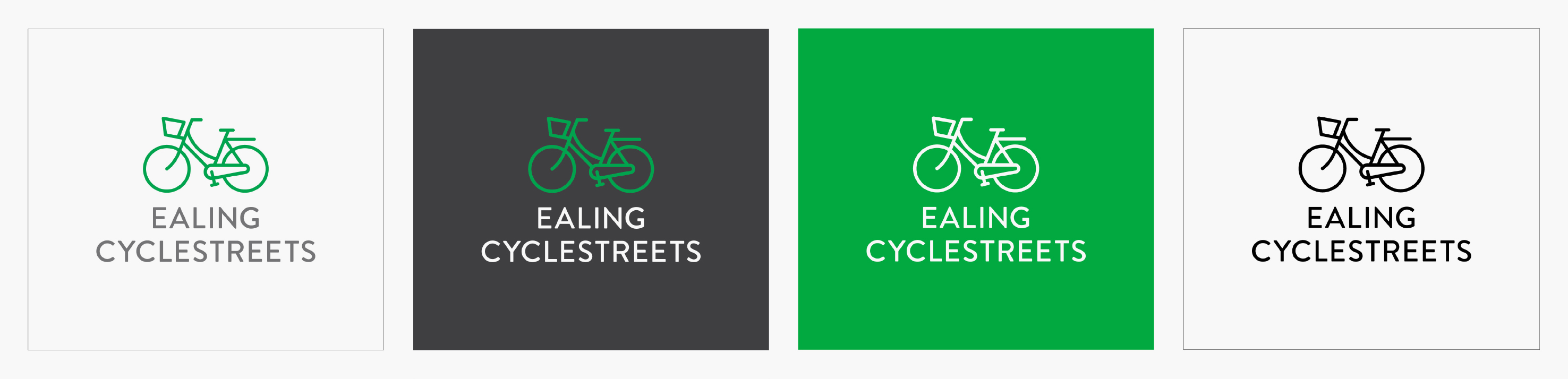
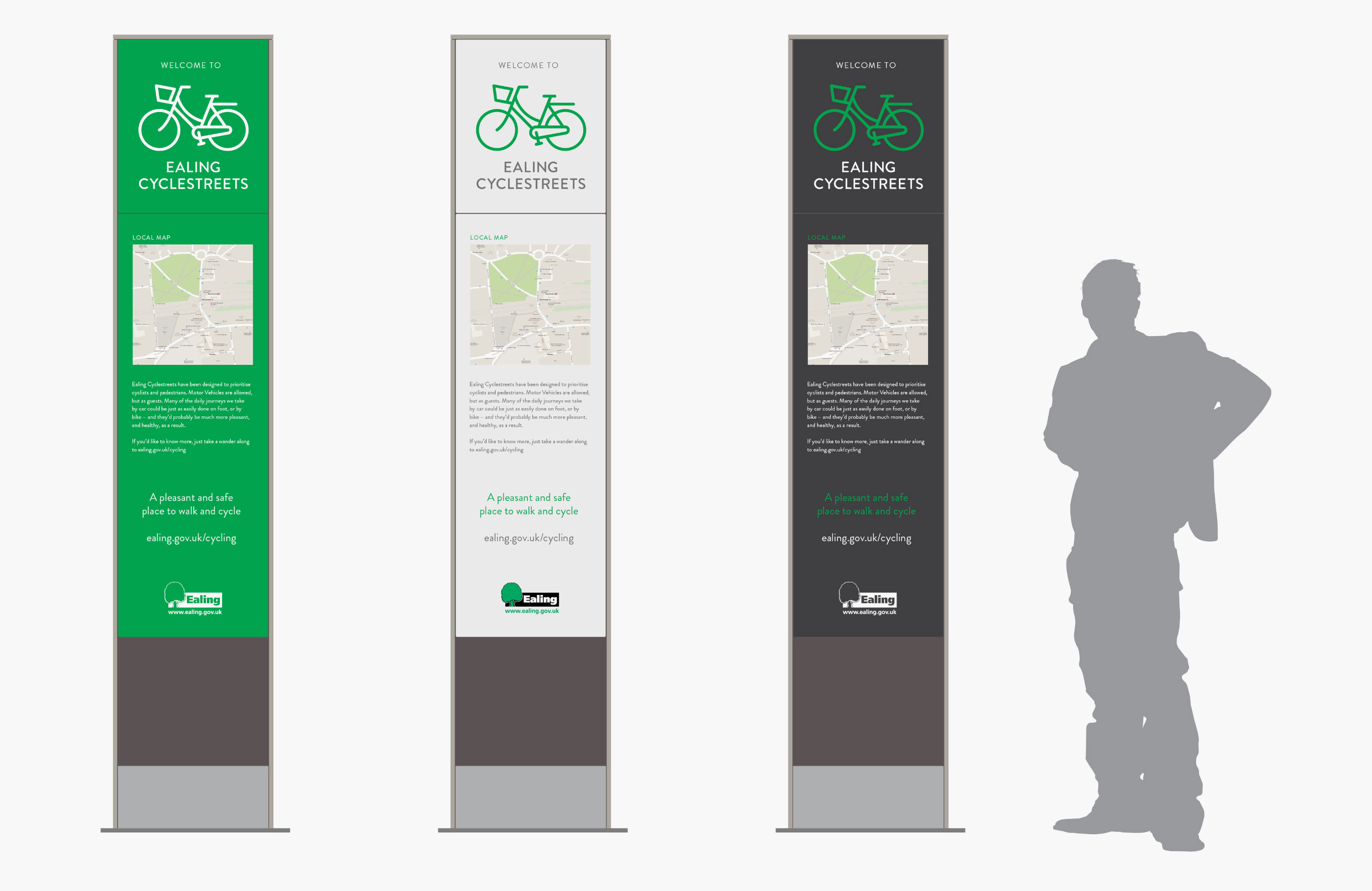
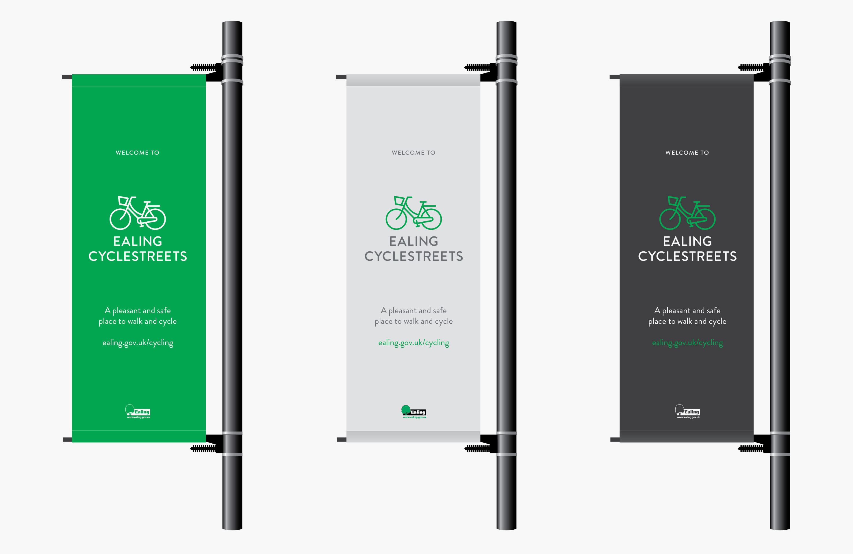
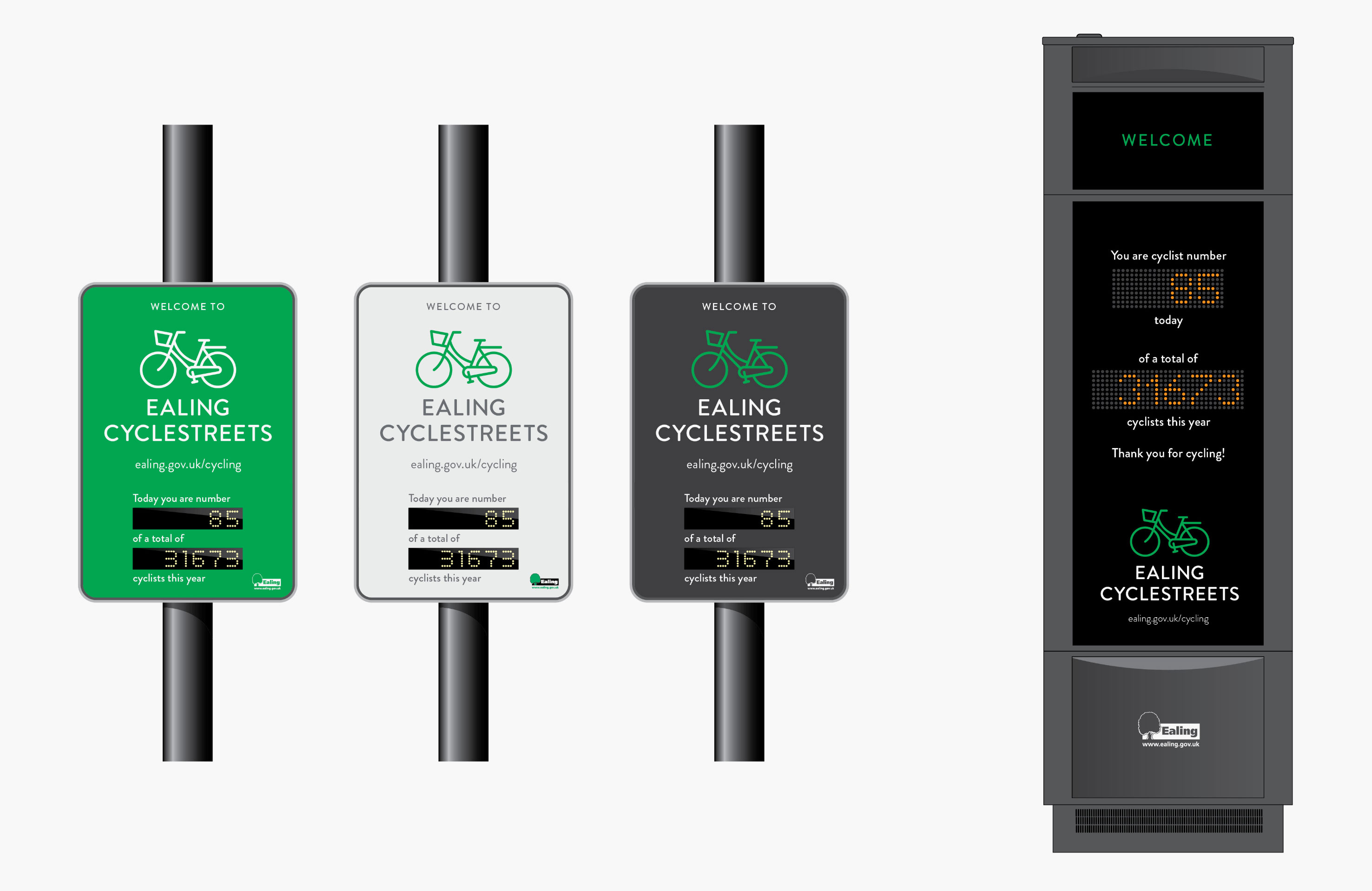
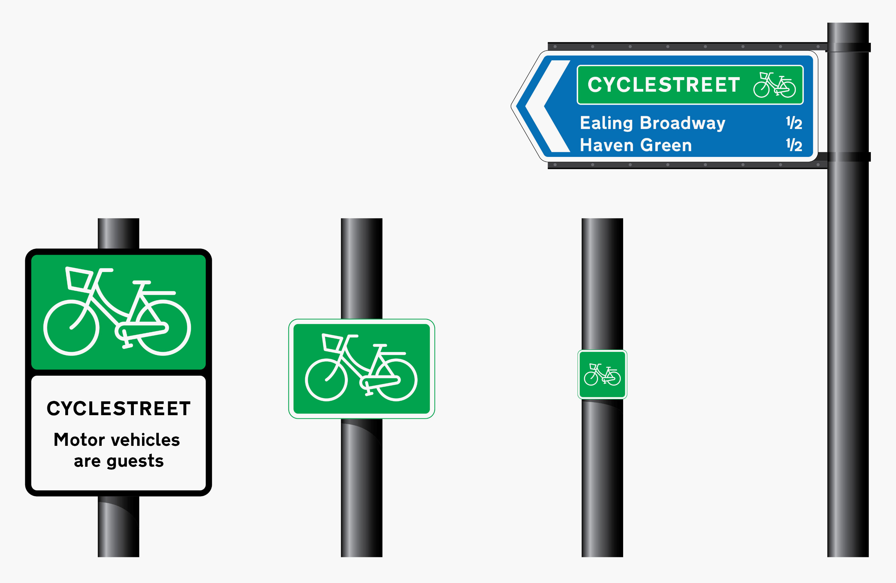
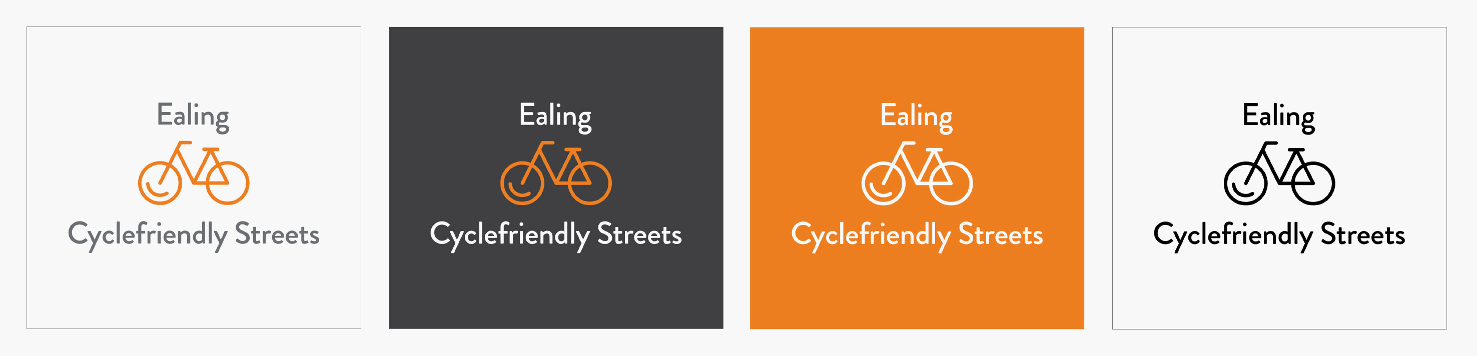
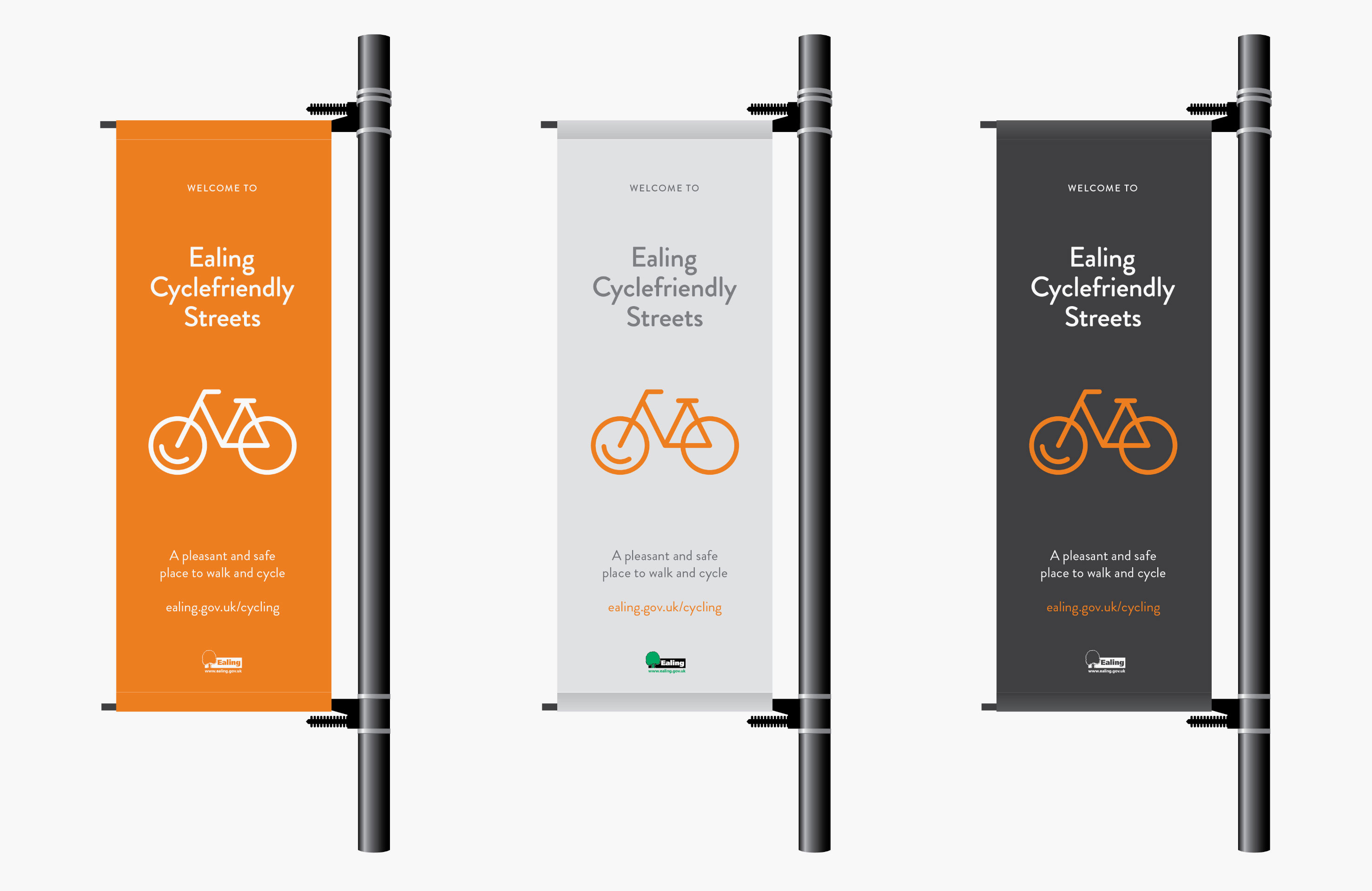
Back at the beginning of 2015, working with the wonderful London Cycling Campaign, I was asked to put together a proposal for the naming, identity and signage for a set of cycle routes in the London Borough of Ealing.

In the end, the project evolved in a different direction, so the work didn’t go ahead, but I think it had real merit so is worth sharing here.

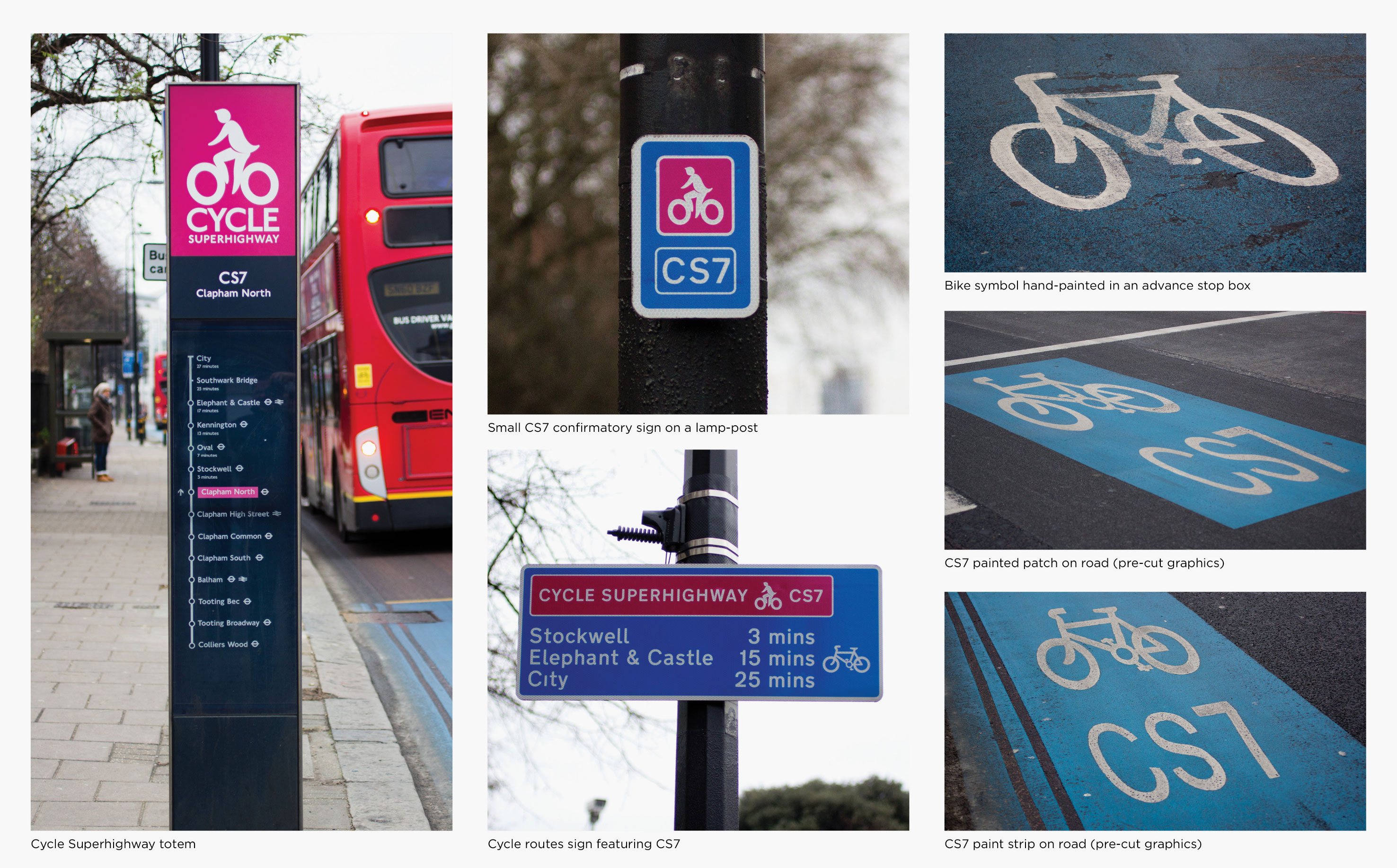
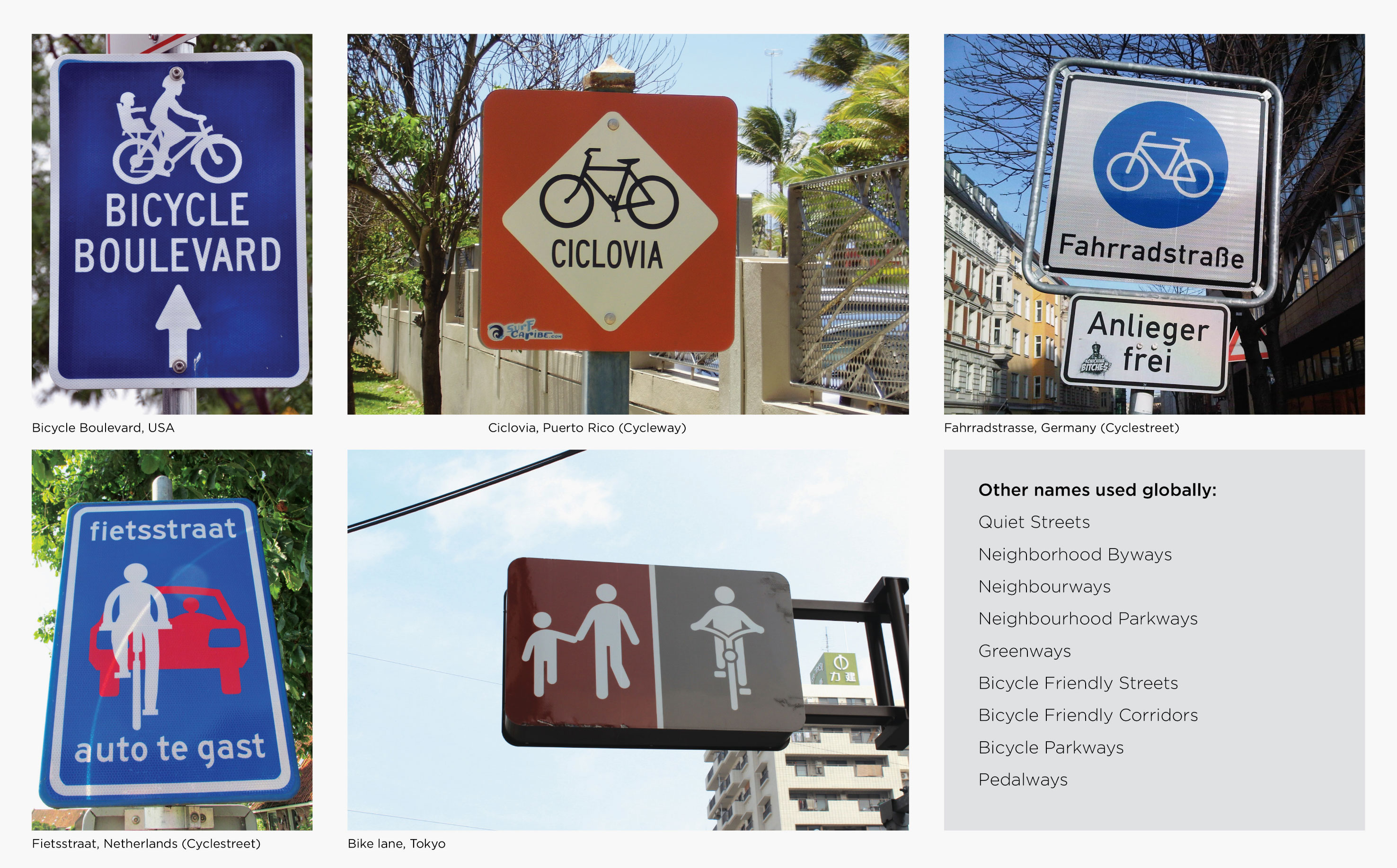
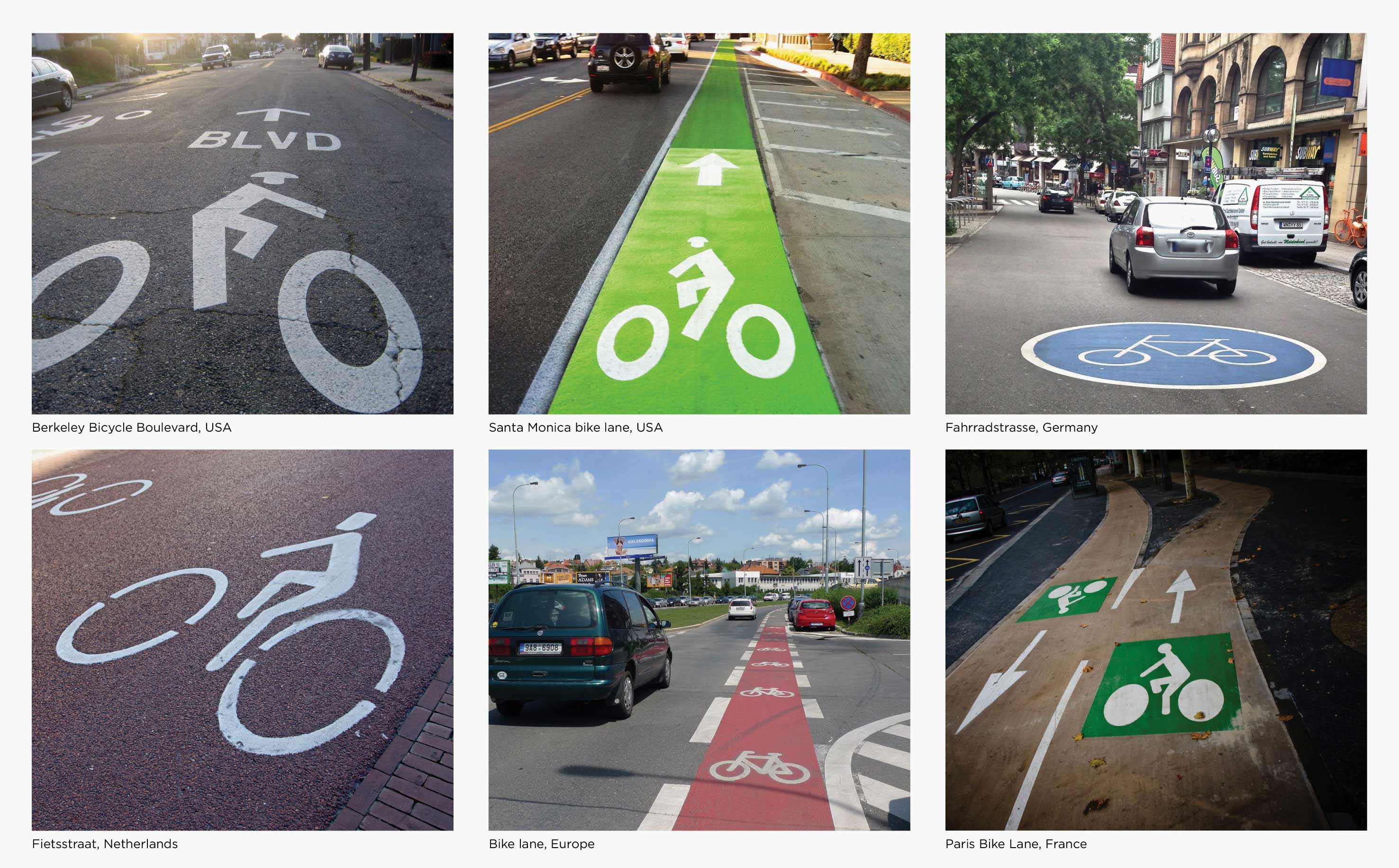
To prepare for the work, I researched the naming, identities and signage of cycle routes in London and further afield.

LCC_Ealing_presentation23
LCC_Ealing_presentation24
LCC_Ealing_presentation25
 

From this research, I created a naming matrix, to demonstrate the different possible combinations of words that could be used for the cycle routes. From these we narrowed the options down to Ealing Cyclestreets, and Ealing Cyclefriendly Streets. Based on these I put together three identities.

For the first I drew a simplified utilitarian bike – something a new cyclist might use to do their local shopping if the right cycling infrastructure was in place. I set it in Ealing’s brand colour of green, and paired it with friendly geometric sans serif lettering.

LCC_Ealing_presentation29
LCC_Ealing_presentation210
 

As well as the identity, I put together designs for various types of signage. These included monoliths – vitreous enamel signposts with local information; branded lamp post banners; digital cycle counters; and additional on-street signage.

LCC_Ealing_presentation211
LCC_Ealing_presentation212
LCC_Ealing_presentation213
LCC_Ealing_presentation214
 

For the second route, I reduced the bicycle to its purest forms: two circles, three triangles, and three extra lines. A contemporary update of the bicycle used on UK roadsigns. I then added in a subtle smile to the front wheel – because cycling these streets should make you happy. The single line also suggested the gentle rotation of  the wheel. The warm orange colour was taken from Ealing’s TravelSmart campaign. The lowercase typesetting and rounded typeface emphasised the friendliness of the name.

LCC_Ealing_presentation216
LCC_Ealing_presentation217
LCC_Ealing_presentation218
LCC_Ealing_presentation219
LCC_Ealing_presentation220
 

For an alternative to that design, I really wanted to create a smiling bike. However, after putting a few designs together, I found out that a cycling advocacy organisation in the United States, People for Bikes, was already using a similar identity. Fortunately, bike people like to share, so I got in touch with the organisation to ask permission to work from the same concept – and they were more than happy for me to do so. The bike I designed was simplified, with even line weight, and no chainstay. A happy, smiling bike, paired with a rounded typeface that matched the illustration style.

LCC_Ealing_presentation223
LCC_Ealing_presentation224
LCC_Ealing_presentation225
LCC_Ealing_presentation226
LCC_Ealing_presentation227
 

Unfortunately, as I mentioned, the project evolved in a different direction. It’s always a shame when a project doesn’t go ahead – particularly one with a happy smiling bike – but perhaps one day it’ll get to go out for a spin…