Expedition Engineering
Expedition is an award-winning, and refreshingly innovative, civil and structural engineering firm in London, and they asked me to put an identity together for them.
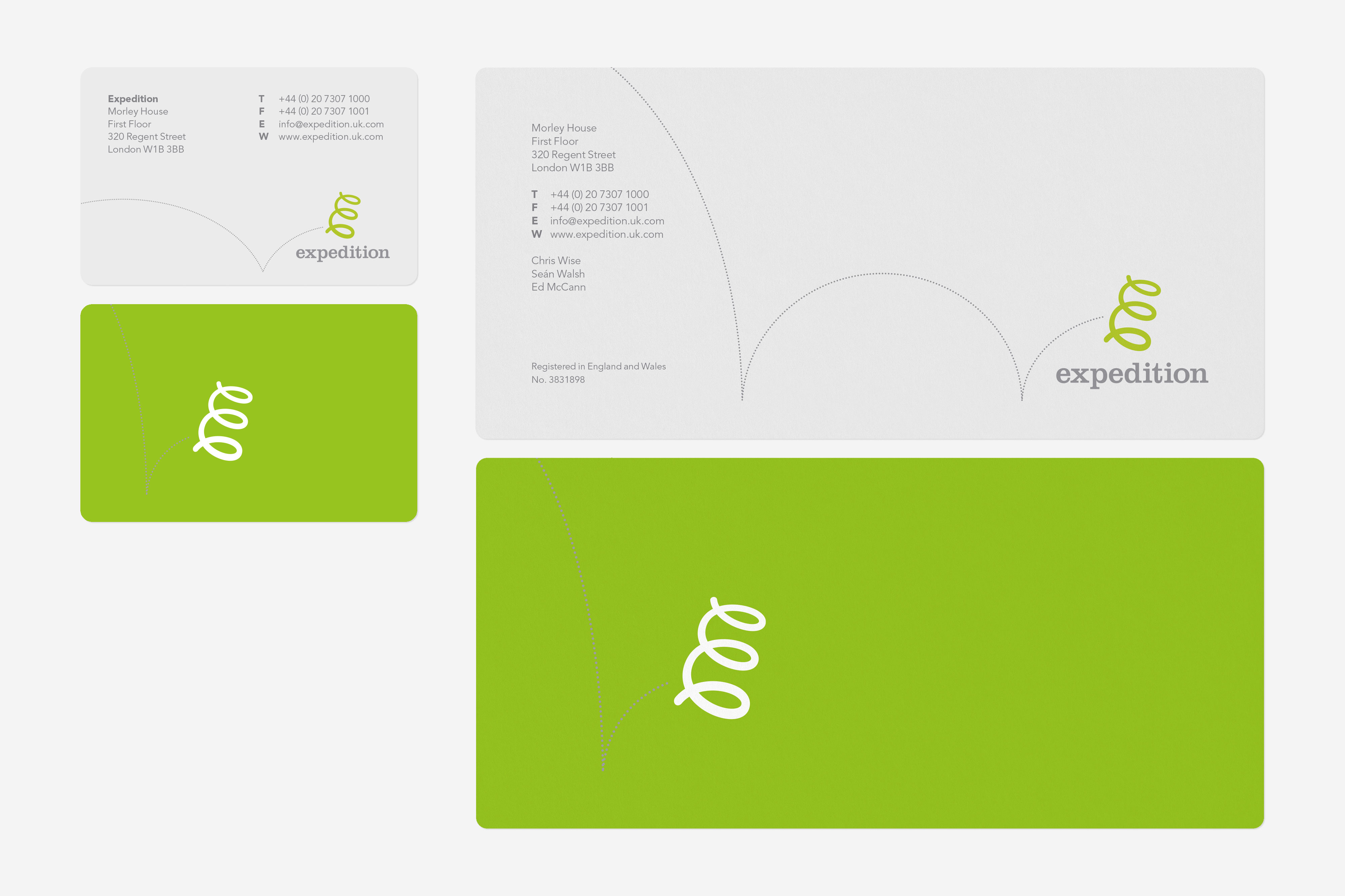
I created a logo that is part letter E, part bouncing spring; and then hooked that up with a logotype set in Clarendon, a slab-serif typeface created around the time Isambard Kingdom Brunel was doing his thing. The house typeface is Avenir, chosen because of the way it combines clarity with a sense of warmth. The E bounces across all their printed material, each time bouncing across in a slightly different way.