work blog about search


Hawkland type specimen

Project Type:
Print

Client:
Jeremy Tankard Typography

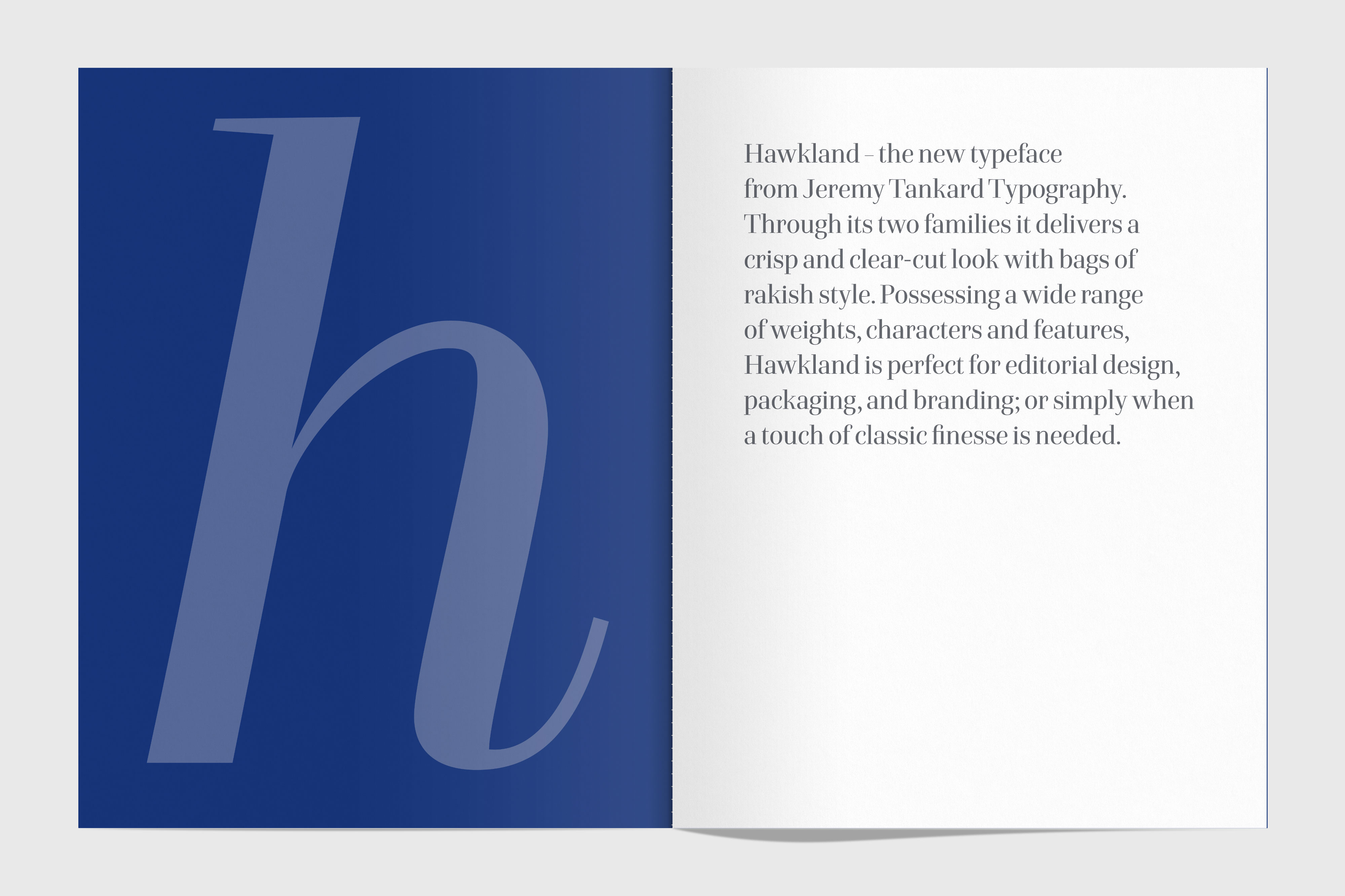
Hawkland is a beautiful, elegant new typeface from Jeremy Tankard Typography.

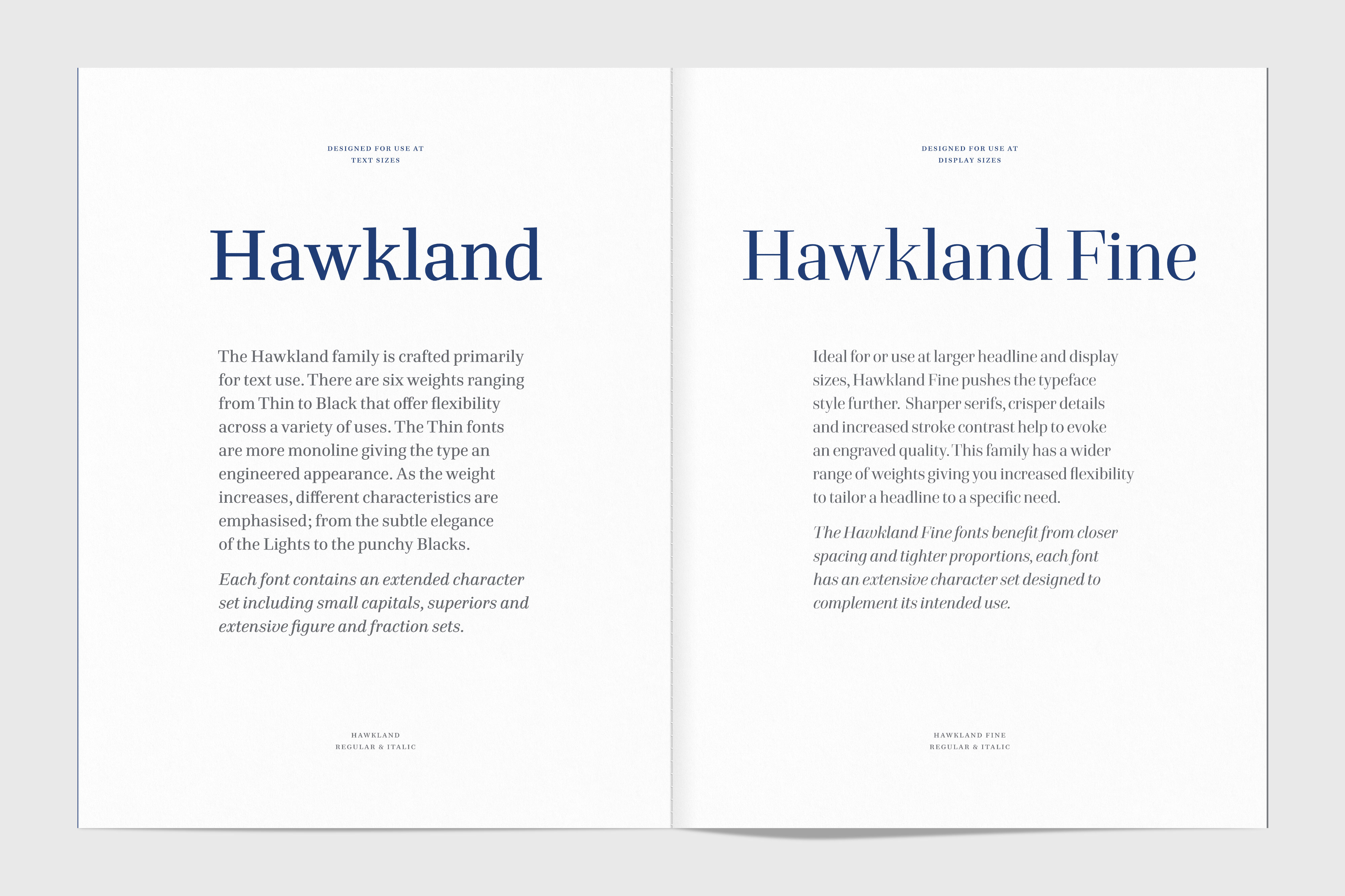
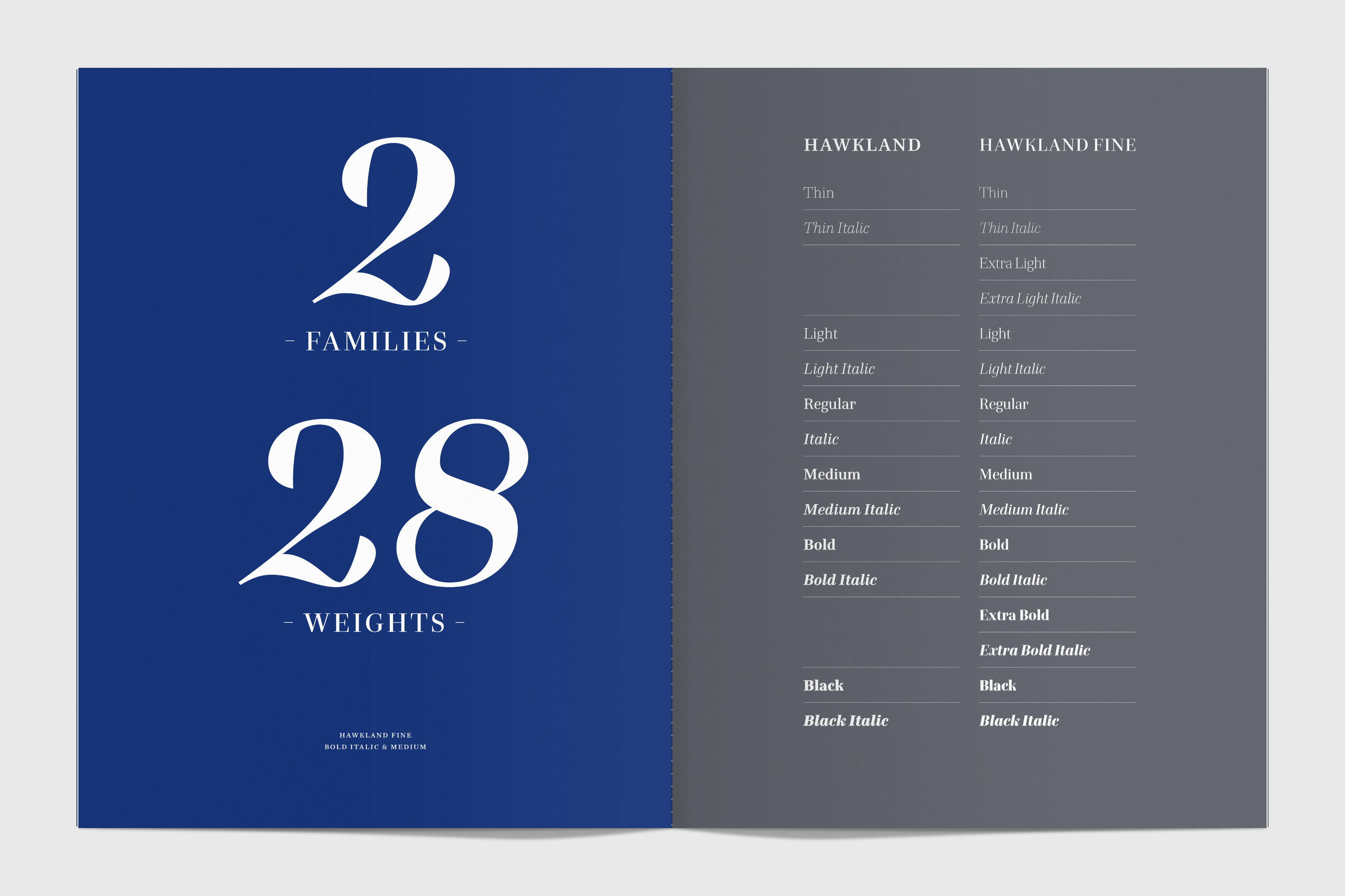
It’s based on a typestyle that appeared in the second half of the 18th century, which later became known as Transitional. It’s a typeface of two families – one designed for use at text sizes, the other, with a slightly higher contrast of stroke widths, for use at display sizes. Overall there are 28 weights, making Hawkland a truly versatile typeface.

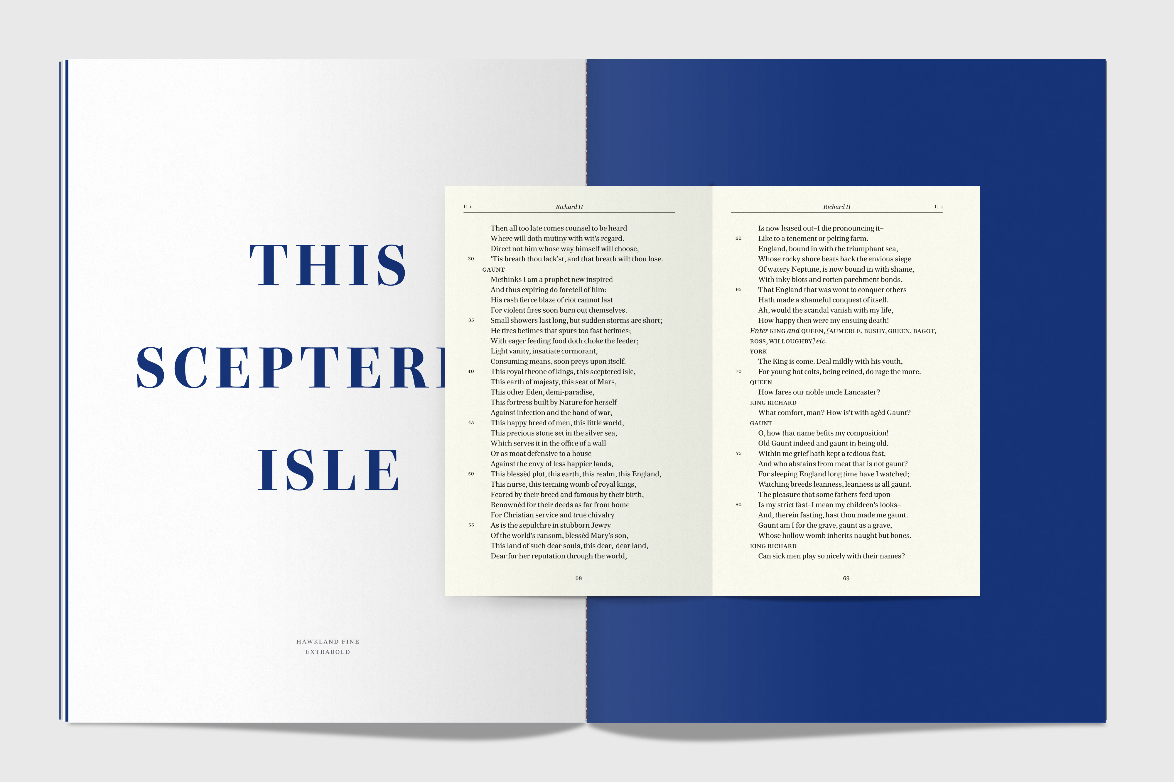
Jeremy asked me to design a specimen for the typeface, and he had something truly special in mind. I visited him at his Cambridge studio, where he showed me a staggering collection of books and journals from his typographic library. Some of these featured tip-ins (a separate item that’s glued in to a larger publication) to show the use of a typeface, illustration or print process. They give a unique hand-crafted feel to the final product.

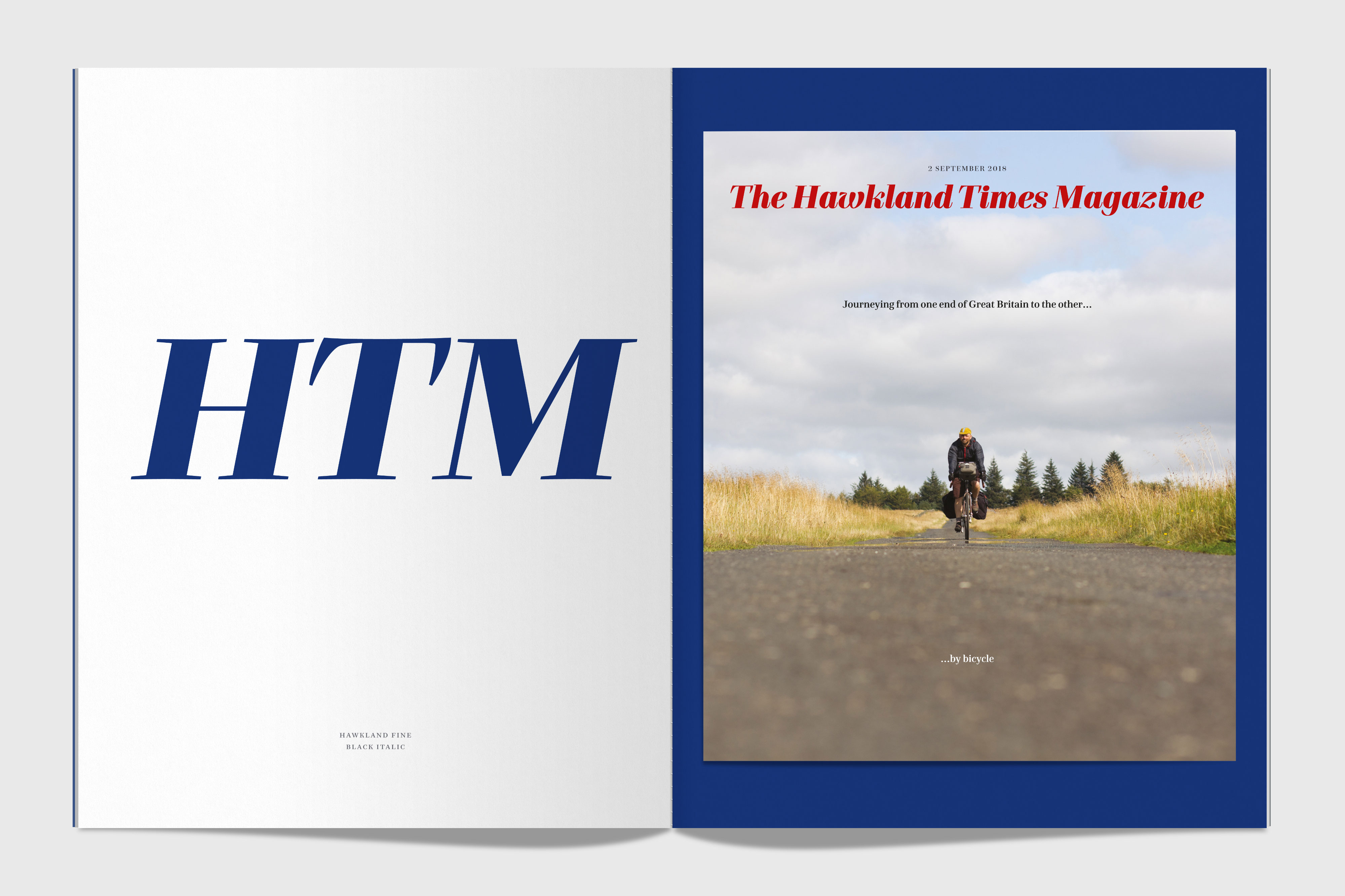
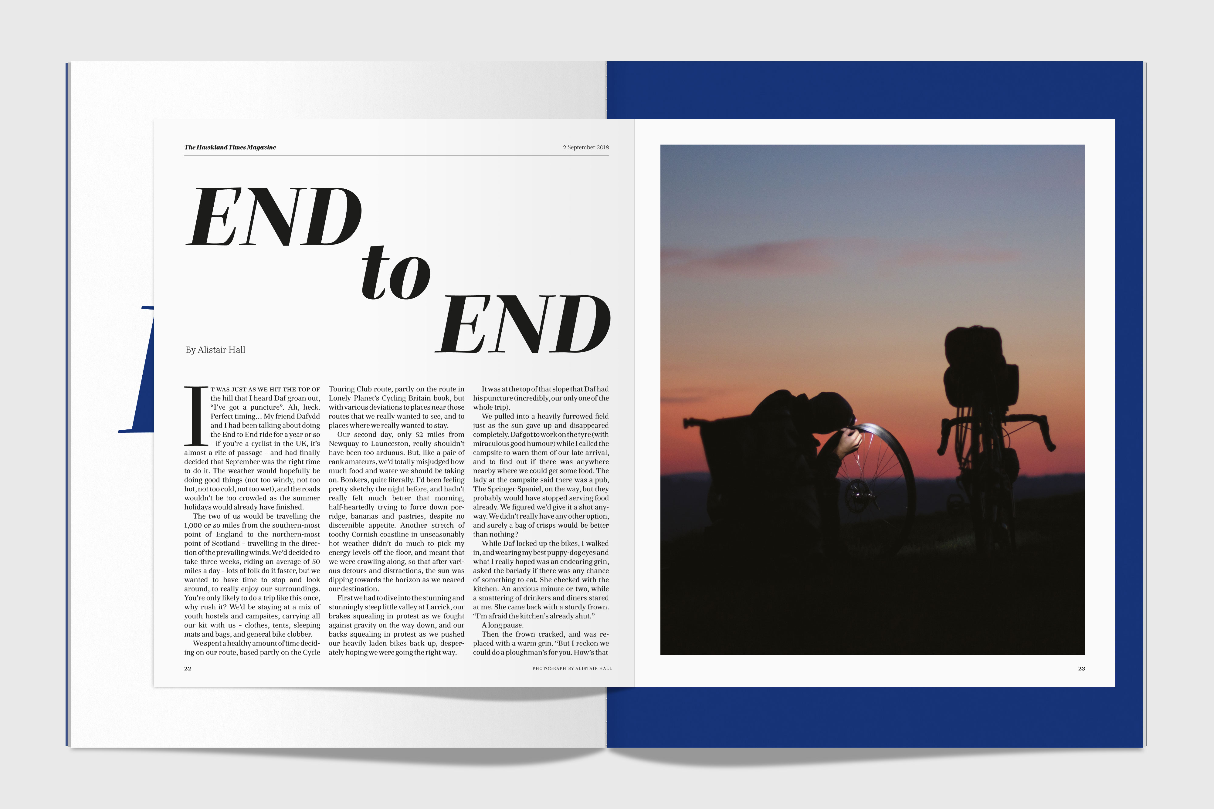
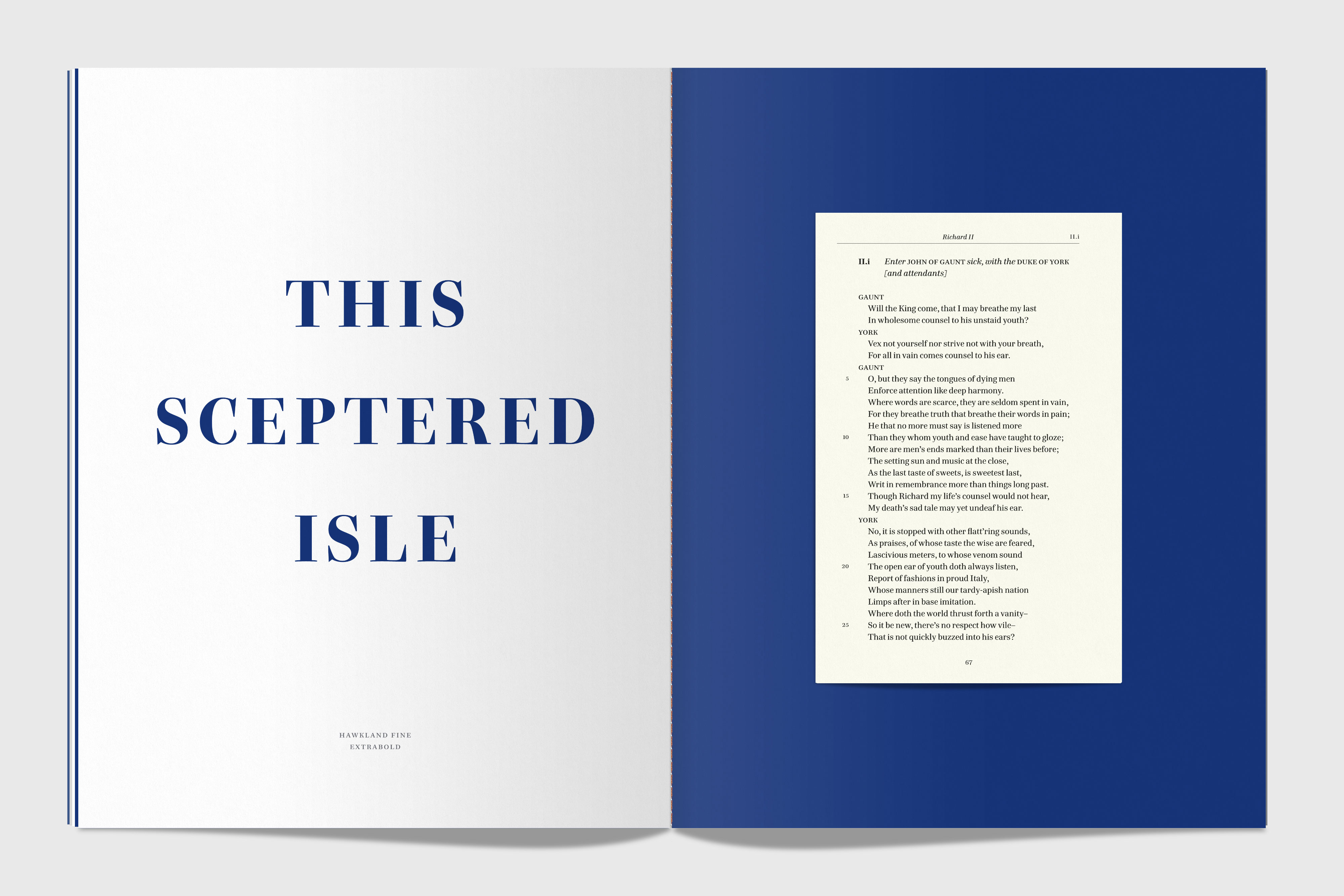
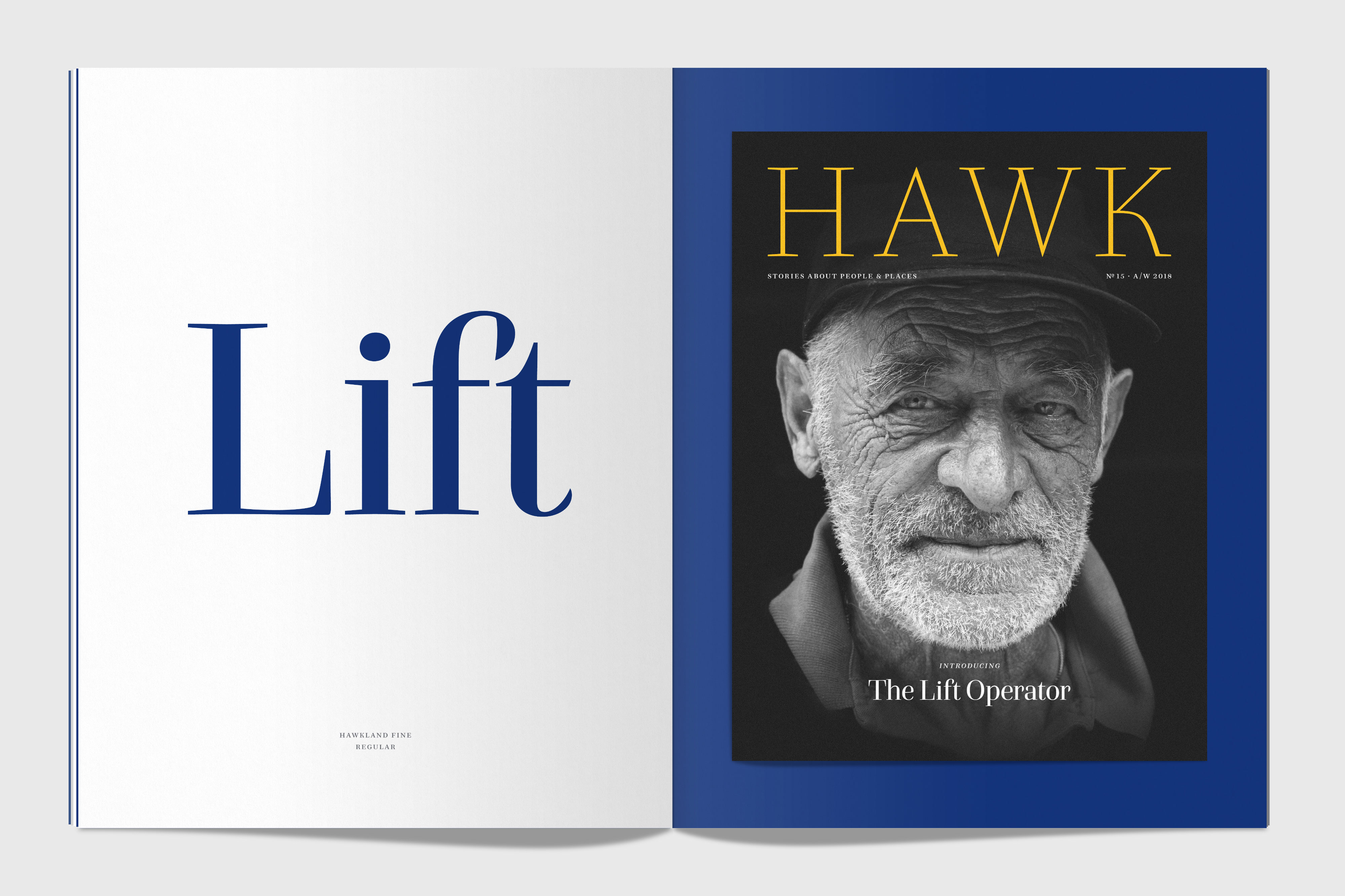
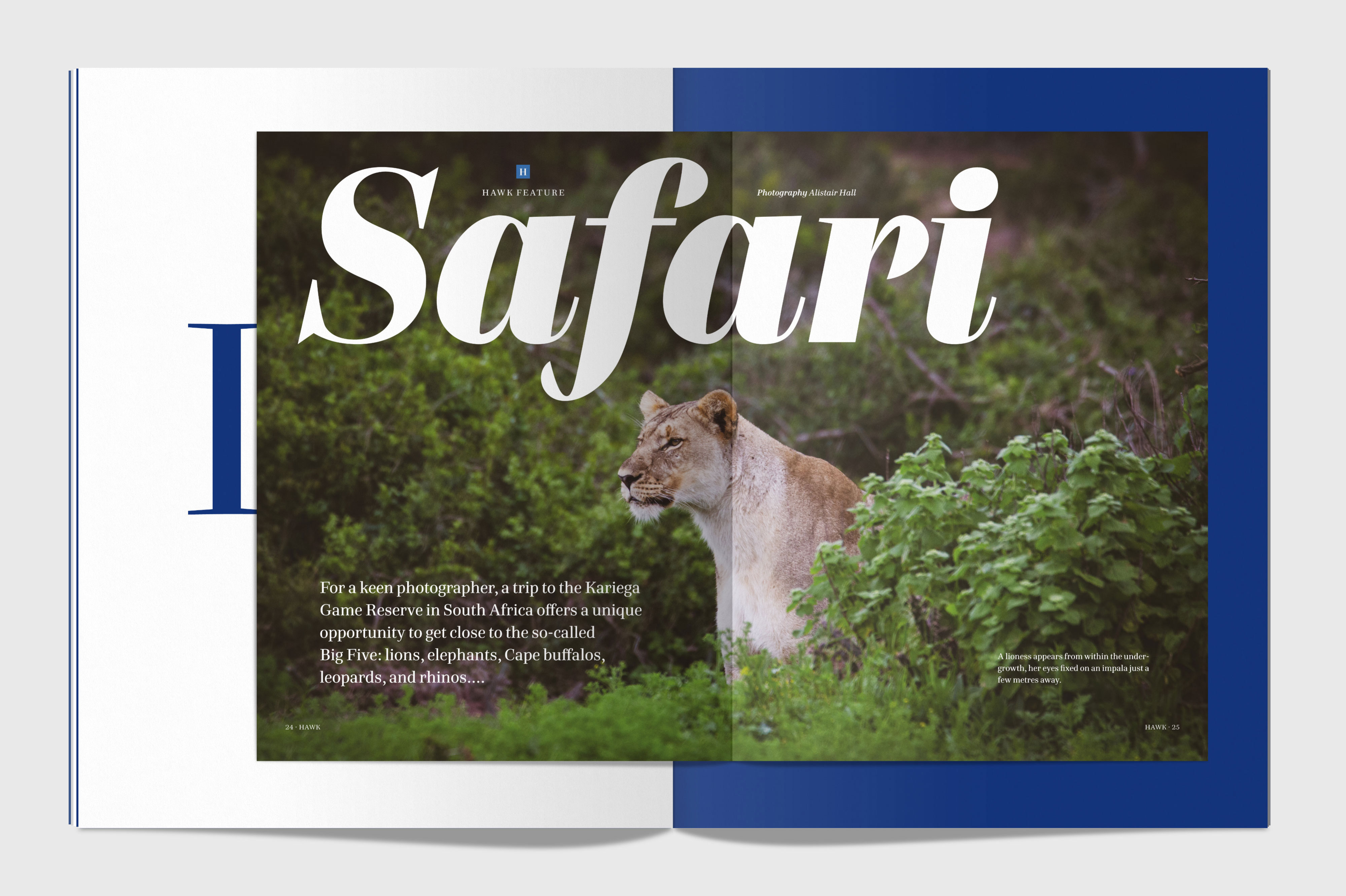
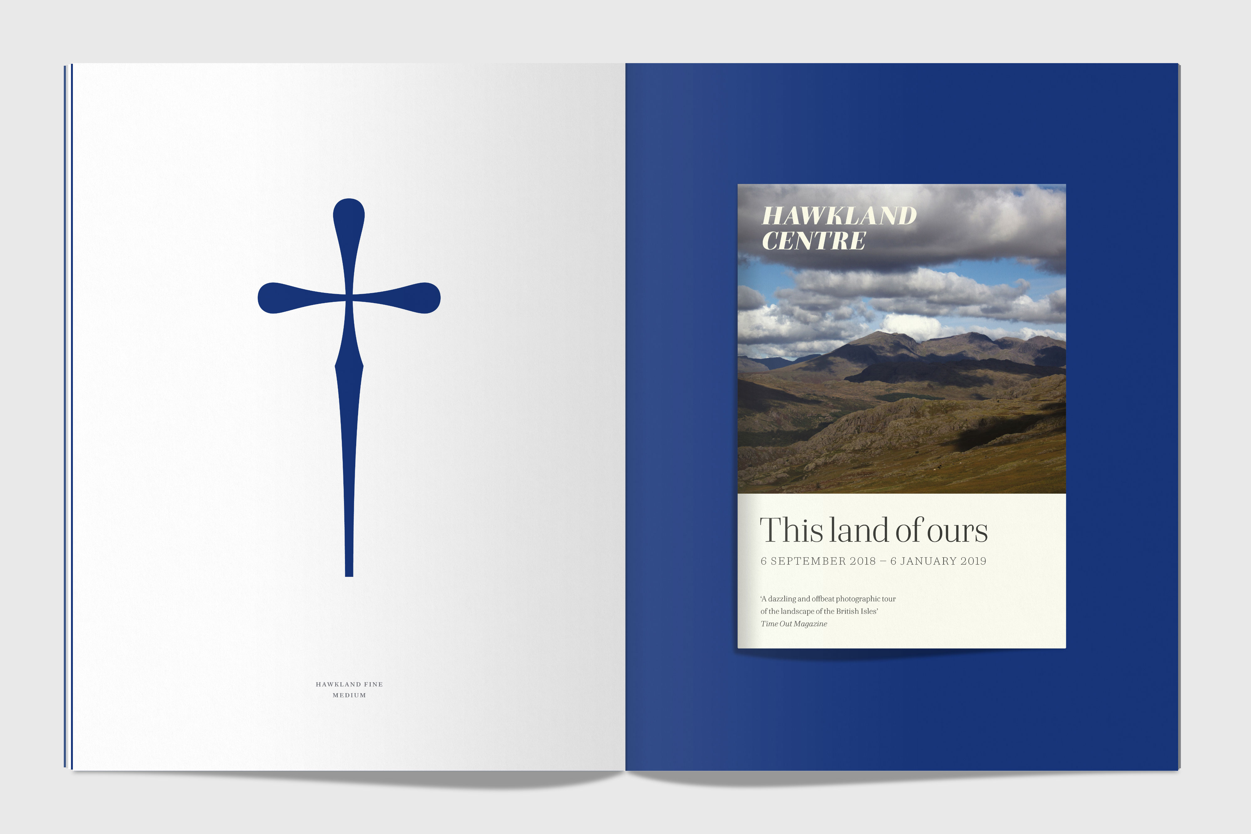
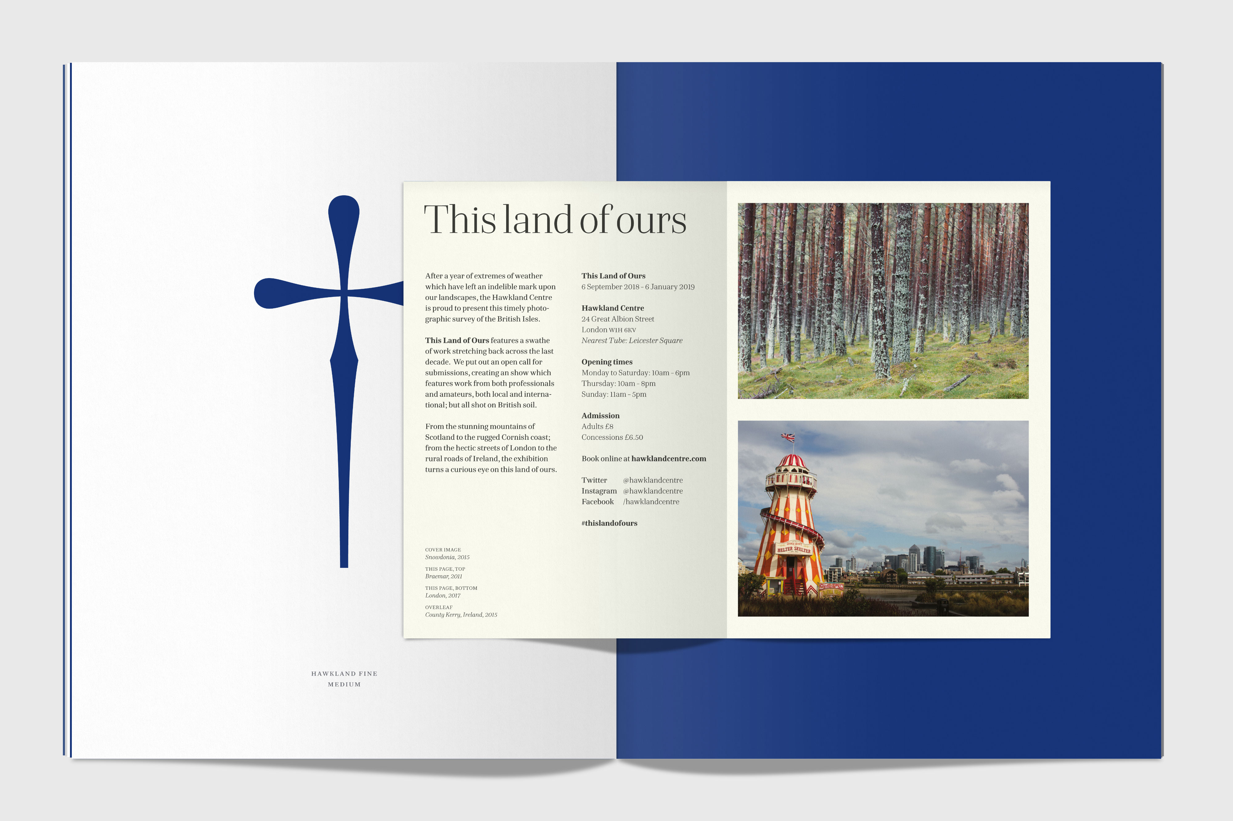
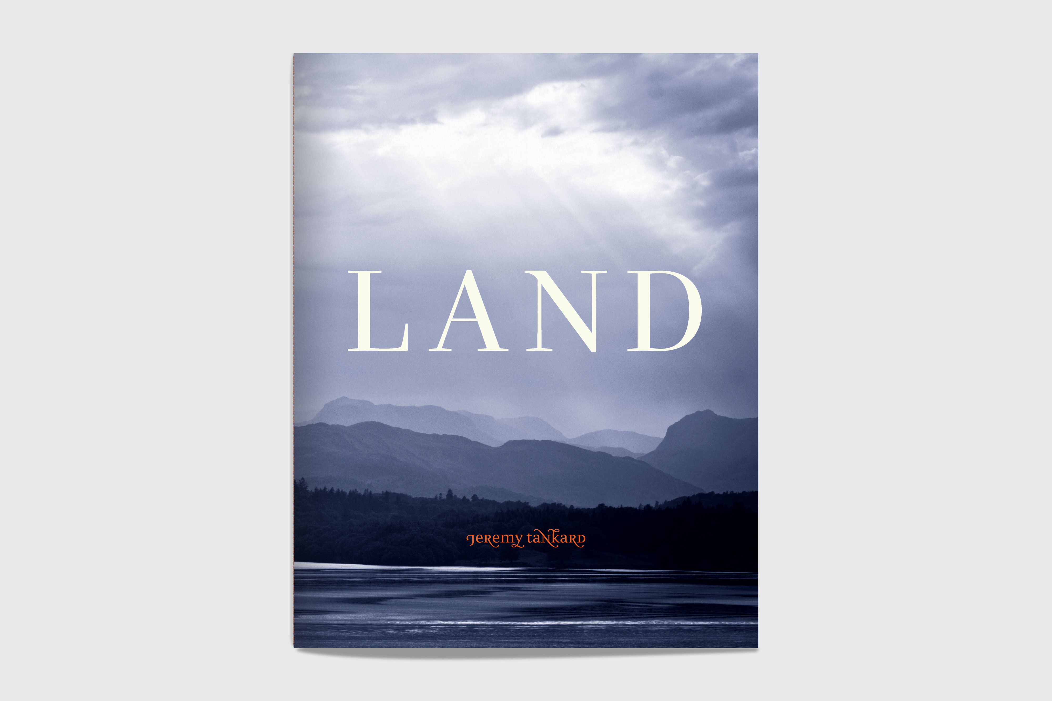
We decided to theme the specimen around the concept of ‘land’, and to include full size examples of the typeface in use in hypothetical publications: a newspaper supplement, a book, a magazine, and a leaflet. Having those full size meant creating a specimen of considerable proportions, with spreads that open to over half a metre wide!

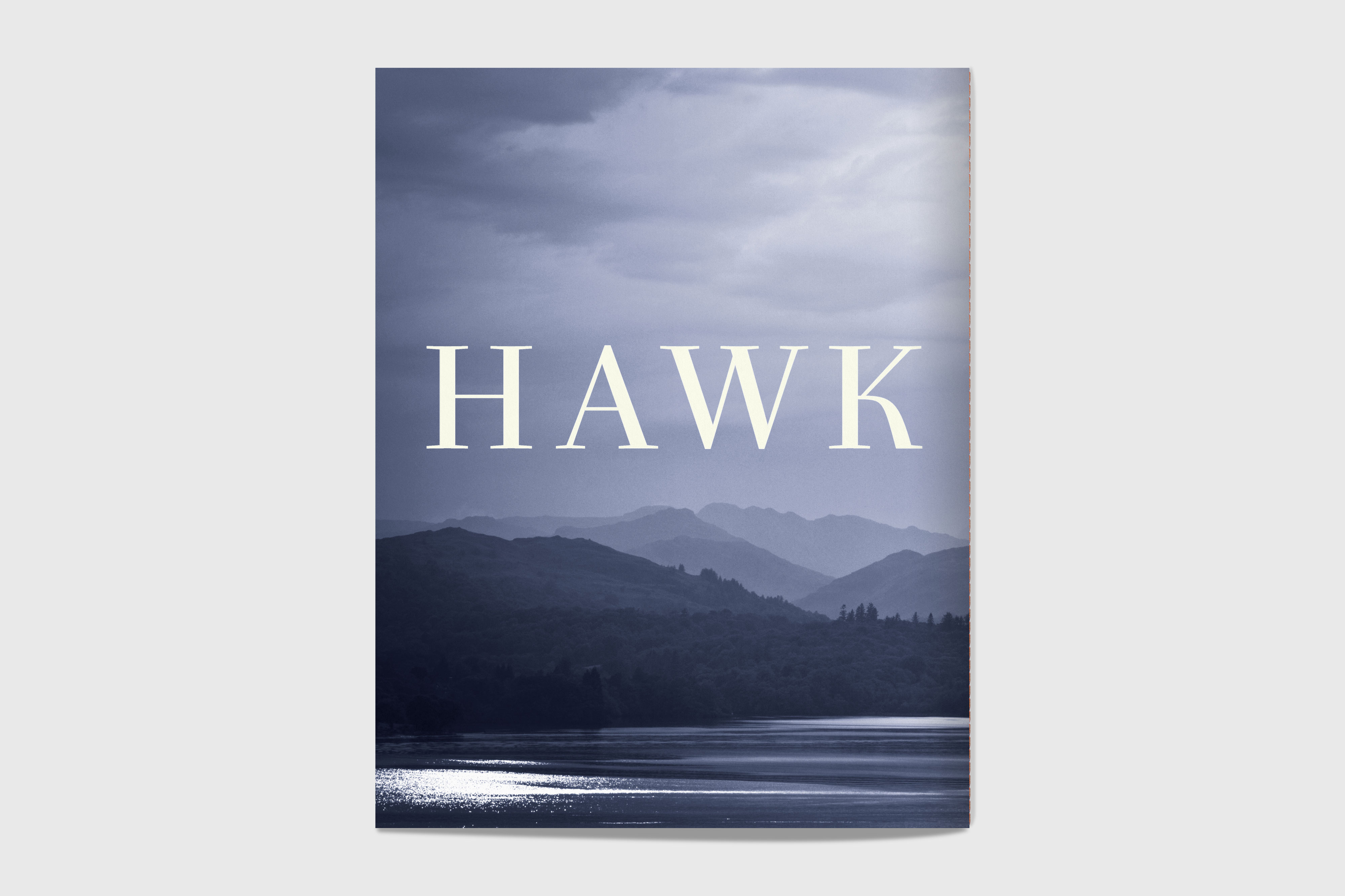
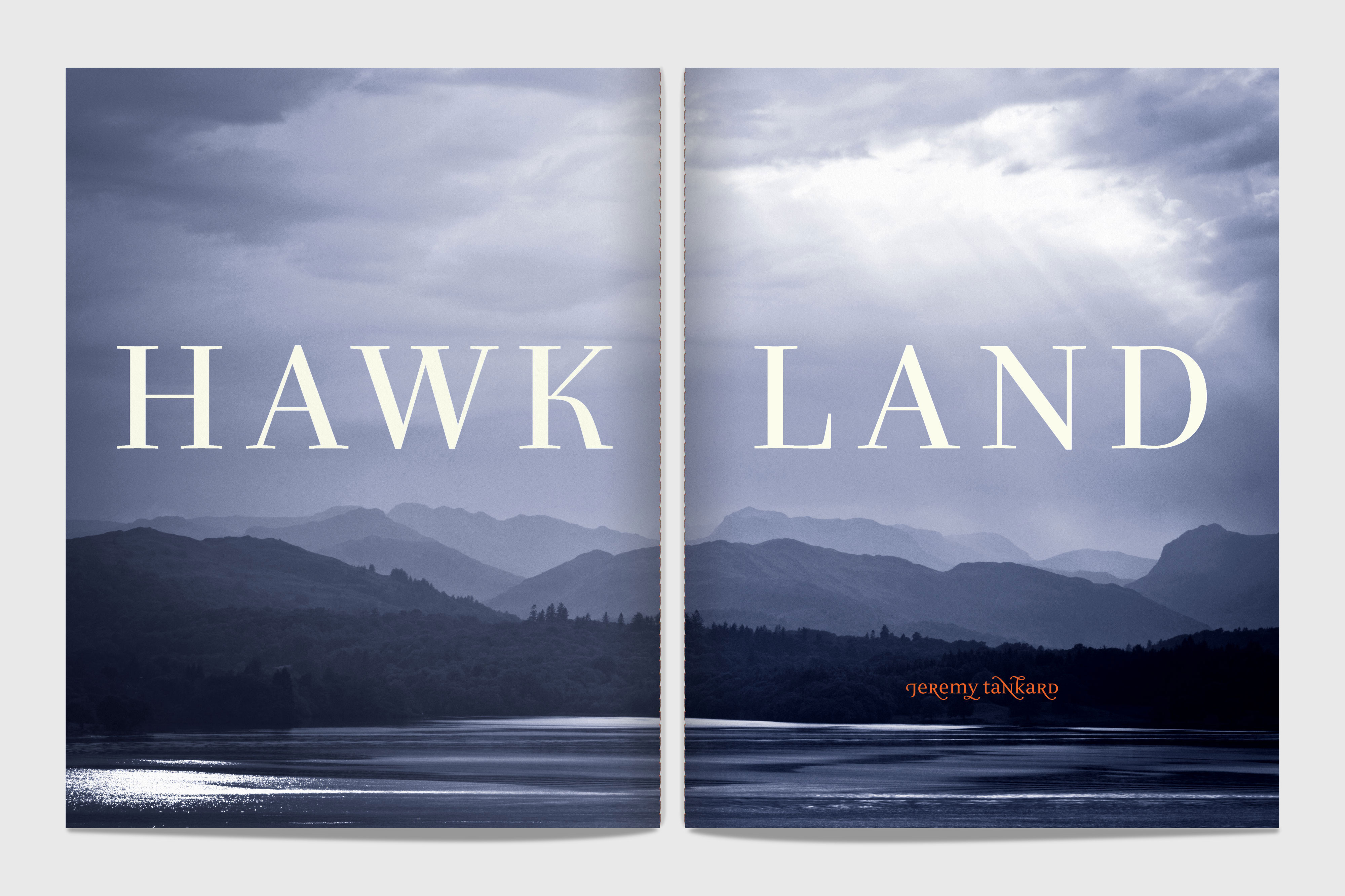
The cover features a photograph I shot of Lake Windermere. The image is a tritone, printed with three spot colours, with the typeface name and the foundry name foil-blocked, in white and orange. The whole booklet is thread-sewn, adding to the feeling of a truly hand-crafted piece.

Hawkland_specimen_layered-BC
Hawkland_specimen_layered-full-cover
Hawkland_specimen_layered-1
Hawkland_specimen_layered-2
Hawkland_specimen_layered-3
Hawkland_specimen_layered-4
Hawkland_specimen_layered-5
Hawkland_specimen_layered-10
 

The first tip-in is The Hawkland Times Magazine, styled like a Sunday newspaper supplement. It features text and photographs from a trip I made a few years back with a friend, across England, Wales and Scotland, cycling from Lands End to John o’ Groats.

Hawkland_specimen_layered-6
Hawkland_specimen_layered-6b
 

The second tip-in showcases the typeface in a classic text setting: Act II, Scene i of Shakespeare’s Richard II, which features John of Gaunt’s powerful speech about England, ‘this sceptered isle’.

Hawkland_specimen_layered-7
Hawkland_specimen_layered-7b
 

The third tip-in shows the type used in a wide range of weights, in Hawk – a magazine which covers stories about people & places.

Hawkland_specimen_layered-8
Hawkland_specimen_layered-8b
 

The fourth tip-in is an A5 leaflet which folds out to an A3 poster. It’s for an arts venue, the Hawkland Centre, and a hypothetical photographic exhibition called ‘This land of ours’. I used photographs I’d taken in Snowdonia, Braemar, London and County Kerry to illustrate this, and showed the versatility of the type, using it at a wide range of sizes and weights.

Hawkland_specimen_layered-9
Hawkland_specimen_layered-9b
 

The booklet also features ‘Shaping Hawkland’, the full design story of the typeface, exploring the various inspirations as well as detailing the design process.

Hawkland_specimen_layered-11
 

The specimen has only been produced in a limited edition of 125 copies, making it truly covetable.

We printed it three-colour litho for the main booklet, and digitally for the tip-ins. We hunted around for a printer who could really get the best from the type, and selected Westerham, whose meticulous attention to detail meant that the type looks beautifully crisp even at the smallest sizes. It’s printed on a range of stocks from GF Smith, with each different stock for the tip-ins chosen to be as close to the real thing as possible.

You can buy Hawkland here, buy the specimen here, and read more about the design of Hawkland over here.