Poster Art 150
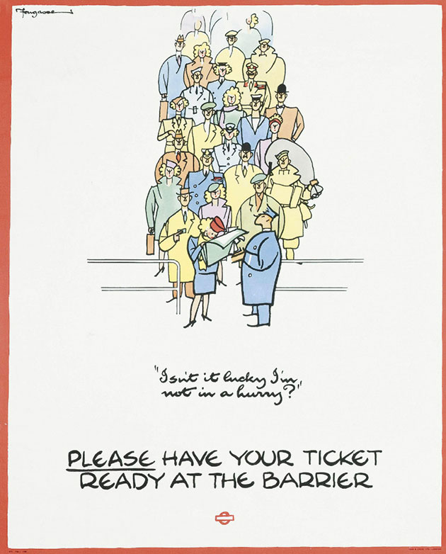
We dropped in to the London Transport Museum over the weekend to check out their truly fantastic new show, Poster Art 150.
Put on to celebrate the 150th birthday of the London Underground, the densely packed show is a collection of 150 of the best posters produced for the tube. It features a stack of brilliant designs from the big names in poster design, including Abram Games, Edward McKnight Kauffer, Frederick Charles Herrick, Tom Eckersley, Edward Bawden, Fougasse (above); as well as a few fine artists, including Man Ray and Howard Hodgkin.
The show is split into six thematic areas, which neatly sidesteps the possible problem that might have occurred had the exhibition been chronological - namely that the more recent designs just aren't as good. Partly this is due to the rose-tinted nature of nostalgia, but it's not just that - the earlier designs have an energy, simplicity and wit that seems to have faded away from most of the contemporary designs we see now on the tube. Hopefully this show might serve as an inspiration though, both to the commissioners at the tube, and also to designers.
And you know, it's interesting to stop there and linger on that word 'designers'.
It feels like most of the contemporary commissions on the underground are given over to fine artists rather than designers. Witness the Olympic and Paralympic Posters for London 2012, Mark Wallinger's Labyrinth, and The Roundel: 100 Artists Remake a London icon - all commissioned through the Art on the Underground programme. Where are the commissions for designers? Surely a show like this demonstrates just how brilliant a tradition of design London Transport has - it'd be great to see them embracing that by commissioning more contemporary designers, rather than just fine artists.
Anyway, here are some of our picks from the exhibition:
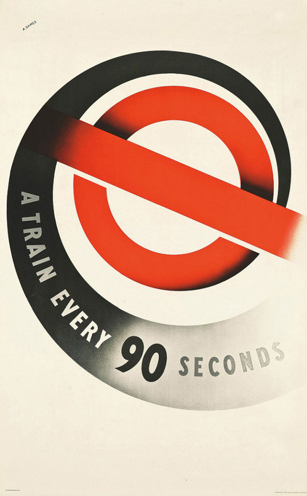
'A train every 90 seconds', the first poster Abram Games designed for London Underground, in 1937.
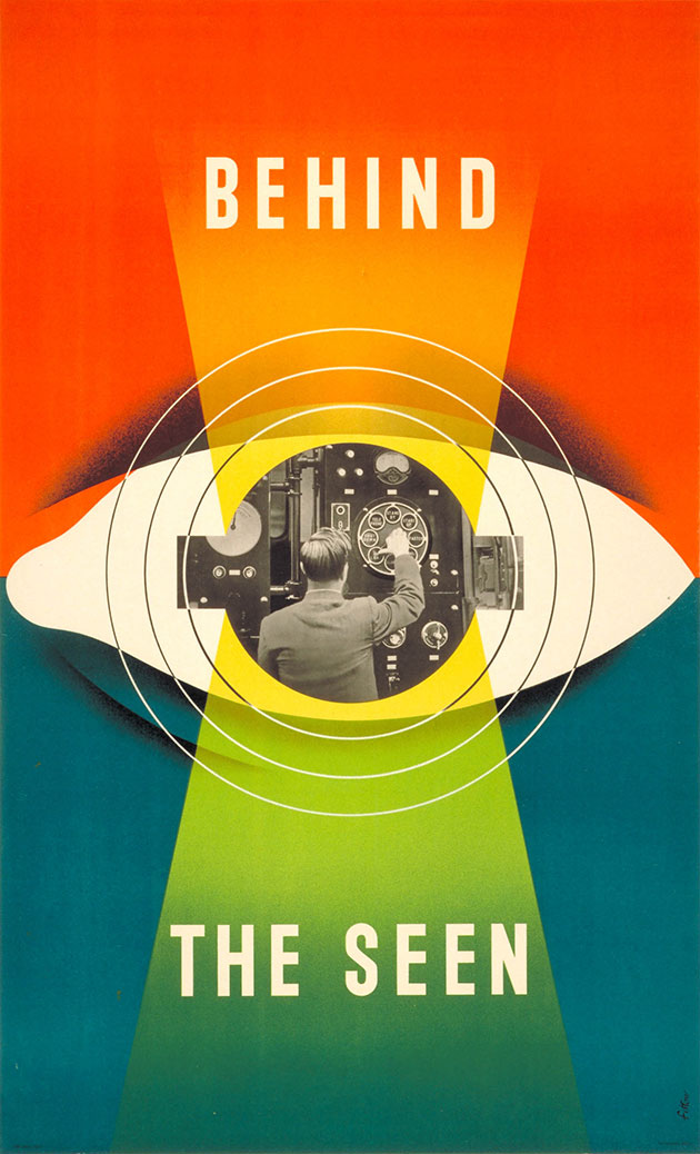
'Behind the seen', one half of a pair poster by James Fitton from 1948.
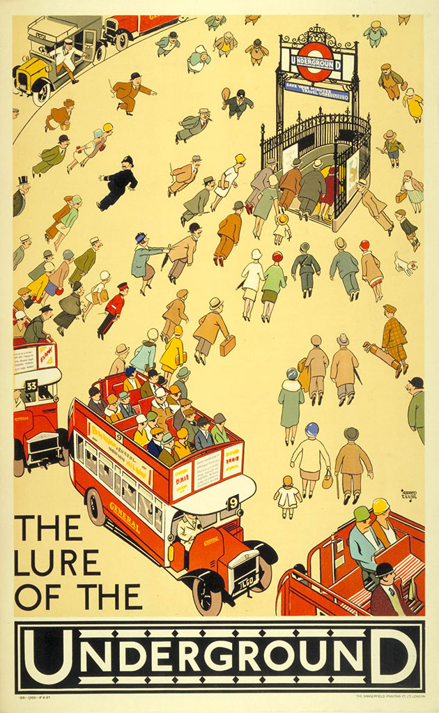
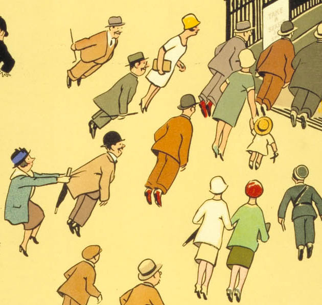
'The lure of the Underground', by Alfred Leete (the chap behind the Britons: Lord Kitchener Wants You poster) from 1927. This is a glorious poster - a fantastic economy of line, with wonderful characterisation, as you can see in the detail below:
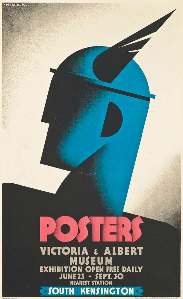
Austin Cooper's poster advertising the V&A's first major poster show in 1931, and depicting Mercury, the winged messenger of the gods.
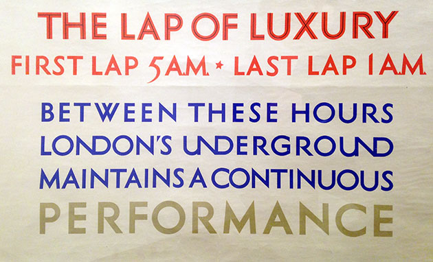
One of the highlights of the show is the fantastic array of different and frequently bonkers typographic styles. Here are some lovely ligatures from Frederick Charles Herrick's 'The lap of luxury' poster from 1925:
And two Os getting up close and personal in Charles Paine's 'Boat Race' poster from 1921:

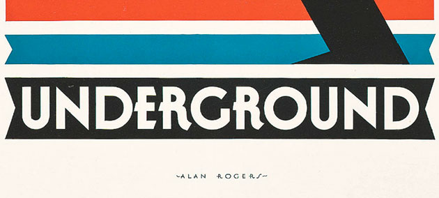
And Alan Rogers' lovely styling of the word Underground from his 1930 'Speed Underground' poster:
Tasty stuff.
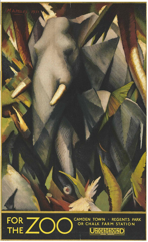
'For the Zoo', from 1933, by Maurice A. Miles, one of many posters for London Zoo featured in the show.
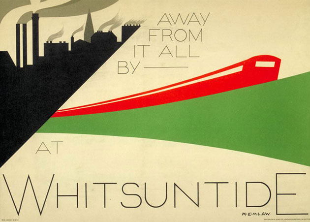
'Away from it all' by M.E.M. Law in 1932 - has a tube train ever looked so dynamic?
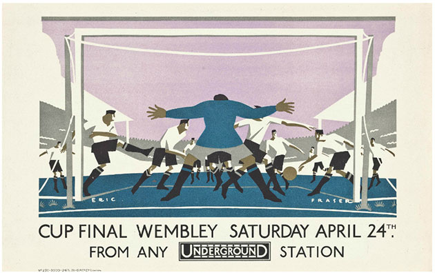
And finally, 'Cup final' by Eric George Fraser in 1928, which puts you right in the heart of the action.
The show runs until 27 October, and is really outstanding - do get along if you can.