Interrobang: an international showcase of letterpress print
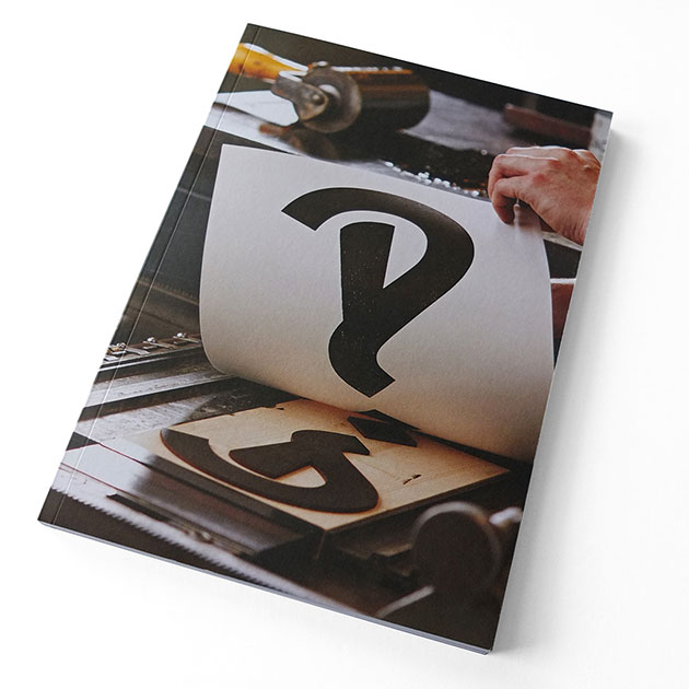
The lovely people at St Jude’s Prints have just sent me the latest edition of their Random Spectacular journal, Interrobang, and it’s a corker.
It’s been published in collaboration with Ditchling Museum of Art + Craft, which is my new favourite place in the whole world.
The Sussex village of Ditchling was the home of letter-cutter Eric Gill (he’s the chap who designed Gill Sans) and calligrapher Edward Johnston (responsible for the famous Johnston typeface used by London Underground). The museum has collected together works from them, and from the artists and craftspeople who gathered around them.
I took a wander down that way a month or so ago. It made for a fantastic day out, starting with a stroll along the South Downs.
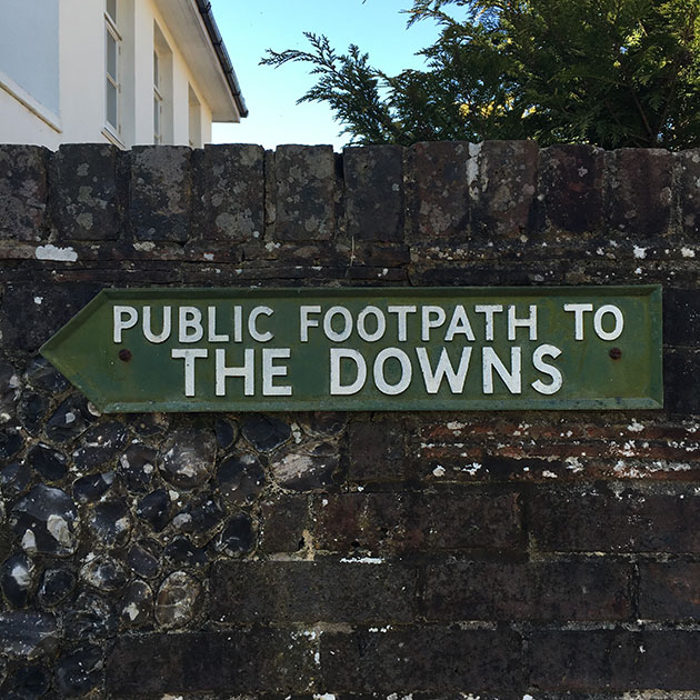
Here’s a sign post set, of course, in Gill Sans.

And an old National Trust sign, set in Albertus.

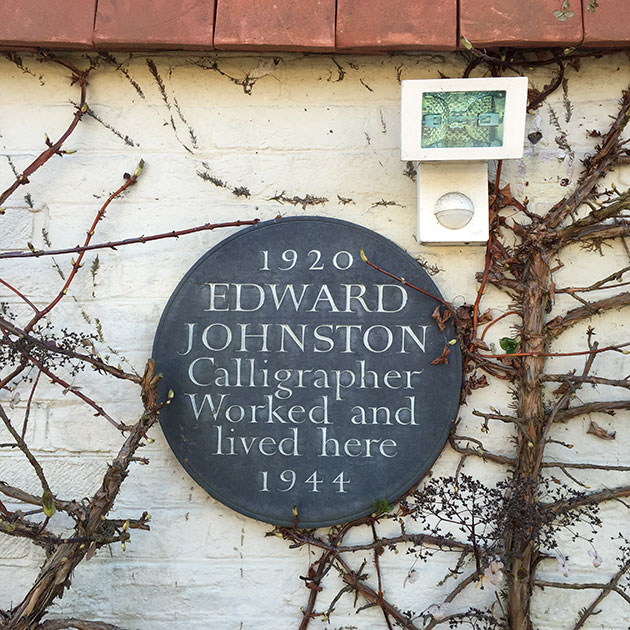
On the way from the Downs to the museum, you pass the home where Edward Johnston used to work and live. (I believe the security light is a more recent addition.)
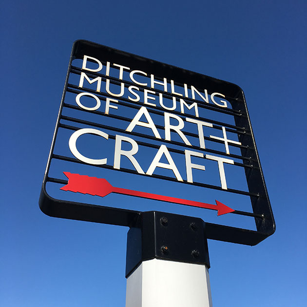
The museum’s identity was designed by Phil Baines. And boy it looks great on a sunny spring day. Loving that arrow.
The current main exhibition at the museum is a history of the development of the Johnston typeface, and that alone makes it worth a visit. Just look at this lower case qu ligature. And the alternate versions of the g!
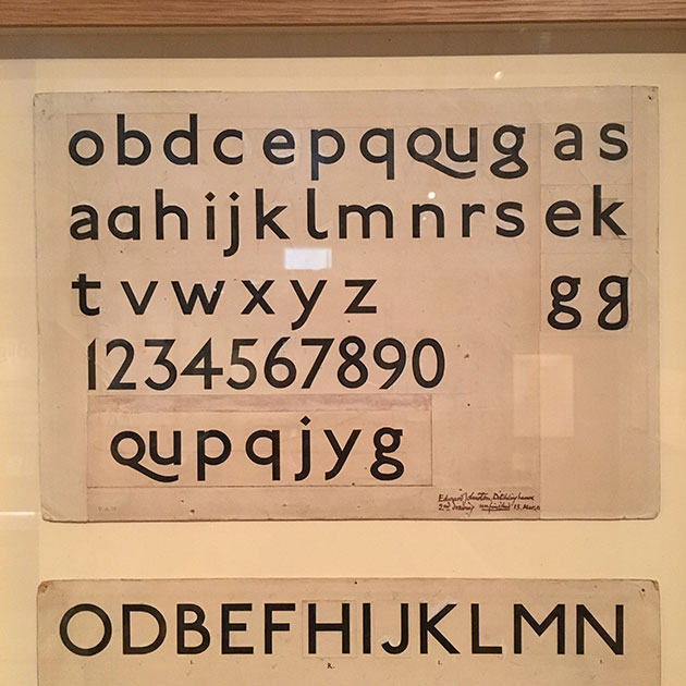
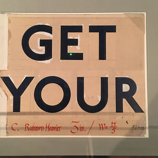
And check out this lovely set of Ws:
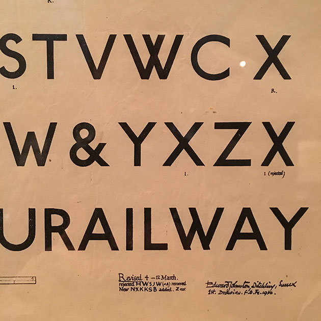
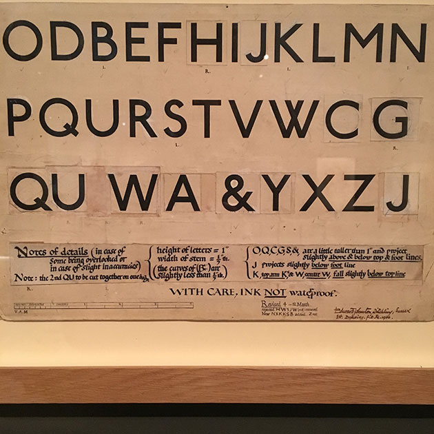
If you do one thing this year, go to Ditchling. Twice.
Anyway, I digress.
As part of their brilliant Village of Type events which run throughout May, the museum has put together Interrobang - an international showcase of letterpress print. The exhibition is an open submission, with pieces selected by a panel of typographers and designers.
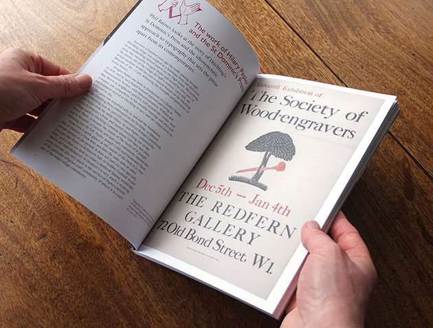
The journal, designed by Kenneth Gray, and put together by St Jude’s in tandem with the show, features a selection of fantastic articles about the current state of letterpress printing, as well as all the work from the show.
It opens with Phil Baines writing about Hilary Pepler, who set up the local St Dominic’s Press in 1919.
Then there’s an insightful article by David Marshall and Elizabeth Ellis of The Counter Press about the state of letterpress. They rightly point out that letterpress printing is having a moment, with myriad new small presses joining the old hands who’ve been doing it for years. But they worry about whether letterpress printing is being valued purely for its old-world values: ‘it seems that more often than not, people struggle to leave the nostalgia and vintage charm of the aesthetic in the past.’ They warn of the danger of ‘pastiche and unimaginative reproduction’.
Coming from anyone else, this might sound like they’re just stirring the pot. But they’re one of the most exciting design teams working with letterpress at the moment. They specialise in what they call ‘traditional techniques with modern design thinking’. Here’s the cover of their recent publication Extra Condensed.
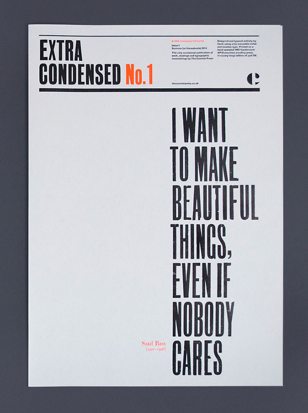
It is beautiful. And I do care.
This theme continues in Patrick Baglee’s wonderful interview with Alan Kitching: ‘He is a designer that is surrounded by and works with letterpress type and letterpress technology. But it is the ideas and deeper meaning that step forward... This sense of expressiveness, of freedom and joy is still what marks Kitching’s work out from much of what passes for letterpress – where it is the means of production that people believe we ought to care about – rather than the final idea as evidence of artistry, craft and simple, clear thinking.’
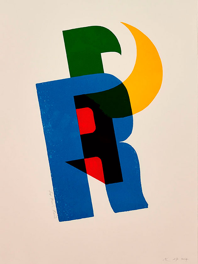
Here’s Kitching’s recent print for Monotype commemorating Paul Rand:
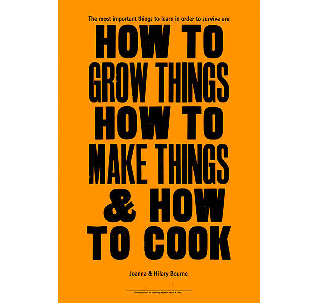
Later on in the journal, there’s an article about Adams of Rye, the printshop where Anthony Burrill creates his posters, including this recent one for the museum:
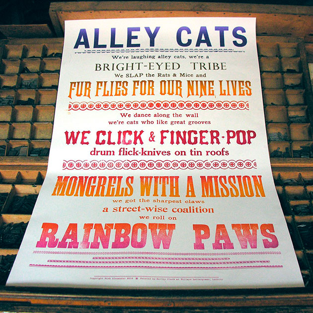
Another piece looks at the collaboration between Tilley Printing and poet Nick Alexander, creating posters which are flyposted in the local Tinsmith’s Alley in Ledbury, Herefordshire.
The bulk of the journal though is a showcase of the prints from the show. Here are just a few of those:
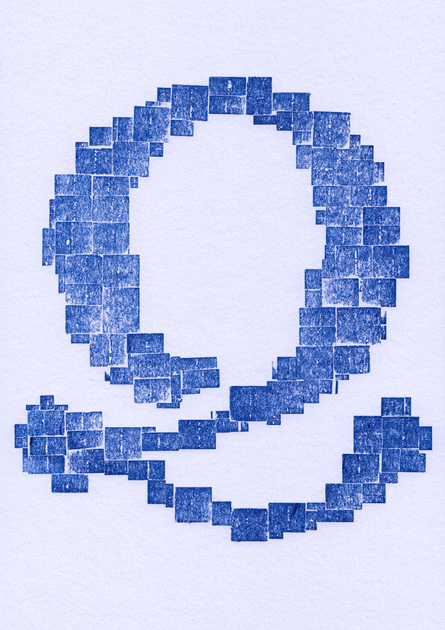
From Nicole Arnett Phillips in Brisbane, an analogue bitmap Q: ‘My intention with this series is to explore the space between analogue and digital type design and lettering. Each print translates form between analogue and digital instances. The letterforms start as pencil outlines. I then use physical type - either the face or the feet - (face being right way up type side of the sort, and feet being upside down backside of the physical piece of type) to typeset an analogue bitmap inside the pencil outlines.’
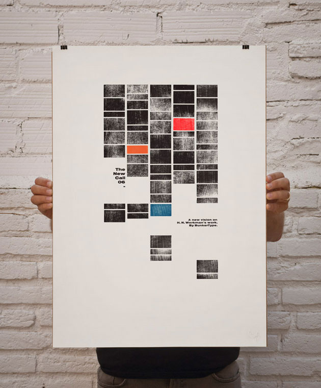
From BunkerType in Barcelona, a print (#6) from their ongoing project, The New Call, based on the work of Hendrik Nicolaas Werkman:
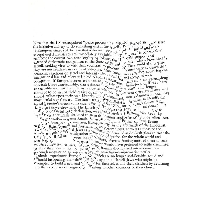
Artist Ruth Kirkby shows one of ‘a series of prints to represent the Western-imposed state borders and the effects they have had on the Middle East. The text in the prints is taken from recent Al Jazeera articles about the areas affected by the enforced borders.’
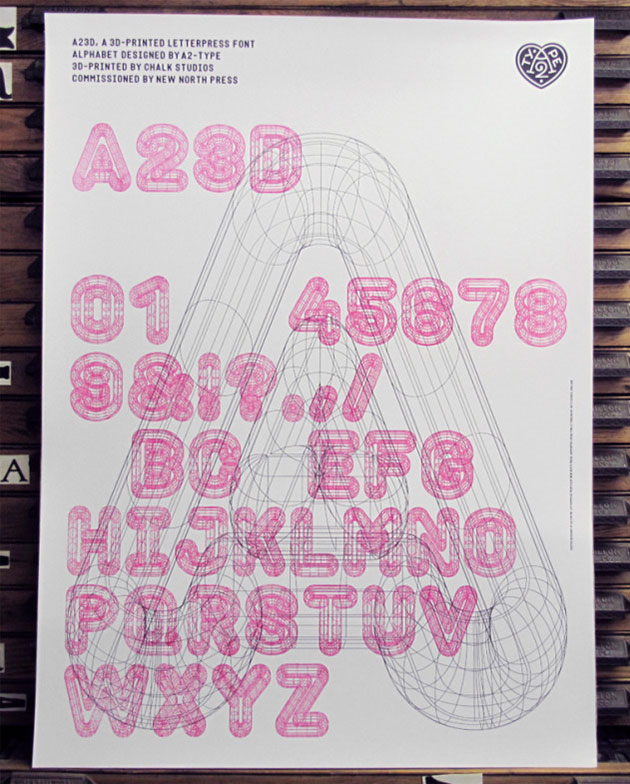
From New North Press in London, comes a print from their ‘A23D’ 3D-printed letterpress font, designed by A2-Type, fusing old and new technologies.
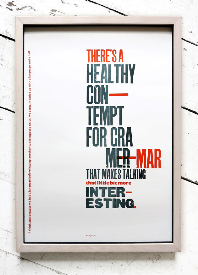
One Strong Arm in Dublin submitted a print featuring a quote from Rudolf Koch, but I couldn’t find a picture of it, so here’s one of their other pieces, with a quote from Roddy Doyle.
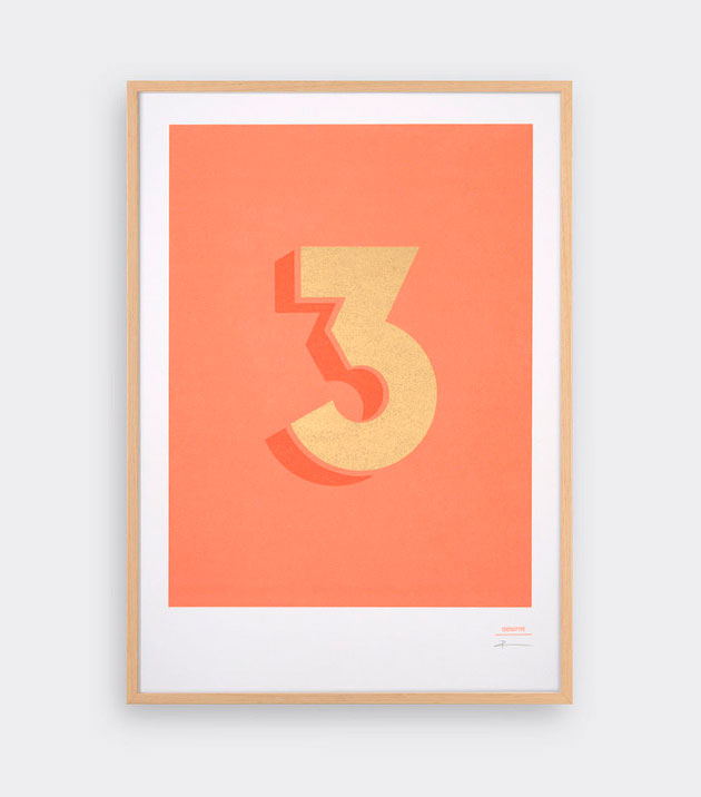
Tom Pigeon, the studio of Pete and Kirsty Thomas, show one of their ‘Cinematype’ prints. ‘Cinematype is an original sans-serif, geometric typeface designed by us and inspired by the typography of early 20th Century film. We've worked with British printmaker Thomas Mayo to create these exclusive Cinematype letterpress numbers prints.’
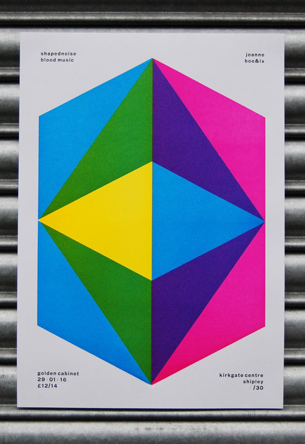
The next print is from The Print Project in Shipley. I’m rather in love with their fantastic posters for the gig night Golden Cabinet, printed using metal type and overprinted laser cut abstract shapes:
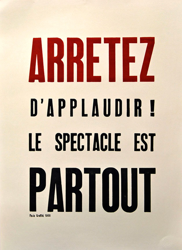
I’m also quite taken by this print from The Wireless Press in Brighton. It’s based on Parisian graffiti from the 1968 uprising (the text translates as ‘Stop clapping - the show is everywhere’).
All in all, the journal is a wonderful record of a brilliant show, giving a really thorough sense of what is being produced by the best designers and artists working with letterpress print today.
The exhibition is on until 30 May. In the meantime, you can (and should) buy the Interrobang journal from St Jude’s.
categories: Events | Graphics | Letterpress | Magazines | Posters | Print | Typography