The Wolpe Collection
You wait ages for a lovely new typeface, and then Blam!, five come along at once.
Monotype have just launched a new collection of typefaces based on five classic types designed by Berthold Wolpe. (More about them further below.)
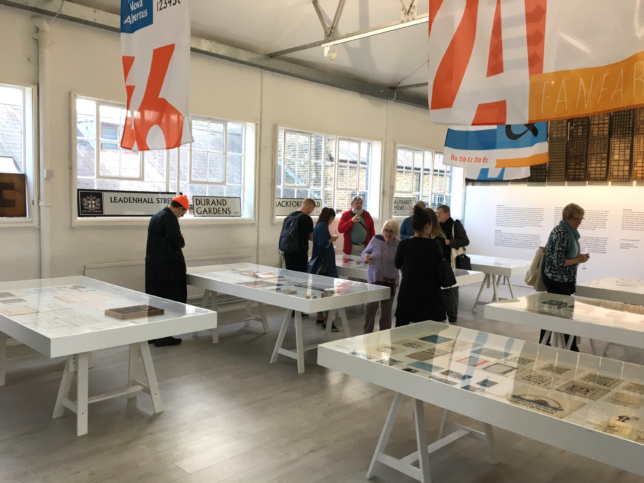
To accompany the launch, Monotype have put on a fantastic exhibition at the Type Archive, featuring a huge range of items from Wolpe’s archive. It’s a corker of a show.
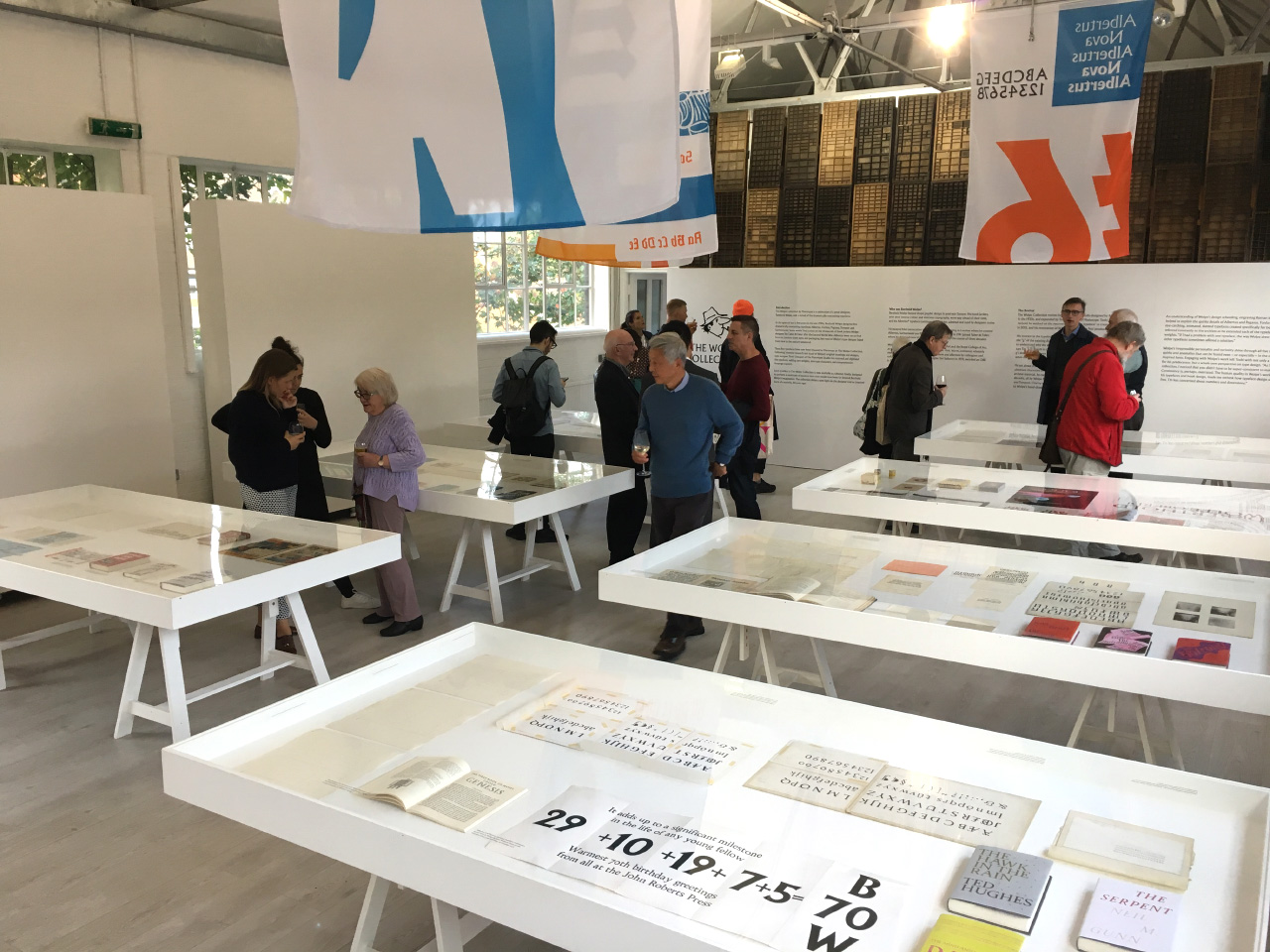
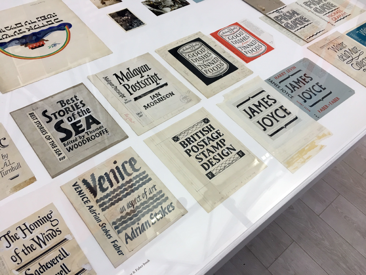
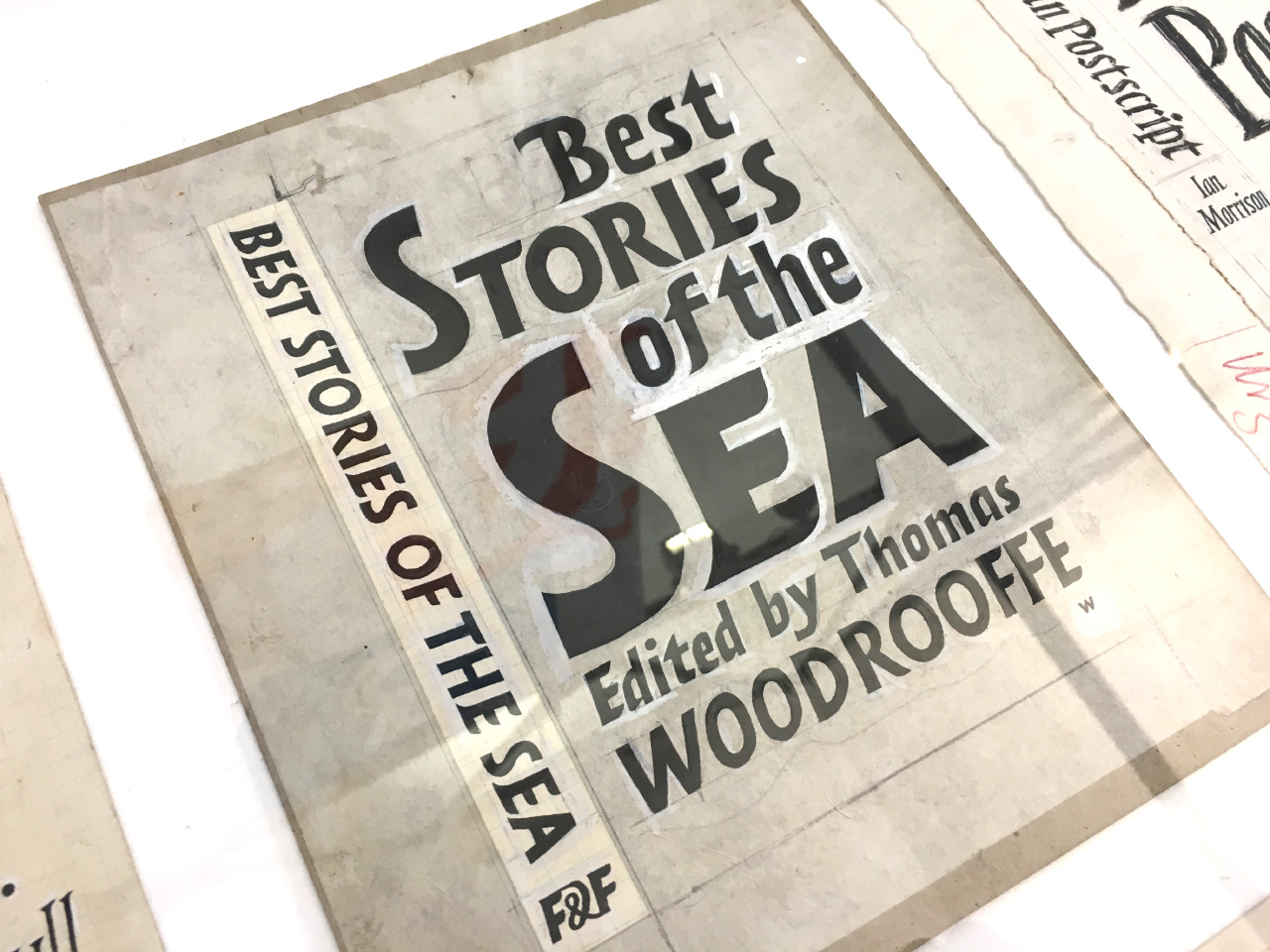
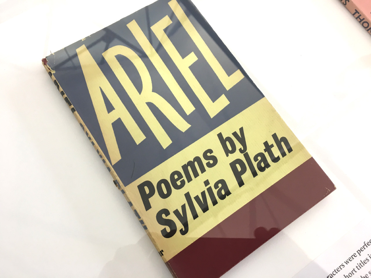
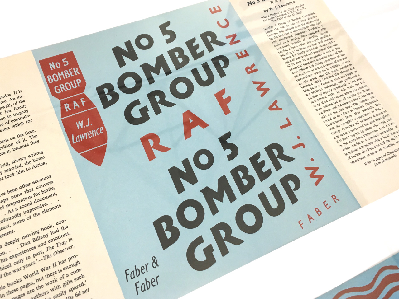
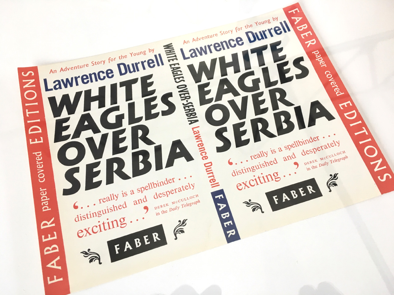
There is of course a selection of original artworks for various book covers from his time at Faber & Faber.
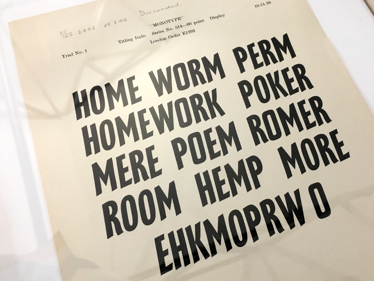
There’s also a selection of materials showcasing his original typefaces, most of which have never been digitised before.
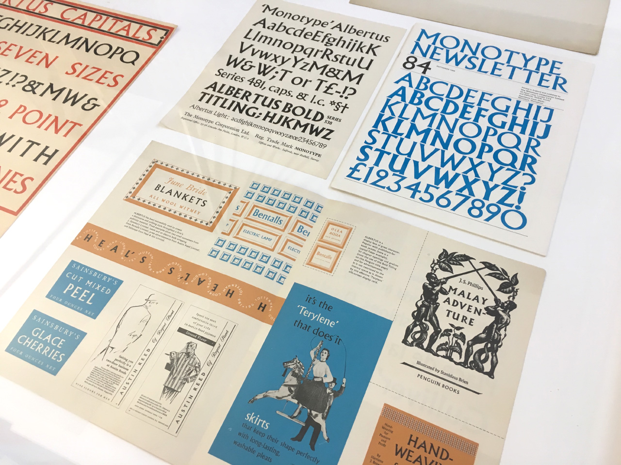
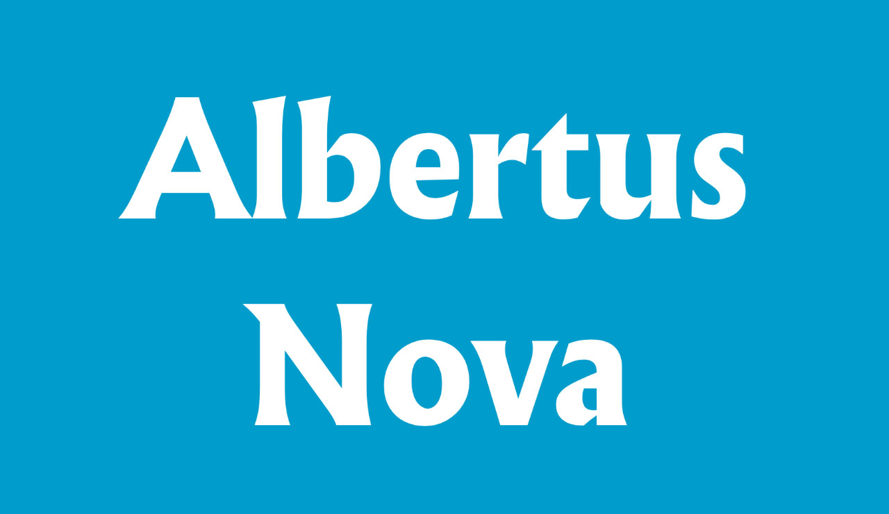
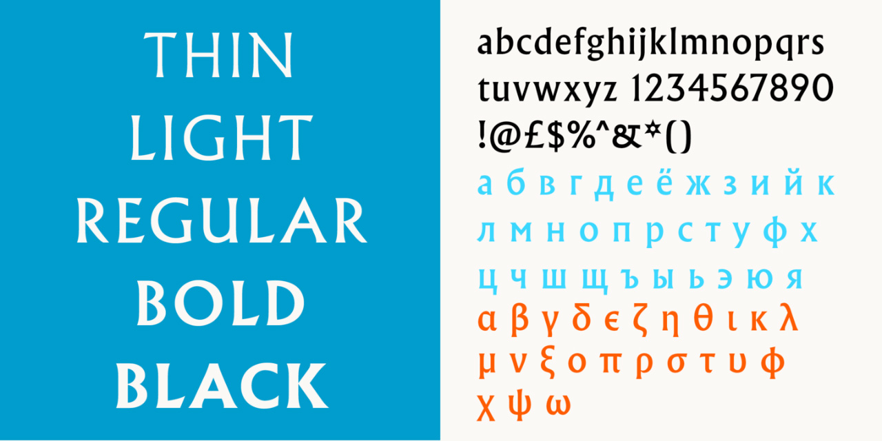
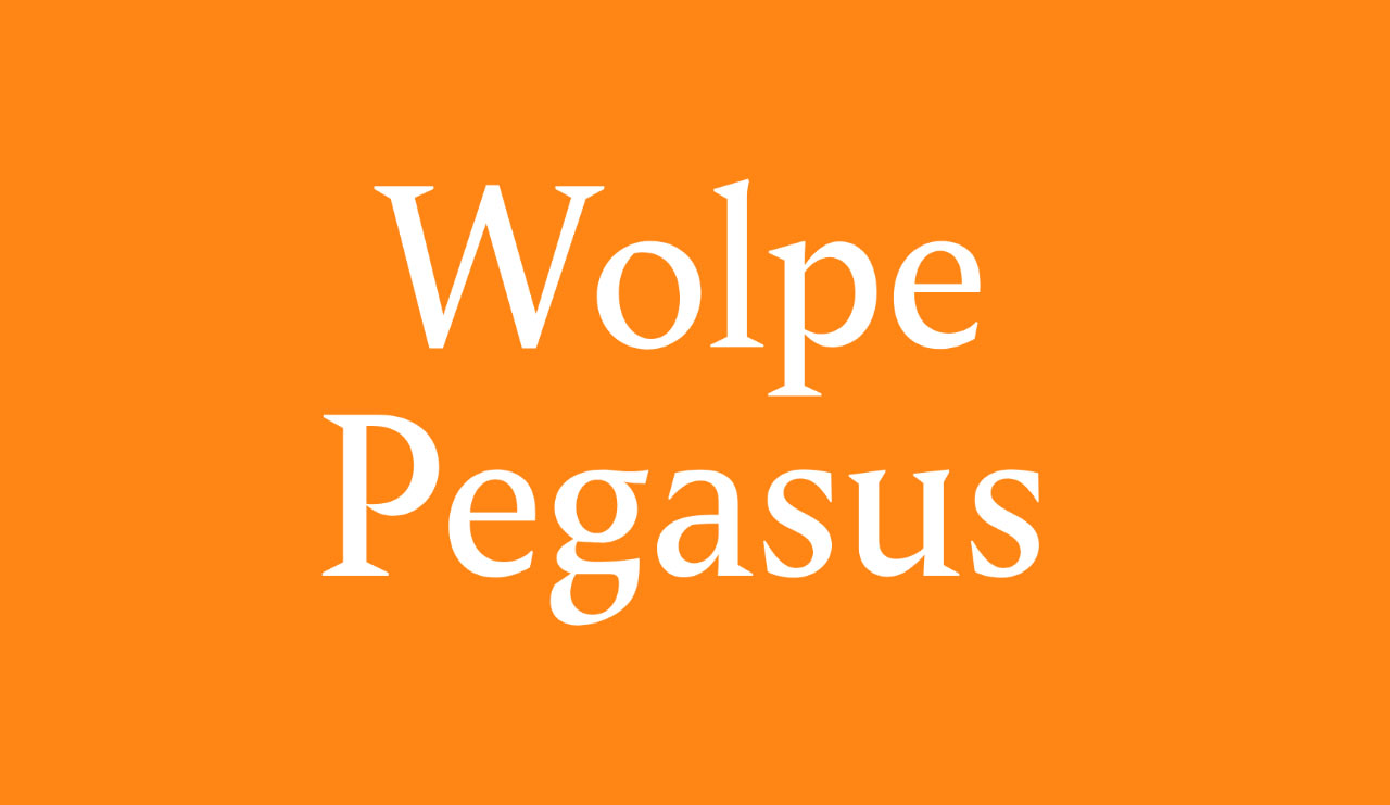
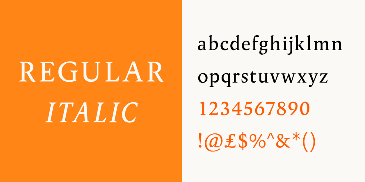
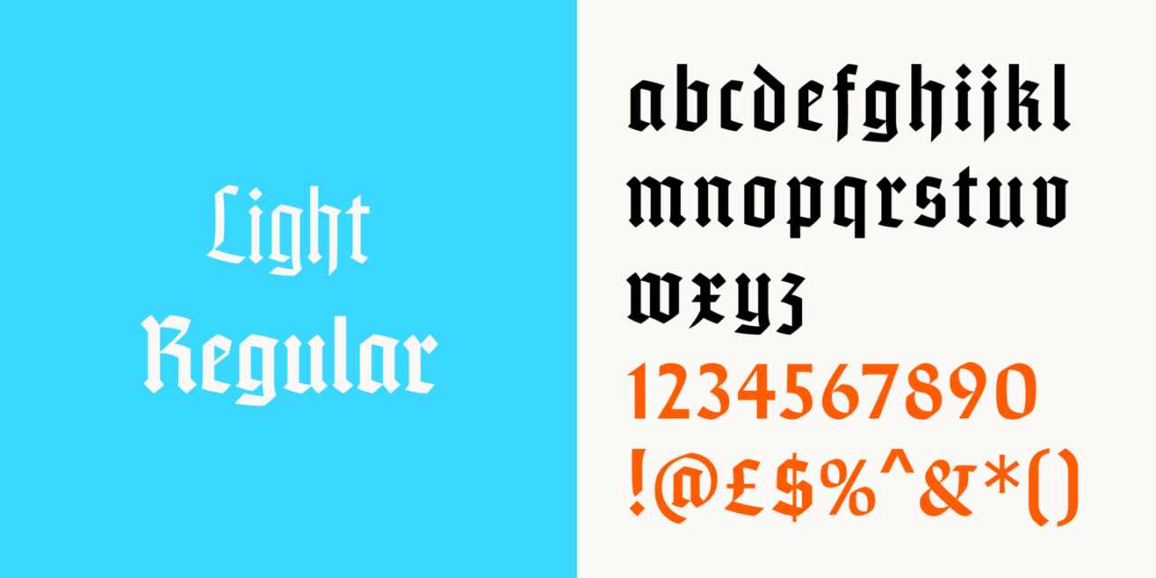
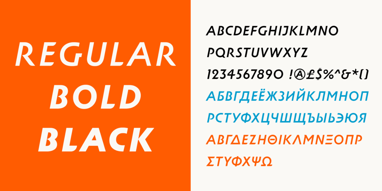
The newly released typefaces, based on those materials, are Albertus Nova, Wolpe Fanfare, Wolpe Pegasus, Sachsenwald, and Wolpe Tempest:
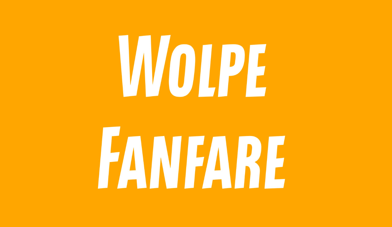
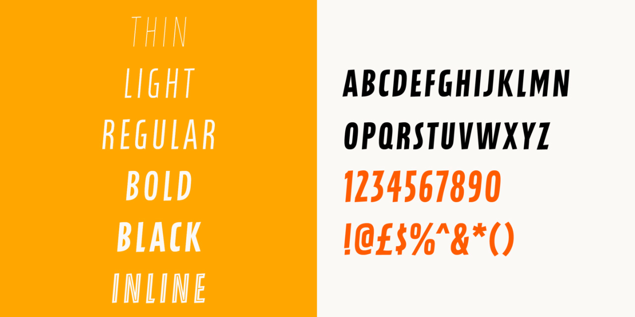


They’re all delicious, but we’re particularly excited about playing with Tempest and Fanfare. And Sachsenwald is deeply tempting too.
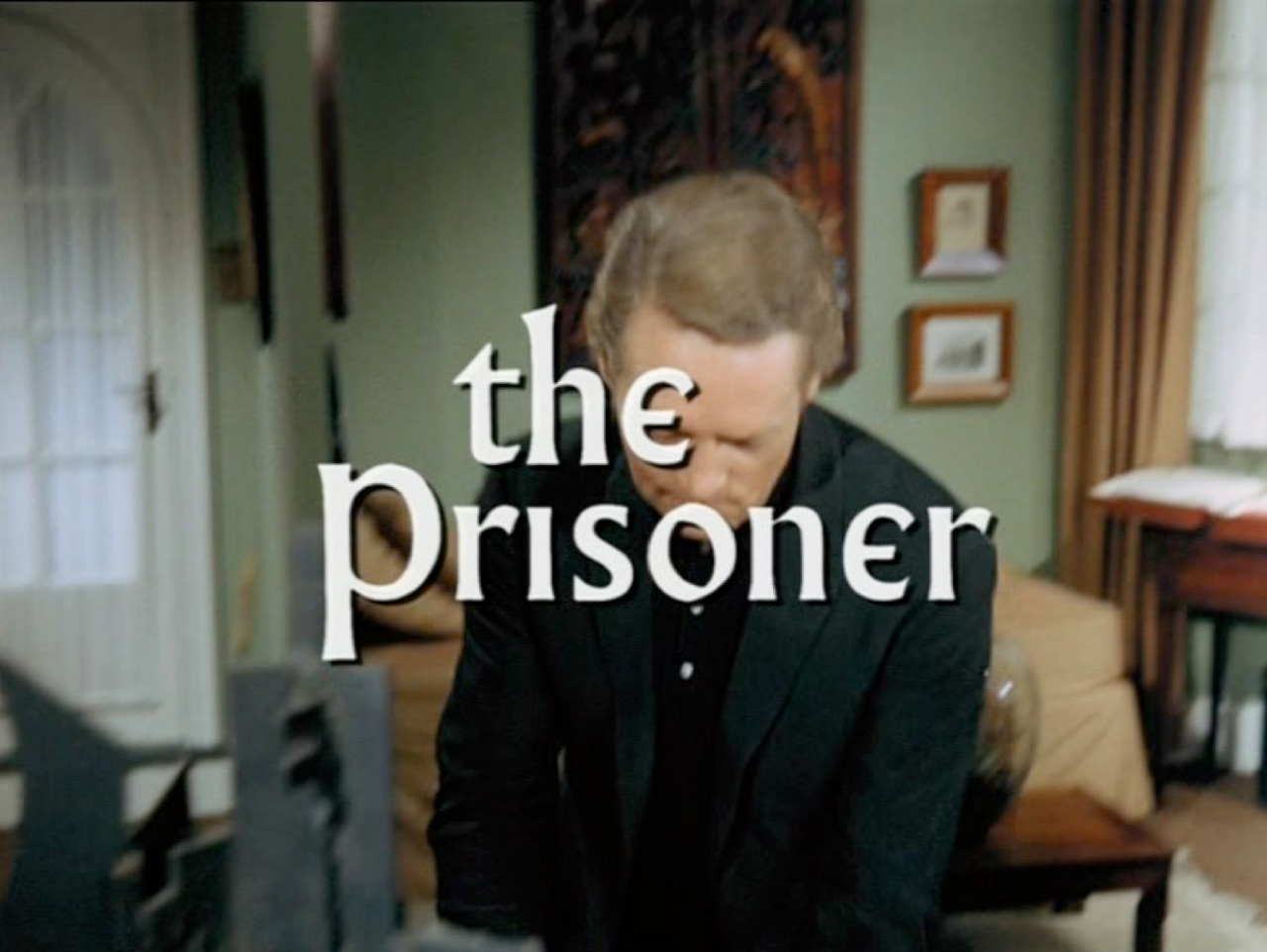
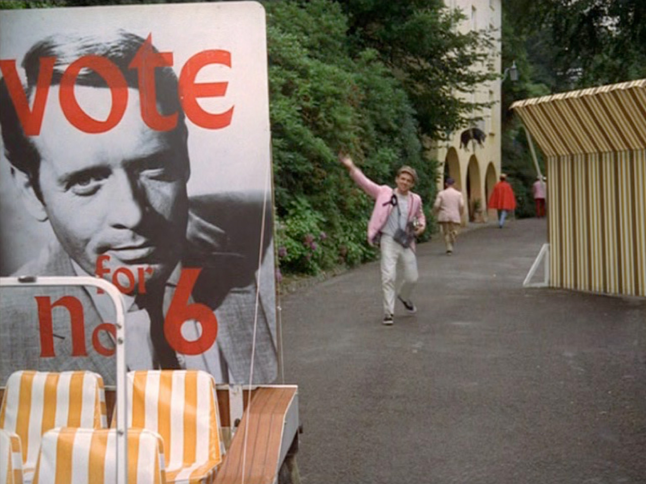
As part of the launch activities, on Tuesday evening Alistair was invited to speak on a panel at the exhibition. At the event, hosted by Eye Magazine’s John Walters, Alistair spoke about the use of an adapted form of Wolpe’s Albertus in the cult 60s TV show The Prisoner (you can read all about it on this blog post).
Serendipitously, today marks exactly fifty years since the programme was first broadcast in the UK.
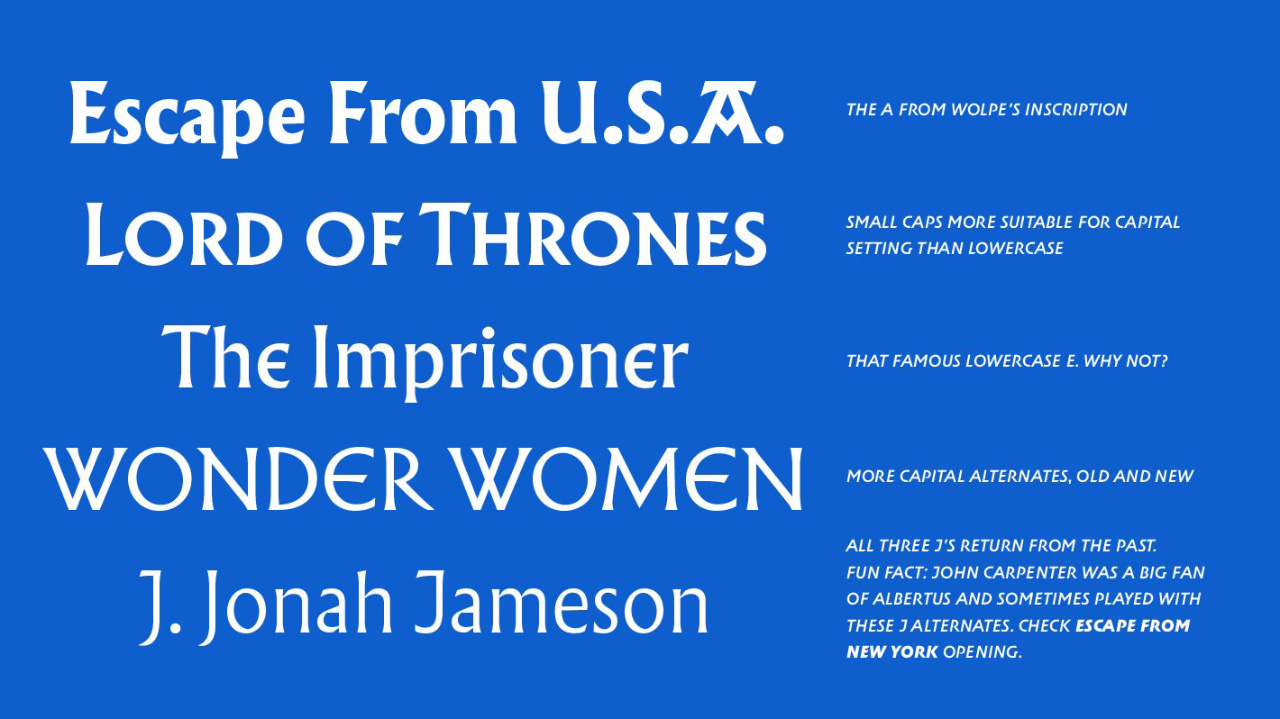
Brilliantly, Toshi Omagari, who created the new designs of Wolpe’s classic types, has included some of the alternate forms used in The Prisoner, and elsewhere, in Albertus Nova:
You can read more about the design process over here.
The other speakers at the launch were Ian Chilvers of Atelier Works, and Rian Hughes.
Ian discussed how his studio had used Wolpe’s Albertus for all the street nameplates in Lambeth (where Wolpe lived for part of his life).
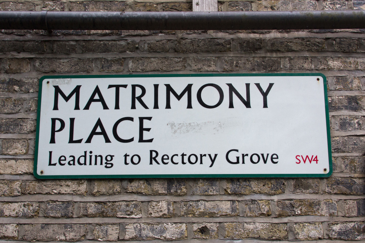
You can read more about that project over on the Atelier Works site.
Type designer and illustrator Rian Hughes discussed the iconic masthead that Wolpe created for the Eagle comic.
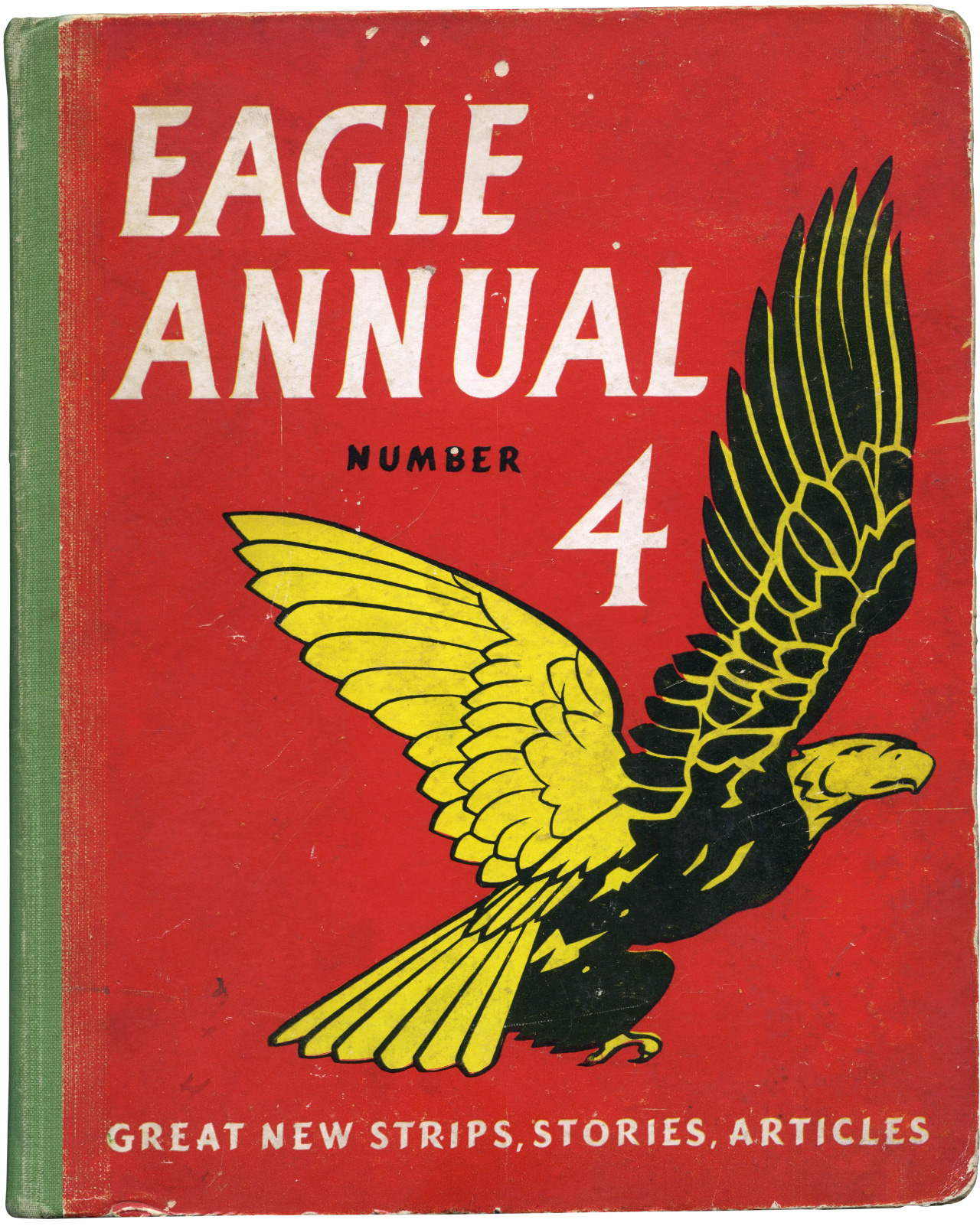
You can see how much the masthead lettering has in common with both Tempest and Fanfare.
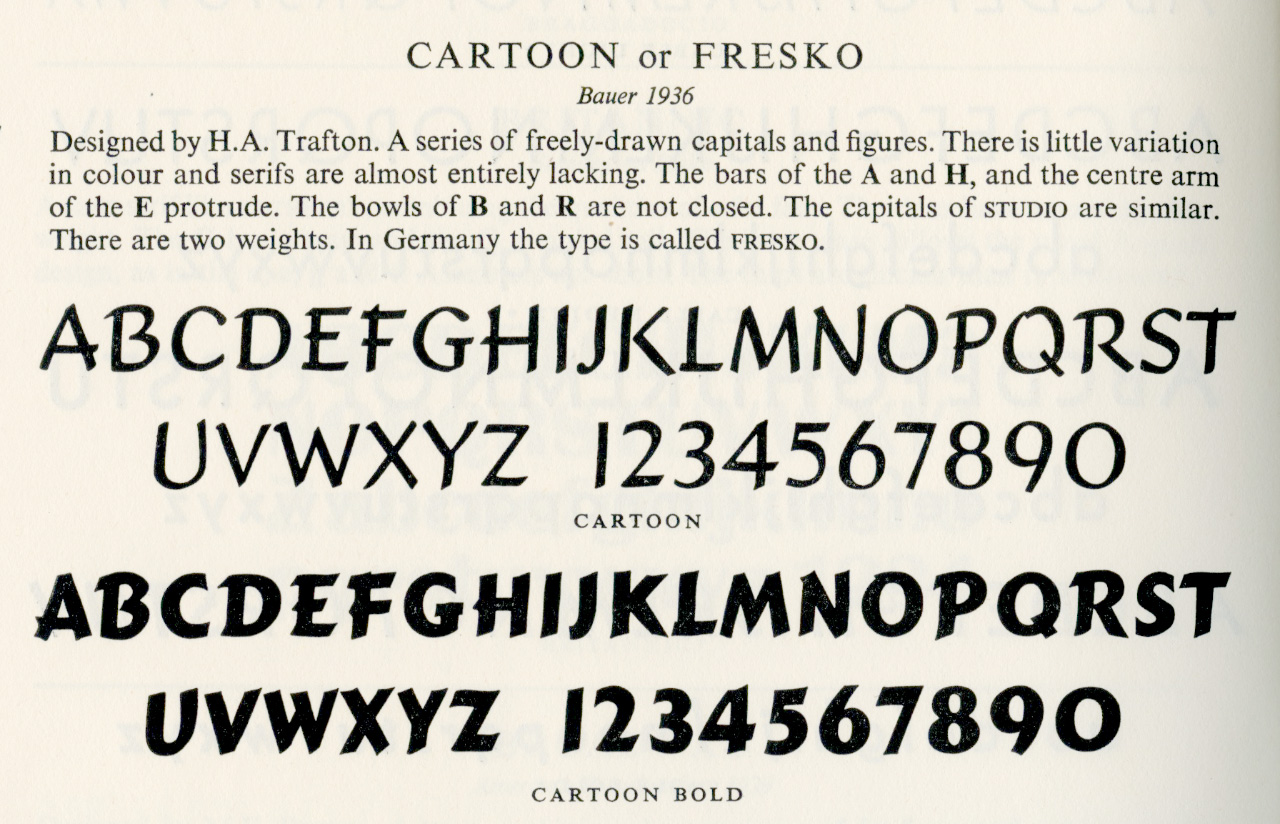
The rest of the lettering on the annual cover is set in Cartoon Bold, which is also a bit lovely:
The exhibition, open on Fridays, Saturdays, Sundays and Mondays each week, is well worth a visit, and runs until 30 October. Book a place now.