Designs on Britain
We made our way to north London over the weekend to check out Designs on Britain, the new show that has just opened at the Jewish Museum.
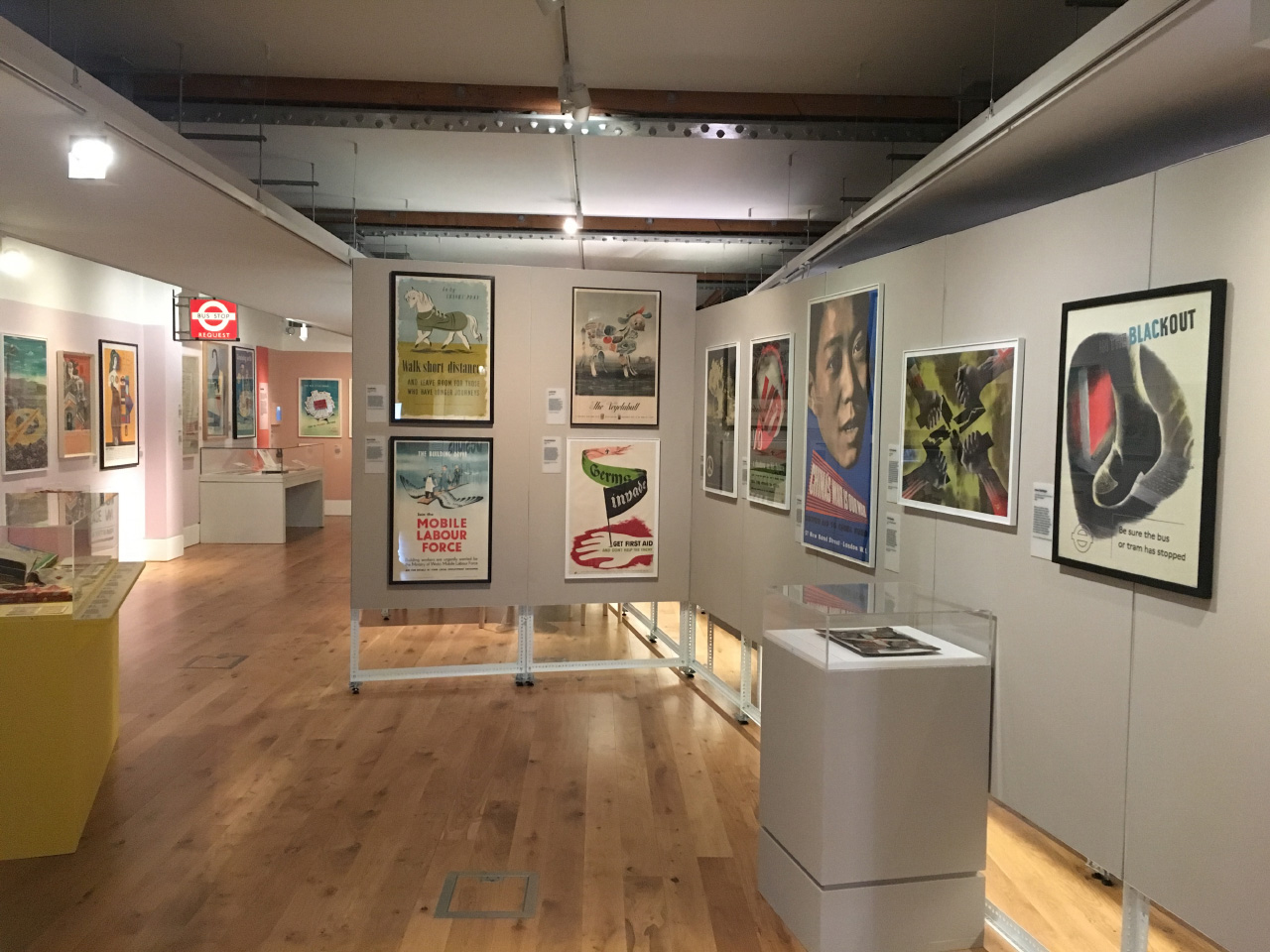
This timely exhibition showcases how much of what might be considered classic British design was produced by Jewish immigrants, some of them escaping the Nazi regime during the Second World War. It covers various design disciplines, including graphic design, textiles, industrial design and advertising (though curiously not architecture). It focuses on a few key figures, including FHK Henrion, and the three Hans’s: Schmoller, Schleger and Unger. Pleasingly, much of the material on show is the original or early artwork for well known designs.
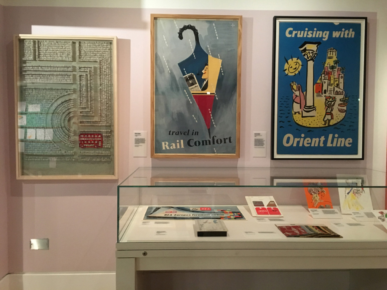
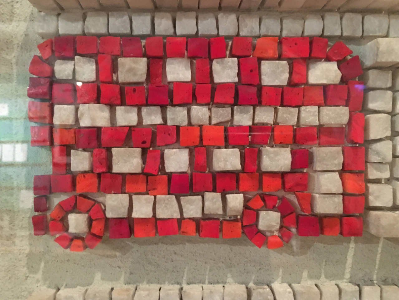
Here you can see the original mosaic created by Hans Unger and Eberhard Schulze for their 1970 Busabout poster, for what was then London Transport.
And how glorious is this British Rail poster, also by Unger, from the 1950s:
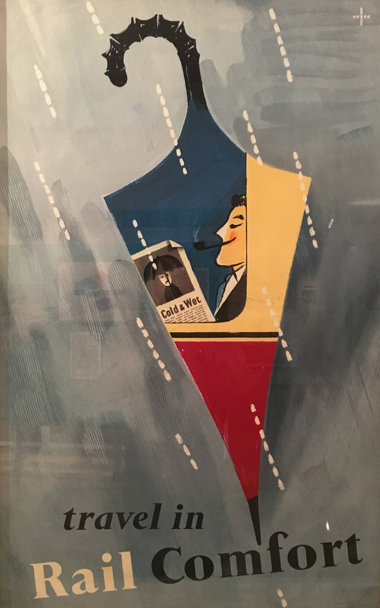
So much to love here: the joy of using the umbrella as a surreal window; the rain drops echoing the shape of a train; the simplicity of the ‘Cold & Wet’ headline and the unhappy character below the umbrella; the economy of line in the drawing of the contented traveler; the delicious colours; and Unger’s monogram in the top right.
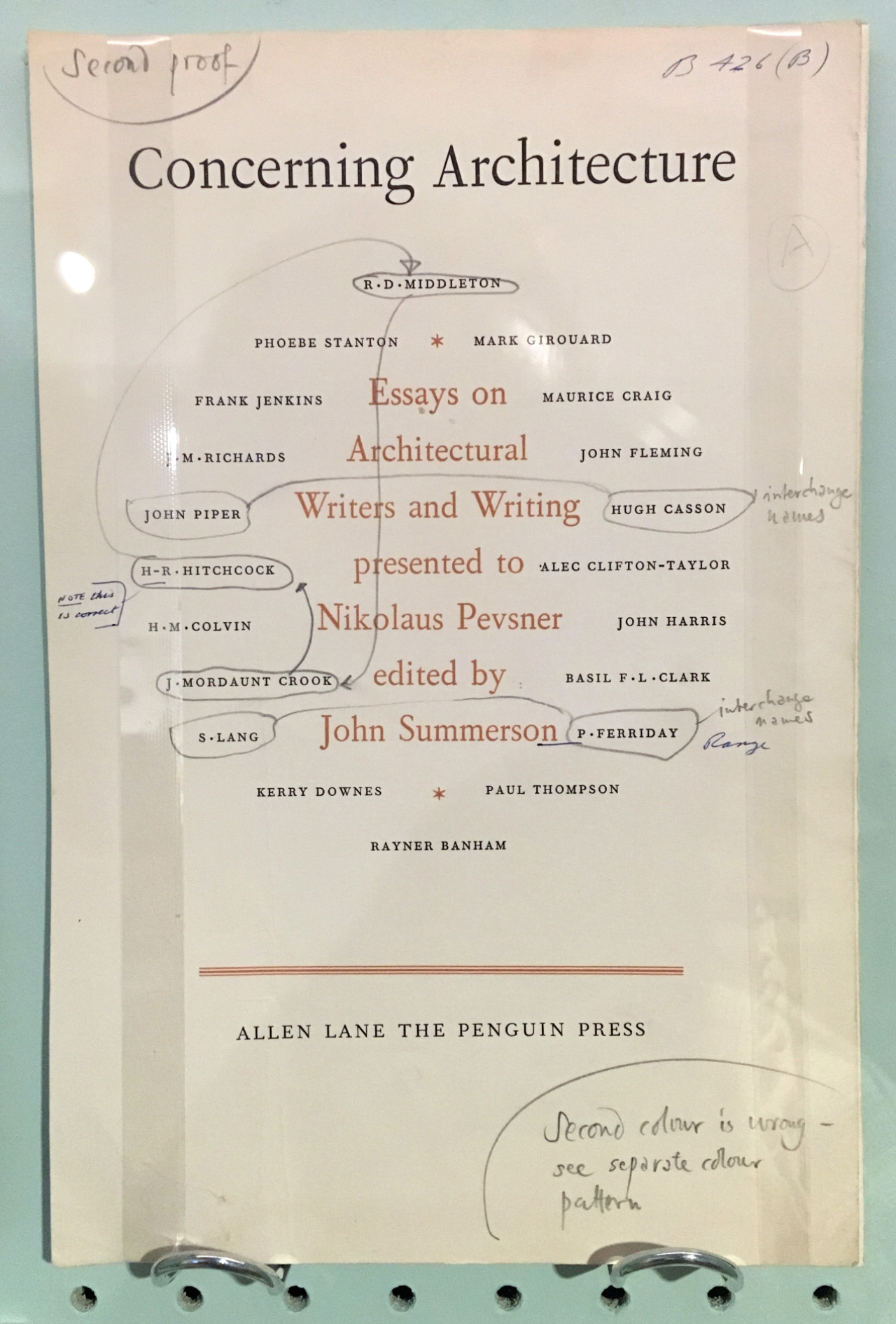
Meanwhile, and with a touch more typographic finesse, here’s Hans Schmoller’s second proof for Concerning Architecture from the 1960s:
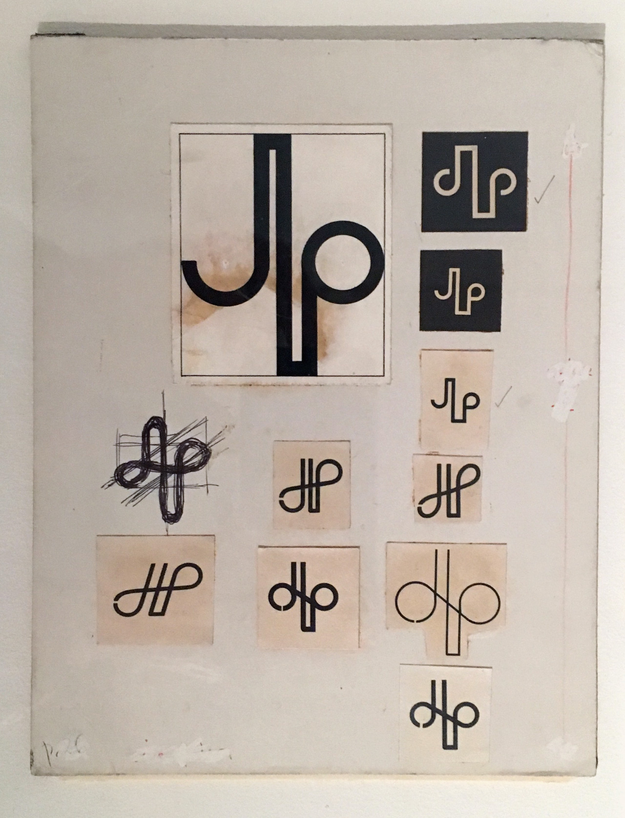
And here are Hans Schleger’s early ideas for the identity for the John Lewis Partnership, from the early 60s. (Apparently his very earliest ideas revolved around the image of a bee, and he spent hours sketching bees in the Natural History Museum before abandoning the idea.)
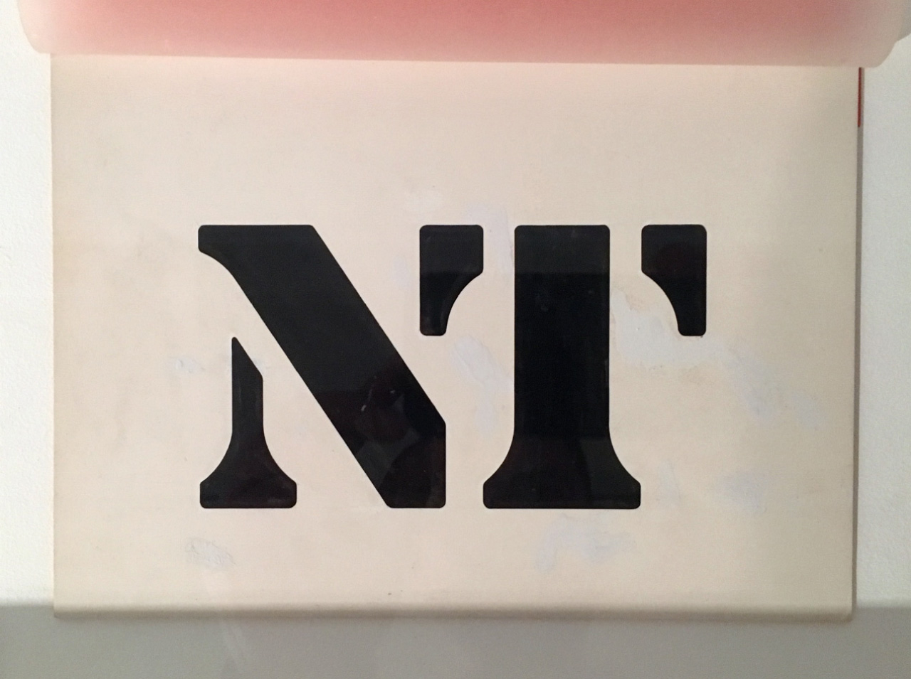
Sticking with company identities, here is the National Theatre logo artwork by Ian Dennis from FHK Henrion’s design consultancy Henrion Design Associates.
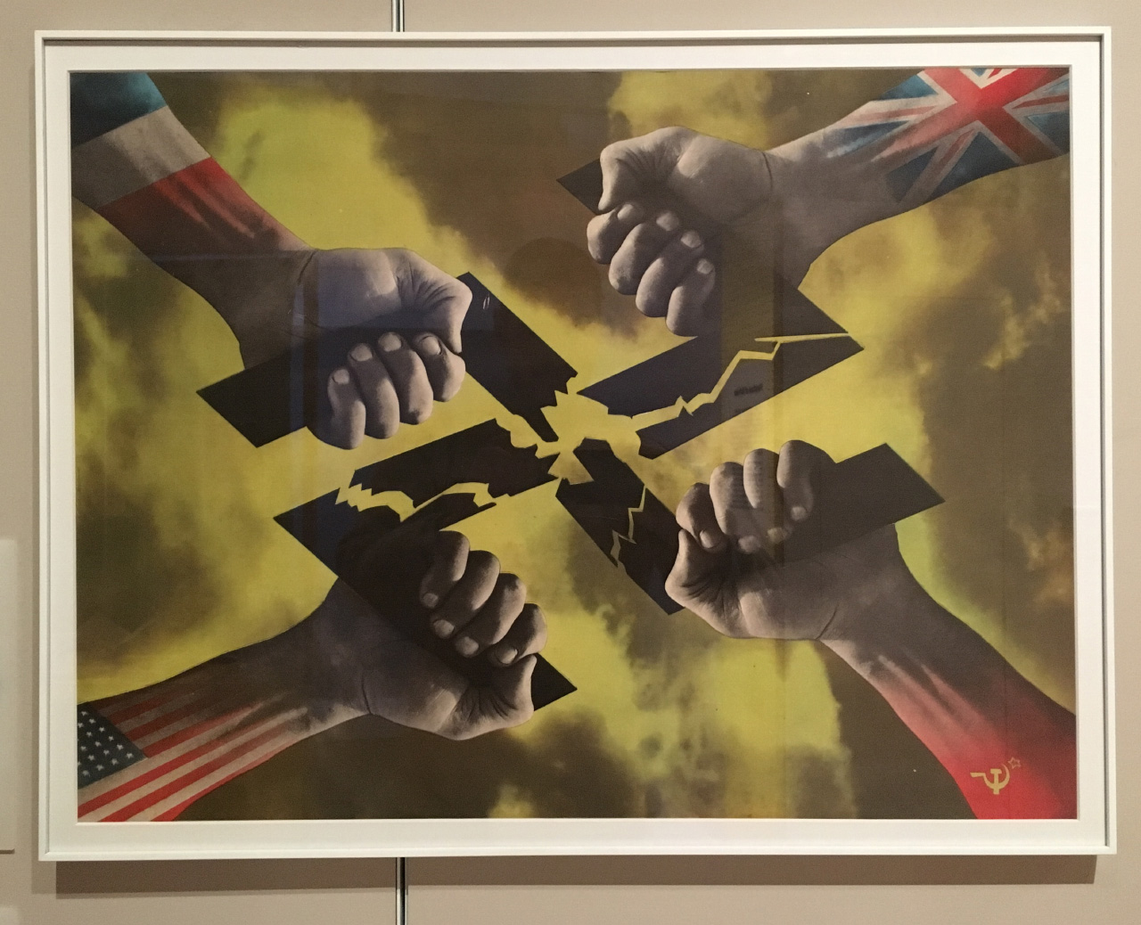
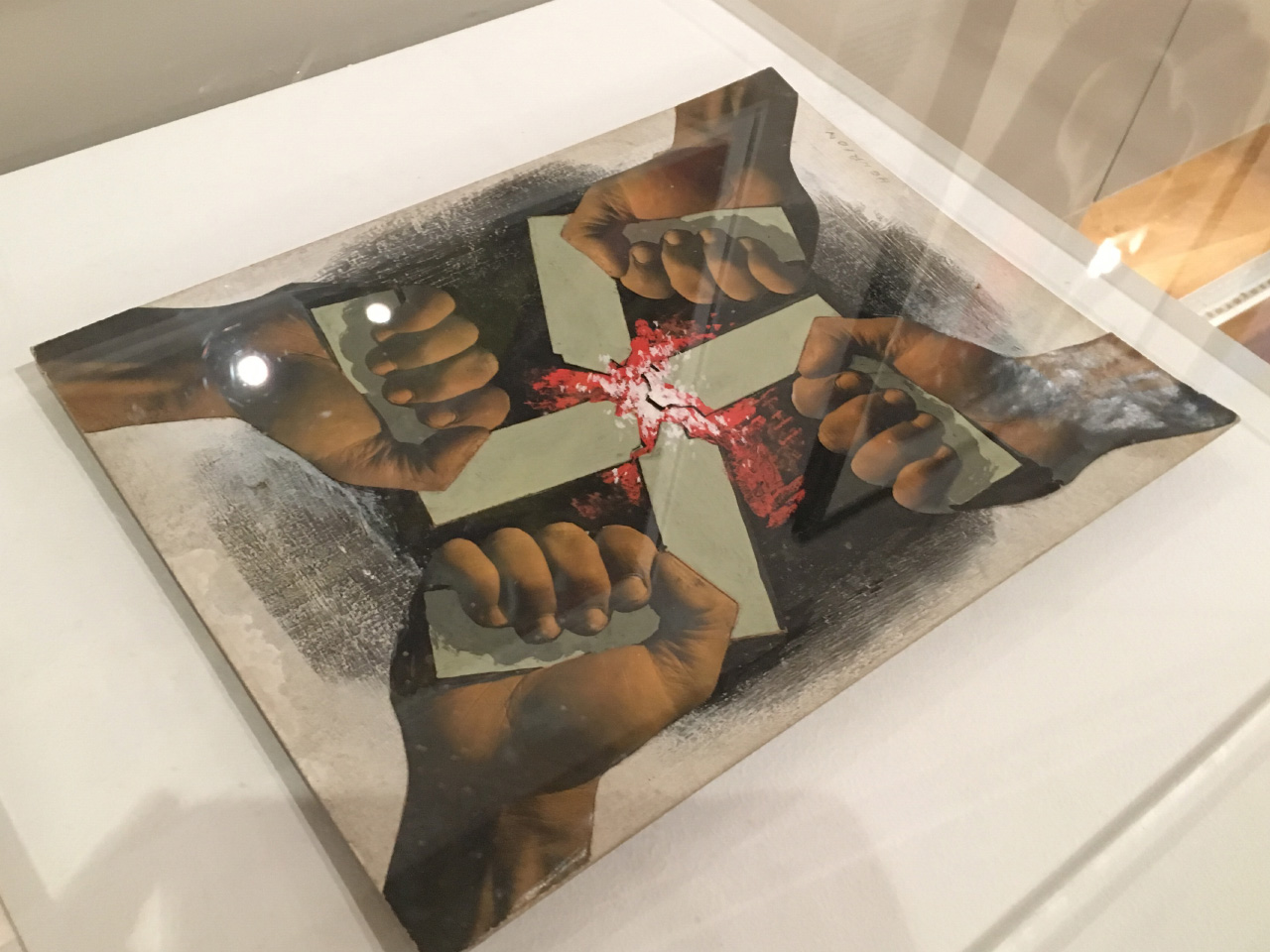
There’s a lot of Henrion’s work on display at the show, including many of his poster designs, such as this – Four Hands, from 1944, commissioned by the US Office of War Information. A bold, striking image that dispenses with the written word, meaning it can be used in any country, regardless of language.
It is displayed next to the original artwork:
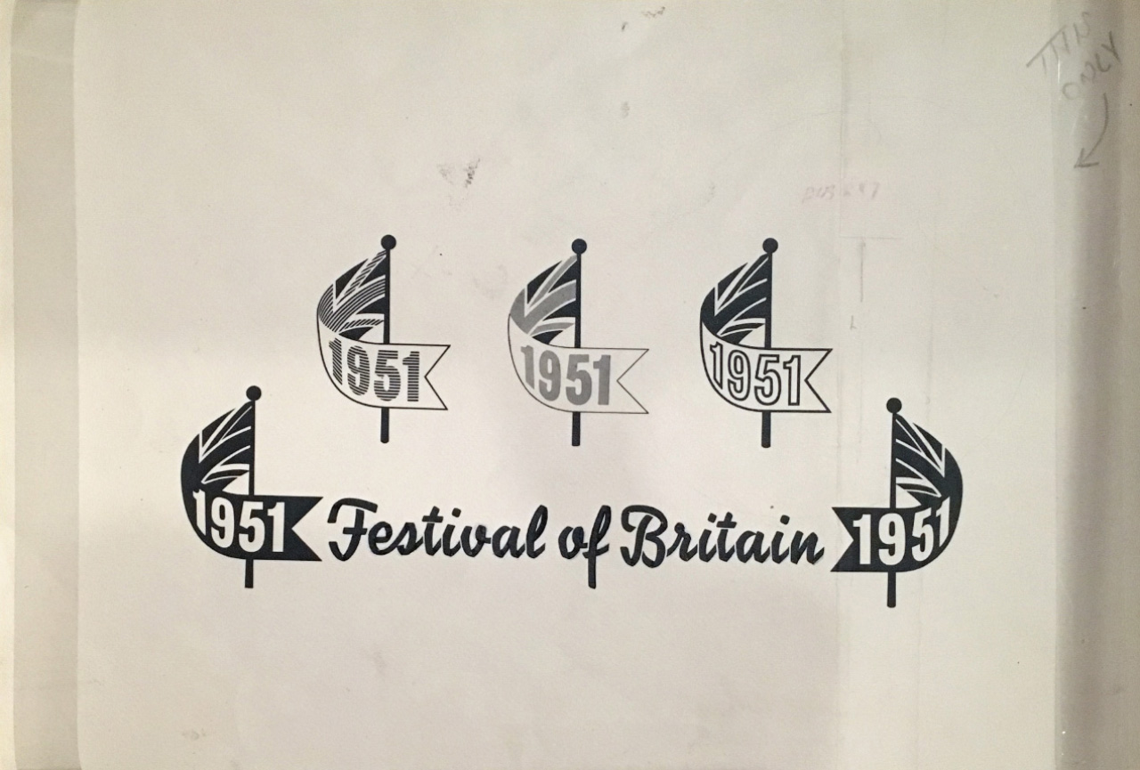
In amongst Henrion’s identity work, there’s even this proposed emblem for the Festival of Britain – the gig of course eventually went to another British-Jewish graphic designer, Abram Games.
It’s a cracking show, and it runs until 15 April.