On the trail of the angled terminal
So, you might know that I’m in the process of documenting and researching the street nameplates of London – you can see pictures from that over on my London Street Nameplates Instagram feed.
As part of that research, I’m trying to track down the origins of a rather elusive lettering style. It’s a style that you see frequently on enamel street nameplates and advertising signs, though also on other types of sign, such as milk-glass ones.
The most notable features of this lettering are angled terminals (the ends of each letter) on a few characters: C, G, J and S. In addition, the R tends to have a flared leg. The G sometimes has a bar, sometimes doesn’t. The central diagonals of the M tend to sit onto the baseline, but don’t always.
Here are some examples photographed on my wanderings:
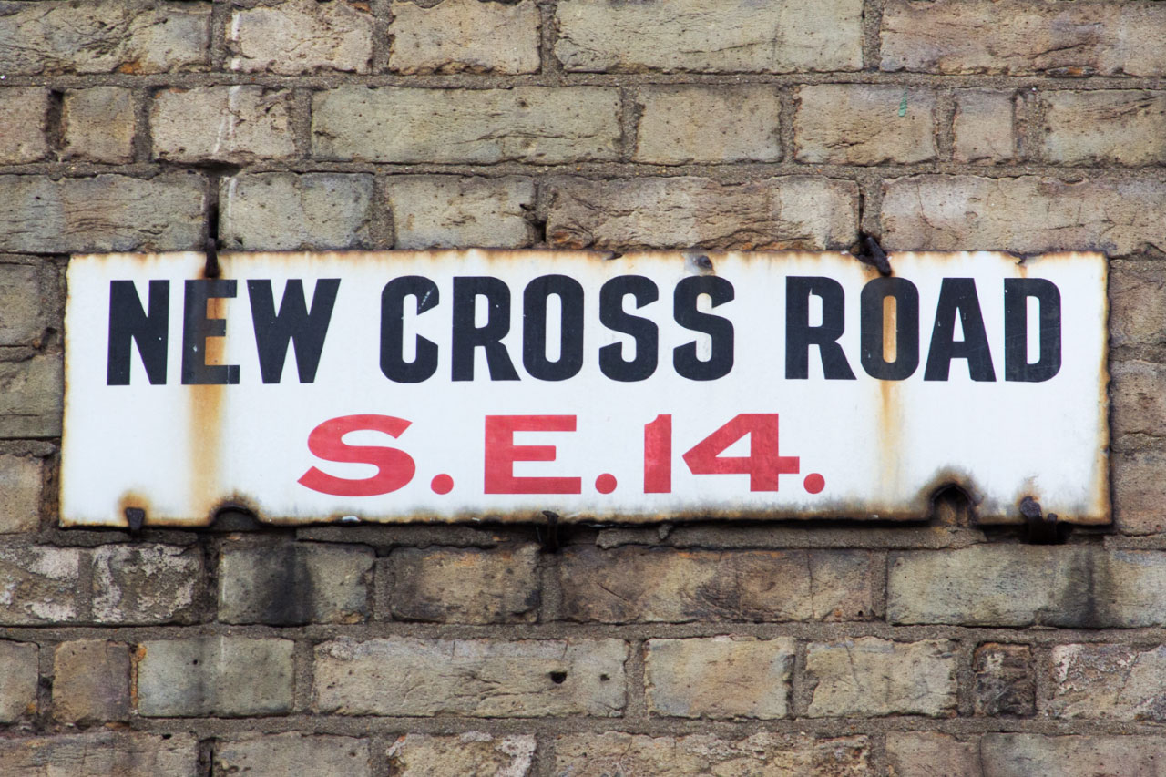
The sign above, from the Metropolitan Borough of Southwark, features various forms of the lettering. You can see the angles on the terminals of the G and S, as well as on the ends of the diagonals of the Z; and the flared leg of the R.
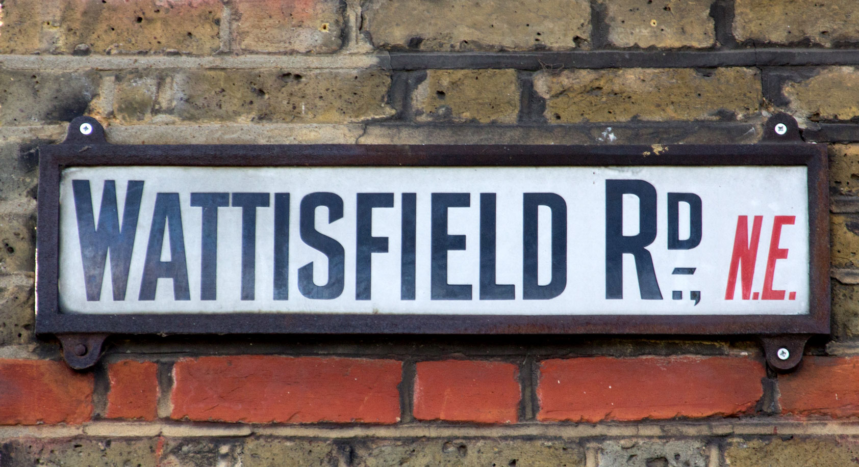
The sign below, from the abolished London postal district of N.E., has a similar style, though slightly more condensed, with sharper terminals on the S, and a slightly more elaborate R.
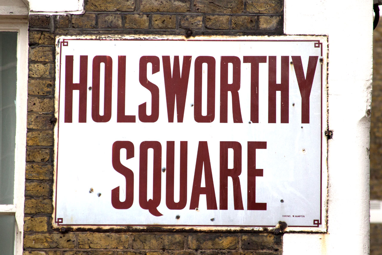
This large enamel sign, manufactured by Chromo of Wolverhampton, is ultra condensed, with a rather wonderful tail to the Q.
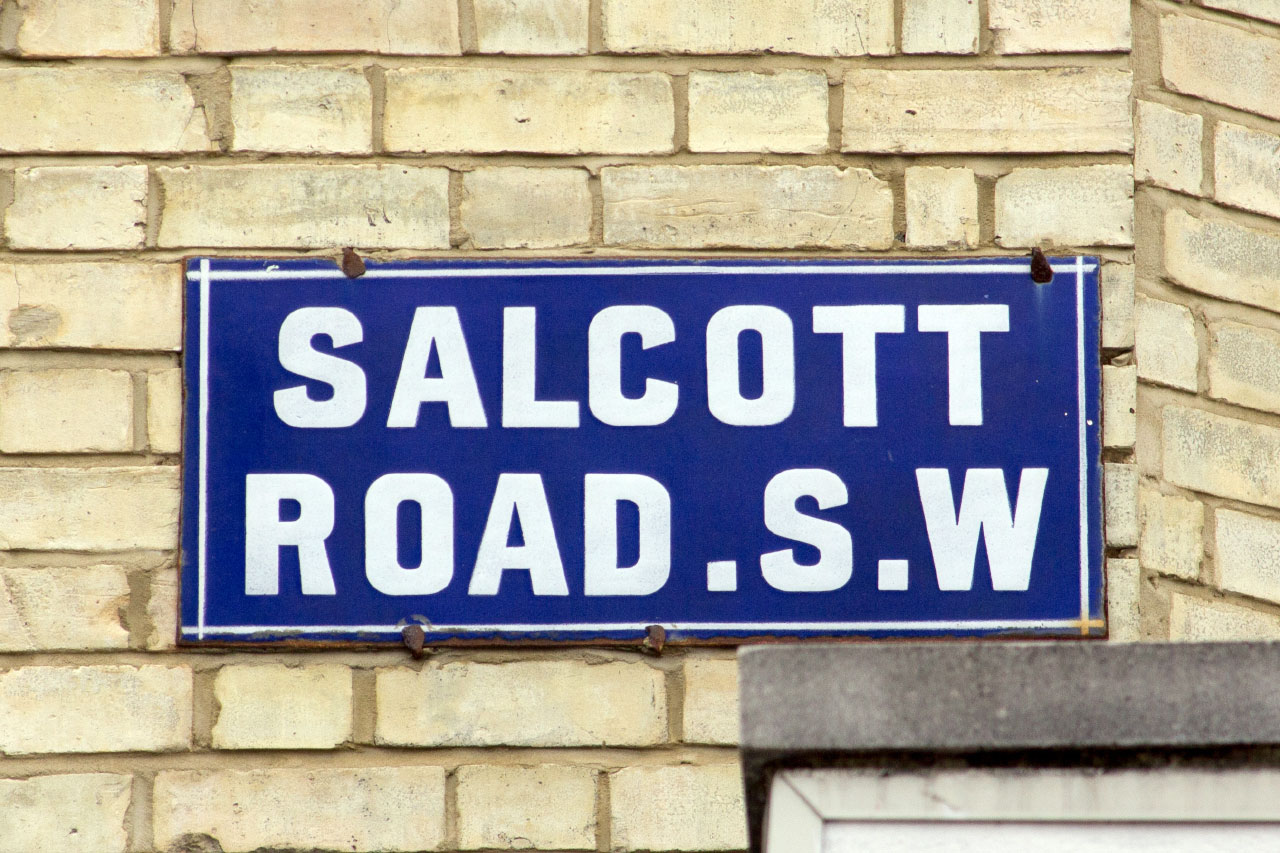
This street nameplate in Clapham features a much blockier form of the lettering:
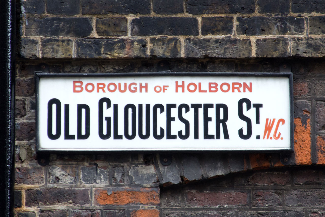
Many of the nameplates from the Metropolitan Borough of Holborn feature this style of lettering, on both enamel and milk glass signs, and in many different widths. Here you can see the G, C and S all together:
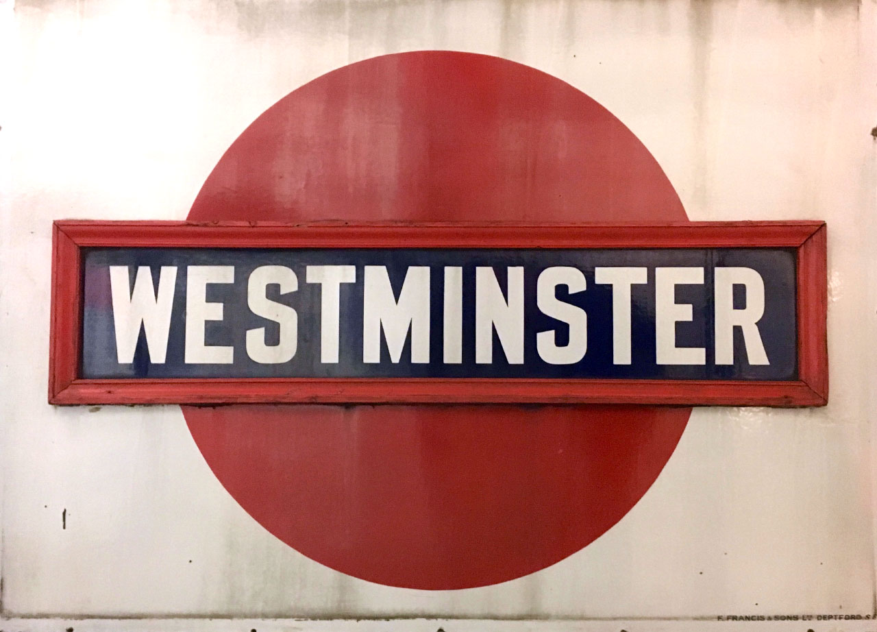
It’s not just street nameplates either. Here’s one of the early roundels from the District line of London’s Underground, from some time between 1908 and 1915, manufactured by F.Francis & Sons, Deptford; and photographed at TfL’s Museum Depot.
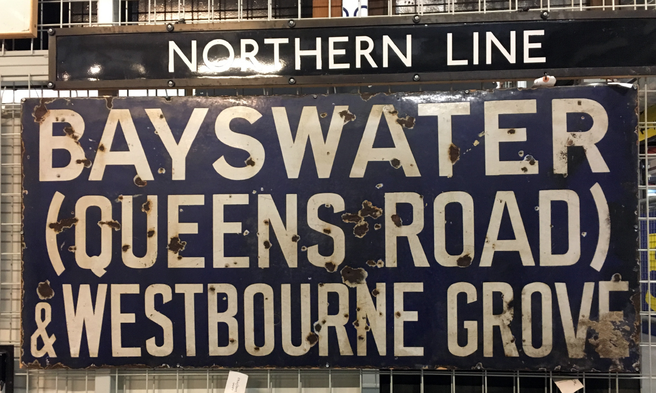
Also at the Museum Depot, we spotted this creative mix of lettering styles:
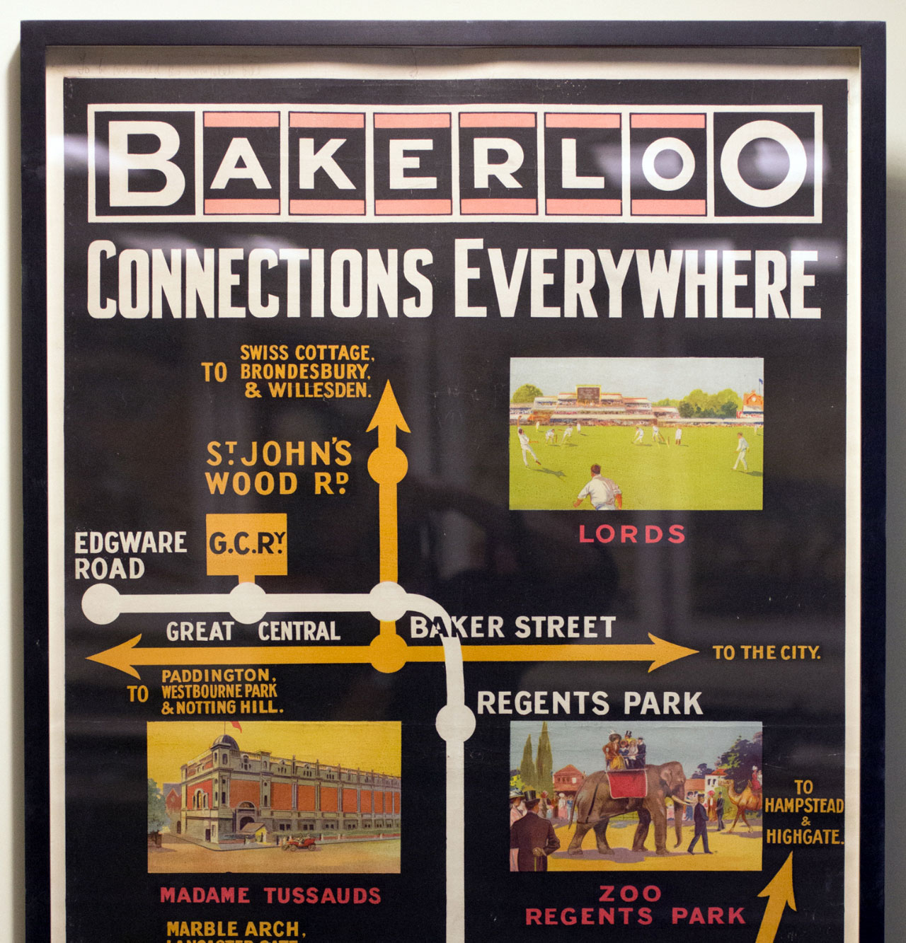
We even spotted the style crop up on this 1908 Bakerloo poster at the depot – possibly the artist had taken the style from existing signage.
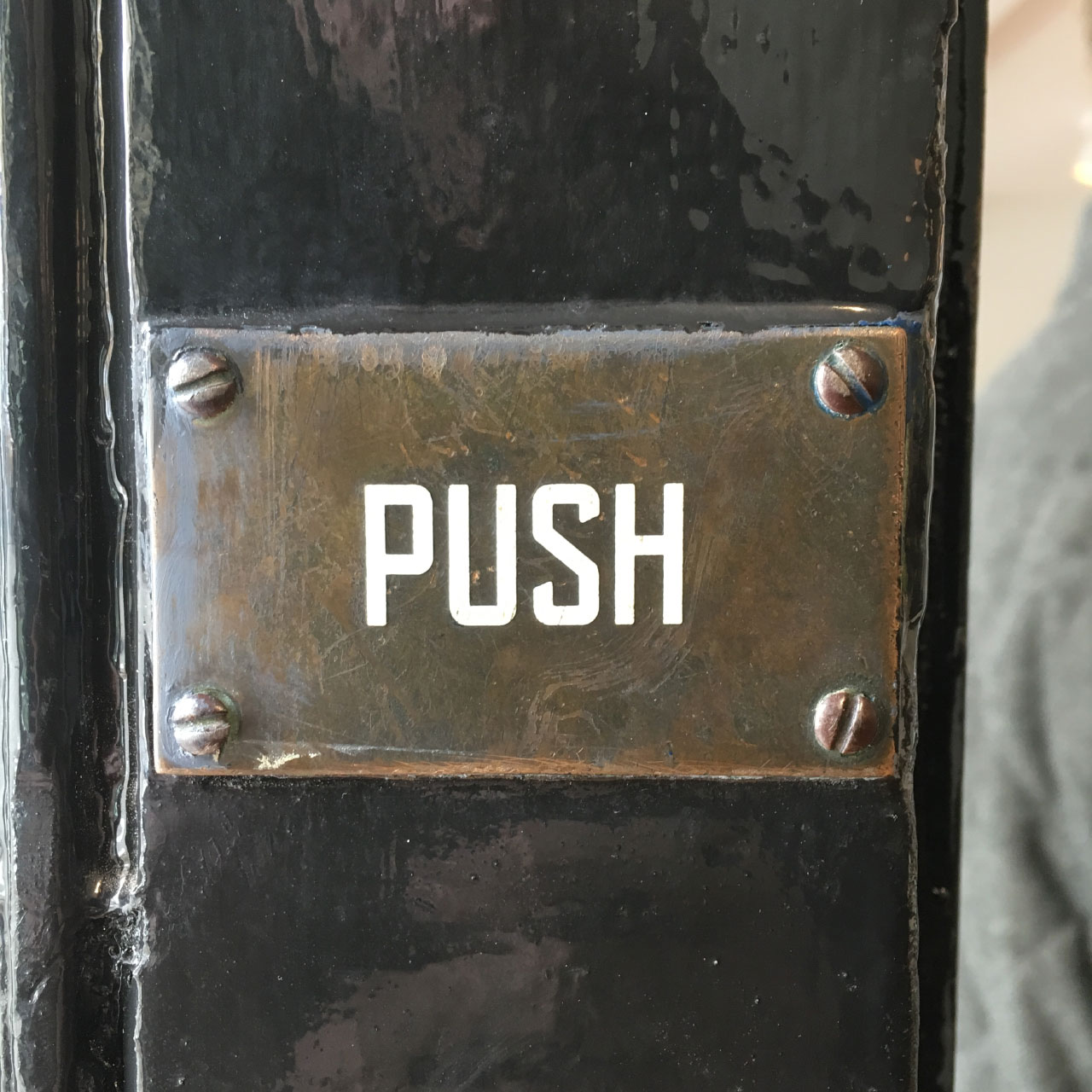
And here’s that S again, on a metal door plate:
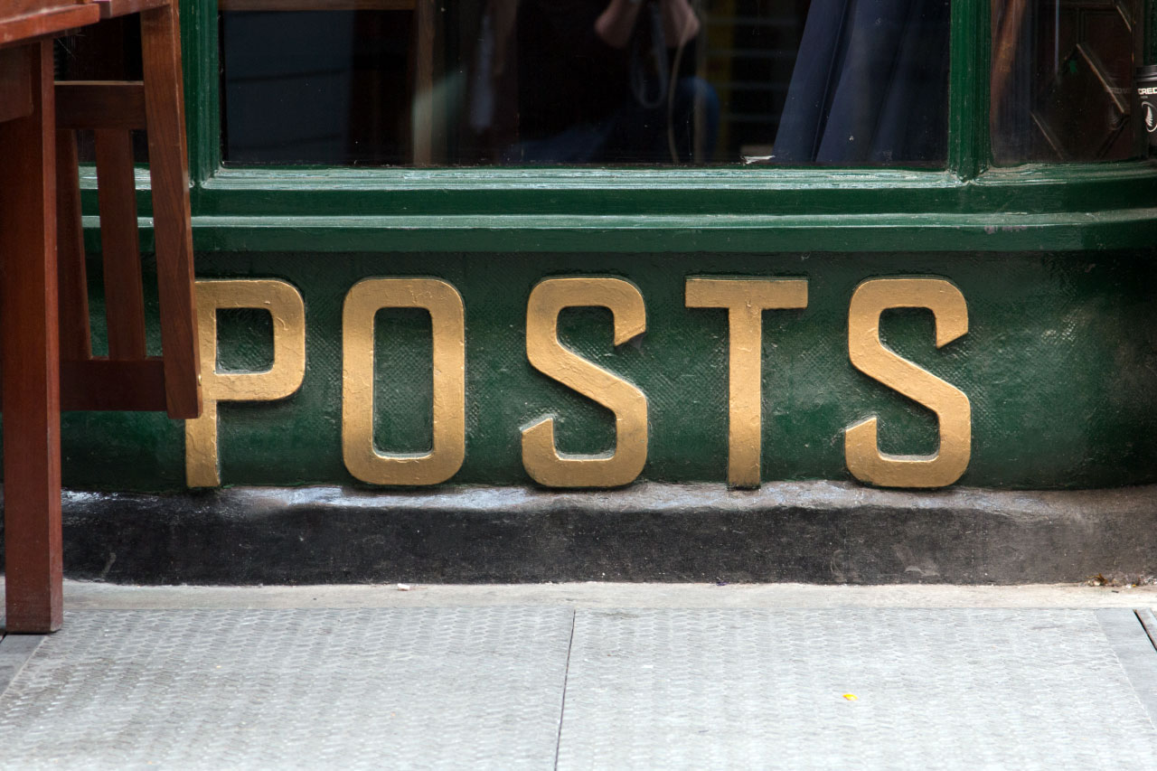
And here in relief lettering on the outside of the Blue Posts pub on Kingly Street in Soho:
But, although I’ve hunted high and low, I haven’t yet found out where this lettering style originated. You see it primarily on enamel signs, so I wonder if it originated there?
There are are examples of some typefaces that have similarities, but nothing that matches the style specifically.
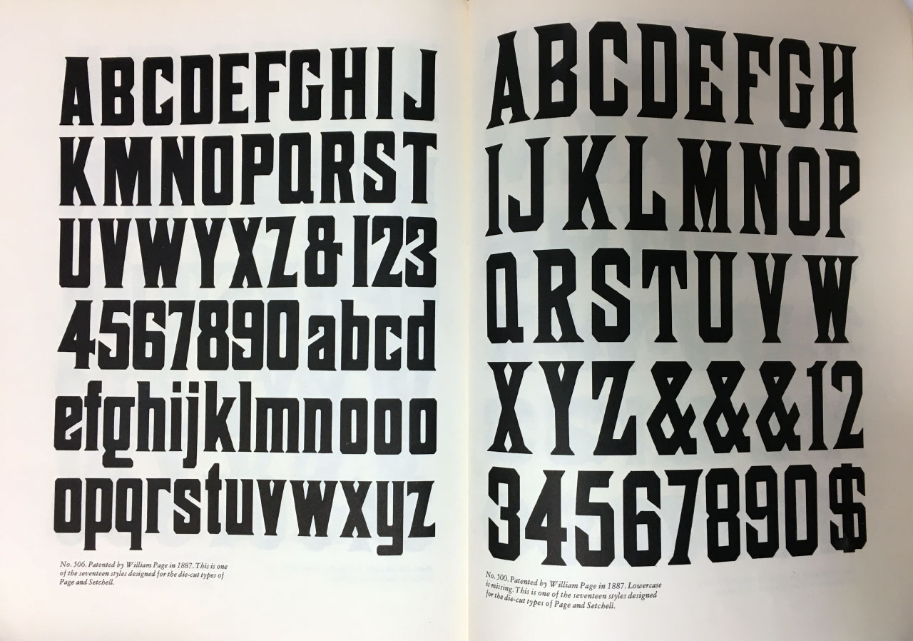
For example, the typeface below, No. 506, from William Page in 1887, found in American Wood Type 1828-1900 by Rob Roy Kelly, has angled terminals, but heading in rather different directions from the lettering above. And of course has serifs too.
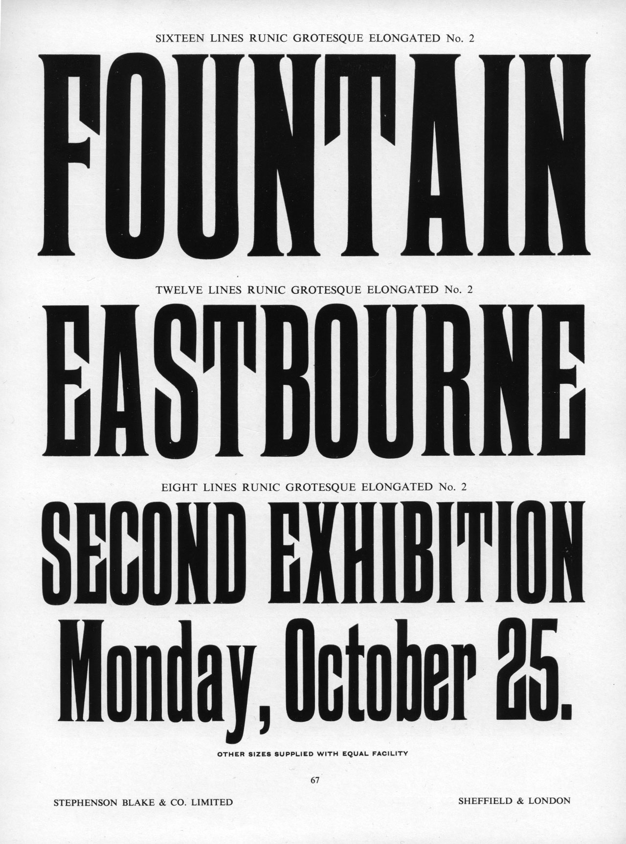
Similarly, the Runic Grotesque Elongated from Stephenson Blake, shown here in their Specimens of Wood Letter Borders Ornaments &c. from 1962:
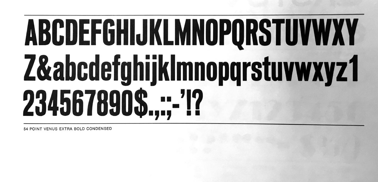
The closest I’ve yet found is Venus Extra Bold Condensed, from around 1916. Venus was a multi-weight family, from the Bauer Type Foundry in Germany.
Contemporary type designers have of course looked back to this intriguing style to create revival typefaces. Particularly notable are Keith Bates’ Enamela typeface and Weathersbee Type’s Franchise.
But the origins of the style remain quite a mystery. I’d love to find out more. So if you know anything, do get in touch. And do share this post with anyone else you think might have some information.