Collections and Collaborations at St Bride Library
Towards the end of last year, the good folks at the St Bride Library got in touch and asked if I’d like to design a poster to help raise funds for the library, on the theme of ‘Collections and Collaborations’.
The library originally opened in November 1895, and it’s one of the world’s most significant collections of books about printing, typography, paper-making and graphic design. It’s home to a spectacular range of the physical objects of printing and type-founding, including presses, punches, matrices and type-casting equipment. It also houses one of the world’s largest and most important collections of type specimens. It’s an utterly invaluable resource, and is always looking for supporters – why not become a friend?
The folks at St Bride had approached fourteen “artists, designers, writers, illustrators and musicians”, asking us to collaborate in pairs to create posters celebrating and highlighting “the rich and varied collections held within the St Bride Library and the building itself”.
For my collaboration, I was paired with the wonderful Bob Richardson, manager of the library – a deeply lovely man with an encyclopaedic knowledge of printing. I visited the library together with another pair of collaborators: designers Jonathan Barnbrook and Anil Aykan from Barnbrook Studio, who together also make up musical duo Fragile Self.
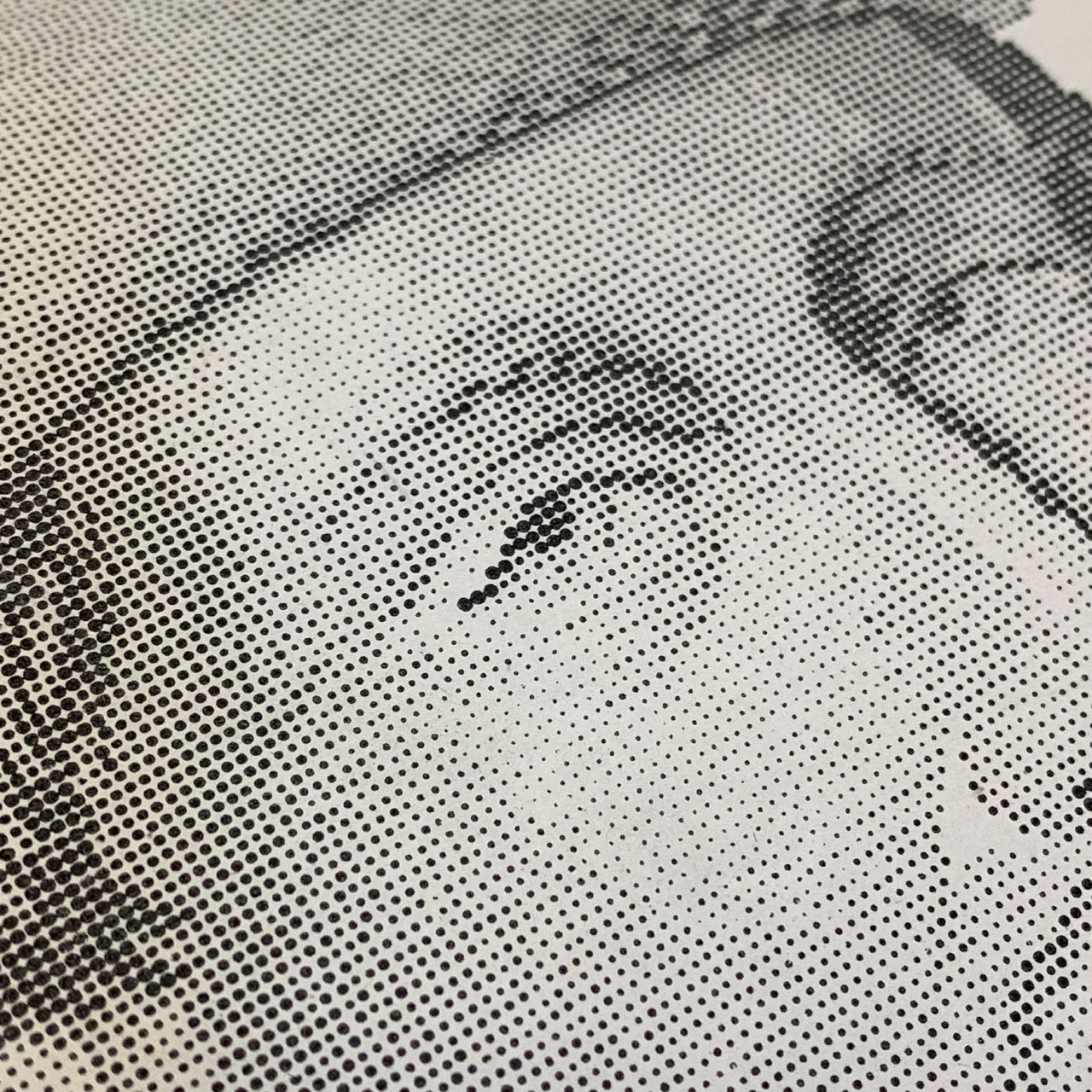
Bob had been good enough to pull together some of the most notable bits from the library’s collection for us, and showed us a treasure trove of incredible stuff, including this portrait of Johannes Gutenberg set in Stigmatype.
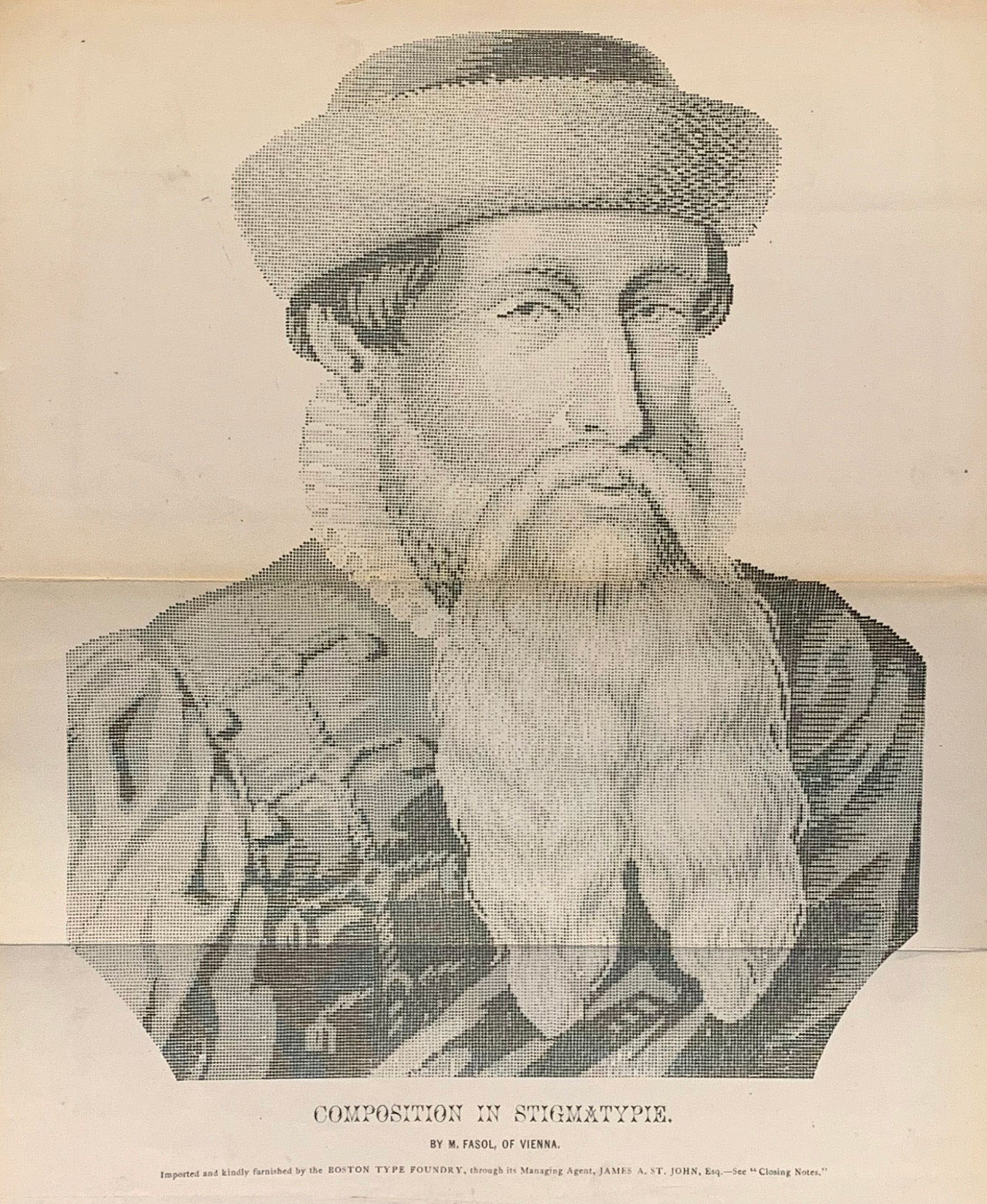
This uses tiny pieces of type, each shaped as a circle of different size, to build up a halftone image.
Insane.
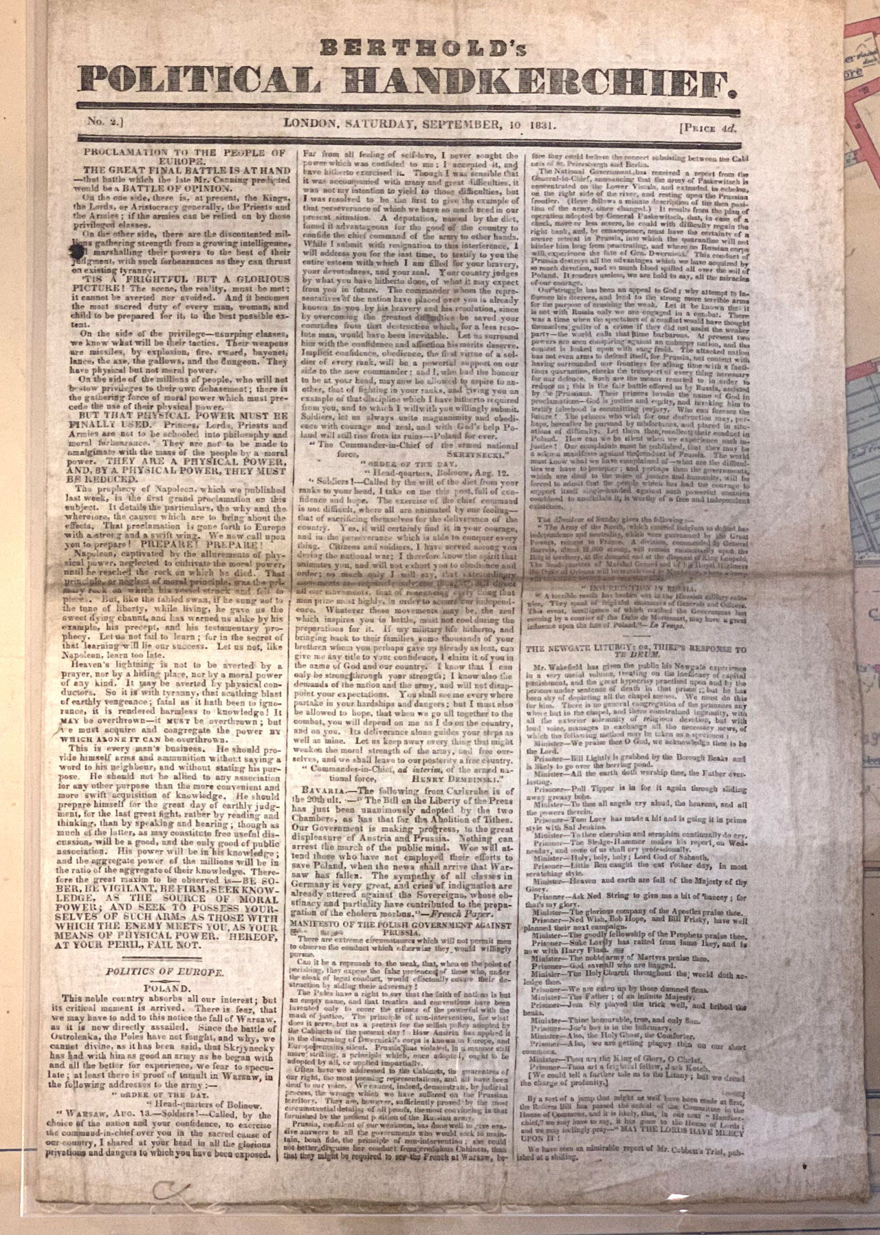
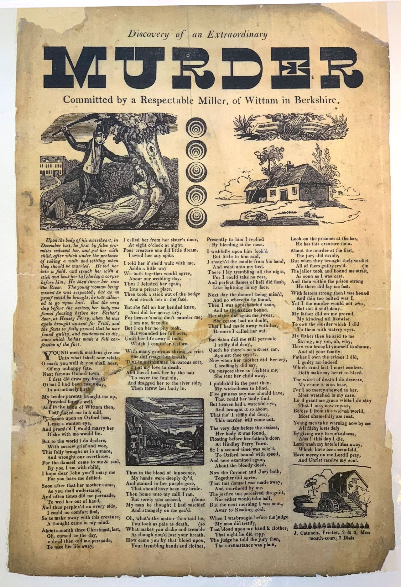
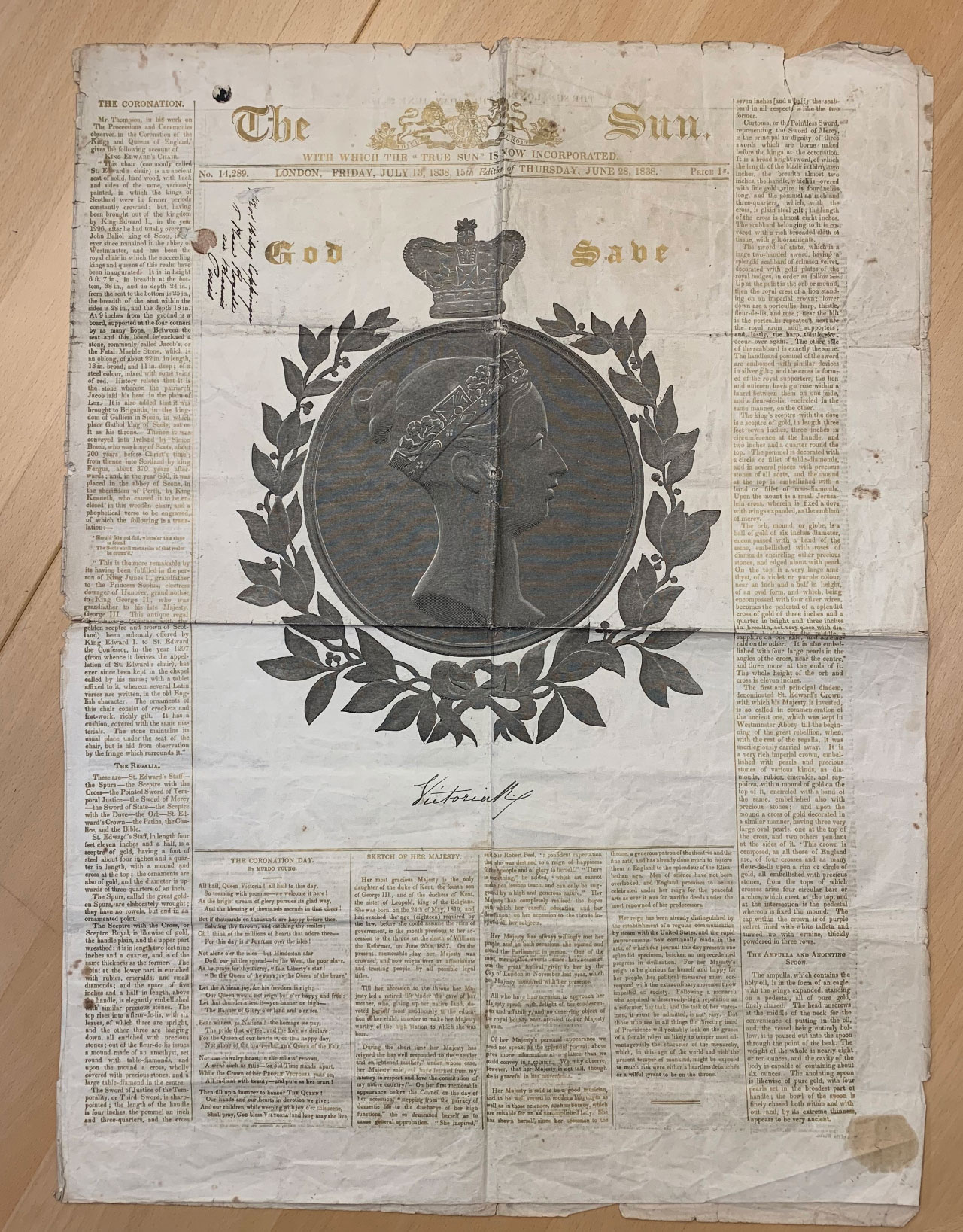
We also got introduced to Berthold’s Political Handkerchief, some fantastic broadsides, and even an edition of The Sun printed in a gold coloured ink, which gradually poisoned its printers. Visit the library to hear the full stories on each of those.
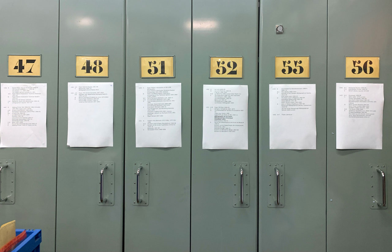
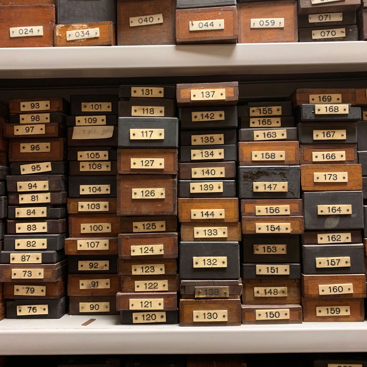
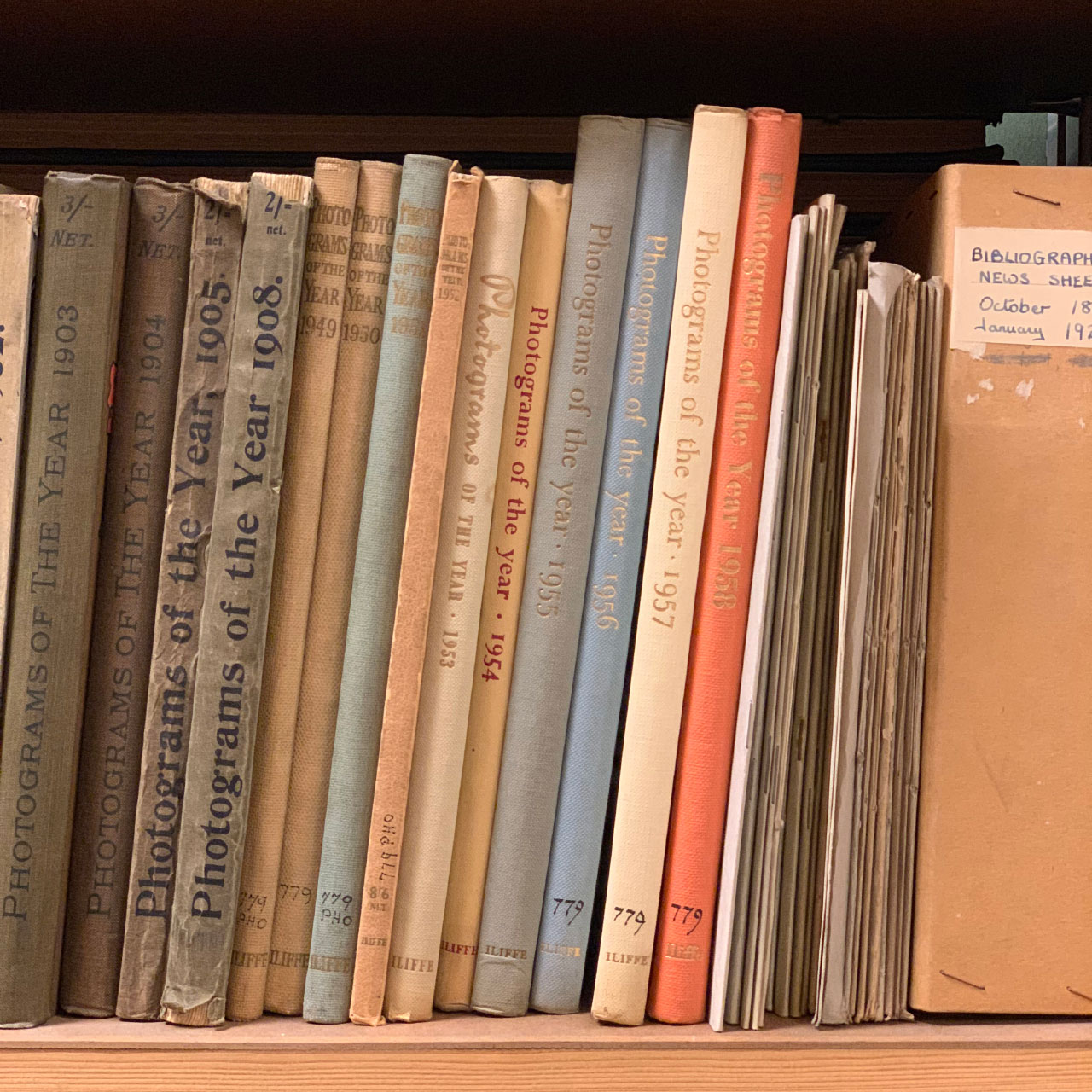
Even the shelves looked stunning.
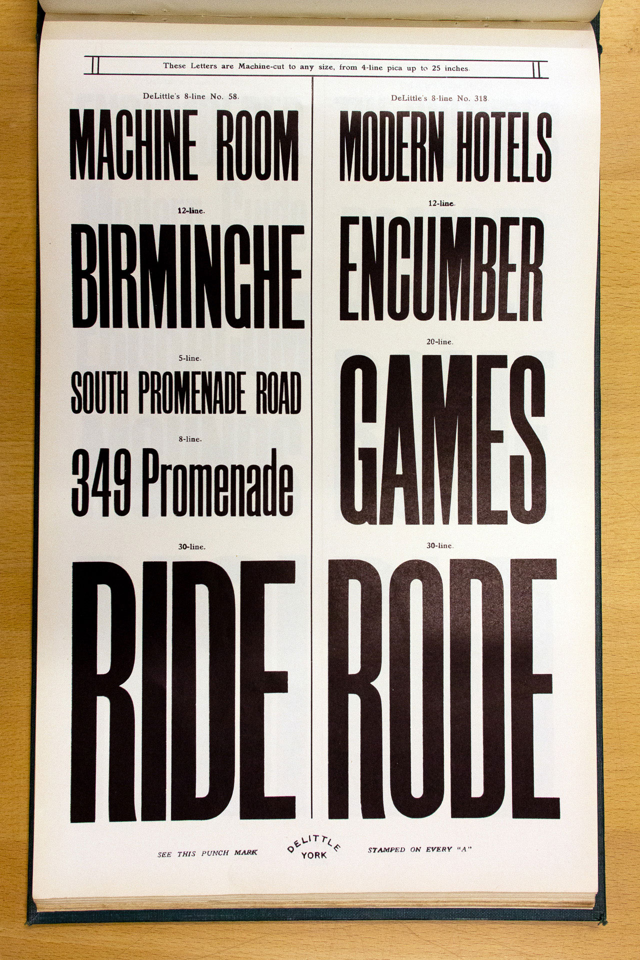
During the visit, I spotted an unusually shaped booklet lying slightly to one side – Specimens of Wood Letter by R. D. DeLittle.
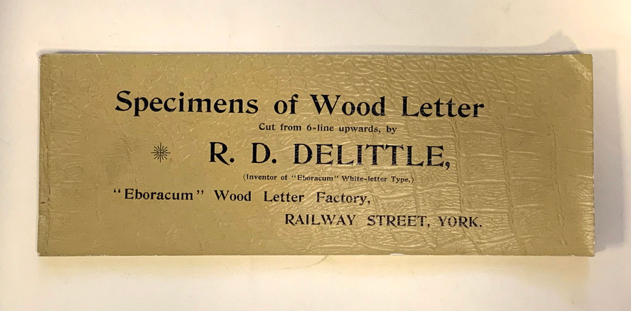
DeLittle was the largest and most creative designer and manufacturer of woodblock typefaces in Britain. Set up by Robert Duncan DeLittle in York in 1888 as the R D DeLittle “Eboracum” Letter Factory, it produced a huge range of display typefaces in wood. Read more about DeLittle over on woodtyperesearch.com.
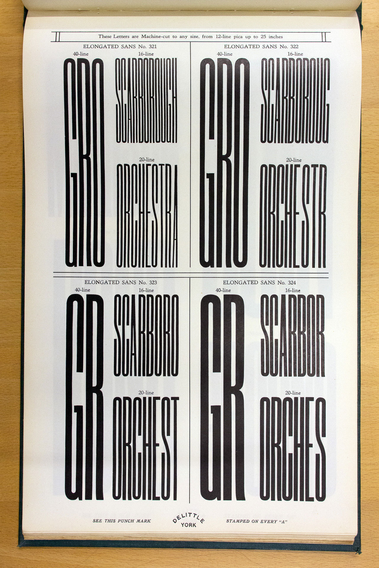
What particularly caught my eye were their incredible elongated sans serif typefaces – brilliantly tall and thin types designed for use on narrow theatre playbills.
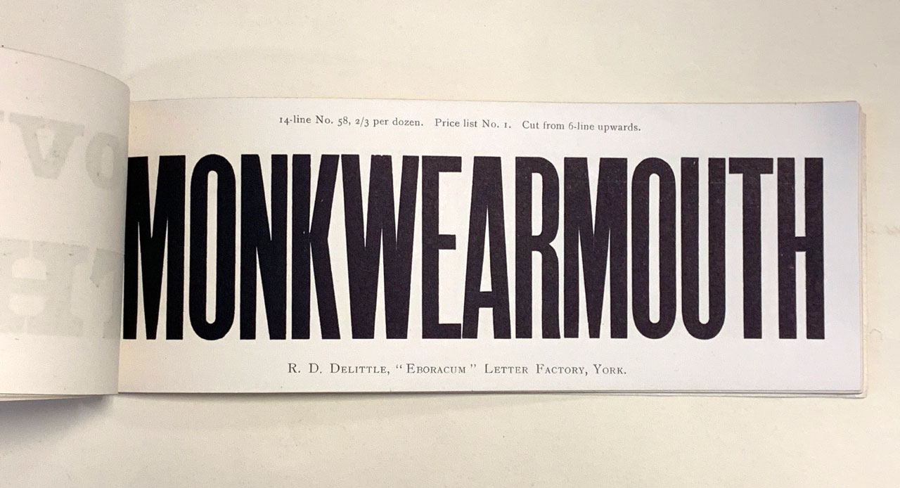
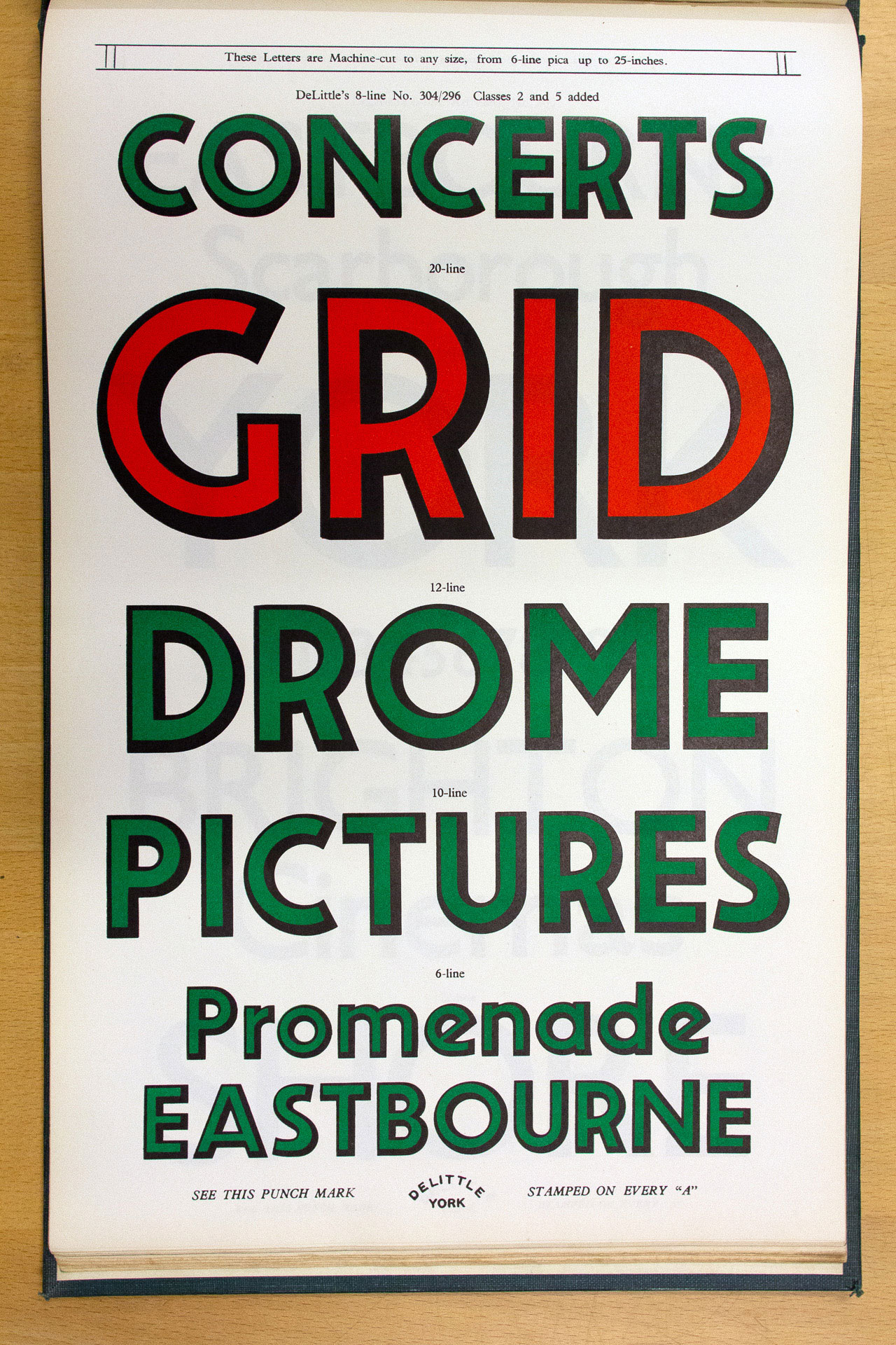
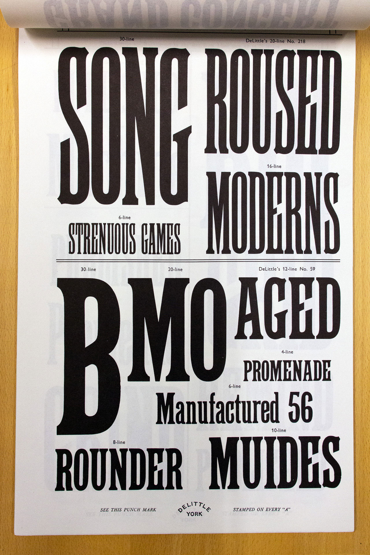
In the reading room I saw a more recent DeLittle specimen book, from 1985 (the company finally ceased trading in 1998) which had pages and pages of these stunning elongated faces. The designs of the specimens hardly changed over the years. Each typeface was numbered, and some of them date back to the 1890s. For example No. 53 was from 1892, No. 58 from 1893.
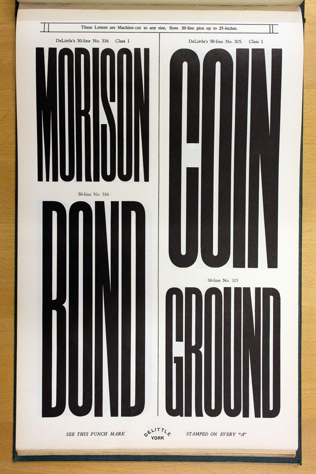
The other typefaces were no less interesting:
I did a bit of research into DeLittle, and came across Colophon Foundry’s recently released Coign type family, which was inspired by DeLittle’s elongated sans faces. The team from Colophon had even visited St Bride Library as part of their research.
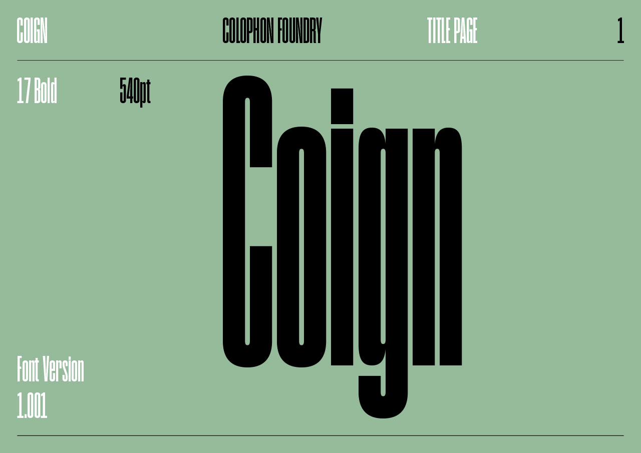
Coign is an extensive family, with 28 styles featuring 4 widths in seven weights. It’s a real stunner. (Read about its development.)
That meant that I could create a poster that not only showcased a physical thing from the library, but also the more abstract essence of the library as a place of research, inspiration and scholarship. Brilliant!
I wrote some words that captured what the library meant to me, and used Coign to set those, mirroring the style of the DeLittle specimens, with smaller text set in Caslon:
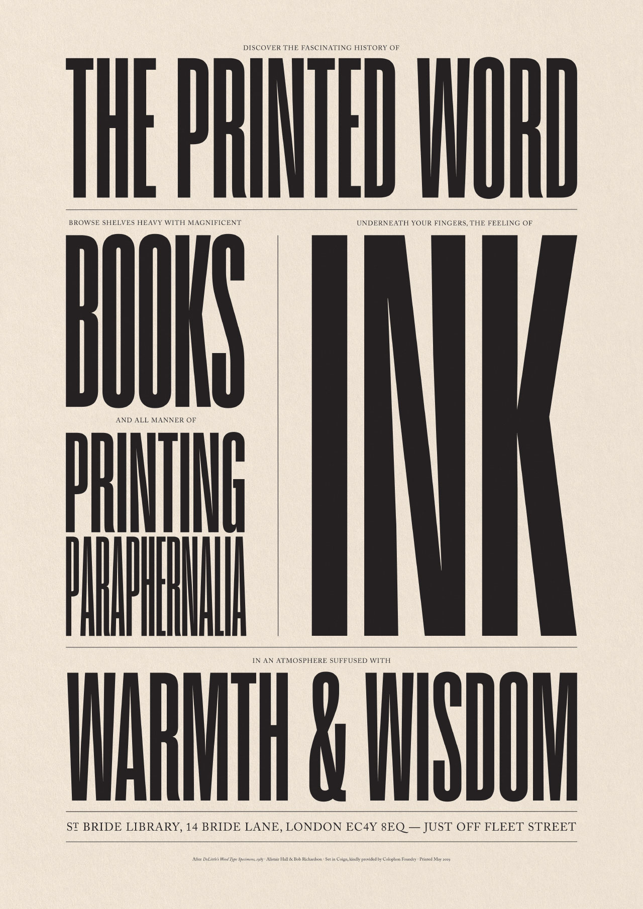
When you’re up close the full text reads:
‘Discover the fascinating history of the printed word. Browse shelves heavy with magnificent books and all manner of printing paraphernalia. Underneath your fingers, the feeling of ink. In an atmosphere suffused with warmth and wisdom. St Bride Library, 14 Bride Lane, London EC4Y 8EQ – just off Fleet Street.’
but from a distance, it reads:
‘The Printed Word. Books. Printing Paraphernalia. Ink. Warmth & Wisdom.’
It’s an intentionally digital design – using the tools of today, but inspired by the tools of the past. It was printed by Boss Print onto an off white stock, 170gsm Creative Print Champagne, kindly supplied by Fenner Paper.
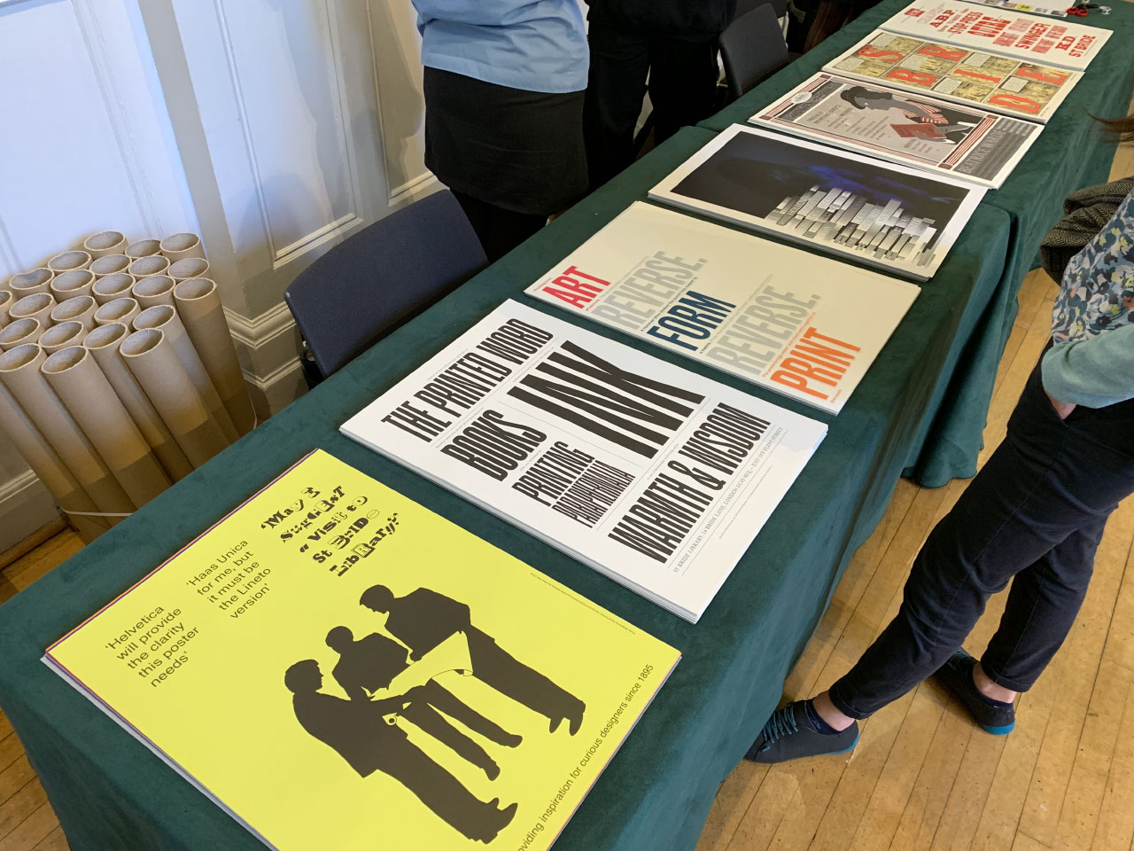
Last night was the launch event at the library, and the first chance for everyone to see all the posters together, and to hear from the teams behind them.
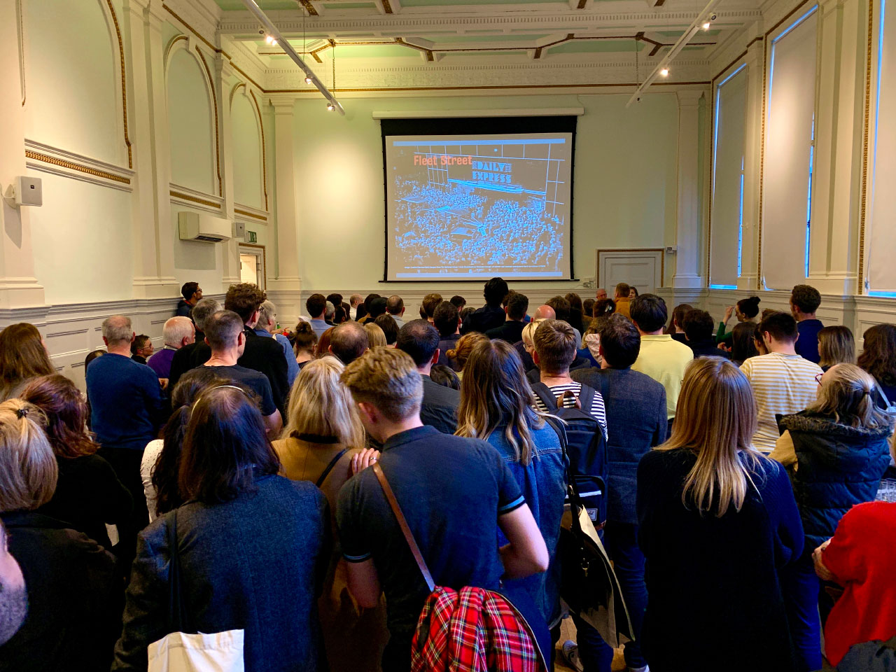
There are 7 posters in total, each printed in an edition of 80. And crikey, what a set!
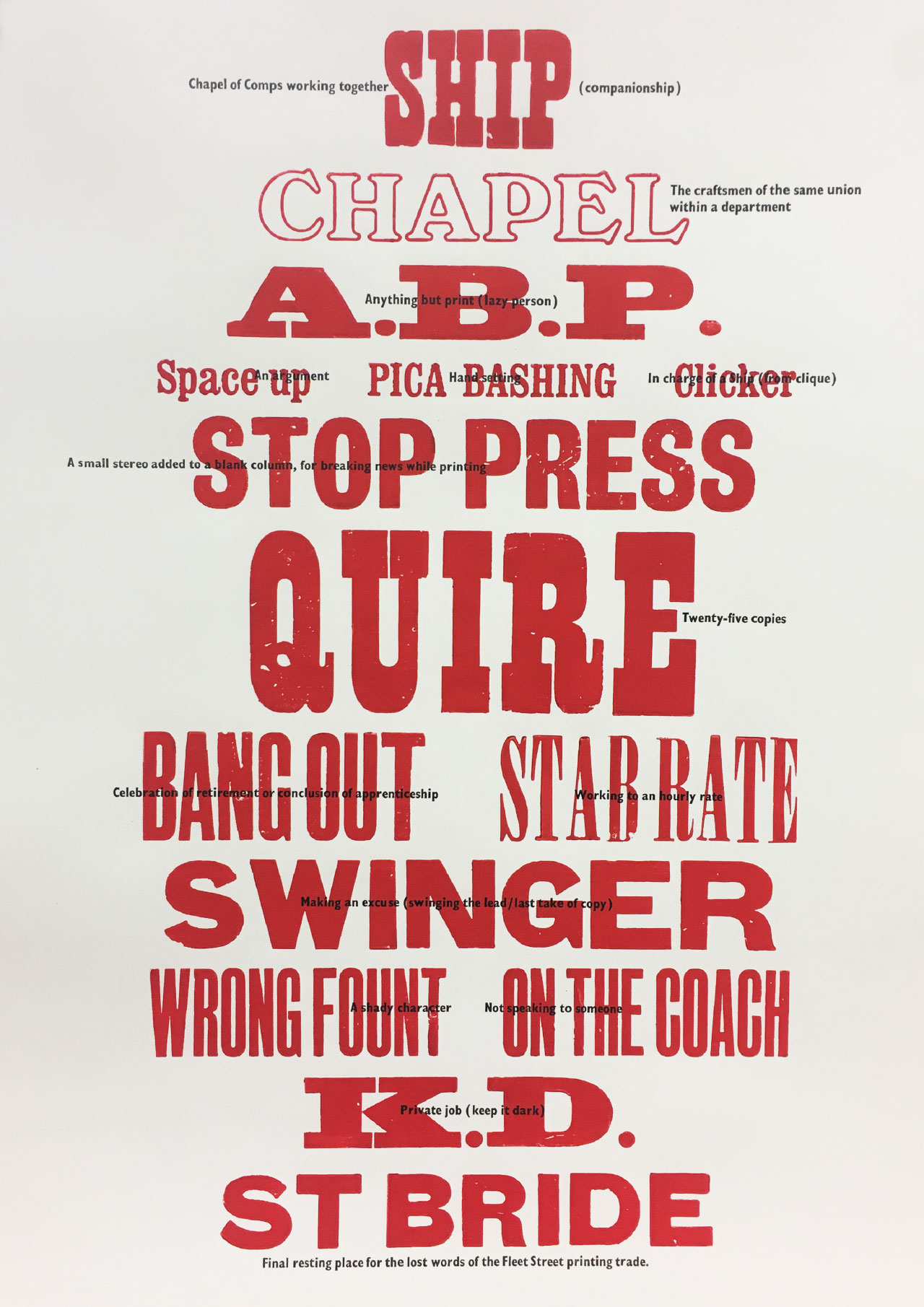
Designer, writer and teacher Catherine Dixon worked with freelance type compositor Mick Clayton, who manages the St Bride Print Workshop. They went the extra mile – well, several extra miles to be honest – and letterpress printed their creation in the print workshops at the library, onto Shiro Echo, White 160gsm. It features a collection of ‘lost words’ from the printing trade.
Book designer Tom Etherington, from Penguin Press, working with author Keith Houston, who wrote the fantastic books Shady Characters and The Book, created this fantastic print.
The image above doesn’t really capture the brilliant way it’s been printed though. All the grey text is actually printed in black on the reverse side of the poster, showing through the thin 60gsm Sixties stock, as you can see here:
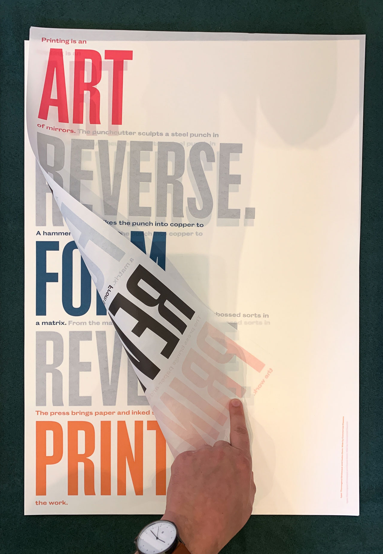
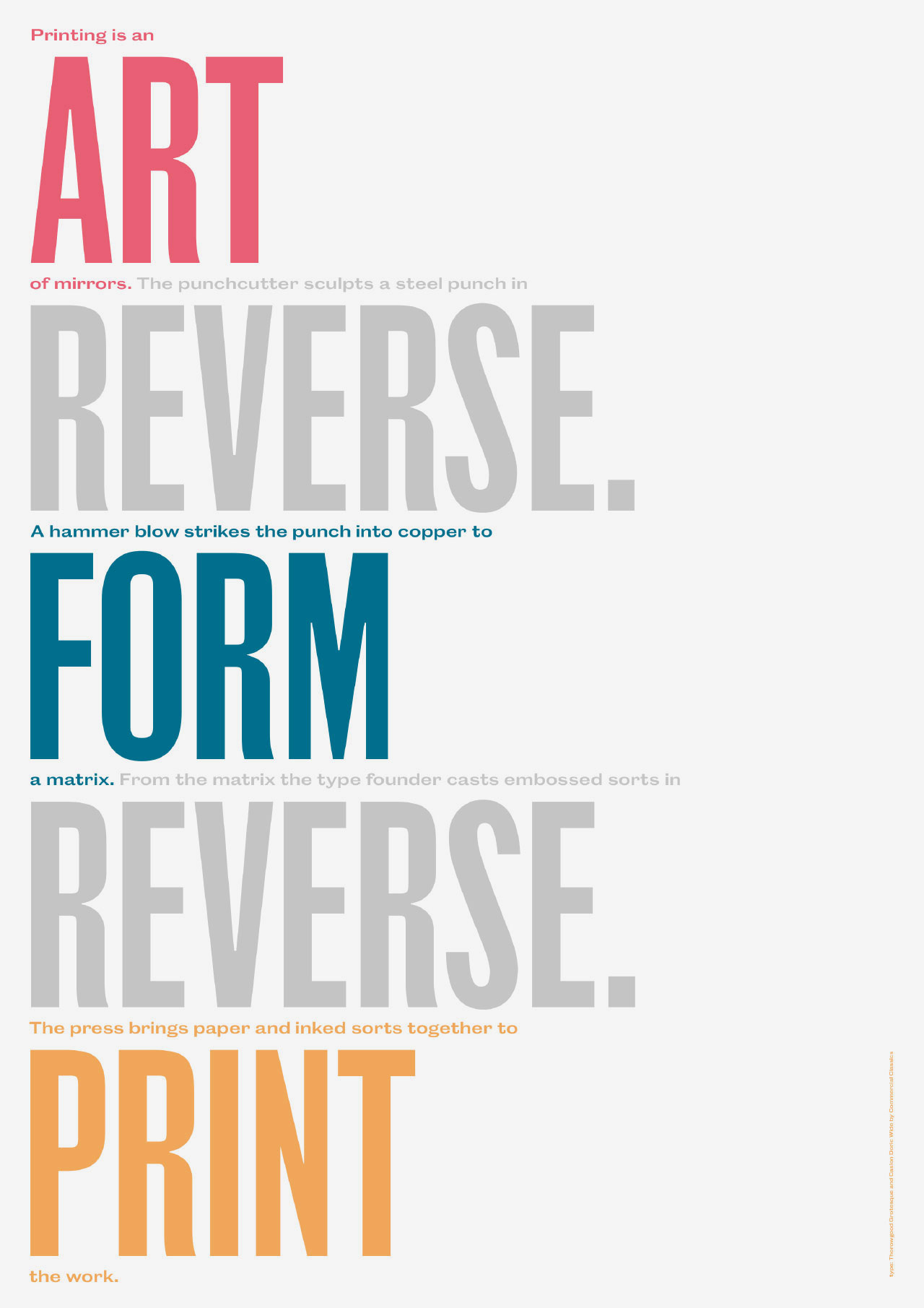
The type on that one is set in Commercial Type’s soon to be released Thorowgood Grotesque and Caslon Doric Wide – keep an eye on commercialclassics.com for its release.
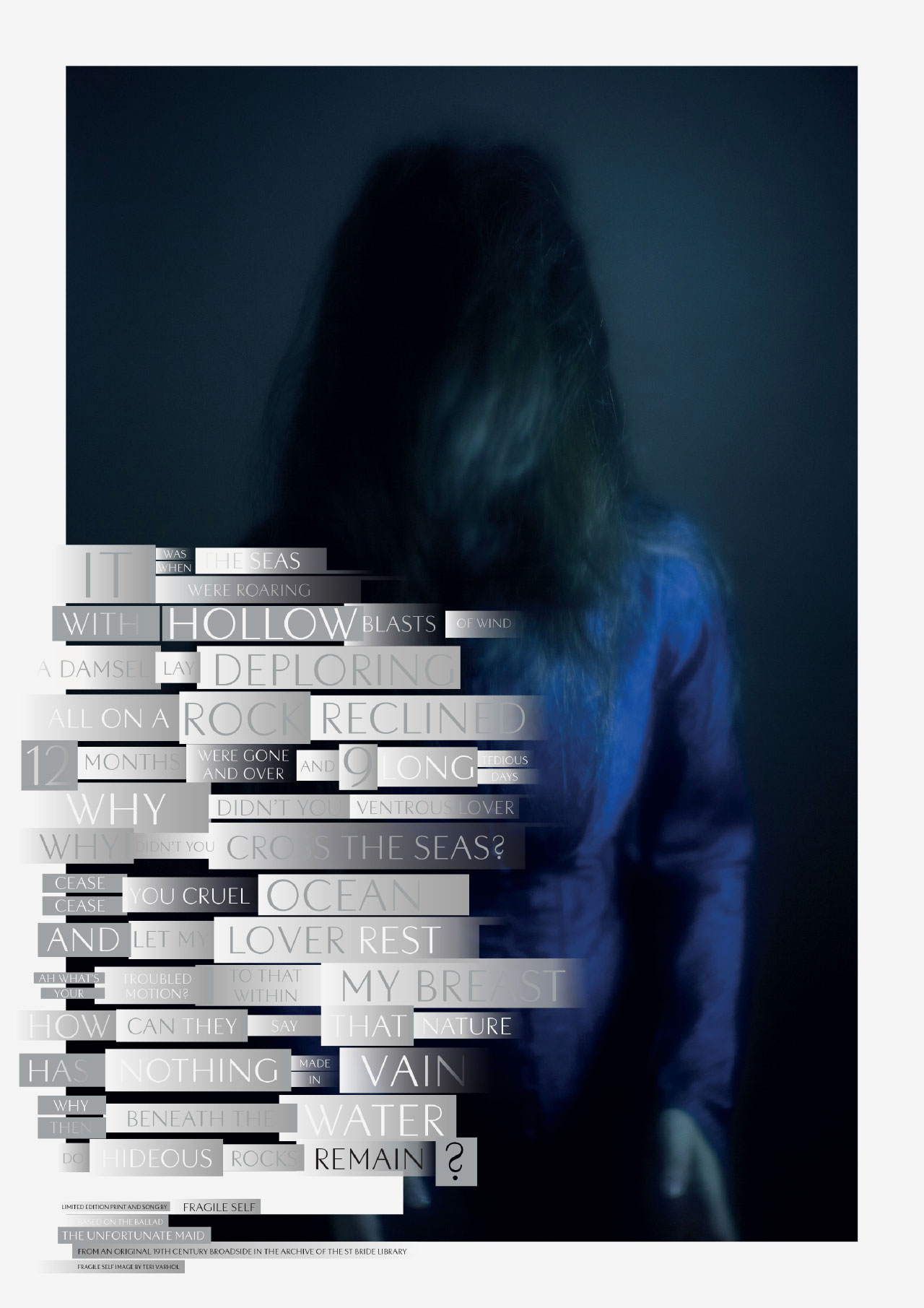
The aforementioned Anil Aykan & Jonathan Barnbrook from Barnbrook Studio took a set of song lyrics from a broadside they found in the library, and created this contemporary version, printed on Omnia White 150gsm, and featuring a bespoke typeface:
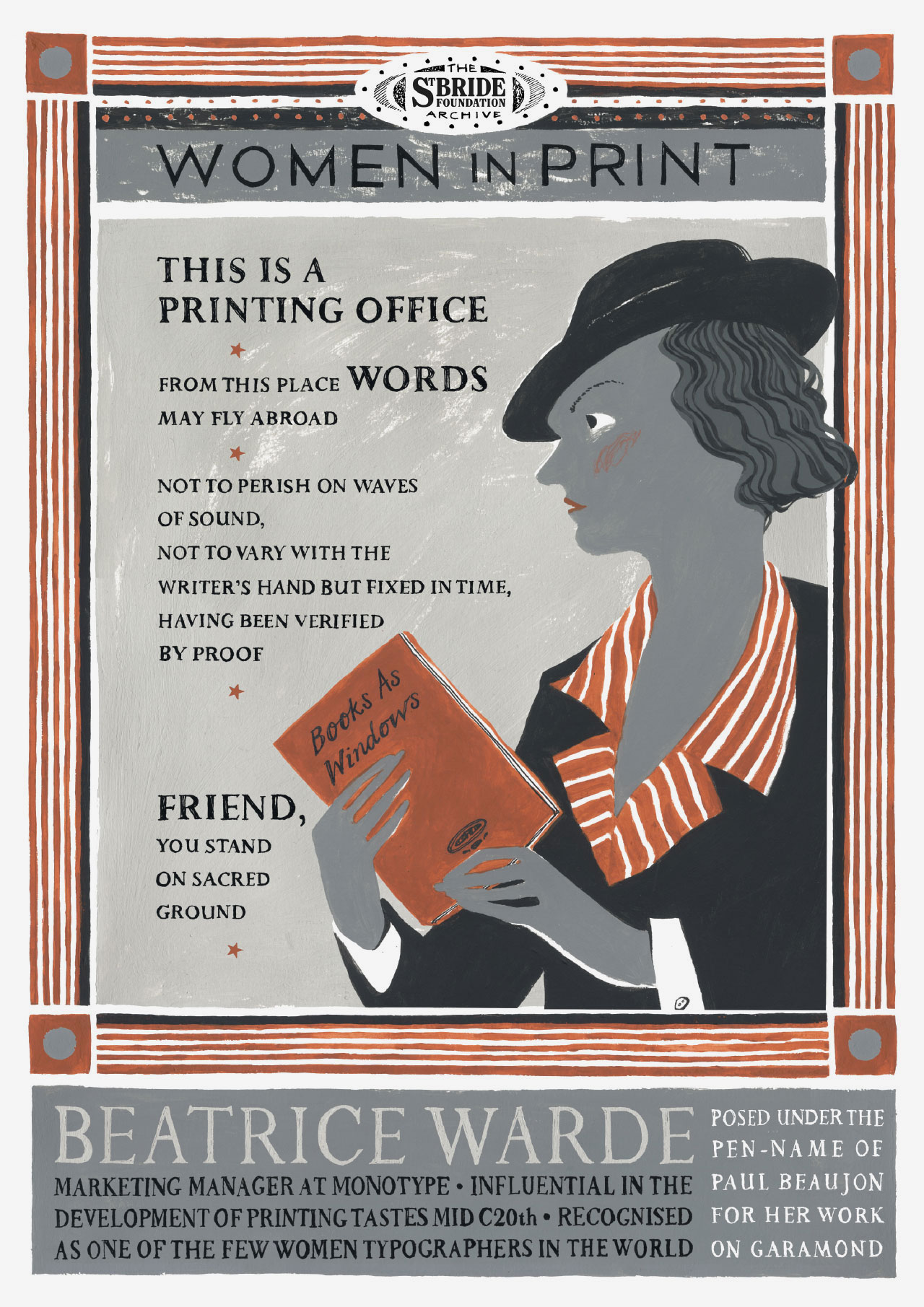
Illustrator and teacher Pam Smy teamed up with book designer and lecturer Ness Wood (together with Maisie Paradise Shearring they make up Orange Beak Studio), and created this print based on the work of Beatrice Warde, printed onto Pergraphica Smooth, Natural 120gsm.
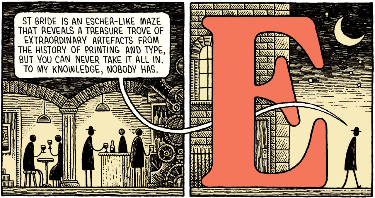
Illustrator Tom Gauld (with whom I worked on a cover for Wikinomics) was paired with John L. Walters, author, musician, and editor of the fantastic Eye magazine. John wrote a piece about the experience of visiting St Bride Library, and Tom created this stunning print around it. It’s printed onto Gardapat 13, Klassica 115gsm.
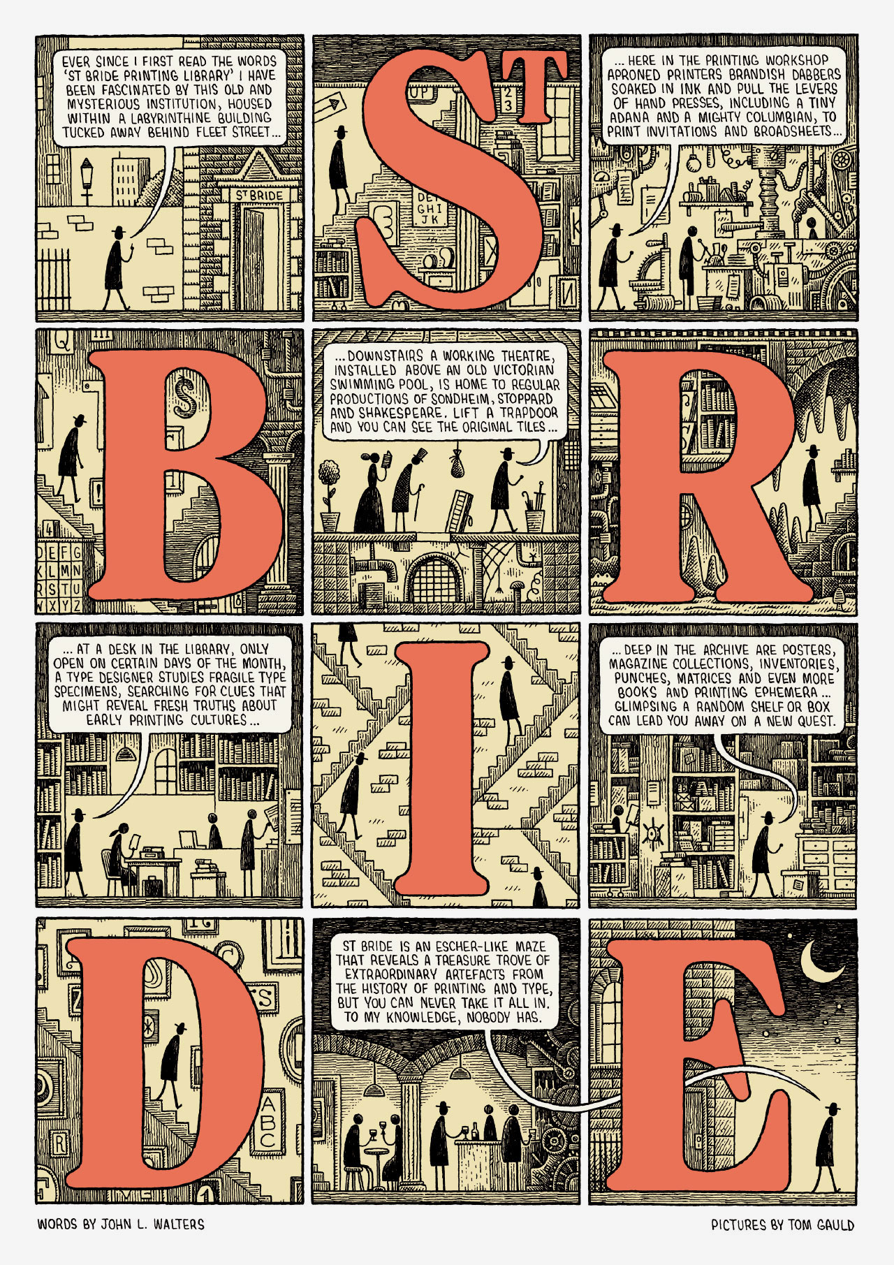
Here’s a detail from that:
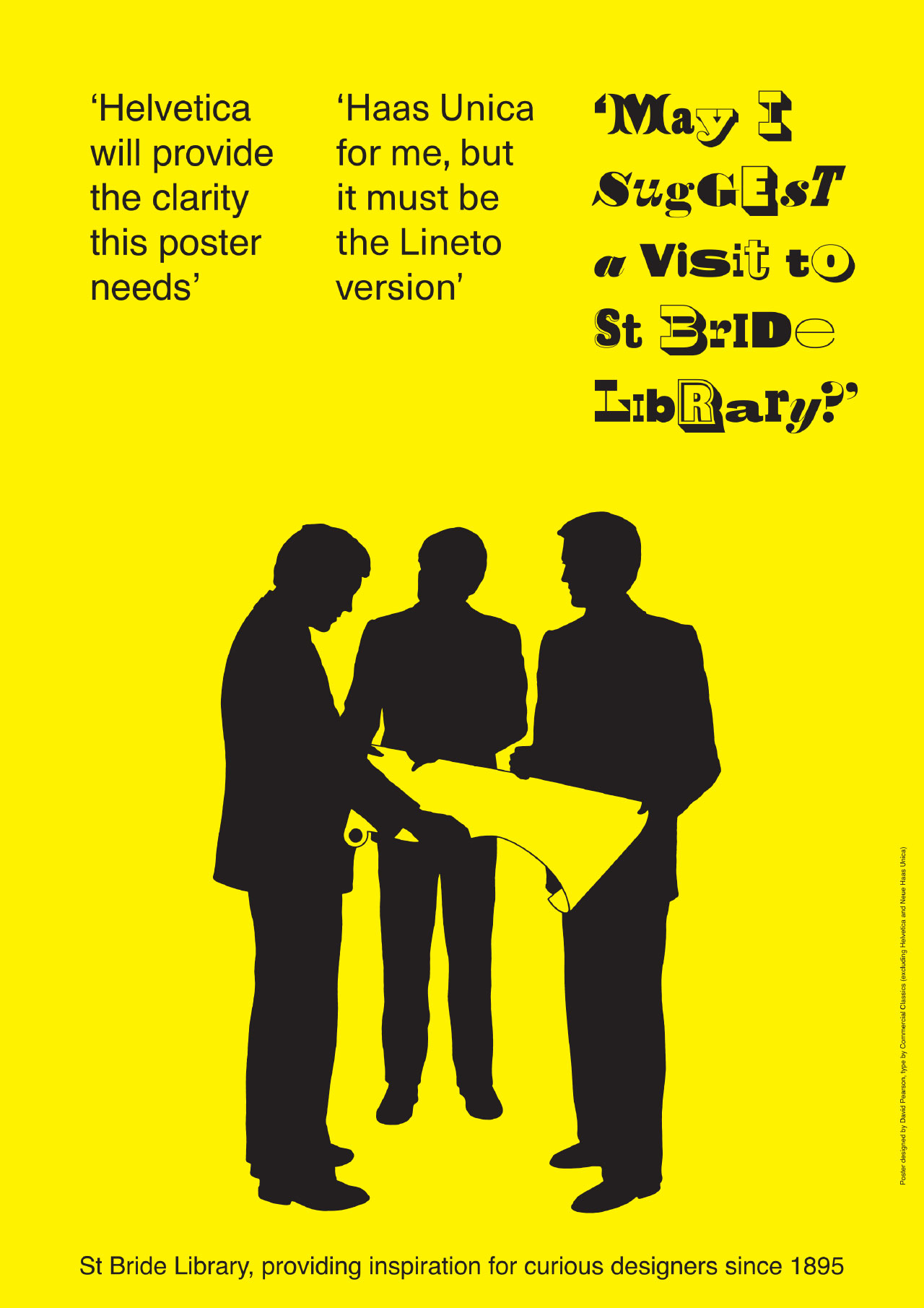
Our studio partner, book designer David Pearson, worked with type designer Paul Barnes from Commercial Type, showcasing some more types from Commercial Classics. Unfortunately Dave’s currently swanning around Japan, so couldn’t make the event. Some people, eh? The posters were printed onto a whole range of different colours of Colorset 120gsm.
The posters are £15 each, except Catherine and Mick’s letterpress print, which is £30. A bargain whichever way you look at it. And full sets are available for £110. They’ll all be on sale at the St Bride Wayzgoose which is on this Sunday, 19 May; and online from the St Bride shop soon.
Huge thanks to the sponsors – Fenner Paper, Boss Print, and Colophon Foundry – and to the brilliant Becky Chilcott for curating the event.