City of Westminster Street Nameplate Auction
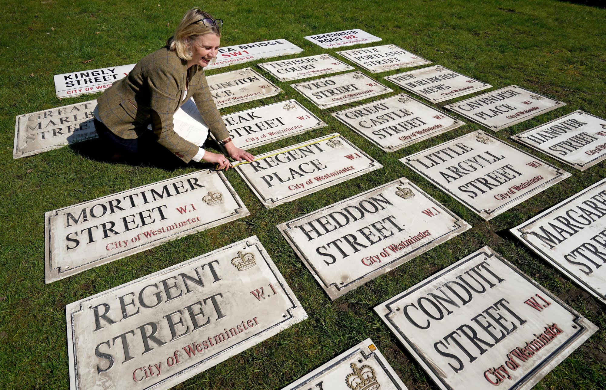
A huge sale of 335 City of Westminster street nameplates has been announced. The online auction will happen on 18 May 2023 at 6pm, through Catherine Southon Auctioneers and The Saleroom.
Westminster sell their old nameplates fairly regularly – it’s a great way of generating revenue from the old nameplates, which are specified to last around twenty years generally, and means they aren’t simply being binned.
This sale is unusual though in that it includes a huge set of signs that aren’t the standard Design Research Unit design, which was implemented in 1968. These signs instead feature a black border with serif lettering (it looks a lot like Times New Roman, though compressed on some of the nameplates), black for the street names, and red for the postal districts and City of Westminster name. The sales blurb lists the signs as being from the 50s and 60s, but I think they’re actually far more recent – possibly from 1992.
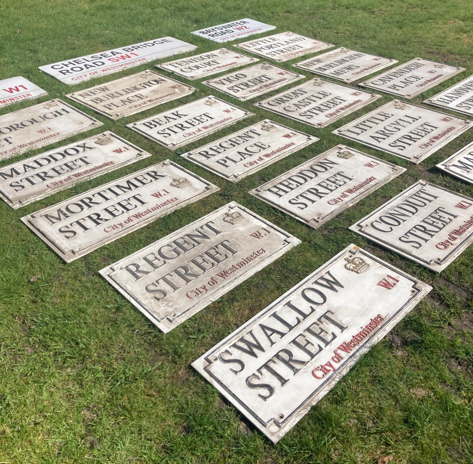
The signs are all from streets which adjoin Regent Street, which led me to do a bit of hunting…
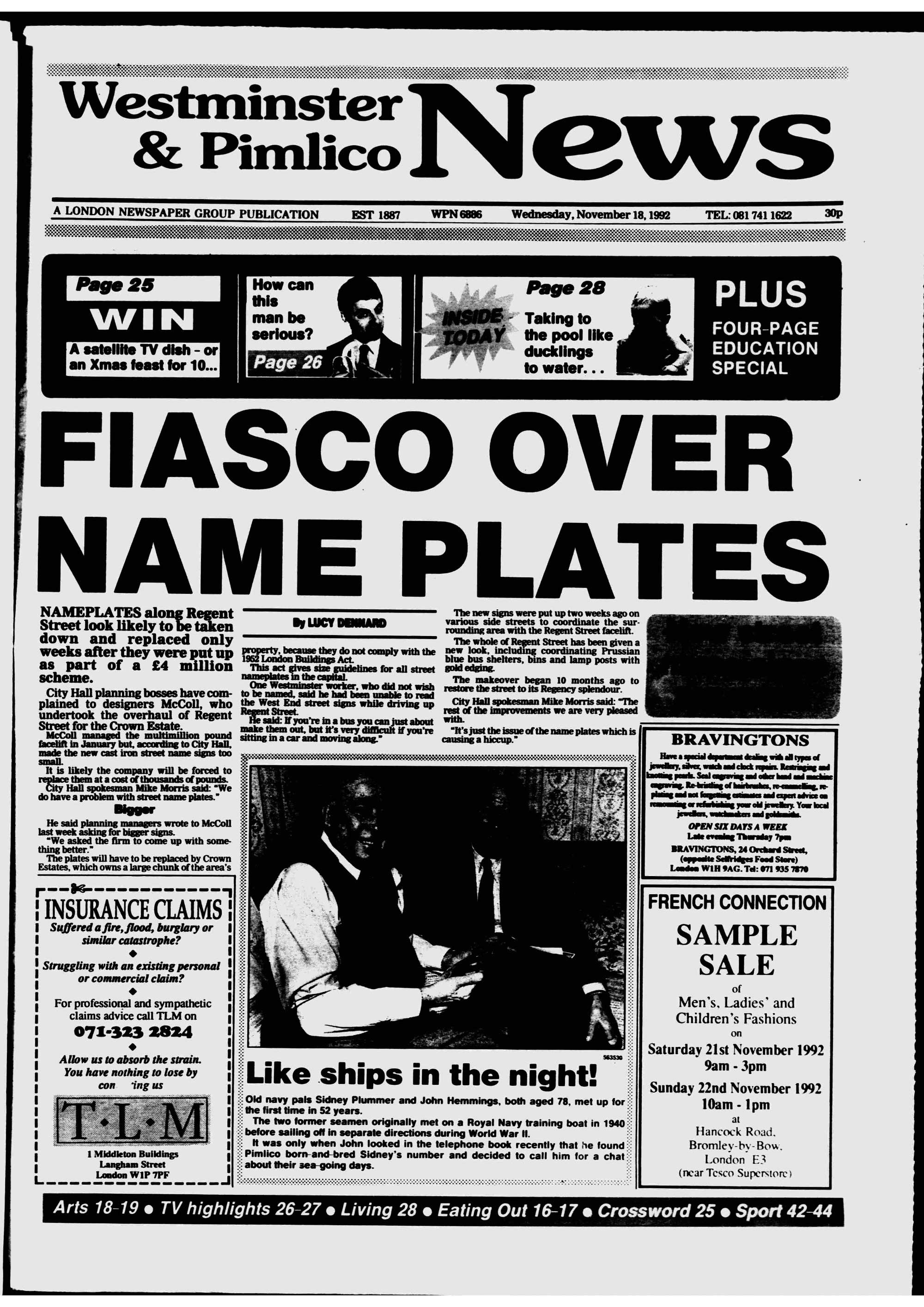
In January 1992, a multi-million pound revamp of Regent Street for the Crown Estate was begun by the designers McColl (run by Stewart McColl). On 13 October that year, Jonathan Glancey in the Independent bemoaned the new work, which had “created the world’s first Regency traffic lights”. And as part of the revamp, at the beginning of November 1992, a new set of street nameplates were installed on all the streets adjoining Regent Street, and Regent Street itself.
However, as the Westminster and Pimlico News reported, the plates were subsequently judged to be too small to read, particularly as they featured gold lettering on a blue background, which didn’t create enough visual contrast.
[Frustratingly, I haven’t yet been able to find any photographs of these signs.]
On 5 August of 1993 Deyan Sudjic wrote in The Guardian about how much he disliked the revamp of the street, including the small signs:
“Where they [the designers] have been given their head is with the street signs, and the whole area bears the scars. Every existing sign has been taken down, and the lucid and elegant City of Westminster house style has been replaced with blue and gold cast iron and type that is so small as to be illegible. The miniature new signs also have the unfortunate result of revealing the streaks of grime and the badly-filled pitted stone left by the removal of the previous signs.”
Their days were numbered.
By October 1993, less than a year after they were installed, the Paddington Mercury reported that new signs would replace the small blue ones at an additional cost of thousands of pounds: “A Westminster Council spokesman said a new design had been approved and would be installed in side streets early next year.”
I have a feeling that the set of signs up for sale now are those replacement signs.
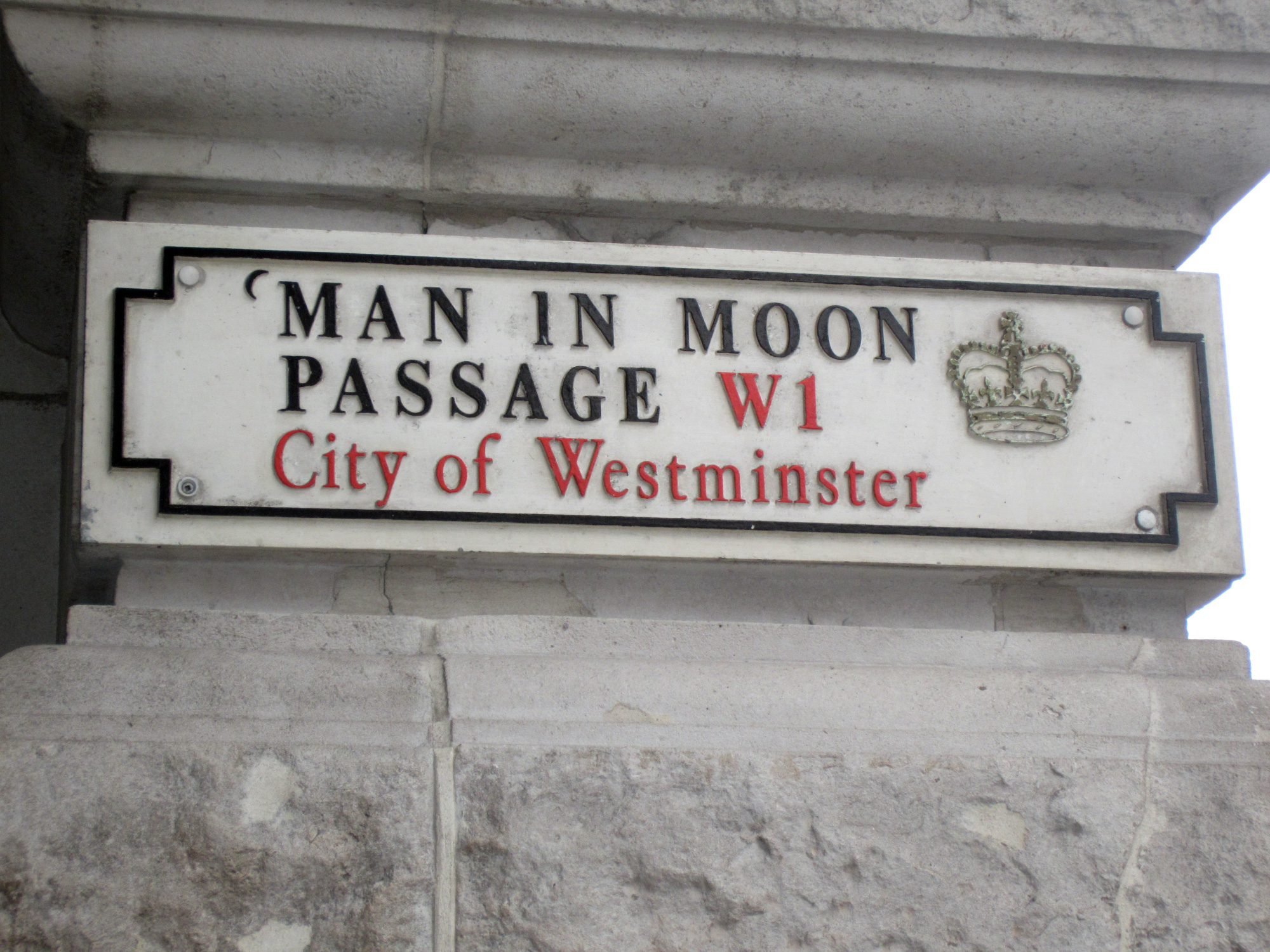
Interestingly, one of the signs from that time, the nameplate for Man in Moon Passage, a small alleyway at the bottom of Regent Street, featured a small typographic joke. A small bracket was inserted before the word ‘MAN’, presumably to represent a crescent moon. The sign isn’t included in this sale, but nor is it still in place on the passage, having been replaced with a standard Westminster nameplate.
If you know anything about either set of nameplates, do get in touch!