Albertus and The Prisoner
For those of you not familiar with it, The Prisoner is one of the most iconic TV shows to have come out of the 60s.
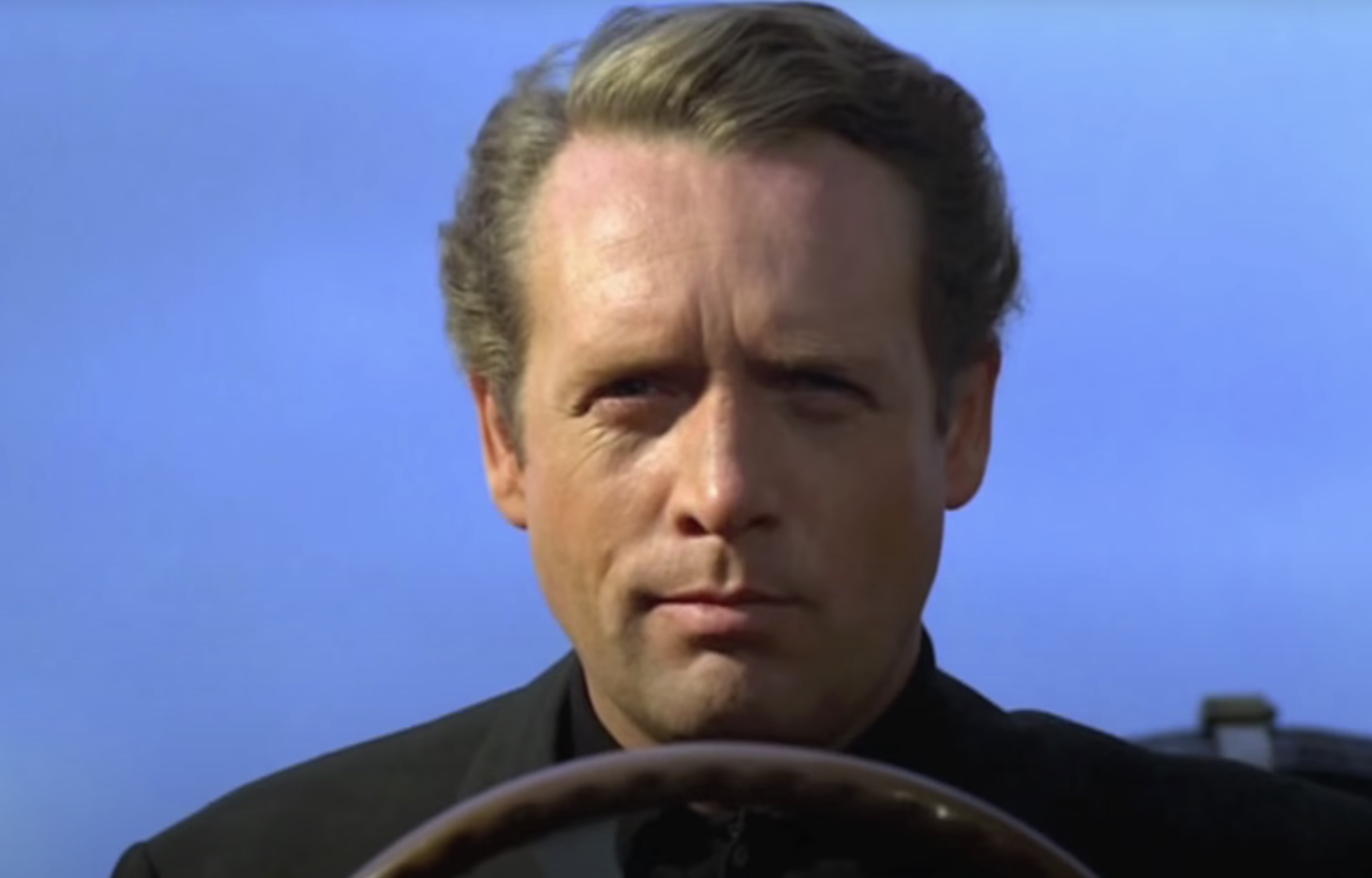
It ran on ATV from September 1967 to February 1968. While any TV programme is obviously the work of a huge team of people, this show had one powerful force at its core: it was co-created, directed, and produced by Patrick McGoohan, who also starred in the lead role of No.6.
McGoohan had made his name in the black and white spy show Danger Man, and had even been asked to be the first Bond on the back of his work on that. He turned down Bond, but after more than 80 episodes, had grown bored of working on Danger Man. He proposed a new show to Lew Grade (the cigar chomping head of ATV) - The Prisoner.
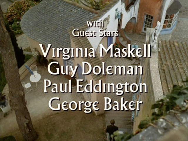
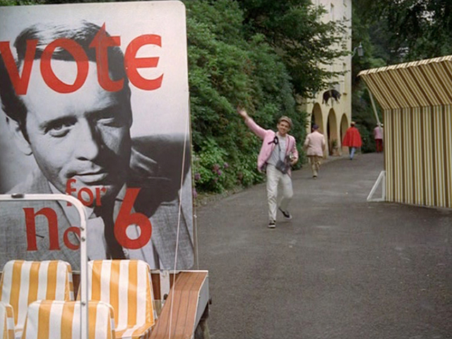
The plot revolves around No.6 – we know little about him, not even his name. The fantastic opening credits (above) show him resigning from some sort of governmental position, and then being abducted, and waking up in The Village – a mysterious community in an unknown location. Over the course of the series, his captors use any means necessary to find out what he knows, and why he resigned. It’s a psychological battle of wills in each episode, as each new No.2 tries and fails to break him. It’s an incredible show, well worth checking out.
But what’s particularly of interest from a graphic design point of view, is the rich use of a single typeface, Albertus, during the show.
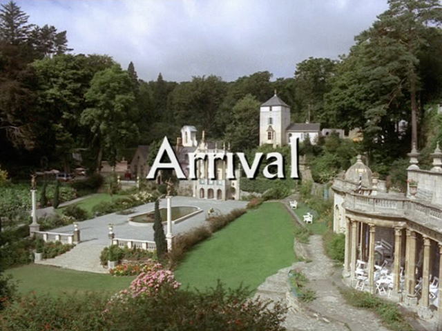
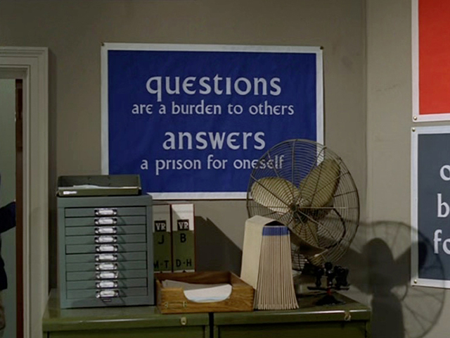
Used far more extensively than just on the credits, the typeface appears on props and signs throughout the series. It represents the Village as much as the sets, the costumes or the characters.
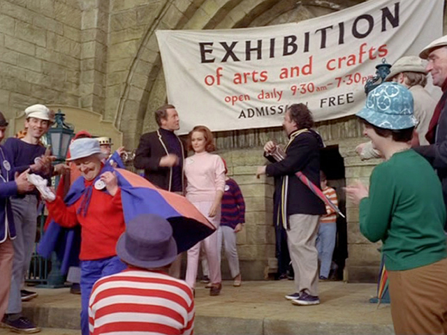
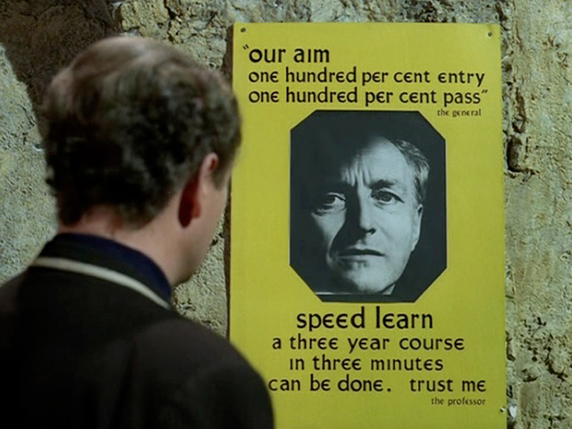
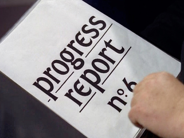
Sometimes the lettering was very professionally rendered, other times slightly less so:
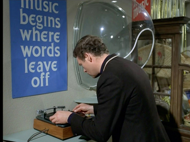
Occasionally another typeface sneaks in, but often this just highlights the ubiquity of Albertus everywhere else. Futura shows up a couple of times for example (decades before Wes Anderson made it his own):
But Albertus is No.1 in this show.
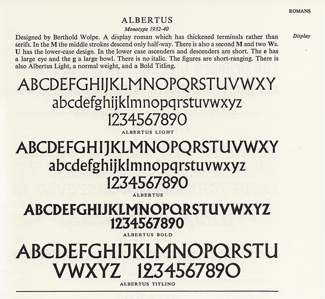
The typeface was designed by Berthold Wolpe. Born in Germany, Wolpe had apprenticed at a metalworkers, becoming proficient at engraving in gold, copper and silver. He travelled to England in 1932, where he met Stanley Morison. Morison saw some photographs of a set of Wolpe’s bronze inscriptions, and asked him to create a typeface for Monotype based on the lettering. So in 1935, Monotype Series No. 324 was born: Albertus Titling.
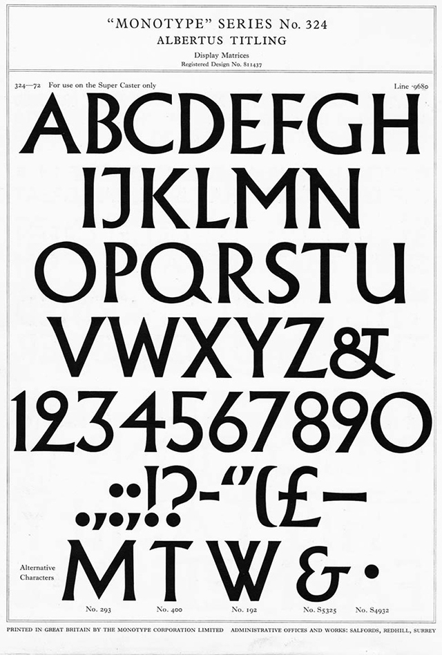
As you can see, it’s a beautiful typeface, somewhere between a serif and a sans-serif, with a few rather tasty alternate characters, and a frankly wonderful number 2. (Oddly, it doesn’t seem as if the Titling set has ever been digitised. What’s that all about?)
The marketing material of the time described it as follows:
“It is obviously a cut, and not a drawn letter, and possesses that squareness which in Roman inscriptions so notably serves legibility; but while true to the orthodox proportions, displays a marked individuality in the treatment of detail. The main strokes so terminate that the alphabet stands midway between the classical inscriptional letter and the modern sans serif.”
Albertus Titling was uppercase only, but a lowercase set followed in 1937, with bold and light versions arriving shortly afterwards in 1940.
I’ve not been able to find any direct statements from the McGoohan or any of the other creators of the show about why Albertus was chosen. It has a strong flavour to it, which will have helped to define the Village as somewhere out of the ordinary, and perhaps its duality fits well with the feeling of the setting as somewhere both old and new.
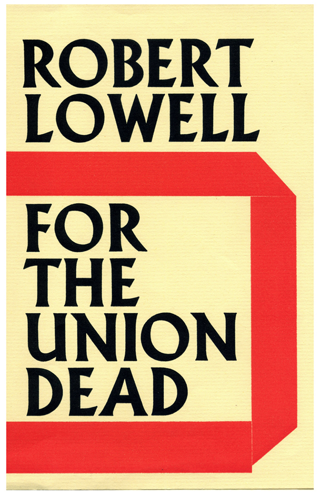
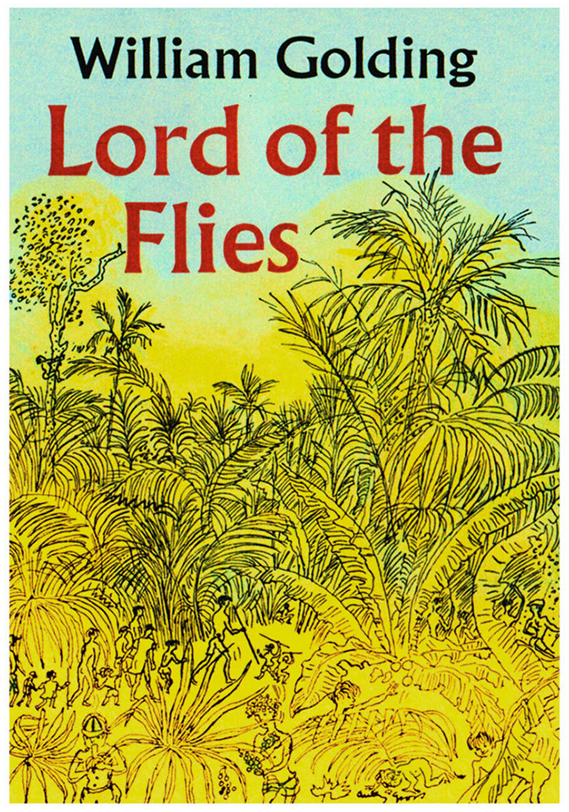
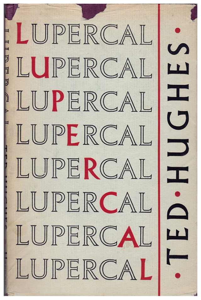
At the time the series was made, people would mainly have been aware of the typeface thanks to Wolpe’s vast number of book covers at Faber & Faber, where he used it extensively:
But we should perhaps look a bit closer at the way Albertus was used within the show. As with all things in The Prisoner, first appearances can be deceptive.
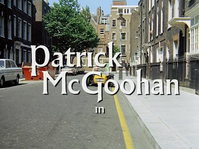
In the opening credits, the typeface is tweaked here and there. In the instance above, the ‘G’ of McGoohan has an extended stem that drops below the baseline.
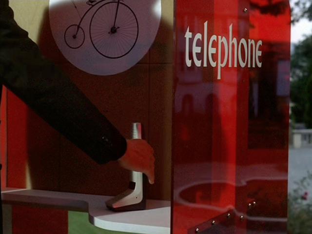
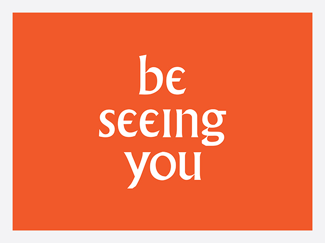
The programme’s title was carefully adapted too:
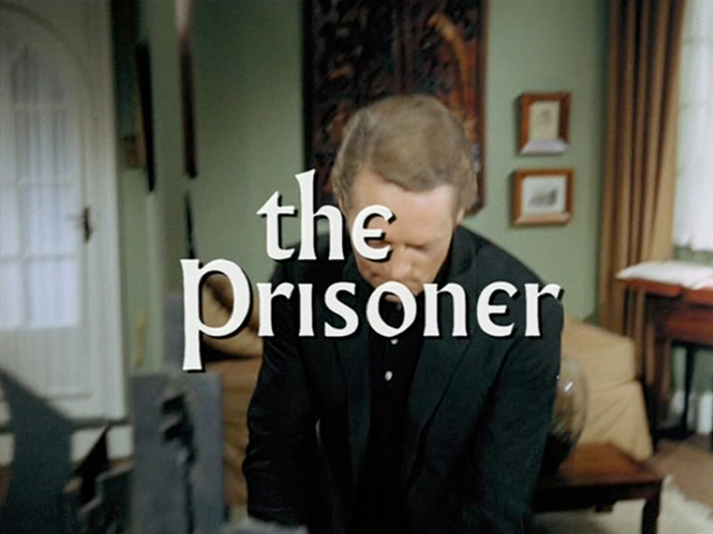
The dot, or tittle, of the ‘i’ has been removed, but most distinctly of all, the lowercase ‘e’ has been attacked! The right hand side of the bowl has been lopped off, so that it resembles a sort of epsilon (the fifth letter of the Greek alphabet).
This adaptation was extended across nearly all appearances of Albertus in the programme. I’ve hunted high and low for information about why this was done, but as yet haven’t discovered any facts. Obviously it makes the typeface feel much more bespoke, but I’d love to know if there was any reason beyond that. Was it perhaps done to instil a feeling of discord?
Here’s a look at the difference between a regular setting of Albertus, and a Prisoner style setting:
I created those two slides for this post, but here’s how it looked in the show itself:

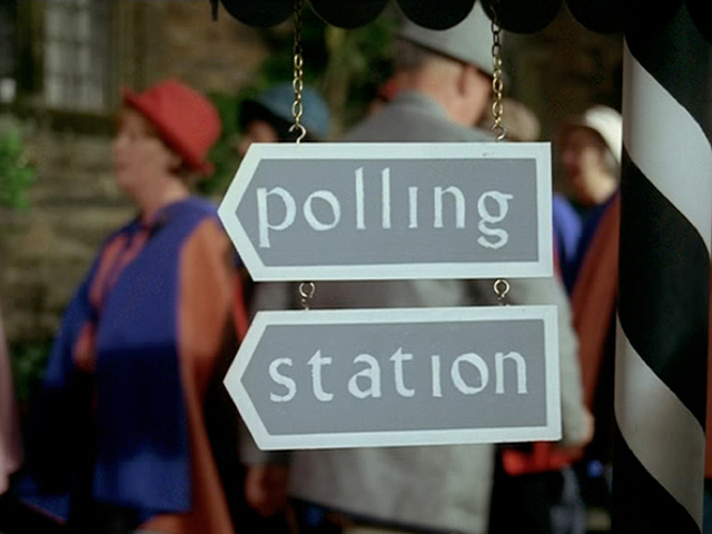
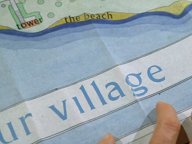
As you can see, the sign is hand-rendered, and the ‘e’s have been given their own little flared terminals. A little bit bonkers. By contrast, in the credits, the ‘e’s have clean sharp ends:
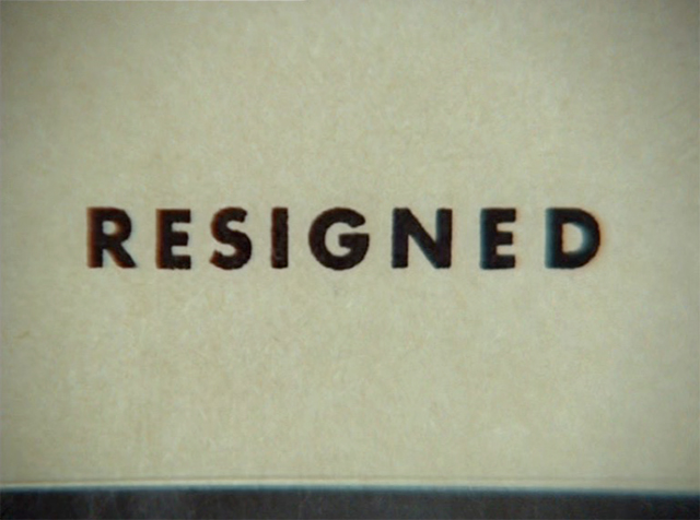
Here the ‘e’ has a distinctly even stroke, and a vertical terminal at the top:
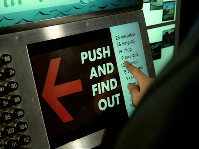
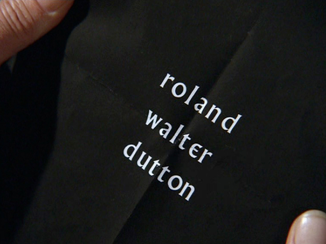
And in fact, the lettering changes constantly throughout the show, presumably depending upon who created each piece, and how much time they had to work on it:
Check out this heavyweight version:
And what’s going on here?
That poor ‘e’ looks a little bit stretched out.
And sometimes, the customised ‘e’ was forgotten about entirely:
You can picture the scene on set when that was produced:
Art dept guy: ‘So here’s the map you asked for.’
McGoohan: ‘Great, that’s looking really... Wait. What. Is. This?’
Art dept guy: ‘Um, is something...’
McGoohan: ‘What is this ‘e’? What the hell is this ‘e’? What the bloody hell is this ‘e’ doing here? Answer me that. I want information. Information.’
And it happened more than once:
Sometimes they even got it right and wrong at exactly the same time:
Regardless of any inconsistencies though, The Prisoner is a fantastic example of using typography as a key part of the creation of a fictional world.
I’d love to know more about the specifics of why the typeface was chosen, why it was adapted, and who actually created all the props and signs. So if you know anyone involved with the show, do get in touch.
Oh, and if you’d like to play around with making your own Prisoner bits and bobs, there’s a downloadable font called Village, created by Mark Heiman in 1994 in homage to the show, which features the lopped off ‘e’, and which also has ‘i’s and ‘j’s with their dots removed.
And remember – you are not a number.
---------------
This post is an adapted version of a talk I gave at Grafik’s Letterform Live event on 25 February 2015. Larger images are available on my Flickr set.